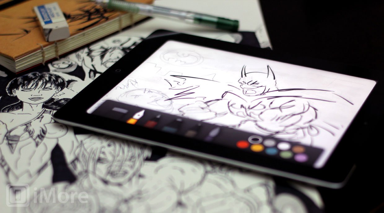
If you're looking to turn your iPad into a blank slate that you can easily, beautifully be filled with anything from a sketch to a flow-chart, a list to an diagram, get Paper and get creating.
Paper by 53 for iPad is exactly what the name implies, a fresh canvas ready and waiting for your ideas, inspiration, and art. While hand drawing and handwriting note-taking apps are nothing new to the iPad or App Store, Paper feels qualitatively different in kind. It has a focus, a flow, a humanity, and a technology about it that somehow come together to create one of the most natural creative experience I've had on the iPad to date.
When you launch Paper you're greeted with a series of beautifully rendered books. (They look so good they almost overcome the shadows behind them not falling at a precise 90 degree angle. Almost.) There are three pre-populated for you: Sketches, Ideas, and Making Paper. Sketches and Ideas are empty and waiting for you to fill them with wonders of your own devising. Making Paper is pre-filled with samples of what those creations can involve: pretty much anything you could whiteboard, scribble, or sketch.
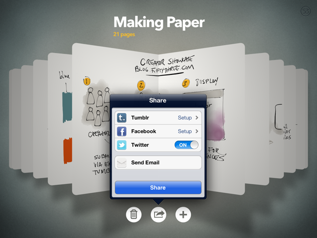
Tap or pinch open a book and it unfolds in front of you into a browsing and sharing mode. You can quickly leaf through the pages, add or delete pages, or share pages via Tumblr, Facebook, Twitter, or Email. There's no save to Camera Roll, unfortunately, but you can take screenshots of the pages to work around that.
To start creating, tap it or pinch on an open book and the page fills the screen and becomes editable. That's it. There's no user interface unless you call it up or leave the page. It's just you and the glowing electronic paper.
To leave a page, pinch it closed. To move between pages, swipe from one side to other in the direction you wish to go. (This has been problematic for me, often resulting in unintentional lines being drawn instead of pages being flipped.) To bring up the tools, swipe up from the bottom up. To close the tools, touch them and swipe back down.
Paper comes with two free tools: Draw (an ink fountain pen) and Erase. Additional tools are available for $1.99 each via in-app purchase and include Sketch (a pencil), Outline (a marker), Write (a pen), and Color (a water-esque brush).
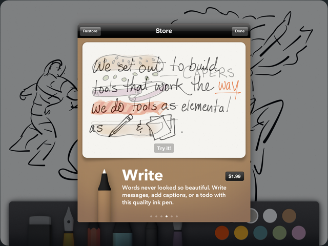
Each tool does pretty much what you'd expect them to do. Which is a remarkable achievement. Almost immediately I was able to break down motion lines and poses and build up structures and forms with the sketch pencil tool, and it felt right in a way no other iPad app has ever felt. Likewise inking with the draw fountain pen tool was great. Pages even simulates stroke width. The accuracy was terrific, better than any other app I've used. The line just went where I expected it to go and looked the way I expected it to look.
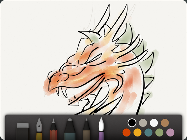
Color was a different story. It might simply be my lack of skill with water colors, though I've used them quite a bit in the distant past. I immediately missed controls I've come to depend on in Photoshop -- brush size, opacity, and custom colors. I immediately lost the incredible connection the other tools had given me. Without real world palettes and water to mix and thin and perfect my media before applying it to the page, and no digital controls, it just didn't click. Still, it seems like something that can be figured out.
Also requiring some figuring out is the undo/redo metaphor. You touch two fingers and trace a counter-clockwise circle to "rewind" actions and a clockwise circle to "replay" (though still labeled as "rewind") them. It... takes some getting used to. While the idea is like a dial, there's no real delineation between the steps you're undoing or redoing, and the control doesn't feel particularly fine grained. So, I was constantly undoing or redoing not enough or too much. A jog shuttle isn't truly useful unless it has those little notches to give you precise feedback for each frame or step.
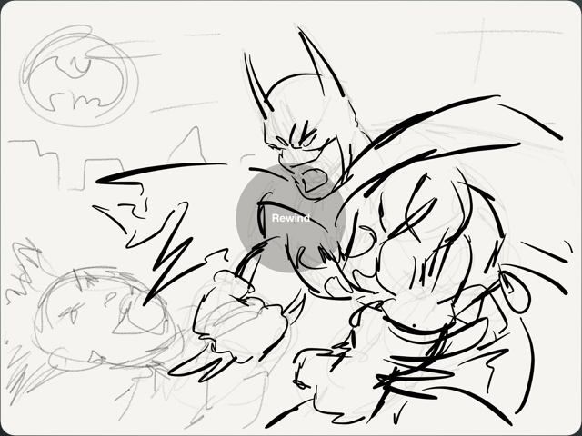
There are some other challenges to be overcome as well. You can't, for example, draw an upward line from the bottom of the screen because that brings up the tool selector (you have to use downward lines). You can't quickly fill in large areas of color with the marker because the tip is unchangeably small. But for every gripe there are a hundred smiles to be had simply because Paper truly nails the look and feel of sketching and inking.
Neither Paper nor the iPad will ever be able to match the texture of a real sketchbook, the smell of graphite or ink or whatever the chemicals are that make erasers smell the way they do. It can't get paint or marker on your hands (or nose), or drip water down your canvas or onto your foot. It's not real. But it's really, really good, and the advantages Paper and the iPad have over traditional media make them a better choice for many tasks.
Note: Paper by 53 looks absolutely stunning on the new iPad Retina display but it works on all generations of iPad.
Paper for the iPad from FiftyThree on Vimeo.
The good
- Excellent free-hand creative tool
- Terrific natural media pens, pencils, brushes, and markers
- Elegant, out-of-your-way, user interface
The bad
- No control over tools, colors
- Undo mechanic can be unwieldy
Conclusion
There are better, more specific drawing and painting apps in the App Store, there are better, more optimized note-taking apps. There are apps that let you annotate PDFs or mind-map ideas in ways Paper simply doesn't. Yet, through thoughtful interface and natural feeling tools, Paper achieves something great.
It was late at night when I downloaded Paper and I had so much fun I ended up staying up far longer than I should have. I used it mainly with my finger. A stylus, however, is even better. I've drawn with pencil and pen and paint since I was a child, so the stylus just seems to fit. It gets your hand out of the way and allows a greater range of stroke and better control of angle. If the next-generation Bluetooth 4.0 styli deliver on the promises of pressure sensitivity, wrist rejection, etc. we could really, finally have a really, really good sketching experience on the iPad.
If you're looking to turn your iPad into a blank slate that you can easily, beautifully fill with anything from a sketch to a flow-chart, a list to an diagram, get Paper and get creating.
Free with in-app purchases - Download now
(Already picked up Paper for iPad? Jump into the iPad app forum and show us your creations!
More: The Verge has an interesting interview up with Paper by 53's developer, Georg Petschnigg.

Rene Ritchie is one of the most respected Apple analysts in the business, reaching a combined audience of over 40 million readers a month. His YouTube channel, Vector, has over 90 thousand subscribers and 14 million views and his podcasts, including Debug, have been downloaded over 20 million times. He also regularly co-hosts MacBreak Weekly for the TWiT network and co-hosted CES Live! and Talk Mobile. Based in Montreal, Rene is a former director of product marketing, web developer, and graphic designer. He's authored several books and appeared on numerous television and radio segments to discuss Apple and the technology industry. When not working, he likes to cook, grapple, and spend time with his friends and family.
