Adobe has previously attempted to bring Photoshop in whole or in part to mobile devices, with Photoshop Touch, Photoshop Mix, Photoshop Fix, and Photoshop Sketch. Those endeavors have worked out pretty well when the scope was small. But, this time it's different. Adobe promised us real Photoshop. An app named "Photoshop" with no suffixes, and no qualifiers.
Given how monstrously large Photoshop is, that seems like an impossible challenge. Photoshop can be automated with scripts and actions. Photoshop can generate 32 kinds of trees, clouds, and fire. Photoshop can render 3D scenes. Photoshop can edit video with audio. I've been using Photoshop for decades and I still occasionally find a menu item I've never used, leading to a window I've never seen. It would be unreasonable to expect that's all coming to Photoshop for iPad. I'm not sure it should, either — this is a good opportunity for Adobe to reassess and reboot the franchise.
While there has been a lot of hype around this release, Adobe themselves said they'll be "starting with Photoshop's top workflows, compositing, masking, and retouching, with more to come". Expectations should be tempered.
Article continues belowFeatures

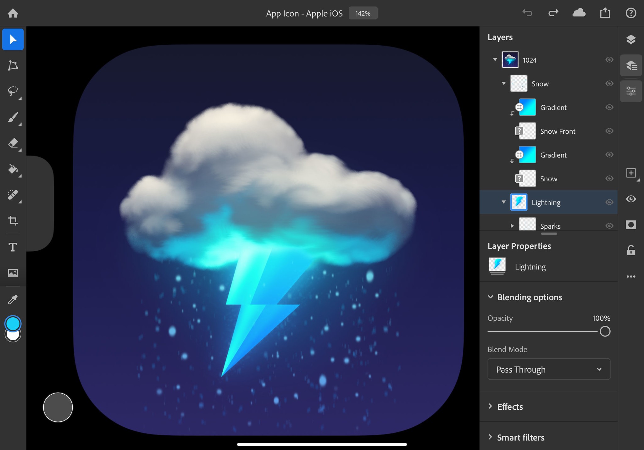
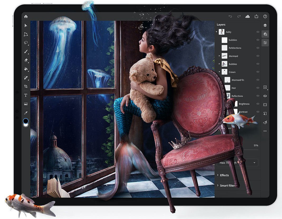
Adobe's description of what's included is bang-on and should be taken very literally. With that in mind, it's far easier to describe what is there, rather than what's not there. Most of the layer management and blending options have survived the journey. Layers can be reordered, renamed, moved, resized and transformed as per the desktop version. Opacity and blending modes can be set, and the blending mode popup menu includes preview thumbnails — a nice touch that's not present in the desktop version of Photoshop. The layers panel can also be displayed in a highly compact mode with just thumbnails and no layer names, helping maximize screen real estate, while still allowing access to many common features via gestures.
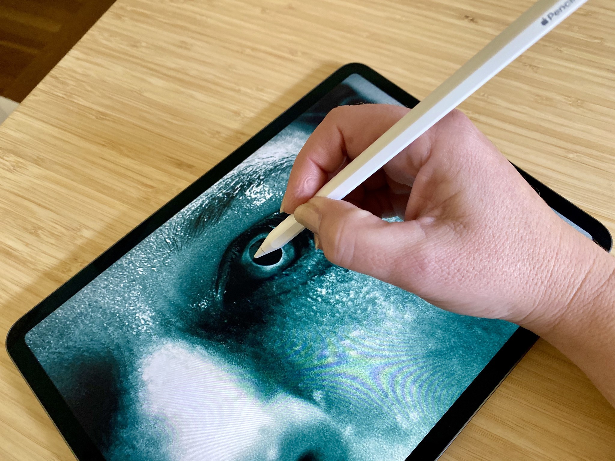
The painting and retouching tools are a joy to use with an Apple Pencil. Custom brushes can't be created or loaded in, but there is a wide range of bundled brushes. If you're looking for something that's better in Photoshop on an iPad than the desktop version, using the spot healing brush and clone stamp tool with a Pencil is a great place to start. Given the lack of other tools and panels, Photoshop for iPad feels fluid and focused for this kind of work.
The painting and retouching tools are a joy to use with an Apple Pencil.
Masking is limited to bitmap masks only (no vector masks yet). However, clipping layers to other layers and groups works. That means many of the standard masking techniques used for photo retouching and illustration are well covered.
The selection basics are all there, but advanced features, such as automated selection of people and other selection refinement, aren't in this version. There's also no way to directly work with channels or save selections. I'm in two mindsets about that — do channels only exist in desktop Photoshop because they were created when layers didn't exist? Given a clean slate, would an ideal tool include them? I use them all the time, but I'm not sure if that's due to learning Photoshop at a time when they were the only way to do certain things.
iMore offers spot-on advice and guidance from our team of experts, with decades of Apple device experience to lean on. Learn more with iMore!
Photoshop's adjustment layers are a staple when it comes to making overall image adjustments. They offer many ways to brighten, darken, change the contrast, change the color balance, and perform other color manipulations. Around half of Photoshop's adjustment layers made it into this version, but Adobe has done a good job choosing the most commonly used types.
Text and gradients are included but very stripped back. Text can be multi-colored and can use custom fonts via the new font management system in iPadOS. Linear gradients can be drawn, but only using the current foreground and background colors — there's no editable stops and no other gradient types.
Version 1.0 works in RGB and 8-bit per channel only. There's no CMYK, higher bit depths, or a way to choose color profiles yet, but Photoshop itself notes that they're coming soon. For many customers that won't be an issue, but for those hoping to use it for print pre-press or higher-end photo retouching, you're out of luck for now.
Layer Effects and Smart Filters aren't in this build, but their spot in the interface exists, and there's some placeholder text suggesting they'll be coming soon.
If your favorite Photoshop feature wasn't mentioned above, there's a very good chance it's not in this version.
Storage and user interface
Photoshop happily opens files from the iPadOS Files app, meaning it'll also import from Dropbox and other sources. However, when documents land in Photoshop, they get stored locally and in Adobe's Creative Cloud. You can export as a PSD, JPEG, PNG, or TIFF, but it's clear that Adobe intends customers to see Creative Cloud as their primary storage. iPadOS includes an Open in Place feature developers can support, which means when something is opened in the Files app, changes are saved in place. Photoshop doesn't support Open in Place, but it would nice if it did.
You can add Adobe's Creative Cloud as a source to the iPadOS Files app, but that gives you access to the "Files" section of Creative Cloud, and not the "Cloud Documents" section, which is where Photoshop stores its documents. I understand why this is, although it's confusing. Storing documents on Creative Cloud works well, but the kinds of people who use Photoshop professionally are accustomed to having control over their files. More flexibility would be great.
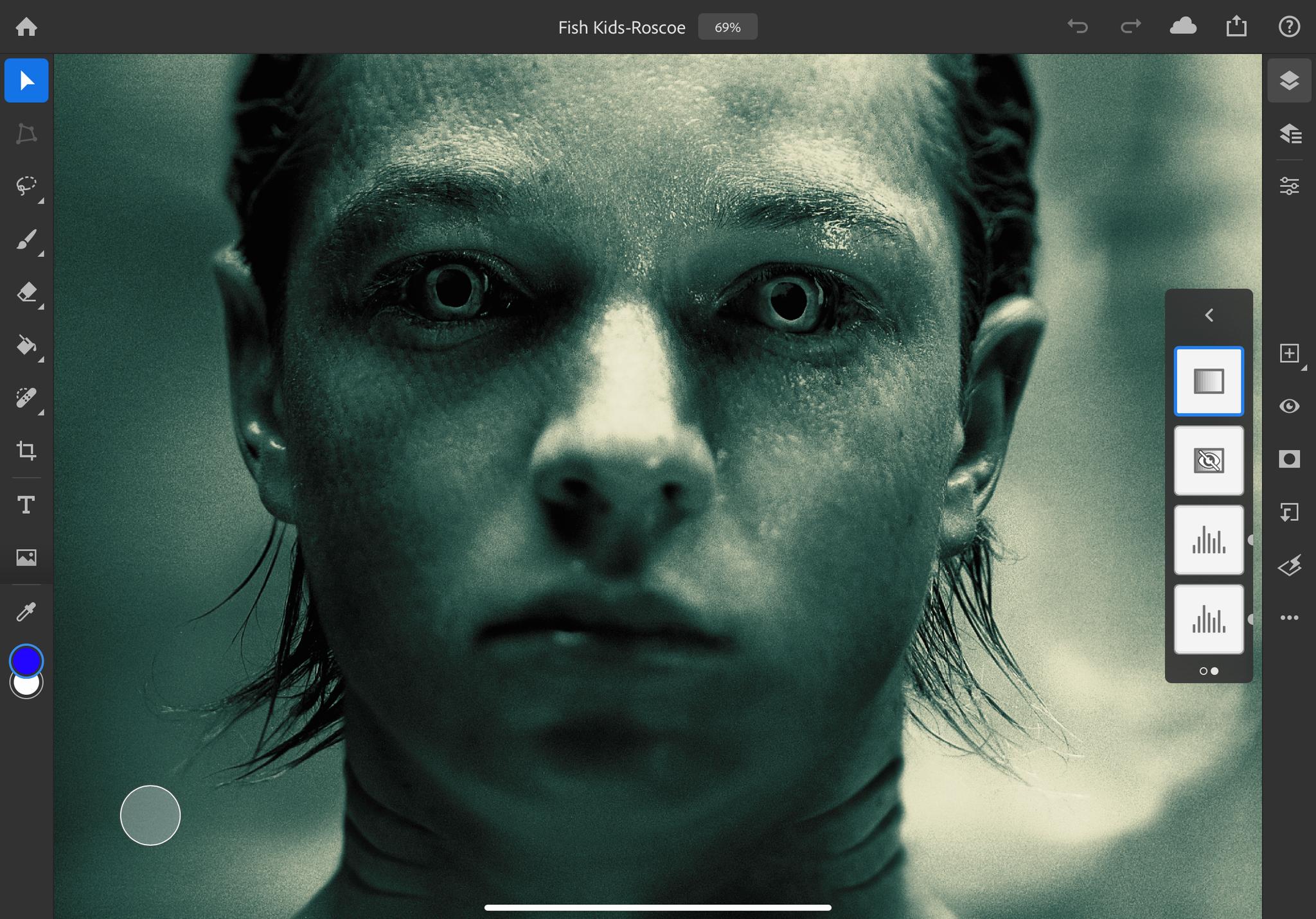
Overall, the user interface is more fluid and animated than I'm used to in Photoshop. A good example of this is switching channels in the levels adjustment layer properties, where the histograms transition into place. It's very nice, but also what you'd expect of a modern app. It's also great to see keyboard support, as well as a light and dark mode interface supported from day one.
The real test for the user interface will be how it holds up as new features are added — iPads have smaller displays than Macs, and multitouch interfaces require larger hit targets. For an app like Photoshop, that could be a problem.
Testing the limits

The desktop version of Photoshop places limits on certain features. The largest document you can create is a ginormous 300000×300000 pixels, groups can only have a hierarchy 10 levels deep, and documents can only contain 8000 or fewer layers. In practice, it'll be incredibly rare to even get close to those limits, and I suspect most professional users of Photoshop don't know they exist. That's okay — a single layer 300000×300000 pixel document will consume at least 250 gigabytes of memory and swap to create. I've tried creating a document like that on an iMac Pro and it ended the way any operation like that ends — I stopped it once I realized what I was asking of the hardware.
Those limits have an interesting purpose given the context of Photoshop for iPad. If Photoshop for iPad is truly running the same code, it's likely the same legacy limits will exist. After double-checking, I can confirm the document size and group hierarchy limits match perfectly. I was informed that the iPad version doesn't have a cap on the number of layers, and is only limited by available RAM.
I opened and edited a wide range of documents to check feature support and performance, and was pleasantly surprised to see it handled everything. An 830MB photo retouching project from 2004 opened with only a minor hitch (a warning about CMYK support). Another 291MB document that uses an extremely broad range of features pushed Photoshop for iPad a lot more, but the performance was honestly pretty solid. That document can strain an iMac Pro, so I'm surprised it opened at all.
I used an 11-inch iPad Pro and Pencil for all my testing. The iPad Pro hardware is extremely well suited for running Photoshop, with one major exception. Having only 4GB of RAM is just not enough to hold big documents (the iPad Pro with 1TB of storage has 6GB of RAM, which would certainly help). That's not Photoshop's fault — there's either enough space in memory or there isn't. Adobe has done an admirable job, and Photoshop does swap parts of the document to disk when needed, but there's just no substitute for having more RAM available.
Given that knowledge, and given I was doing my best to stress test all aspects of the tool, I was able to get Photoshop to crash when throwing documents with thousands of layers at it. I do need to emphasize that I make a sport of these things, and Adobe already has my PSDs, so those issues could be fixed in an update soon.
This is the real deal. This is the full Photoshop engine under the hood, even if only a small subset of the features are available in the user interface.
Who is it for?
If you're a current Adobe Creative Cloud or Photography subscriber, it's a great companion to the suite you're already using. There's no reason to not install it if you have a compatible iPad. It also doesn't count against your Creative Cloud login limit, meaning you can use Photoshop on two computers and Photoshop on your iPad.
If you're not already in Adobe's ecosystem, the pitch is more tenuous. There are a few very capable competitors, depending on the tasks you're looking to accomplish. Adobe's pace in rolling out new features will likely determine Photoshop's value to new customers — in its current form, it's only viable for painting, compositing, and retouching. The interface is very approachable, and I could see it being a good starting point for someone new to Photoshop.
One thing Photoshop for iPad does extremely well is accurately opening Photoshop documents.
One thing Photoshop for iPad does extremely well is accurately opening Photoshop documents. That may sound like an empty compliment, but other tools that claim to open Photoshop documents fall over quickly when the file contains complex masking, adjustment layers or other advanced features. They can't be trusted round-tripping PSDs to and from desktop Photoshop, but Photoshop for iPad can.
A new beginning
Photoshop means different things to different people. It spans an incredible array of industries, including some possibly less obvious uses, such as game development, medical research, and astronomy. It's almost inconceivable that any one person uses all of Photoshop. However, in its current form, it is conceivable that almost all professional customers will find Photoshop for iPad lacking. This is reflected in the app's current low rating in the App Store, and the many negative reviews.
I don't envy Adobe's predicament. I feel like they have taken the correct and more difficult path, bringing the full Photoshop engine to the iPad with a ground-up rethink of the interface. This release is precisely what Photoshop needs. I can see Adobe moving to a place where the engines of their main tools run on iOS, Android, macOS, and Windows, with different user interface layers. I'm excited for what can't yet be seen.
However, the messaging could have been a lot better. I don't think they had to ship like this. Holding off until there were more features, or labeling it a beta, or launched with introductory pricing, or simply keeping the marketing department in check would have provided a smoother release. You only get one chance at a first impression, and Adobe is now on the back foot, needing to work to regain trust.
Founder and designer at Bjango. Co-host of Iterate. Currently building Skala.


