iPhone 7 Plus vs Honor 8: Battle of the (fake) Bokeh!
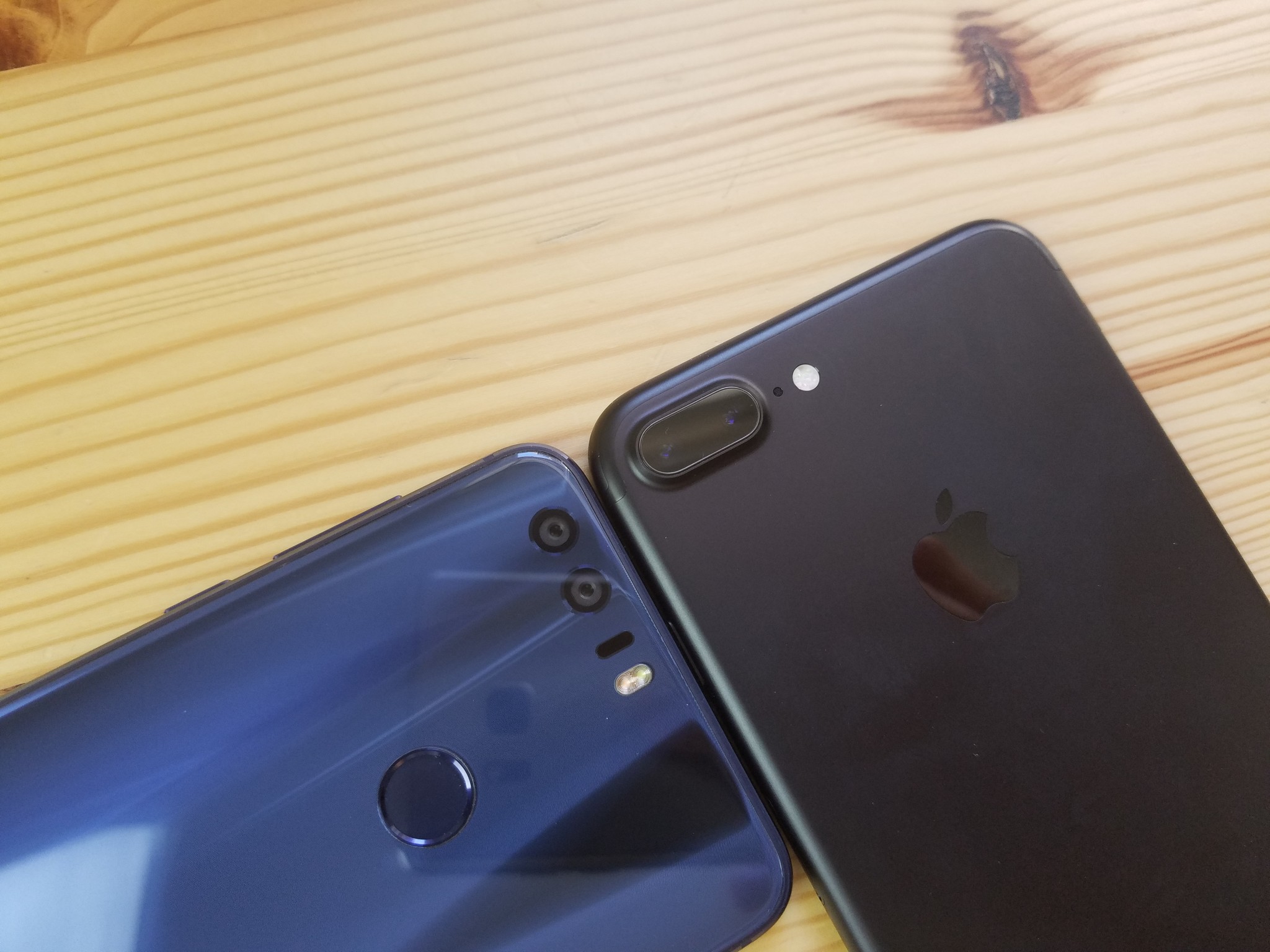
The iPhone 7 Plus has two camera sensors, one with a 28mm depth of field and the other 56mm, meant to take photos at a "telephoto" format. In reality, the second sensor provides a lot of extra data to the sensor, as proven by the iPhone 7 Plus's Portrait mode, which is available to all larger-iPhone users in iOS 10.1.
But such a Portrait mode, as Apple calls it, is not uncommon. It's been available in some Android phones for years. Specifically, the HTC One M8 added a second 2MP camera sensor for this very purpose, and while it was well-received, it never gained the adoption that HTC wanted to justify its addition to the phone's sequel the following year.
Some phones don't make a big deal over the second camera, utilizing it more for additional resolution than adding features. But there are a couple devices, such as the Honor 8, close cousin to the Huawei P9, that does both: like the iPhone 7 Plus, it uses a second 12MP sensor both to accrue additional data for regular wide-angle photos, and to aide with zoom — and it also uses the separation to measure depth, and apply artificial background blurring to photos.
The Tests
Before we begin the tests, it's worth noting a couple of things: the Honor 8's two 12MP sensors are arrayed very differently to the iPhone 7 Plus's. First, one is color and the other monochrome, which is meant to assist in detail, focus, and exposure accuracy. The other is that the focal lengths of the lenses at identical at 27mm, which means the portrait/background blur feature works quite differently to the iPhone's.
The Honor 8 instructs you stand considerably closer to the subject than the iPhone, and the 27mm field of view is not only wider, but not optimized for portraits. In my testing, I tried to frame the subjects are close to one another as possible, but it was difficult given that I needed to stand in different places. I did not want to crop the photos, as that would alter the resolution.
Finally, the iPhone 7 Plus directs you throughout the shooting experience — stand further back, move closer, get better light — which dramatically improves the overall quality of the shot. This is the most instructive Apple has ever been in its own camera app, and I'm happy to see the change.
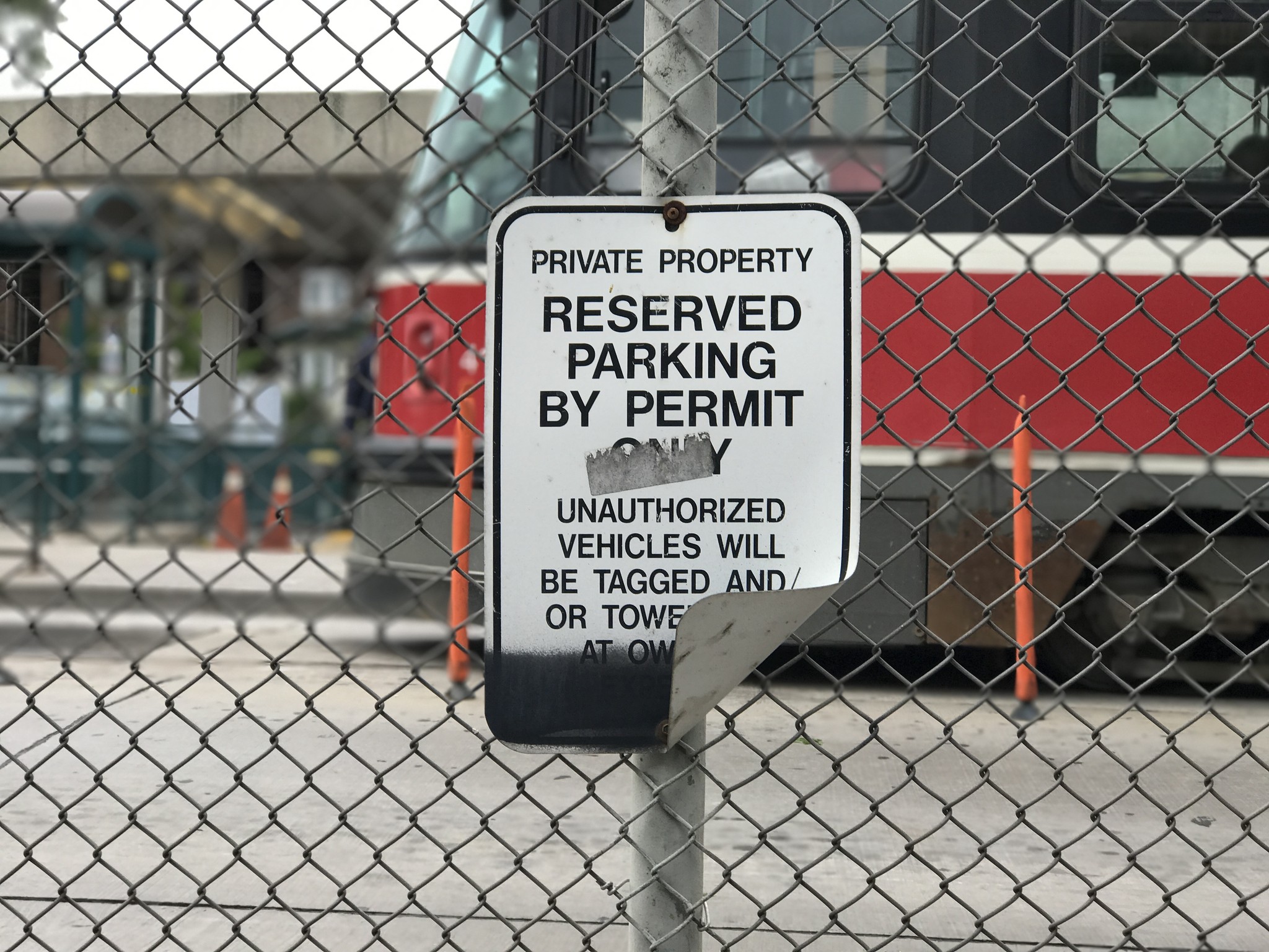
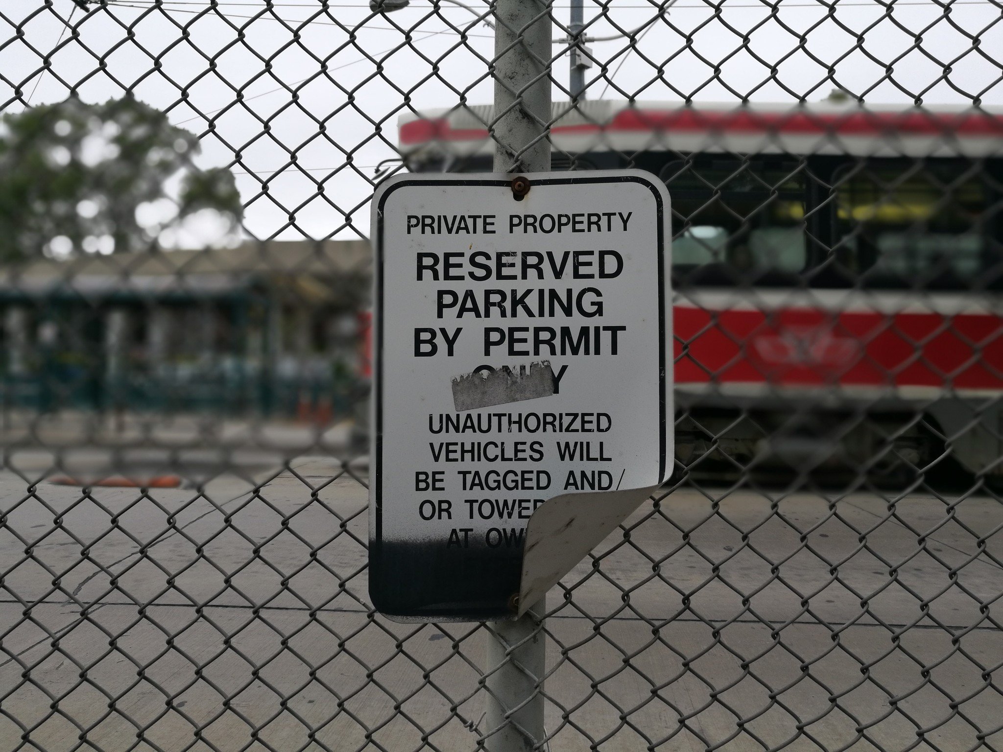
iPhone 7 Plus Portrait mode (left) / Honor 8 Portrait mode (right)
Master your iPhone in minutes
iMore offers spot-on advice and guidance from our team of experts, with decades of Apple device experience to lean on. Learn more with iMore!
You can see from these photos that both phones struggle with fences, selectively blurring only certain parts of the chain that don't have objects obviously behind them. What's interesting is that they both blur the same part of the fence, to the left of the sign, and little else, though the iPhone 7 Plus does a far better job exposing for the available light utilizing HDR to ensure the foreground is as well-lit as the back.
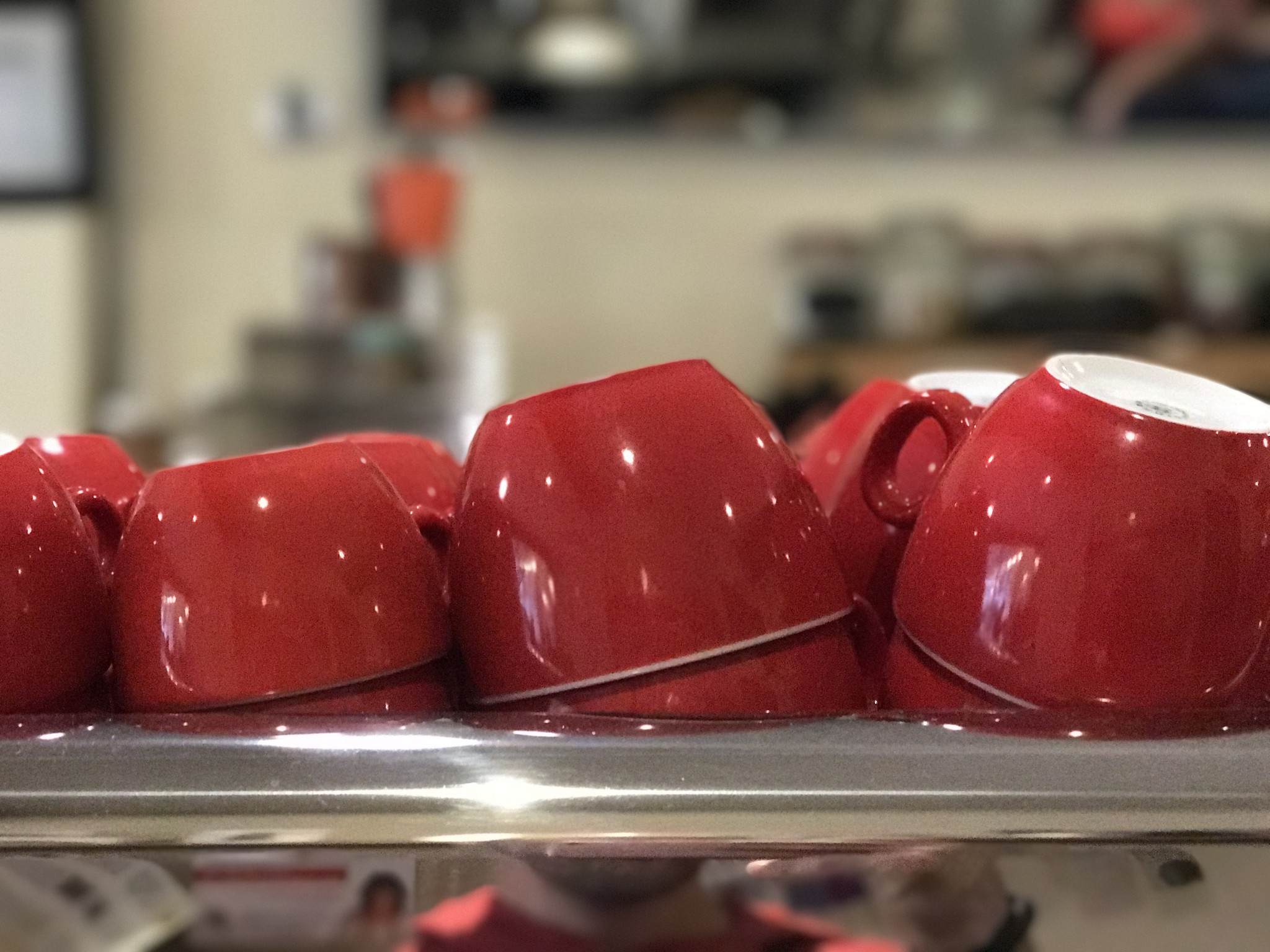
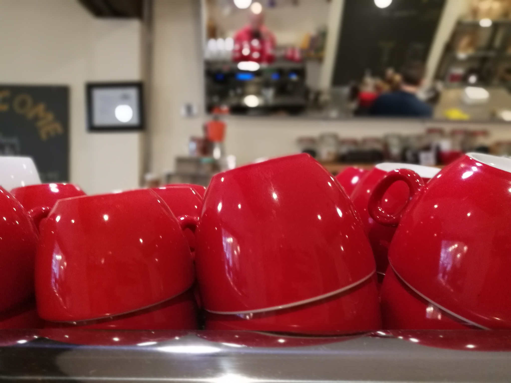
Indoor lighting results in a great shot from both phones. The iPhone looks slightly grainier, since the narrower aperture is letting in less light than its Honor counterpart, but it does a better job gradually blurring the rear of the frame. You can see that in the second row of coffee cups, which have a slightly less severe blur than the true background; indeed, the iPhone implements a much more extreme effect than the Honor, from which it's easier to make out the details. Not sure which one I like better — the Honor saturates the scene more, but the iPhone really emphasizes that foreground.
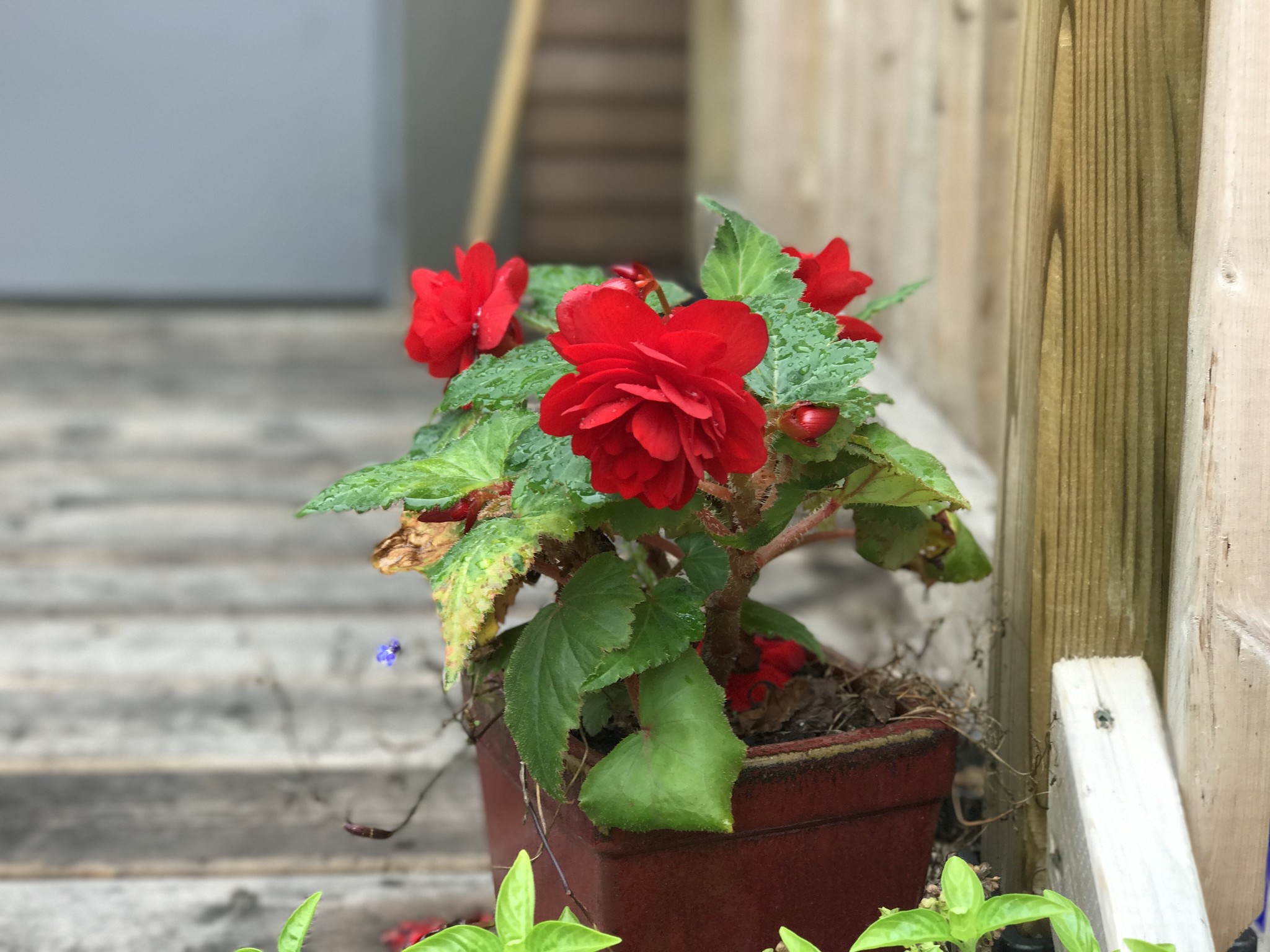
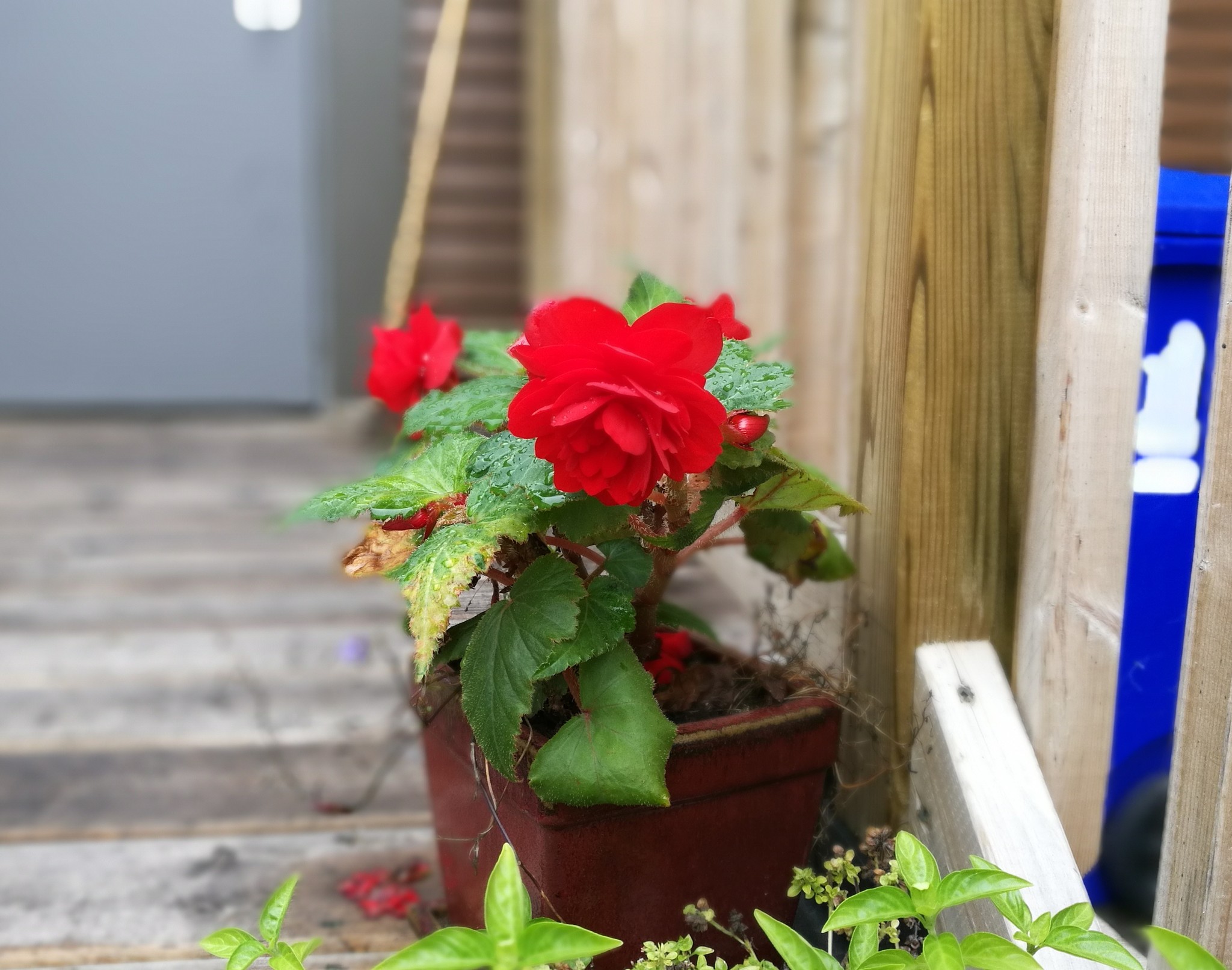
Here, the iPhone is the clear winner. I mean, it's not even close. And here's what I want to emphasize about Apple's slow-but-steady rollout of this Portrait feature: it's really, really hard to get right. Look at these two photos; the Honor completely screws up the mid-section, blurring the top edges of the red flower, some of the leaves, and what appears like random portions of the foreground. There is no consistency at all.
The iPhone, while not perfect, tries to understand the layers of the photo. There's the main subject, the red flower, along with leaves at its side and immediately behind it, plus the true background. Every decision made by the ISP makes sense — well, most of them. The plant itself naturally blurs into the background, but there are problems: the purple flower jutting out to the left of the planter floats on its own, its lithe stem blurred with the rest of the background. And the camera has a difficult time deciding which portions of the planter's soil to blur, so it appears to do all of it, even though it shouldn't. But the evenness to which the ISP applies blurring to the wood fence behind is lovely, and far more intelligent than any Android-based implementation I've yet seen.
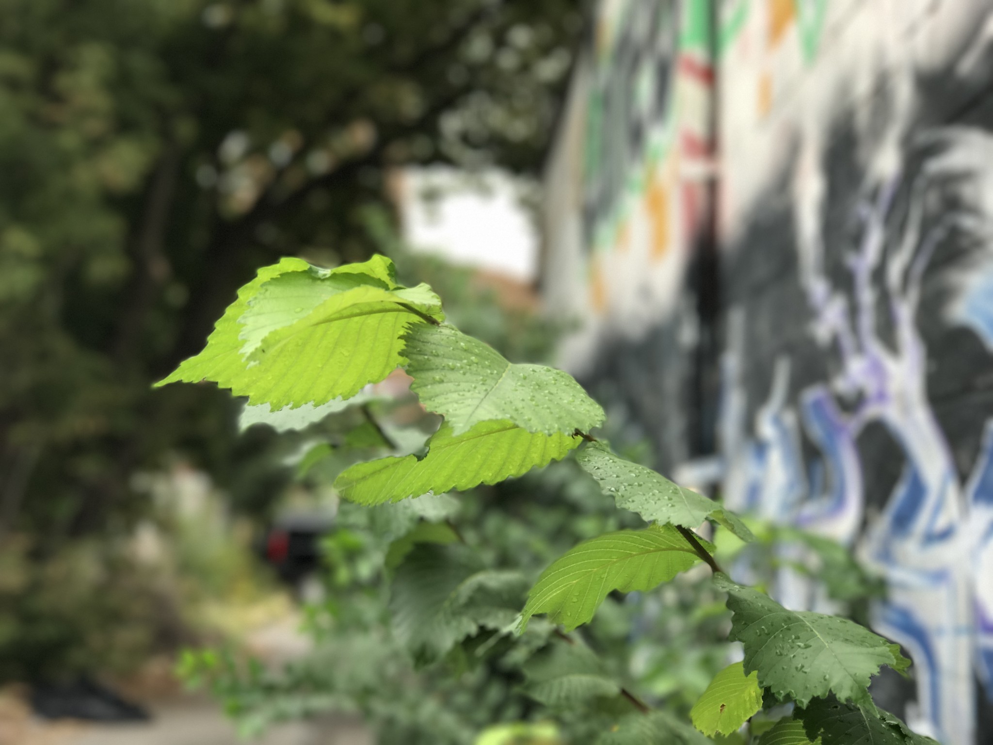
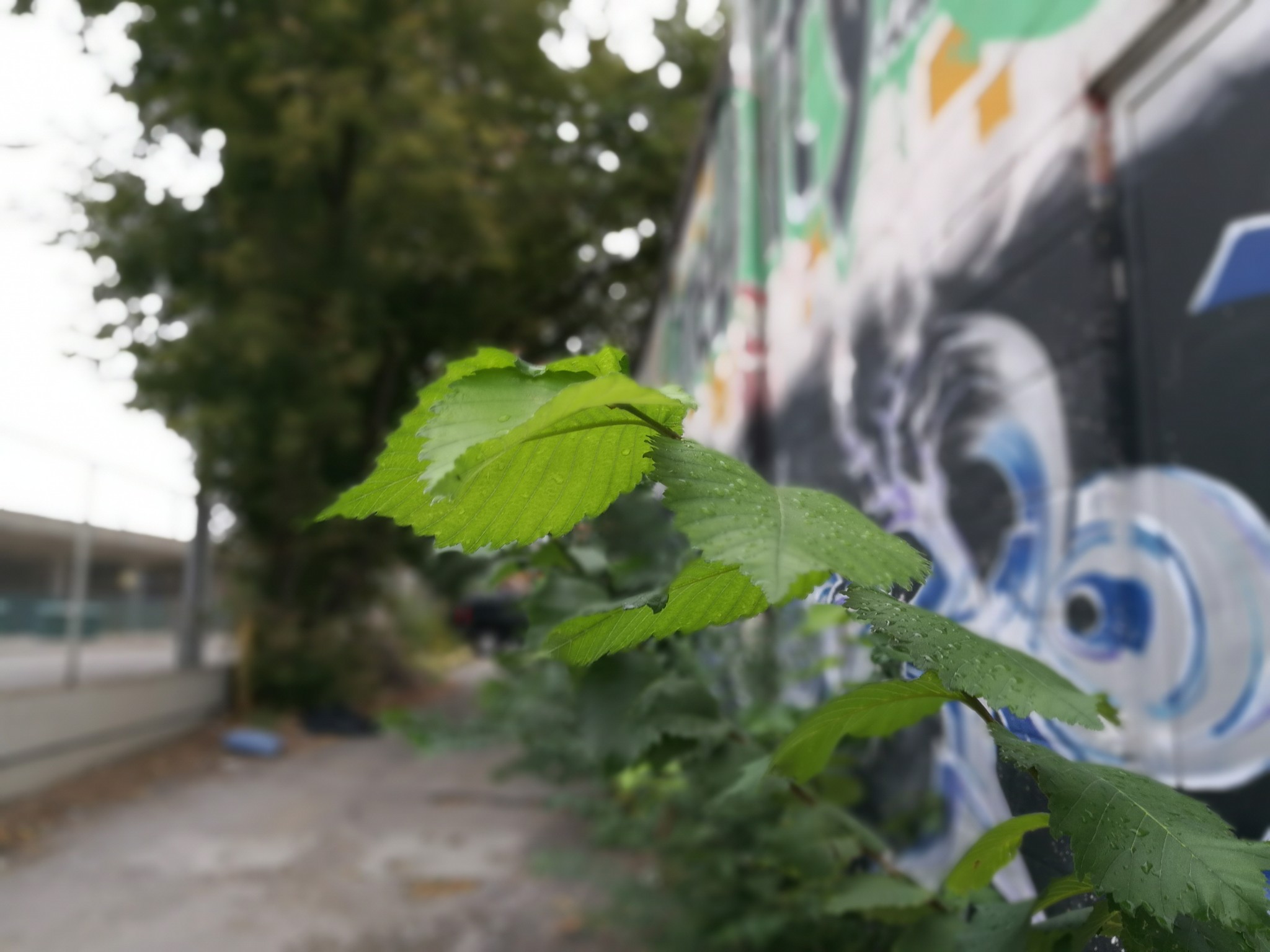
My apologies for the framing: the white of the sky in the Honor 8 is distracting, but as I said in the intro I needed to be physically closer to the subject so I did the best I could to line them up.
Both phones do pretty well here, since there is a clear foreground subject. Ignore the exposure, because the Honor 8 gets tricked up by the sky, but note how much clearer the iPhone's just-behind leaves are compared to the all-or-nothing approach taken by the Android phone. The iPhone tries to gradually blur the background in a way that appears natural; the Honor 8 identifies the foreground subject and applies a thick brush of gaussian blur to everything else. It's fine but the iPhone is great. This is an example of Apple measuring twice (or twenty times) and cutting once.
Also look at the droplets of water on the leaves in the iPhone shot. They're considerably clearer throughout, since the Honor 8 applies blur to portions of the leaves themselves, perhaps attempting to recreate a DSLR shot, but the application is haphazard and imprecise.


Finally, we get to an actual portrait. Here's my favorite barista at my favorite coffee shop in Toronto, who reluctantly agreed to be a subject for my experiment.
You can see how differently the iPhone frames the photo, since you as a shooter need to be much further back than with the Honor 8 to account for the longer lens. Taking a photo from further back feels much more natural, since your phone physically isn't in the face of the person being photographed — I didn't realize how much of a difference this made until I started taking portraits with the 7 Plus.
When looking at the framing differences between these two phones, Apple's decision to add a 56mm lens makes a lot more sense.
Both phones do a good job with this scene, though the 27mm lens on the Honor 8 distorts the person within the scene — he is just one aspect of a wider shot, rather than the main subject.
Again, the iPhone's photo is grainier, given that it is indoors and taken with a lower-aperture lens, but the grain actually works here, since the colors, like his skin tone, are more accurate. The Honor 8 takes a much redder shot.
Conclusion
These five photos contrast the iPhone 7 Plus's Portrait mode to that of another implementation of the same idea. When looking at the framing differences between the iPhone 7 Plus and Honor 8, Apple's decision to add a 56mm lens make a lot more sense, since framing a person is considerably easier and more enjoyable when you're not right in his or her face.
And even though it is currently in beta, the ISP inside the A10 Fusion chip consistently makes better decisions in regards to what to blur, and how gradually to do so, than the Honor 8, which takes an all-or-nothing approach.
What do you think of the comparison? Which phone do you think wins?
Daniel Bader is a Senior Editor at iMore, offering his Canadian analysis on Apple and its awesome products. In addition to writing and producing, Daniel regularly appears on Canadian networks CBC and CTV as a technology analyst.

