ReadKit for Mac keeps your reading together in one fast, stylish place
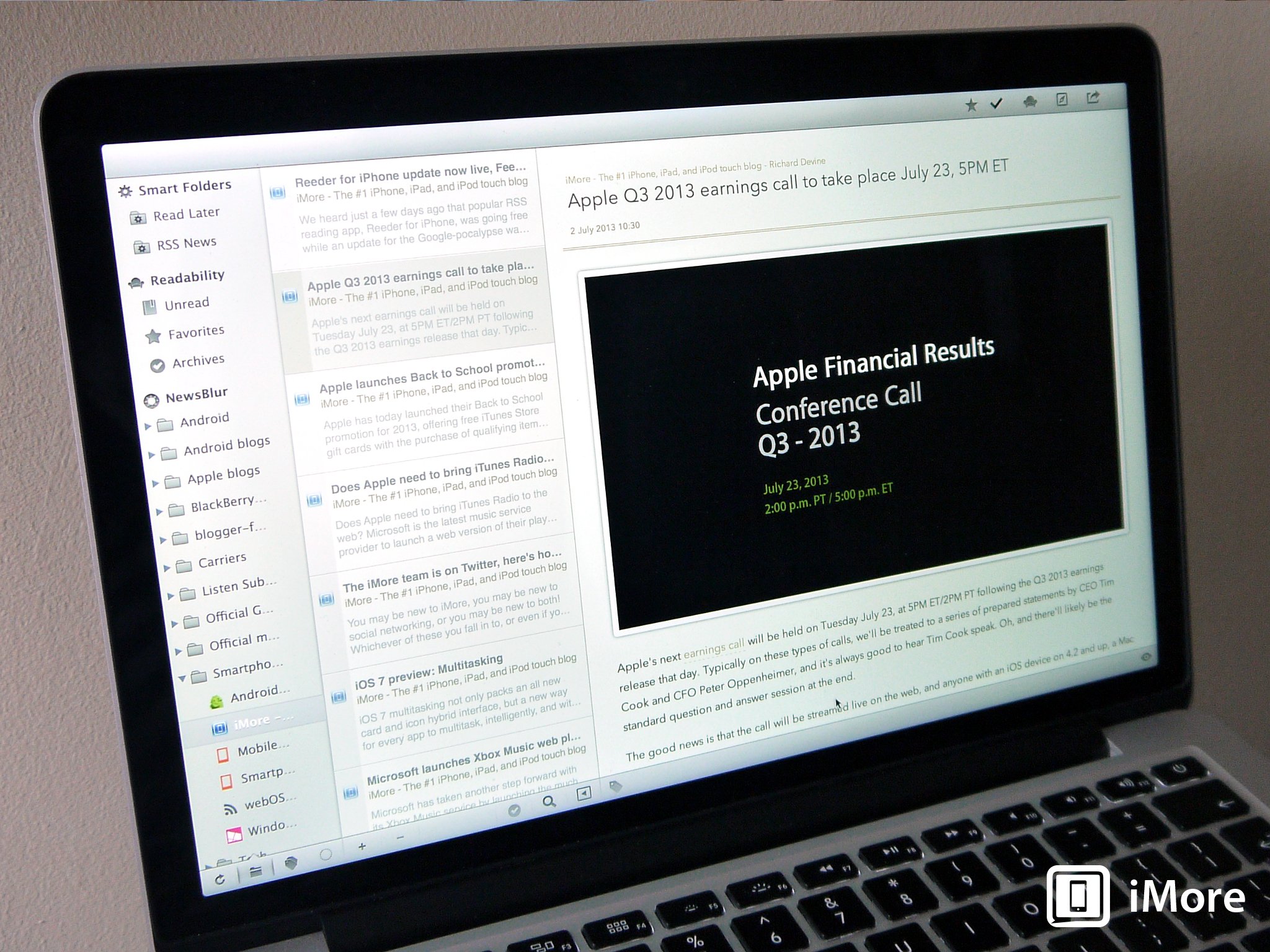
The Google Reader apocalypse sent many of us scrambling for replacements on both our iOS devices and our Macs. Some of the more popular options, such as Reeder, haven't updated in time for the Mac, or perhaps our new RSS service of choice isn't supported by our most used application. The scramble settled, eventually, and I found myself on Newsblur which then lead me to ReadKit for Mac. ReadKit goes far beyond just RSS, though, it'll pull in most of the popular reading services too. Let's take a look.
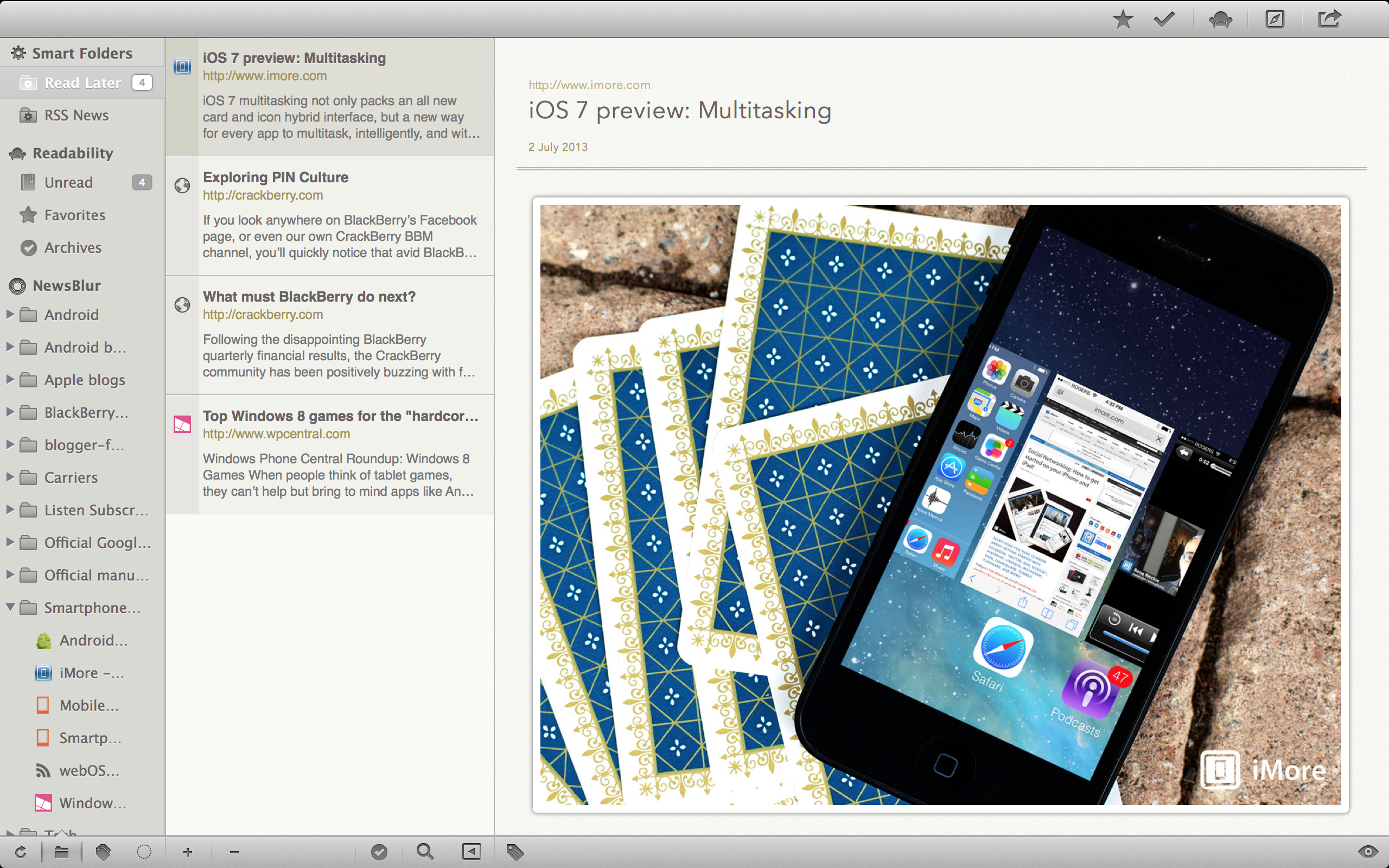
The main interface is pretty clean, and pretty stylish. The largest portion of the window is dedicated to the content you want to read, as it should be. The list of articles and sources is off to the left, ordered with Smart Folders at the top, then alphabetically by source below this. Smart Folders default to RSS News and Read Later, helping you keep your daily news feeds separated easily from any more involved content you've lockered to read. With only two sources as I have, Smart Folders are a little lost, but they come into their own when you up the numbers.
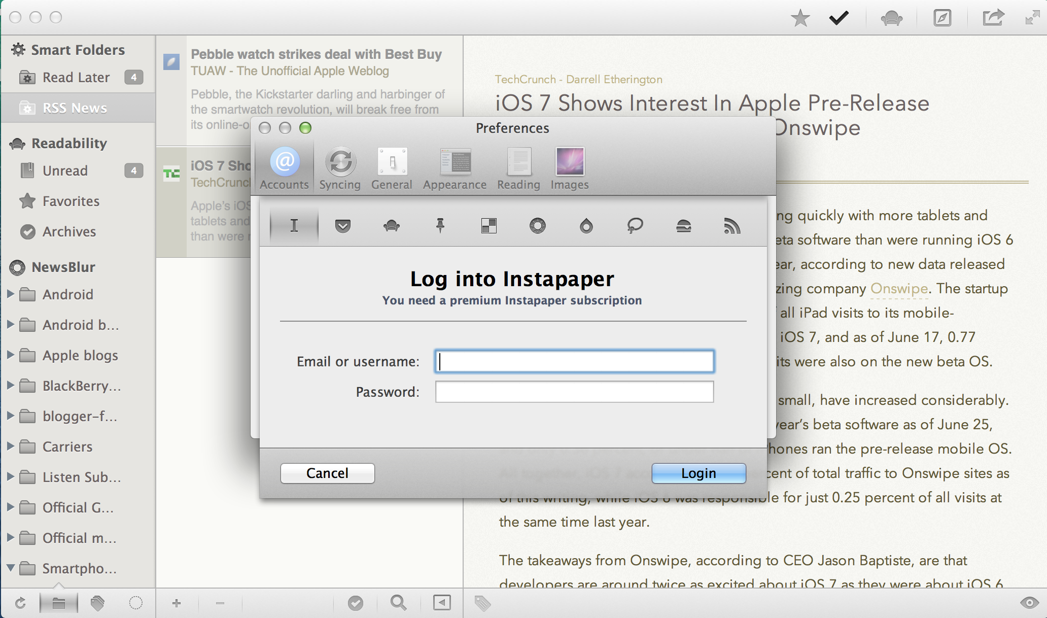
And, up the numbers you can. ReadKit supports 10 different input sources: Instapaper, Pocket, Readability, Pinboard, Delicious, Newsblur, Fever, Feed Wrangler, Feedbin and local RSS. Impressive. That covers a decent amount of the more popular RSS providers, the three big read later services and a couple of things you might not have thought of before. Suddenly, those Smart Folders look pretty useful should you start adding accounts from all of these.
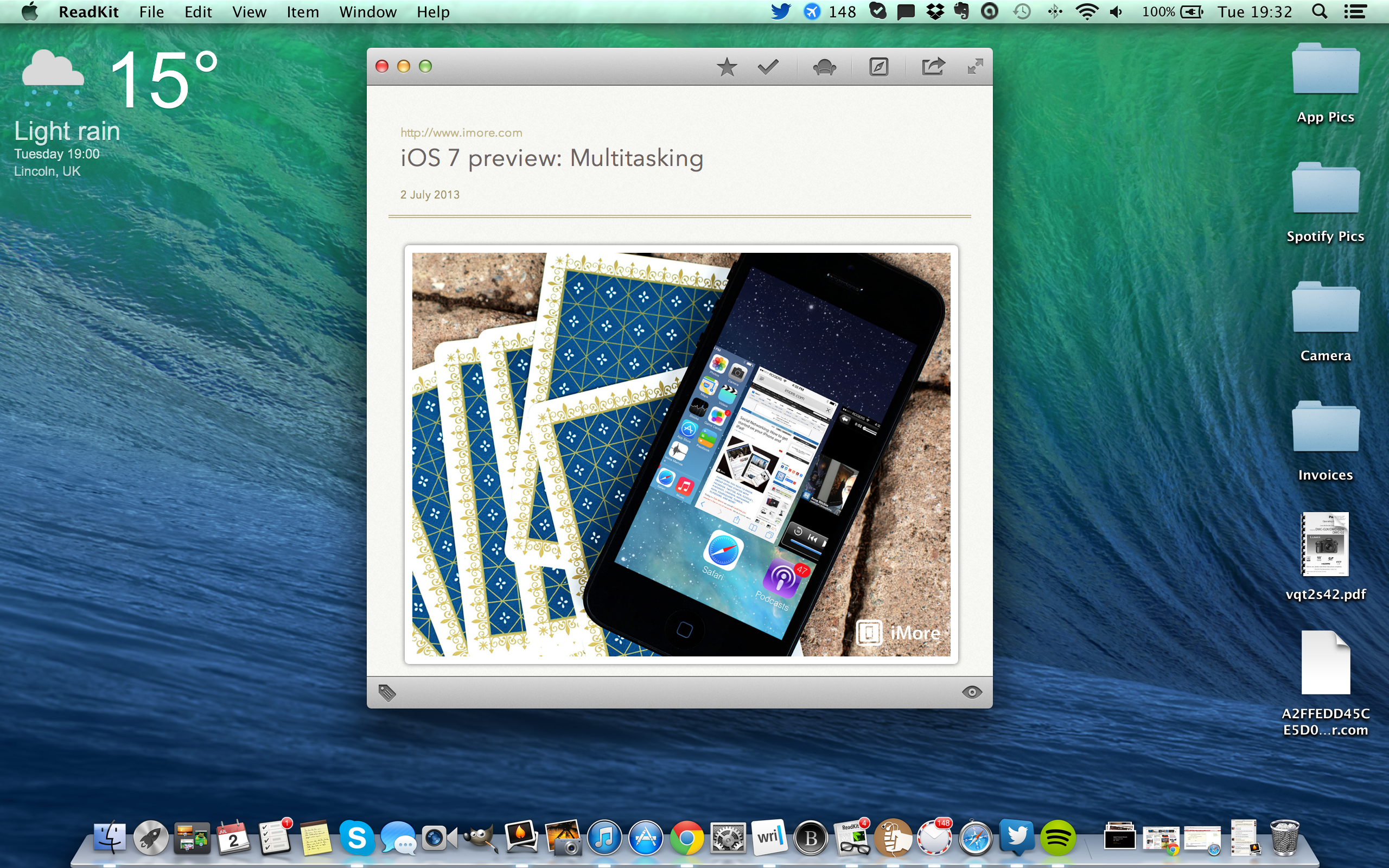
The final thing to note in the interface is the reading view. This strips away all your folders and feeds and just leaves you with the one, important window; what you're reading. It's nice to have, but honestly, ReadKit looks nice enough that distractions aren't really an issue. Folders and feeds just blend in to everything else, and read articles fade away. You can theme it up how you like too, with four different color schemes to choose from, including a light and a dark theme, and there's a bunch of nice looking fonts to choose from as well.
While good looks are one thing, without performing where it matters it would be a total dud. Thankfully, ReadKit does have it where it matters, and the 5 minute auto-sync intervals are enough to please even the power users. Coupled with Newsblur pushing my RSS feeds, ReadKit is about as speedy as I've ever wanted, or needed my RSS feeds at my disposal. If you want to keep all your stuff, that's fine, you can customize how long you want to keep read items, and if you read a lot of image heavy material then set ReadKit to cache the images locally for you.
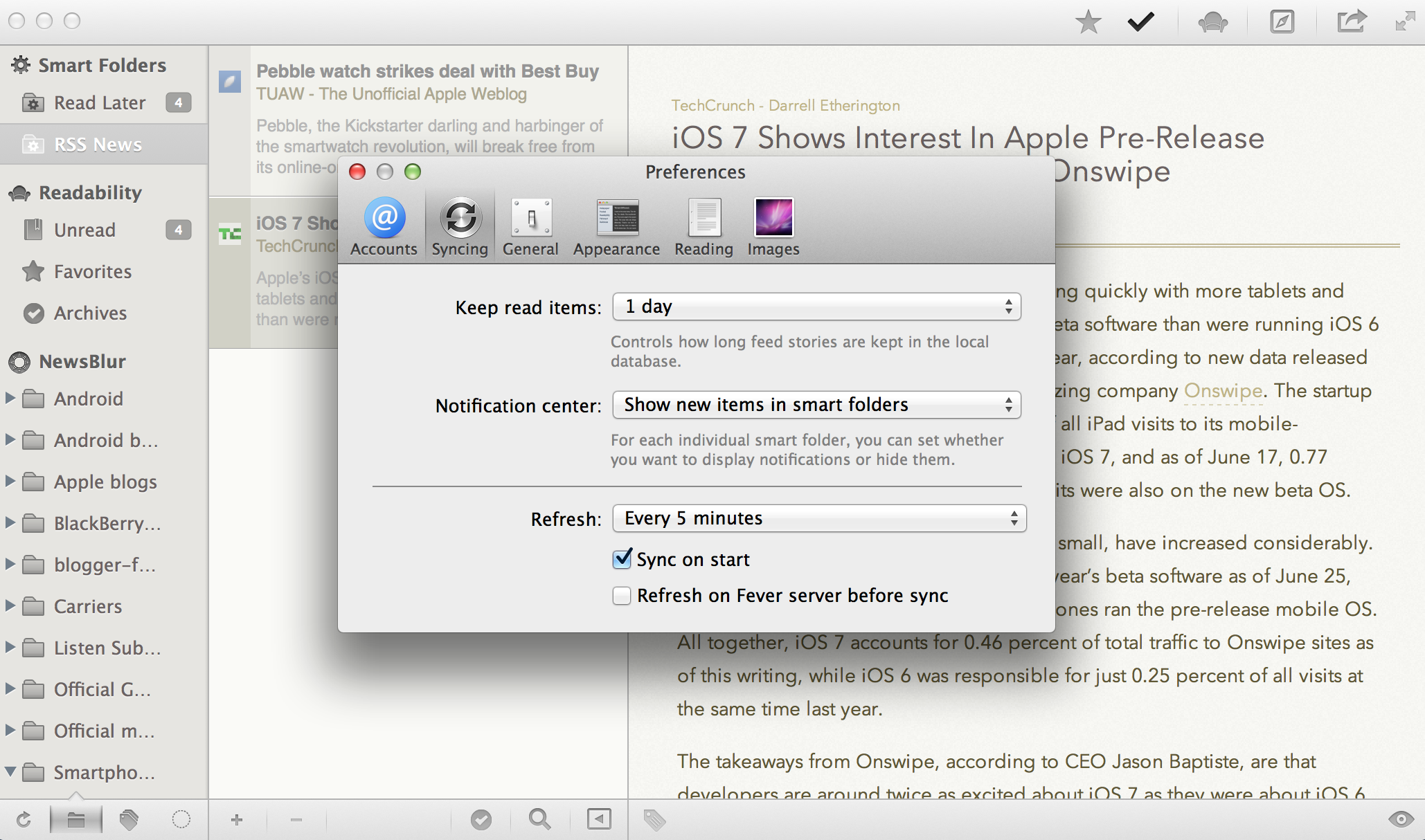
Truth be told, there are plenty of settings to help tailor ReadKit to your own tastes, right down to using the default browser on your Mac to open hyperlinks. There's a lot to like, and almost nothing to complain about.
The good
- Looks great, nice themes and font selections
- Covers most of the major RSS and read later services
- Plenty of settings to customize your experience
- Notification Center integration
- Fast, 5 minute auto-sync is plenty quick enough for most
The bad
- Read articles can hang around faded out among unread articles. Can be a little confusing
The bottom line
Until Reeder was pulled with the demise of Google Reader, I was happy. But now, I'm even happier, because I started using ReadKit. As you can imagine, a lot of the working day at Mobile Nations involves reading news feeds, and ReadKit makes that job not only easier, but also a pleasure. Apps like this are what keeps me using native apps over a web browser. A job very well done.
Master your iPhone in minutes
iMore offers spot-on advice and guidance from our team of experts, with decades of Apple device experience to lean on. Learn more with iMore!
- $4.99 - Download Now

