Reeder 2 for Mac review
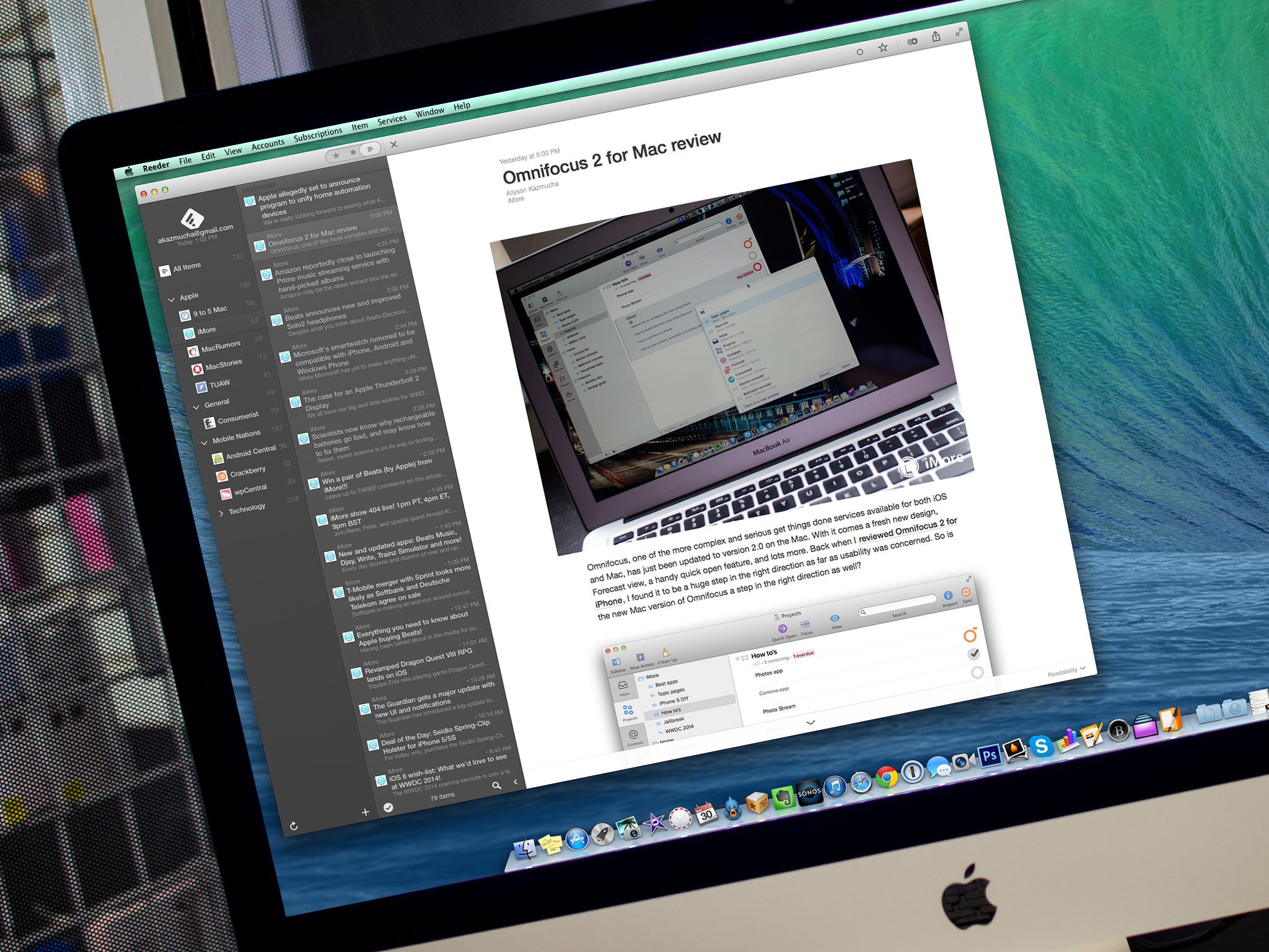
Popular RSS app Reeder has finally released the long awaited Reeder 2 update for the Mac. Since the first version of Reeder was dependent upon Google Reader, which has long been discontinued, the service had to be reworked to incorporate other RSS services. The iOS version was updated a while back but the Mac app provided a different kind of challenge, according to Reeder's developer, Silvio Rizzi. A year later and Reeder 2 has finally landed. So was it worth the excruciatingly long wait?
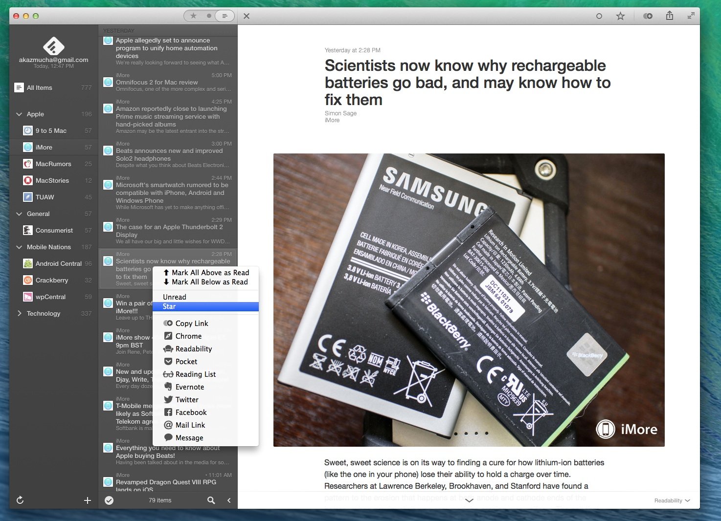
Anyone who has ever used Reeder on the Mac in the past or is currently using Reeder 2 for iOS will still feel right at home on Reeder 2 for Mac. The changes are subtle enough to make long time Reeder users comfortable but they're enough to also let them appreciate the new version. The overall design has been tweaked to be smoother, flatter, and even more sleek than it was before. The tones are similar to that of Reeder 2 for iOS, so if you like them on mobile, you'll love the Mac version. There are also a few themes you can choose from to suit your tastes. I personally prefer the darker themes with white text.
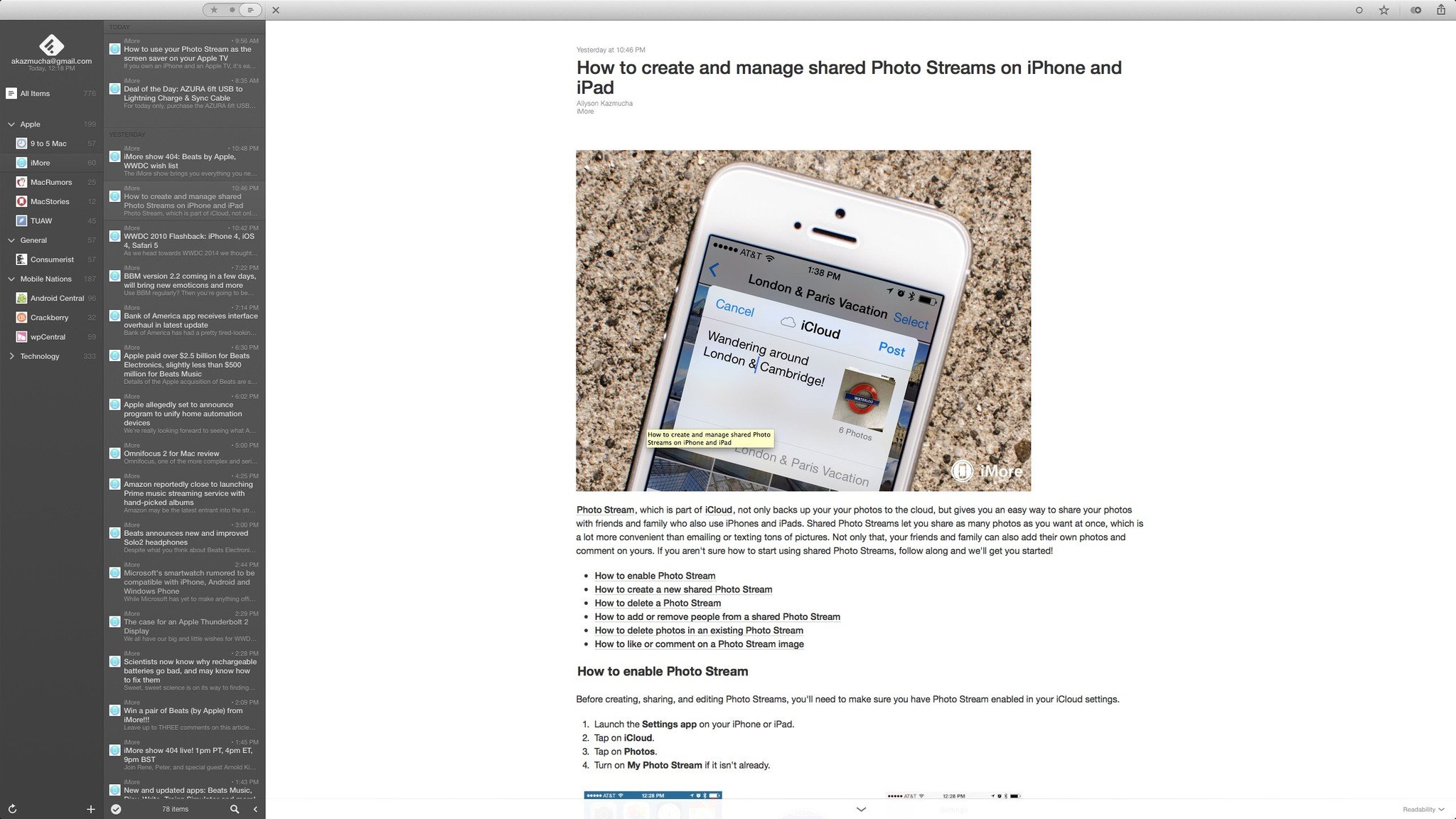
Reeder 2 for Mac now supports Feedbin, Feedly, Feed Wrangler, Fever and Readability. You can also use local or standalone feeds with no account if you prefer. However, standalone feeds won't offer sync. If you have multiple RSS accounts, you can add them all and quickly toggle between them in the far left navigation pane. When you don't need to see your accounts, just use a swipe gesture to hide it. The main interface and navigation of Reeder remains largely unchanged from its predecessor. Cascading panes allow you to drill down into your feeds. The first hierarchy will contain your feeds or folders — whichever you choose in settings. You can then click into individual feeds and finally view articles. The article view supports mobile and full blown web views.
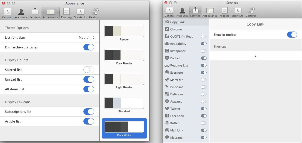
Sharing content remains largely unchanged from the previous version of Reeder for Mac. You can copy URLs and enjoy the same one-click sharing settings Reeder has always offered in a convenient drop-down menu located right above the article view.
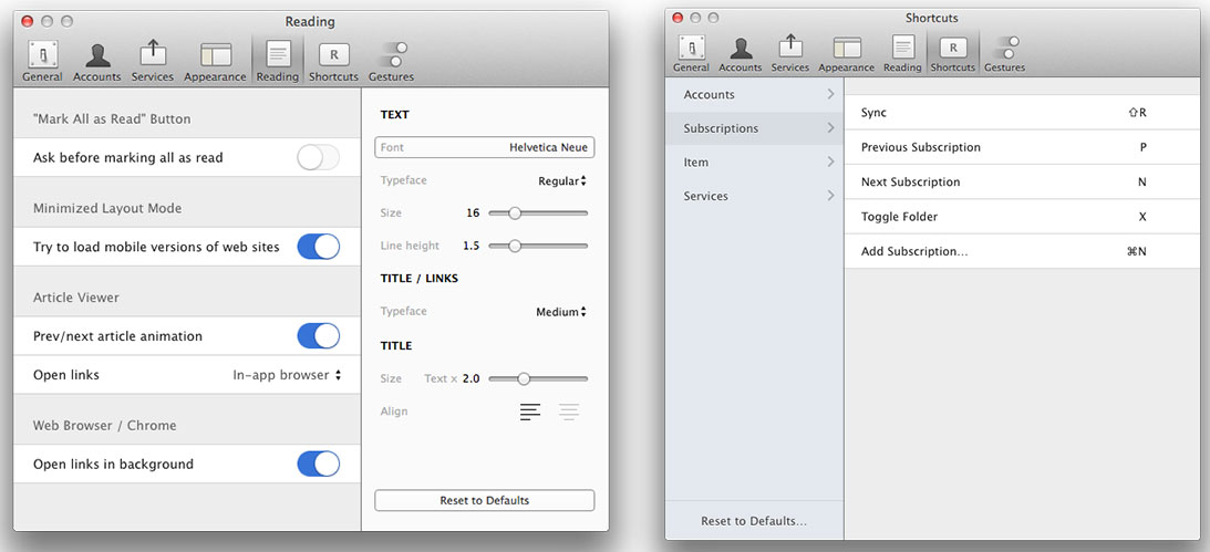
Reeder 2 offers a lot of customizable keyboard shortcuts and gestures that can help make how you consume news a little more personalized. For instance, you can add a quick keyboard shortcut for copying a link or moving to the next feed. You can also change swipe gestures to suit your needs. For example, I prefer swiping up on article view to send the article to Pocket, and with Reeder 2 I can easily do that.
The good
- Same great design and experience Reeder 2 for iOS offers
- Support for all the popular RSS services
- Full screen mode support
- Completely customizable fonts and colors for article view
The bad
- Sometimes the swipe up and down gesture in article view seems to require a lot more effort than it needs to, hopefully that'll be tweaked in a future version
The bottom line
I've been using Reeder on iOS and Mac for as long as I can remember. For the past year or so I've had to turn to other Mac RSS apps to fill the gap Reeder left when Google Reader shut down. After using Reeder 2 for only a few days, I feel as if that gap has been filled again. I missed the simplicity and elegance that Reeder brings to the table. Is it the most feature packed RSS app available? Probably not. But the experience it brings with it more than makes up for it.
- $9.99 - Download Now
If you've tried out Reeder 2 for Mac, was it worth the extremely long wait in your opinion? Or did you expect more this time around? Let me know in the comments!
Master your iPhone in minutes
iMore offers spot-on advice and guidance from our team of experts, with decades of Apple device experience to lean on. Learn more with iMore!
iMore senior editor from 2011 to 2015.

