Regarding Passbook
I joked today that Passbook was this year's Newsstand. I meant that on several levels. First, it's an app that people seem to be struggling to use. Second, it's an app that depends on being fed content that's out of Apple's control. Third, because of those two factors, it's an app that could have done with some better hand-holding and partnership placements at launch.
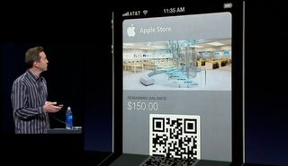
Rewind. Passbook was introduced, along with the rest of iOS 6, at WWDC 2012 in June. Apple Senior Vice President of iOS, Scott Forstall explained it as "the simplest way to get all of our passes in one place" -- a single, easily accessible repository for all the gift cards, coupons, tickets, and other assorted passes that were previously scattered among a myriad, less easily accessible apps. He explained it as the solution to a well defined usability problem.
In his subsequent demo, Forstall showed Passbook pre-populated with content from several well known brands, including Apple, Starbucks, Target, United, MLB, and the W Hotel. Forstall also showed gate updates, Lock screen notifications, and shredding passes when they were no longer needed. He did not, to the best of my recollection, show the process of acquiring a pass or actually using it.

Immediately after the WWDC keynote, I spoke to other members of the media and their reaction, like mine, was optimistic and positive. The QR codes that would serve as the bridge between the passes and the retailers seemed antiquated, of course, but many of us simply assumed they were a placeholder or stepping stone towards what would eventually be a more elegant mobile transaction-based solution.
As the iPhone 5 event approached, many people, myself included, began speculating about what else we might see. Apple typically has a couple of unique demoes at the iPhone events, which often coincide with iPhone TV commercials that follow. Passbook seemed like a good candidate. It seemed like something Apple could really show off. A couple of key partnership announcements, like a Starbucks or Target, and a demo of a pass being purchased and used seemed perfectly possible. Passbook, some of us thought, could even be a candidate for this year's Santa-themed iPhone ad, following up the FaceTime and Siri ads from previous years. Santa buying some last minute toys with Passbook powered gift certificates -- what could be better than that?
Instead, at the iPhone 5 event, we got a re-demo of Passbook from WWDC. No partner announcements. No transactional demos. Admittedly, a lot of the apps that could potentially feed Passbook were and remain dismal -- little more than websites in thin app wrappers with inexcusable interfaces and frustrating transactional experiences. And scanning a code is positively, primitively, unsexy ( especially compared to what other platforms are doing with rapid, touch-and-go data exchange technologies like NFC). Not the stuff of great iPhone event demos.
There was also nothing like FireMonkey and Real Racing 3, however, nothing where Apple brought some hip, marquee retailers to Cupertino -- those who did have great looking apps and existing pass systems -- and gave them some special attention, and helped them make something truly brilliant to show off at the event.
Master your iPhone in minutes
iMore offers spot-on advice and guidance from our team of experts, with decades of Apple device experience to lean on. Learn more with iMore!
Still, developers, including major retailers who already had apps in the app store, or had websites or even marketing mail that could deliver Passbook passes, had had from June until the iOS 6 release date of September 21 to work with the various betas and get something amazing ready. After all, while big ships turn slowly, they still turn, and 3 months is a fair amount of turning time to create a way to push resource files, a bit of JSON, and existing scan codes.
And if three months really wasn't enough time to get app development done, scanners installed, and staff up to speed to support Passbook passes, Apple themselves just happen to be a hip, marquee retailer with an existing pass system (Apple Store Gift Cards), a great looking app, and the ability to scan codes. Forstall even showed an Apple Store gift card off during the Passbook demos. So I held to hope.
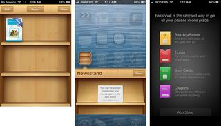
Then iOS 6 was released, and Passbook immediately got off to a rocky start. First, the Passbook app started users off with an empty shelf (or in this case, wallet) experience. Sure, Music.app starts off empty of music, but digital music is an old, established, understood paradigm and, since the Store button was integrated, an easy one to engage.
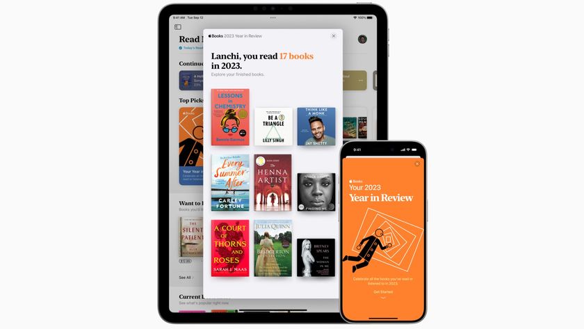
iBooks on the other hand, which is a more recent addition, cleverly started off with a free Winnie the Pooh book. It created a comfortable path of entry for users. Immediately upon launching it iBooks, it gave users something recognizable, something they could play with, something they could use to learn about the iBooks experience. It de-stressed the process and brought users quickly up to speed on the feature set. "Hey, here's something you can play with and if you like, here's how to get much more!" is inherently a better usability, after all, than "hey, here's a big empty thing that you can go figure out how to get stuff for and then figure out how to us!"
Passbook presented itself like Newsstand -- empty but for directions to the App Store. And worse, for some users, the App Store portion took hours if not days to start working following the release of iOS 6. Like it or not, first impressions matter, which is why Apple is usually so purposeful and so clever about nailing them. Users will try something new once, twice, maybe a few times, and if it doesn't work, or if it's confusing, they'll soon stop trying and give up on it.
As much as people take issue with Apple's controlling nature, they complain even more when things don't work, and often the things that don't work are the things outside Apple's control. When the iPhone launched, and for many years thereafter, it was bad carrier service in the U.S. Last year it was old media empires that were ploddingly slow and technologically inept when it came to producing Newsstand content to begin with -- and that was after Apple and Fox held a special event to show off The Daily as a launch title.
Passbook didn't even have that. No Winnie the Pooh. No pre-populated Apple Store pass. No comfortable path of entry.
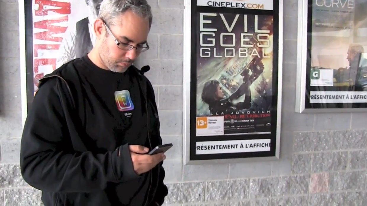
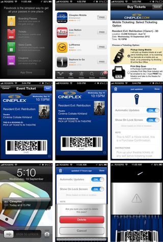
I've now used Passbook several times, and successfully so. I downloaded the Cineplex Mobile app and have used it to buy a few movie tickets. It is, as I feared, a website in a thin app wrapper with an inexcusable interface and frustrating transactional experience. Ugly and imprecisely, I've been able to purchase tickets using my Paypal account and get passes generated and loaded into Passbook. From then on, from the moment Passbook and Apple took over, the experience has been great. I've been alerted. I've been updated. I've been able to shred.
Everything has worked fantastically well -- as well as Scott Forstall showed off at WWDC 2012 and again at the iPhone 5 event. But when I've had to have the Passbook passes scanned at the movie theater and get the actual tickets (because the passes aren't the actual tickets, they're the thing you use to get the ticket...(?!)), it's been unsexy, and its been a part of the process entirely outside of Apple's control.
With Newsstand, Apple didn't go the iTunes or iBooks route, didn't establish a specific format and present the content is a consistent manner. They outsourced to publishers, and the experience suffered. With Passbook, Apple didn't offer the iTunes transaction system, didn't establish a specific process in a consistent manner. They outsourced to retailers, and the experience suffered.
When I joked that Passbook was this year's Newsstand, a bunch of people immediately replied that at least they could hide Passbook in a folder, unlike like Newsstand (which is a folder). That's not the sentiment you want to hear.
If Apple had gone with the Winnie the Pooh model from iBooks, they could have pre-populated Passbook with an Apple Store card. Some have suggested including a nominal amount of credit on it, since it would be returned to the Apple Store anyway. But even absent an existing balance, it could have been used to show how Passbook works, how money could be added to the card using a great app like the Apple Store app, and a great transactional service like iTunes. It could have provided users with an excellent first Passbook experience and excellent first impression. Even if other Passbook feeder apps were abysmal, that experience would have balanced the scales.
A year later, I'm still waiting for Newsstand to get better. Or, preferably, for Apple to Ping it and replace it with "iNews". I'm not sure if I'm waiting for Passbook to be replaced with a more consistent, more controlled "iWallet". I expect it to eventually, though not immediately. Right now I'm waiting and hoping for Passbook to get better. Matt Brian of The Next Web has shown how Apple is promoting Passbook using iAd, which may help, and Matthew Panzarino, also of The Next Web has shown how Apple is pushing Passbook passes from OS X Safari to iOS. Those are good steps.
Siri, which was announced as a beta, struggled with uptime and reliability at launch, but Apple has stuck with it, improved it, and extended it. That's not surprising, because natural language interface is a hugely important part of the future. Mobile transaction payments are just as important, so it won't be surprising if Apple sticks with Passbook, improves it, and extends it as well.
Apple just needs to do it quickly and compellingly enough that iPhone users don't stick Passbook in a folder and forget about it.

Rene Ritchie is one of the most respected Apple analysts in the business, reaching a combined audience of over 40 million readers a month. His YouTube channel, Vector, has over 90 thousand subscribers and 14 million views and his podcasts, including Debug, have been downloaded over 20 million times. He also regularly co-hosts MacBreak Weekly for the TWiT network and co-hosted CES Live! and Talk Mobile. Based in Montreal, Rene is a former director of product marketing, web developer, and graphic designer. He's authored several books and appeared on numerous television and radio segments to discuss Apple and the technology industry. When not working, he likes to cook, grapple, and spend time with his friends and family.
