(Not one, but two premiere game reviews on TiPb today. If you haven’t already checked out the review of Spore for the iPhone, go get your evolution on!)
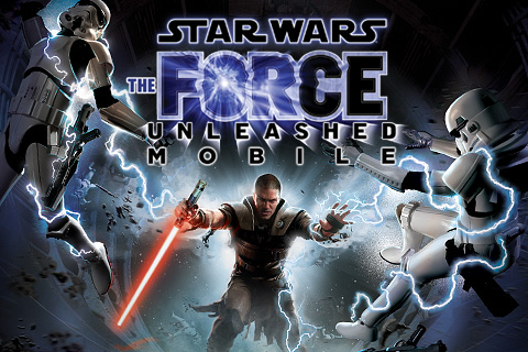
Star Wars: The Force Unleashed (Mobile) for the iPhone by THQ Wireless is available for $9.99 via the iTunes App Store. Alongside Spore, it's one of the highest profile games released so far for the "funnest iPod (and iPhone) ever".
Now, Star Wars was the first movie I remember seeing in the theater (which, yes, makes me old and tells you something about how big a deal actually going to a movie theater was in the days before PPV, torrentz, and home cinema!) I had a lot of the toys. I played a lot of the video games, from the early Nintendo fare that drove the sound track so far into overuse I still cringe when I hear Jawa, to the truly epic Battlefront II on the original Xbox. I even have had the prequels Jedi-mind-tricked out of my consciousness ("not the Star Wars you were looking for...")
Article continues belowSo yes, Star Wars is in my DNA every bit as much as Apple. Put them together and -- even absent Megan Fox -- and The Force Unleashed pretty much had me at announce. But would it hold me? Does THQ deliver Empire-class sizzle, or Phantom-style fizzle?
Check out the review, after the break!
Story
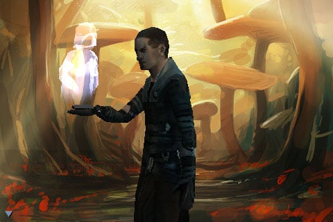
Star Wars: The Force Unleashed takes place after the events in Revenge of the Sith and before Star Wars (a New Hope). Anakin is Vader and in grand Sith tradition, he has taken on a "secret apprentice" and begun his schemes to kill the Emperor. First on his list, however, is eliminating the few remaining Jedi scum still mellowing his full on Force harsh.
We play said apprentice, and right from the start, we're told not to leave any witnesses alive -- Imperial or Rebel alike. Keeps things nice and simple, at least to start.
iMore offers spot-on advice and guidance from our team of experts, with decades of Apple device experience to lean on. Learn more with iMore!
If you've seen the game trailers, however, where whole Star Destroyers get pulled from the sky, you know this isn't n00b Luke or aged Yoda or wasted Windu. This is the Force we always wanted...
... Just not enough of it. The Mobile version is cut way down from its big platform brothers, and ultimately doesn't last as long as we'd have liked. Think of it as the Force Unleashed: Crib Notes Edition.
Score: 4/5
Music and Sound Effects
Right from the start, we can choose whether we want sound on or not. While it's nice to have options, and absent ear phones maybe it helps a little with battery life, but... This. Is. Start Wars! It's John Williams and Ben Burtt, you nerfherders! Of course we wants us some sound!
Now, the themes and effects are all classic to the point of being repeated pretty much endlessly for the last 30 years. That's either made it endearing or maddening, depending on your point of view. Except for the aforementioned Jawa theme, it still works for me.
It all comes through well on the iPhone's "casual listening" speaker, and better still with earphones. I had some issues with stuttering, but a force quit (hold down Home for 10 seconds) cleared it up. Strange that an iPod-based device could have sound issues, unless games are handled differently?
On the negative side, there's no voice. Instead, we get text screen dialog after text screen dialog, in tiny, thin font. It's strange to see on a device that can easily handle hour upon hour of podcast, but let's just assume it's a limitation of mobility and move on. (Although given the poor excuse for James Earl Jones the big consoles get, it could actually be a blessing!)
Score: 4/5
Graphics and Visuals
Developers, including some big-timers, have thrown out comparisons between the iPhone and the Nintendo 64, Xbox, PSP, and other dedicated gaming consoles and handhelds. That's all fine and dandy in the theretical, but the iPhone isn't dedicated -- it's pushing your data, managing your networks, and doing all sorts of other things behind the scenes because, game or no game, you want the phone to ring when you have a call.
Given that split focus, how do the Force Unleashed's graphics hold up in the actual mobile world? Surprisingly well. It's nowhere near the PS3 version, of course, so if you're expecting that, check yourself into real-hab immediately. I'd say Xbox and PSP were a bit of an overstatement as well, but having played me some Goldeneye 64 back in the day, these are on-par in the polygon pushing department, though the text-mapping is predictably -- and happily -- more advanced.
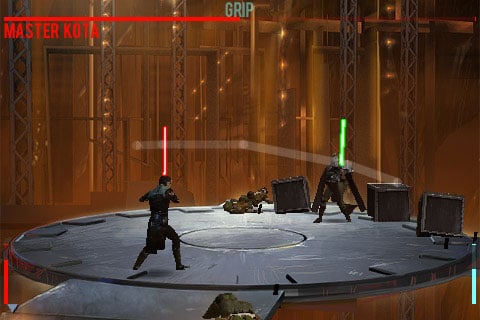
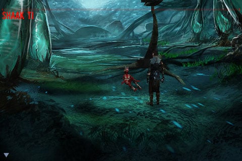
With regards to the art direction: some aspects are... cartoonish. Vader in the beginning, the lush yet animation-style (i.e. static) background plates. Not that the game as a whole shoots for realism, just that it doesn't present a unified feel.
Also, I did have the same jitter issues I had with the sound, and while the force quit memory clean-up helped, it didn't make it perfect.
Bottom line though? This game looks great... for a mobile game, and outstanding for a phone game.

Score: 4/5
Gameplay
I played the PS3 demo over the weekend, which uses a conventional control pad scheme. The iPhone version... games different. To their credit, THQ has leapt headlong into multi-touch.
A word of warning (and potential deal breaker to some): We don't have any influence over where our Sith anti-hero goes. No directional control. No movement at all. Like Space Ace and Dragon's Lair (Wikipedia them) and some of the older Star Wars PC games, cut scenes and the computer move us from situation to situation.
So what can we do? Stand there, get attacked, and have to deal with defense and counter. That's our job, deflect laser fire, and show boxes, Droids, Storm Troopers, Rebels, and Jedi alike the true power of the Dark Side.
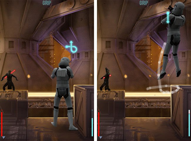
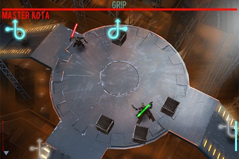
A tutorial starts off the game to teach us the basic Force Grip (a choke) and Throw, and as we progress, new tutorials teach us Force Push and Pull, Force Heal, Mind Trick, Dark Force Lightning, etc. Each is activated by a unique gesture we need to draw on the screen at the appropriate time. For some powers, like the initial Force Grip, the gesture is shown on the screen above the target -- a helpful reminder. Simply draw it out and it happens. For others, like Force Heal, you have to either remember it, or pause the game and check the built-in reference -- also helpful.
To add some measure of complexity, not all powers work on all enemies all the time, and later we have the ability to switch powers depending on foe and factors. For example, a two-finger upward swipe, downward swipe, or tap switches between Force Pull, Force Push, and Force Grip, with the gesture hint changing along with the power (or changing to an empty circle to show when a particular power will not prove useful).
Some may find flashing fingers all over the display distracting or disastrous, but it's a touch-screen device, and while that paradigm is new, it's a good attempt at dealing with controls absent a joystick or d-pad. This is especially true given that the accelerometer isn't used for anything other than rotating the display. (Though it should be noted that the ability to rotate -- and hence choose between between portrait or landscape mode -- rocks and is executed with buttery smoothness.) Maybe next time THQ could throw us a bone and let us use that accelerometer to move our character around a bit, even just between action dioramas?
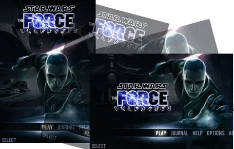
Along with the game mechanics, there are controls aplenty to pause the game, explore options, pick between continuing and starting a new story, and choosing chapters (once you've completed them and made them available for replay).
We can also drop in and out relatively well -- an imperative on a phone-based game. Take a call, or switch out of the game, and when you come back, you can pick up at the scene where you left off (not just chapter!). This is a lesson in integrated device gaming other developers really need to pay attention to.
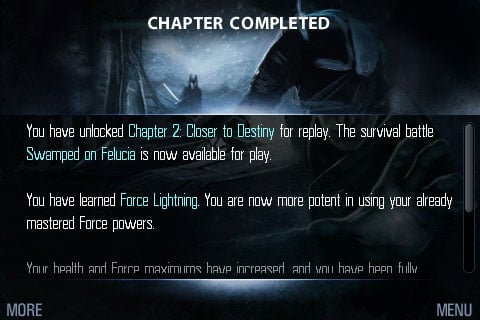
One perplexing choice, however, given the multi-touch-centricity of the iPhone, are the dialog boxes. You can hold down and pull scroll bars or hit the More button to move down long passages of text, but you can't just touch them and flick. It's the iPhone, dang it! We don't need no sticky scroll bars.
Score: 4/5
Replay Value
Reply will be a mixed bag. Since you learn new powers as you go, it's initially a fun journey with some semblance of rewards throughout. (New powers and deepening plot). But it already feels repetitive the first time around.
There is a more difficult mode, which will likely appeal to hardcore gamers (which I am, admittedly, not), and since completed levels become stored as unlocked chapters specifically for replay, perfectionists and casual time-killers alike might be drawn back into them. Might.
Score: 3/5
Conclusion
As mentioned at the top, Star Wars: The Force Unleashed will run you $9.99 at the iTunes App Store. This seems to be the going rate for high profile iPhone games, and while some might find it costly, others will find the entertainment more than worthwhile. Hey, movie tickets cost more than that these days. (Then again, many movies might just last longer than a trip through this game...)
Sure, the iPhone version doesn't pack anywhere near the scope or power of $59 (PS3, Xbox 360), $49 (Wii), or $39 (PSP) versions, but with no real load times to slow us down, and the ability to drop in and out pretty much on a whim, it fits very well into the iPhone environment.
If you like the iPhone and you like Star Wars, it's a no brainer. The story is intriguing enough and an interesting addition to the mythos, the sound is classic, the graphics are a contender, and the gameplay is workable.
If you like action games (minus, you know, moving) and want to experience the first important steps of Apple's "Game On" initiative, it's a similarly easy choice.
Otherwise you're paying for the Star Wars name and the fancy production, and you probably want to look around the App Store a while before hitting that buy button.
Final Score


Rene Ritchie is one of the most respected Apple analysts in the business, reaching a combined audience of over 40 million readers a month. His YouTube channel, Vector, has over 90 thousand subscribers and 14 million views and his podcasts, including Debug, have been downloaded over 20 million times. He also regularly co-hosts MacBreak Weekly for the TWiT network and co-hosted CES Live! and Talk Mobile. Based in Montreal, Rene is a former director of product marketing, web developer, and graphic designer. He's authored several books and appeared on numerous television and radio segments to discuss Apple and the technology industry. When not working, he likes to cook, grapple, and spend time with his friends and family.
