Safari in OS X Yosemite: Explained
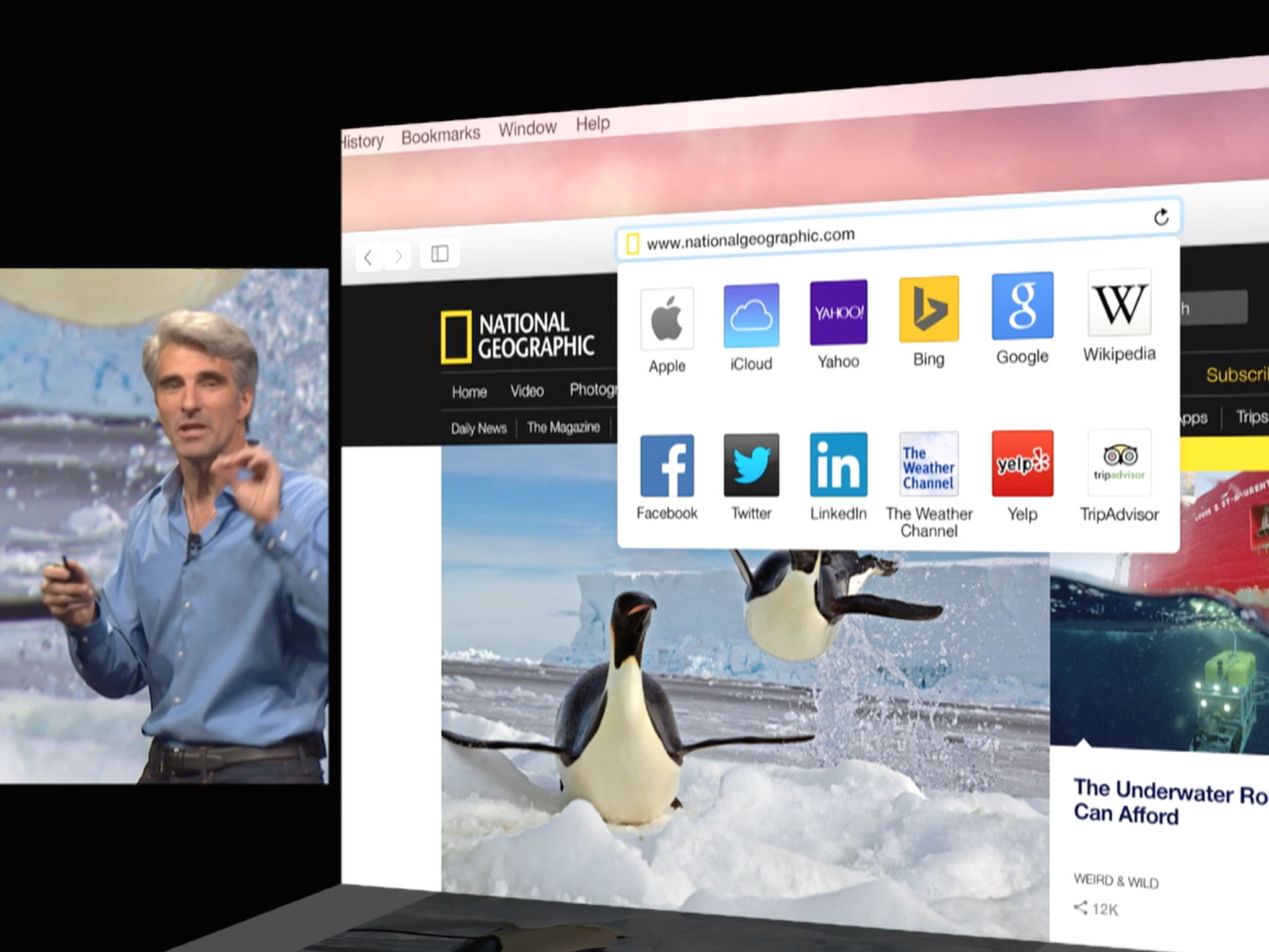
While there are a number of web browsers available for OS X, only one is included: Safari. That makes Safari an incredibly important application for Apple, because it's one of the first things Mac users will use, and for many of us, it's the only web browser we use. So Safari is getting some big improvements in OS X Yosemite, both to usability and to performance.
Streamlined toolbar and "smart search field"
The first thing you'll notice in Safari is a new, streamlined smart search field that's been integrated directly into the title bar. That provides more room below for actual web content.
That design has found its way into other Apple applications in Yosemite, like Calendar and Maps. The menu bar contains previous page and next page buttons, a button to activate the Sidebar, a Share button, Show all tabs button, and Show downloads button.
Safari now follows its mobile version's convention in iOS of masking the URL: Only the root URL of the web page is displayed, rather than the complete thing. For example, looking at this page in Safari on Yosemite will only show you "imore.com" in the search field, until you click in the field, then the full URL is revealed.
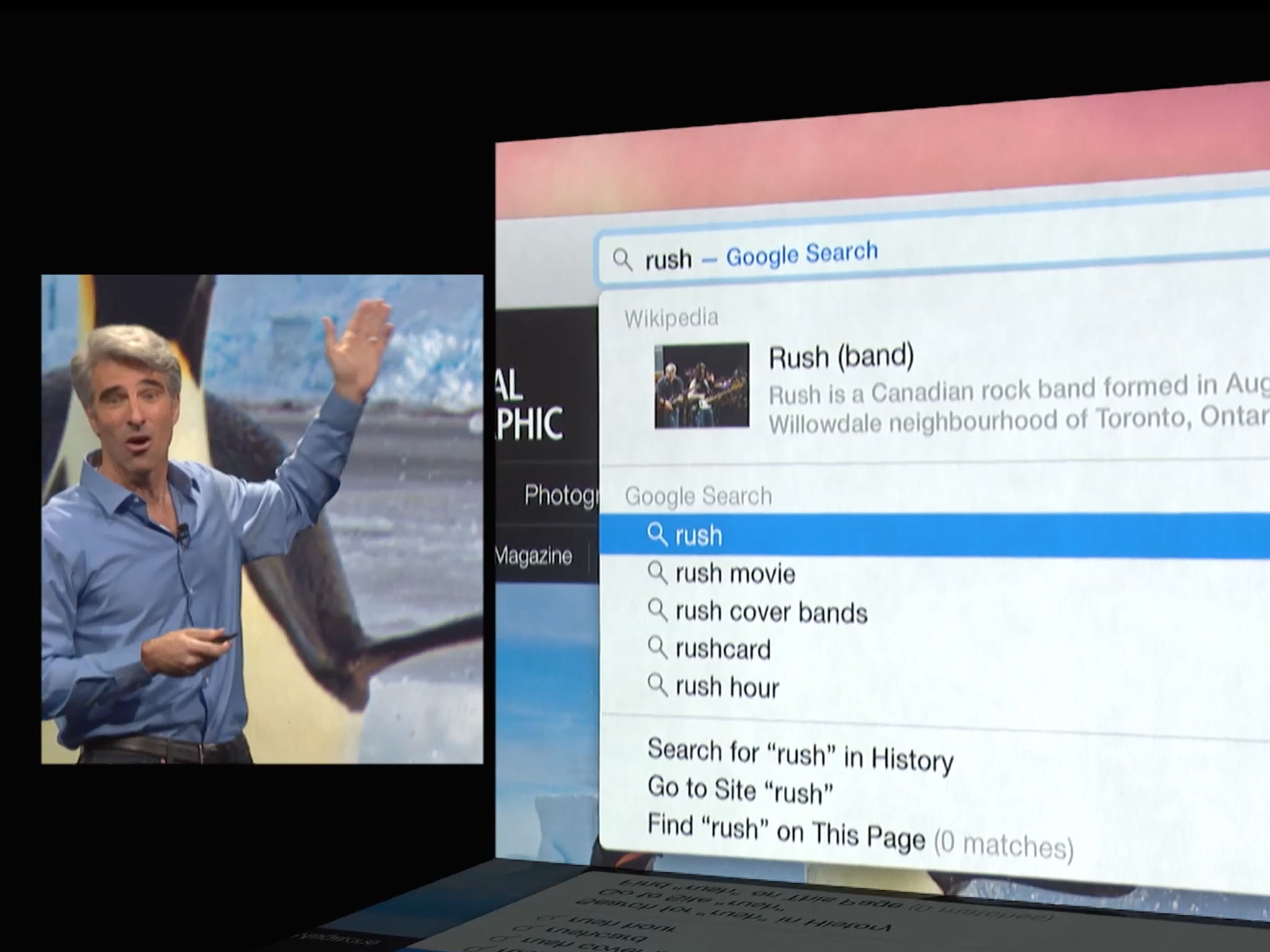
What makes it a "smart search field" is Safari's integration with Spotlight. Now as you type in a search term, Safari drops down hits in Spotlight including links to Wikipedia, to make it easier to find what you're looking for.
Another behavior inherited from Mobile Safari - Clicking in the search field reveals a dropdown menu containing thumbnails of favorite web pages, along with frequently visited sites. As a result, the Favorites bar is gone by default, though you can resurrect it with a keystroke.
In Mavericks, Safari had an "iCloud Tabs" button that showed you tabs shared between your Mac and iOS devices. Now iCloud tabs are visible in that dropdown menu as well.
Master your iPhone in minutes
iMore offers spot-on advice and guidance from our team of experts, with decades of Apple device experience to lean on. Learn more with iMore!
Better tabbed browsing
Tabbed browsing has been greatly improved in Safari, too. You can have an unlimited number of tabs open, and navigating through them is as easy as just clicking back and forth.
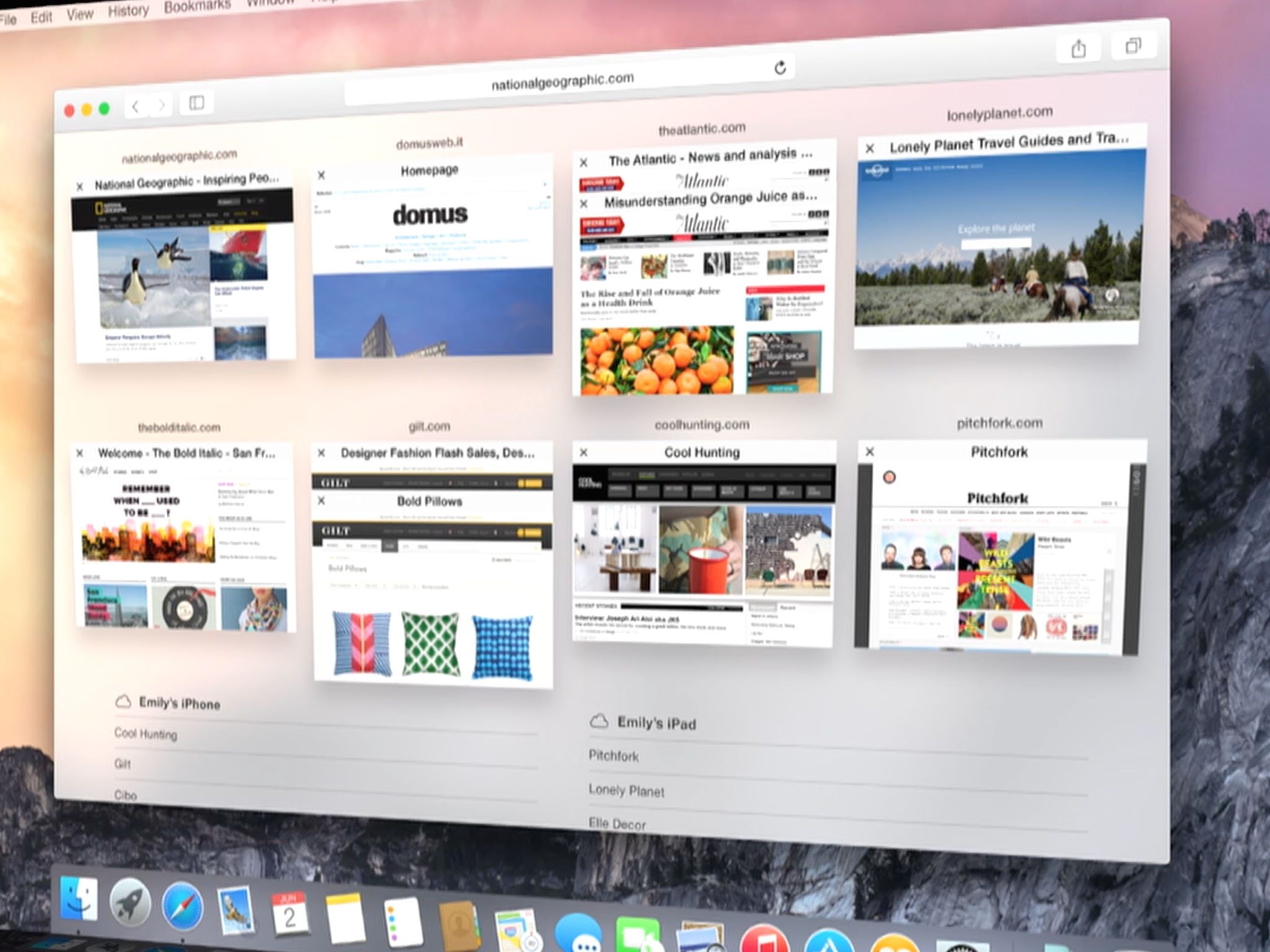
What's more, there's a new Tabs button on the menu that enables you to view all open tabs at a glance. Clicking on the button yields a new window that pops up thumbnails of all of your open tabs a la Mission Control; simply click the tab you want to make that page active.
Easier sharing
Sharing content from Safari is easier in Yosemite than it was before. The Share button has been revamped to include new functionality. Right off the bat, AirDrop is supported (and just a reminder, AirDrop actually works between Yosemite and iOS 8 now). But Apple's paved the way for further enhancements that won't require Safari to be reworked.

A new "Recent Recipients" list at the bottom of the Share menu shows people who you've recently emailed or messaged, so you can more quickly share content with them.
A new "More..." menu option brings you to the Extensions system preference. Extensions in Yosemite enable third-party developers to add new features and functionality to the operating system.
Extensions has a dedicated entry for the Share menu, so as social media sites and other services provide sharing extensions, you'll be able to add them to simplify the process of sharing your content with others.
Improved Privacy
There are some times when you may not be comfortable generating a web page history or letting cookies get installed, such as when you're doing online banking or looking at personal content you'd rather not see tracked (yeah, and porn too). That's where Private Browsing comes in handy.
Safari pioneered the concept of Private Browsing — when it's enabled, no data is recorded about that session. Cookies aren't stored, web pages aren't added to the history list, names of downloads are removed from the Downloads window, Autofill information isn't saved and searches are not added to the search field's pop-up menu.
But Private Browsing in Safari has, up to now, been inconvenient for one reason: it's either all on or all off. You can't set up one window with Private Browsing while still using other windows normally. Set up Private Browsing in one window and open another to visit Facebook and see what happens: You'll have to sign in again, because Safari isn't remembering your user ID and password.
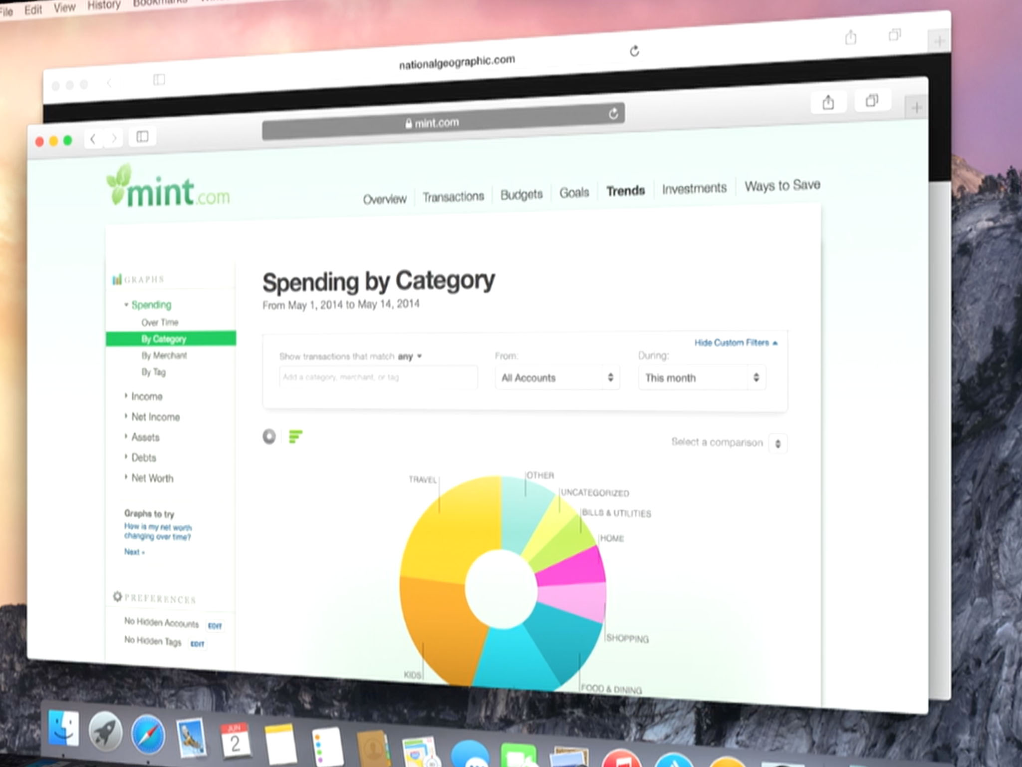
In Yosemite Safari that all changes. New Private Window is how private sessions are handled now. What happens in the new private window stays in the new private window, but you can have other sessions open normally with no ill effects. A long overdue improvement. What's more, that private window can support its own series of tabs, all of which stay private too.
Better performance and efficiency
As I said at the outset, Safari is an incredibly important app for Apple, because it's the web browser most Mac users depend on, and it's a showcase app. So Apple's really dug into the guts of it to eke out the best performance possible. To that end, they've made a number of improvements to performance that should yield even snappier results than you have now.
Yosemite Safari sports support for WebGL, a JavaScript-based technology used to render 2D and 3D graphics on web pages that works without needing a plug-in. SPDY, an open networking protocol, is also supported: It reduces web page load times by prioritizing the transfer of web page resources.
Back in April Netflix made noise about moving away from Silverlight, the (deprecated) Microsoft streaming video plug-in they now use, in favor of HTML5. They've developed "HTML5 Premium Video Extensions" accordingly: A suite of technology using JavaScript and other technologies to manage video streaming, Digital Rights Management (DRM) and cryptography to protect video streams.
Though support for HTML5 Premium Video was initially available for ChromeOS, Apple said that Yosemite Safari will support the technology as well, and their preliminary results are impressive: A Mac streaming Netflix content using the new technology runs significantly more efficiently: Up to two hours longer battery life on a MacBook Air watching a 1080p HD movie from Netflix than before.
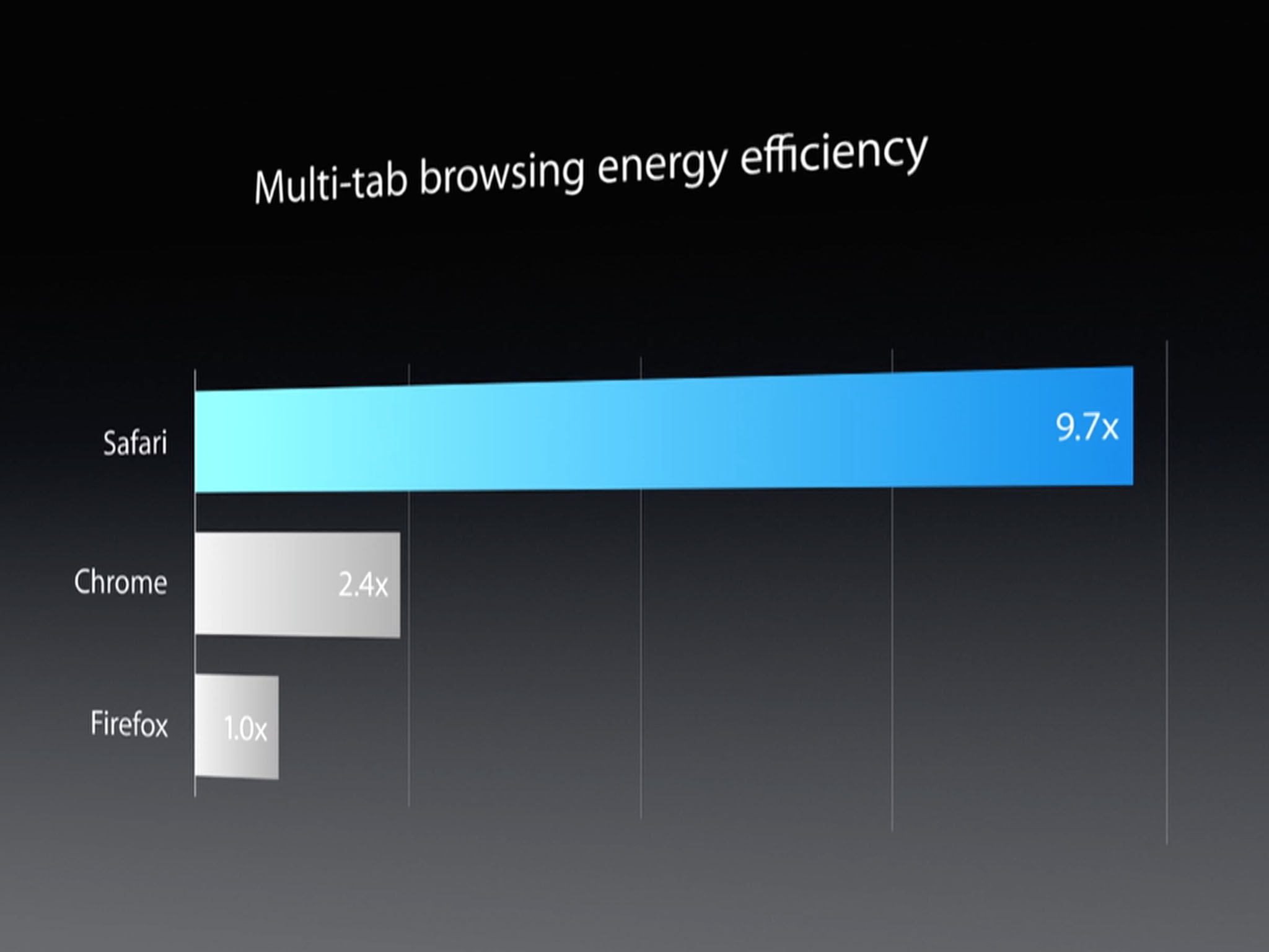
Apple's also improved multi-tab browsing energy efficiency in Safari, with dramatically improved performance in JavaScript — up to 6.5 times faster than Chrome, according to Apple, with twice the performance for most web apps, too.
The bottom line
Safari demonstrates a core philosophy Apple's employing across Yosemite: To reduce pain points or user interface awkwardness for people whose primary experience using Apple products has been iOS. Changes like the drop-down Favorites menu will be immediately familiar to iOS users.
The new functionality is also welcome. Private browsing in Safari is way more convenient than it was before, and the Share menu's link into Extensions promises a lot more social networking integration than was ever possible. The improved performance and efficiency, especially for video content, will be welcome for anyone running Yosemite from a laptop.
What are your pain points for Safari in Mavericks? Has Apple answered them with this new version of Safari? Let me know in the comments.

