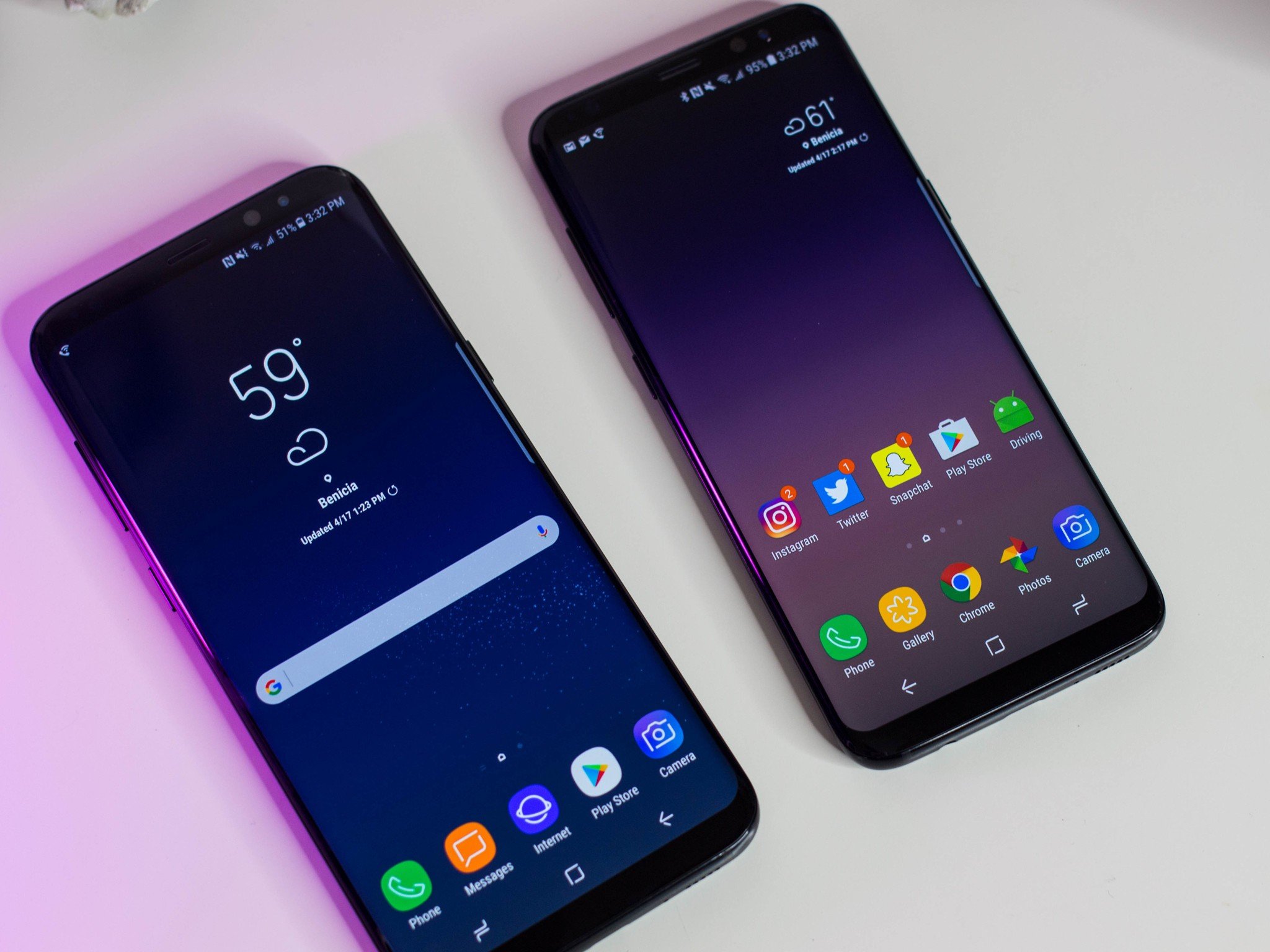

Editor's note: Hi there! Serenity here on behalf of iMore. I'm guessing you may be asking yourself "Why on earth is iMore, a site that puts a lot of energy into the iPhone, running a review of the latest Android phone?" Here's the thing: As much as I personally love my iPhone and Mac combination, I also recognize that there are a lot of people in this world who aren't living in an all-Apple ecosystem. If you're a Mac user who loves Android, for instance, we haven't really been serving your needs very well. So we asked one of my favorite Android writers, Florence Ion, to take a look at the Samsung Galaxy S8 from a Mac user and general tech enthusiast's perspective. While I still am probably sticking with my iPhone for the time being, it's an awesome peek into the land of Android and what it offers users who live in multi-device ecosystems. Enjoy!
The quick take
This isn't a revolutionary smartphone release, but certainly another step forward for Samsung's Android smartphone game. There's no doubt that the Galaxy S8, in addition to its larger Galaxy S8+ counterpart, will be a hit with the masses this year, even with all the drama over Samsung phones that preceded it.
The Good
- Gorgeous AMOLED display that seems to curve over into the chassis
- Performance that's substantial enough for virtual reality
- Fast, responsive camera
- Water resistance
- Extra goodies you won't find on other phones, like Samsung Pay
The Bad
- Rear fingerprint sensor is oddly placed
- Face biometrics are finicky to set up and use
- Bixby, Samsung's voice assistant, is barely there
- Fingerprints. Everywhere. Constantly.
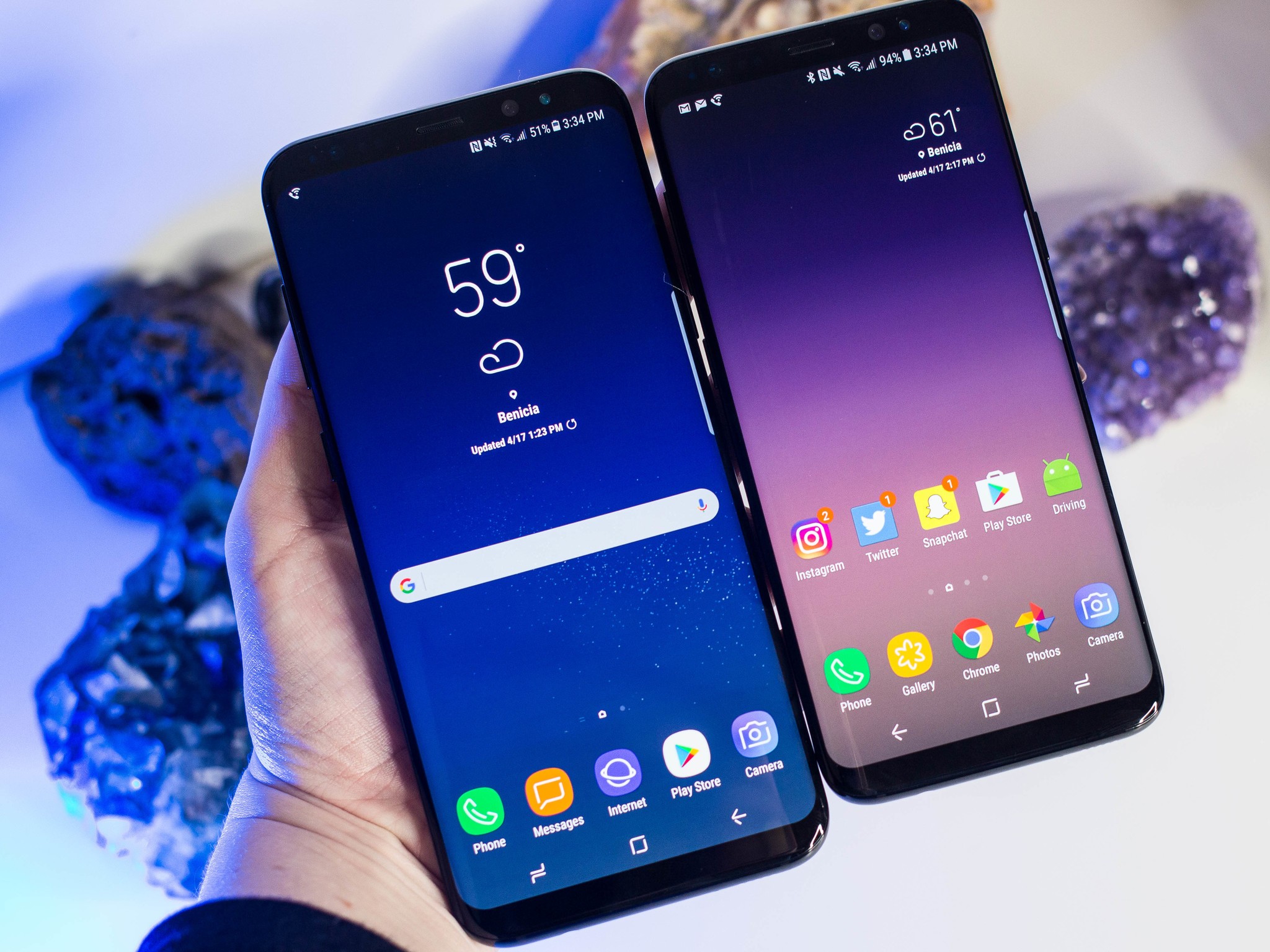
Samsung Galaxy S8 Full Review
It's going to take some time before Samsung's name isn't immediately associated with fiery batteries. The Galaxy Note 7 fiasco wasn't just limited to technology-centric circles; once airlines started banning it on flights, the drama reached around the globe — and back again. Late night hosts were still making jokes about it long after the device had been recalled.
But if Samsung is going to come back from its Note fiasco to win back customers who prefer something a little different than what Apple's iPhone provides, there's no better entry than the Galaxy S8, the company's eighth-generation flagship smartphone.
Like the iPhone, Google Pixel, and pretty much every other high-end smartphone out there, the Galaxy S8 comes in two sizes. Whereas Samsung offered a smaller Galaxy S7 and a larger S7 edge variant last year, the Galaxy S8 and S8+ both employ edge screens; the software has also been improved, and there are neat new gimmicks that make the phone a delight to use as a daily driver.
About this review: I'm publishing this review after using both the Galaxy S8 and Galaxy S8+ for six days. Both phones were active on T-Mobile's network in the western United States during the review process; both were also running Samsung's latest version of Android 7.0 Nougat.
The phone isn't perfect: I'm still scratching my head about Bixby, Samsung's new voice assistant, and the company's DeX dock (which teases the idea of rendering the Chromebook useless). Spoiler alert: I never found out about either during my time with the phone because they aren't completely ready for primetime. The Bixby assistant will ship as a software update later this spring, and we're still waiting on details and availability for the DeX dock.
Fortunately for Samsung's future in the Android smartphone space, there are plenty of other compelling features of the Galaxy S8 to delve into.
Samsung Galaxy S8 Hardware
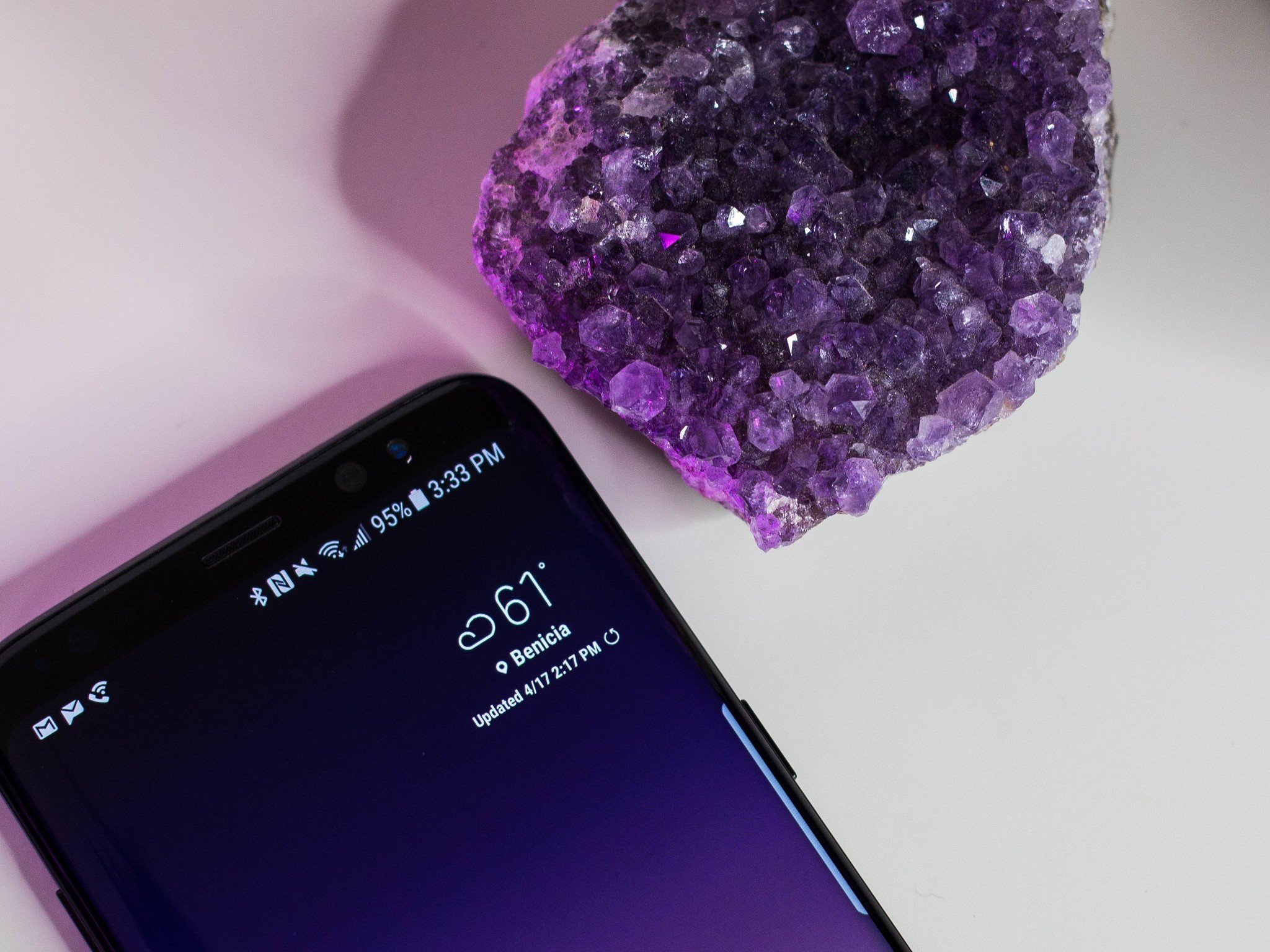
First things first: The Galaxy S8 and S8+ come in three colors in the U.S: orchid gray, midnight black, and arctic silver. Our review unit? Deep, midnight black.
What color Galaxy S8 or S8+ should I buy?
The black-on-black Galaxy S8 is positively stunning — made even more so with its edge screen that seems to literally cascade down into the chassis. I remember using it the other day and marveling at how good it looked propped up in my car holster. There's an element of chic exuded by Samsung's latest, and it's a very different look from how Google's stark blue Pixel XL has been making me feel.
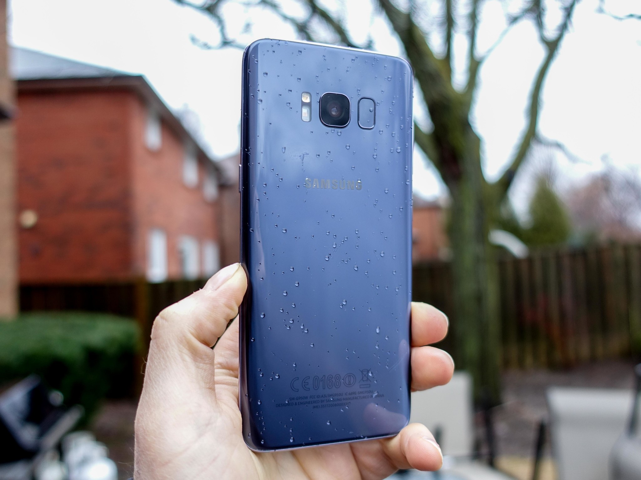
This is a beautiful smartphone regardless of the size you buy it in. I wouldn't blame you if you felt guilty using this thing without a case: I sure did. Even with its Gorilla Glass 5 covering, the Galaxy S8 feels almost too glass-like, the effect of which is heightened by how light and feather thin the phone really is.
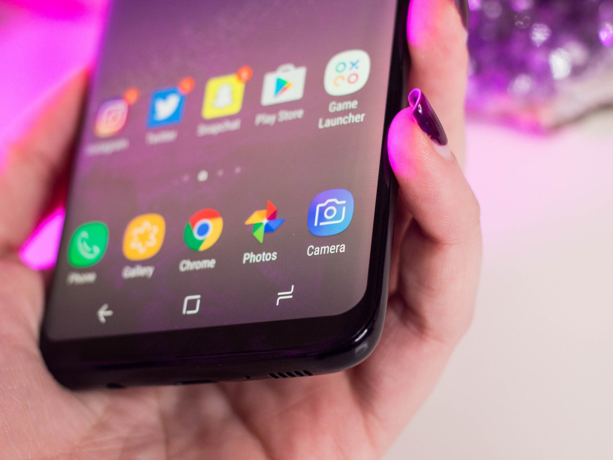
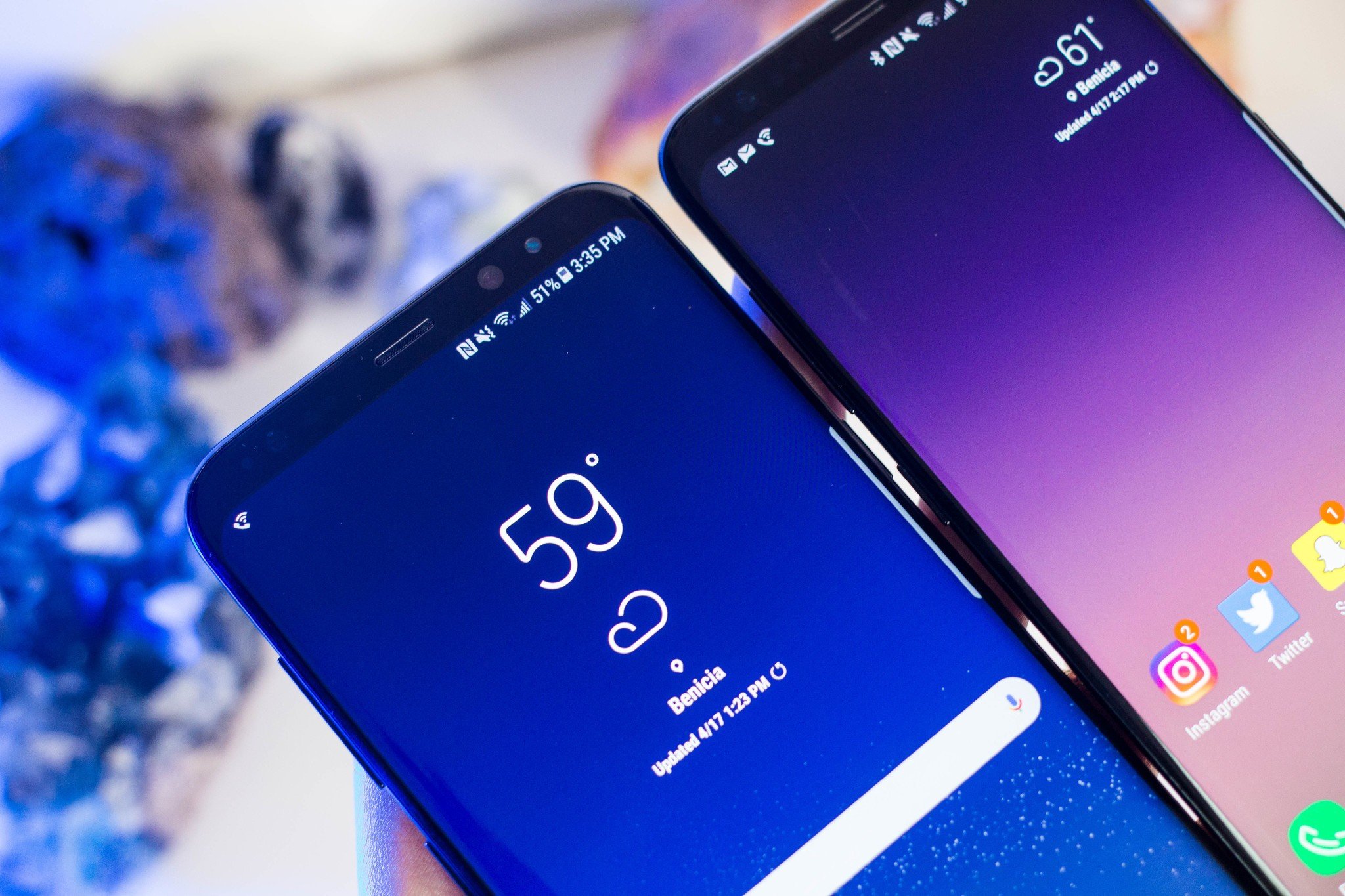
The Quad HD Super AMOLED display screens on the Galaxy S8 and S8+ are stunning: The former is equipped with a 5.7-inch display, and the latter a massive 6.2 inches. Both boast the best smartphone displays in their class, and DisplayMate agrees. The Galaxy S8 is one of the best mobile displays you can bring home.
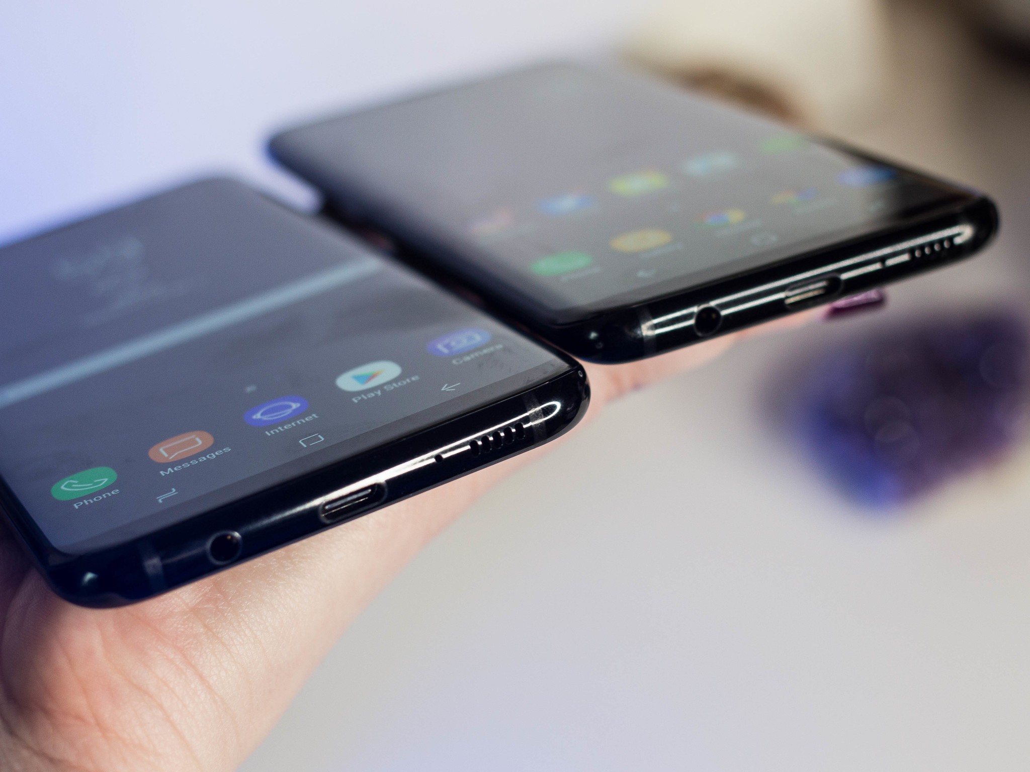
You should bear in mind that the resolution on the Galaxy S8 is taller than you're likely used to, not to mention the curved screen adds a sort of photo frame effect. Both phones have an 18.5:9 aspect ratio — smartphone resolutions are typically 16:9 – so its screenshots will appear tall and narrow.
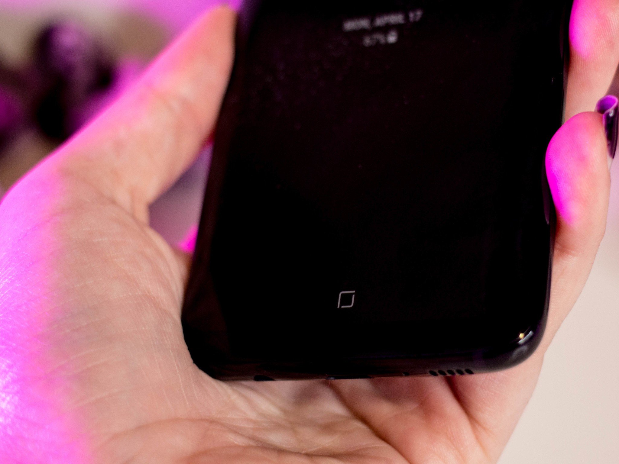
The Home button is gone on the Galaxy S8 and S8+. That was the first thing that my mother, a true fan of the Samsung Galaxy series, noticed when she saw pictures of the new phones. To that end, I imagine that there will be plenty of other Samsung users (and other people's mothers) who will miss the physical Home button they've come to love all these years.
Samsung understands this, however, and has offered a virtual Home button to help satiate diehard fans. It's not quite like Apple's iPhone 7 option: The Galaxy's little square is entirely digital, with no physical cut-out. But even though it isn't actually a button, it responds and "feels" like one: You can adjust its sensitivity and haptic feedback in the settings panel.
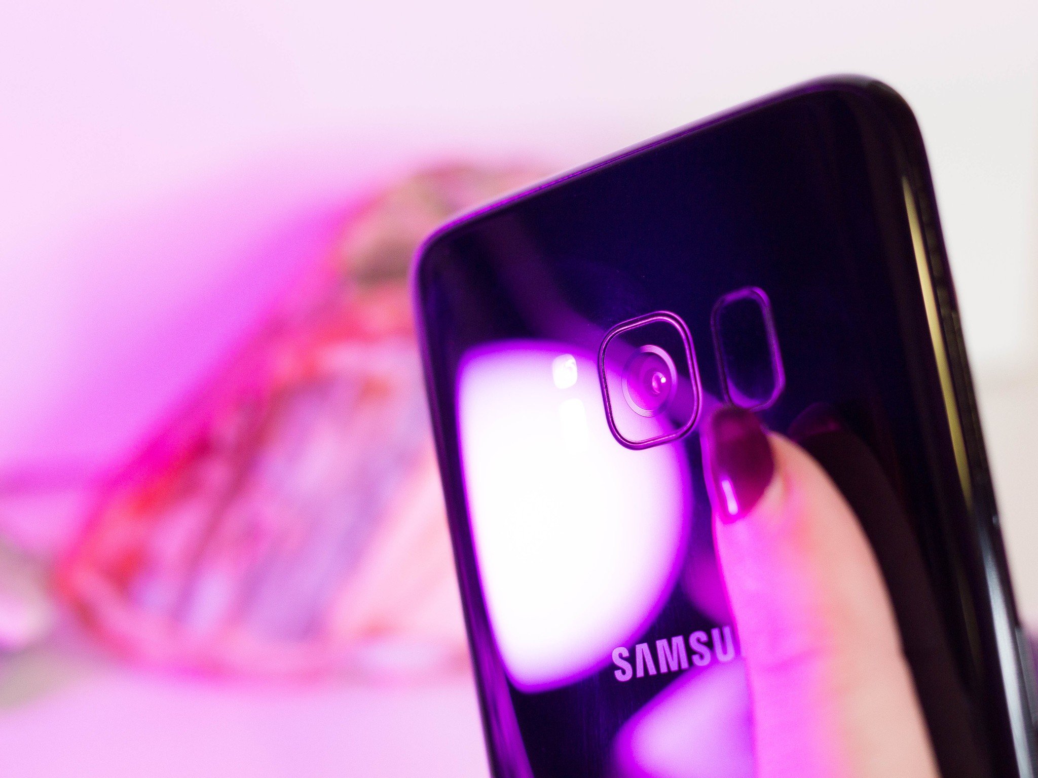
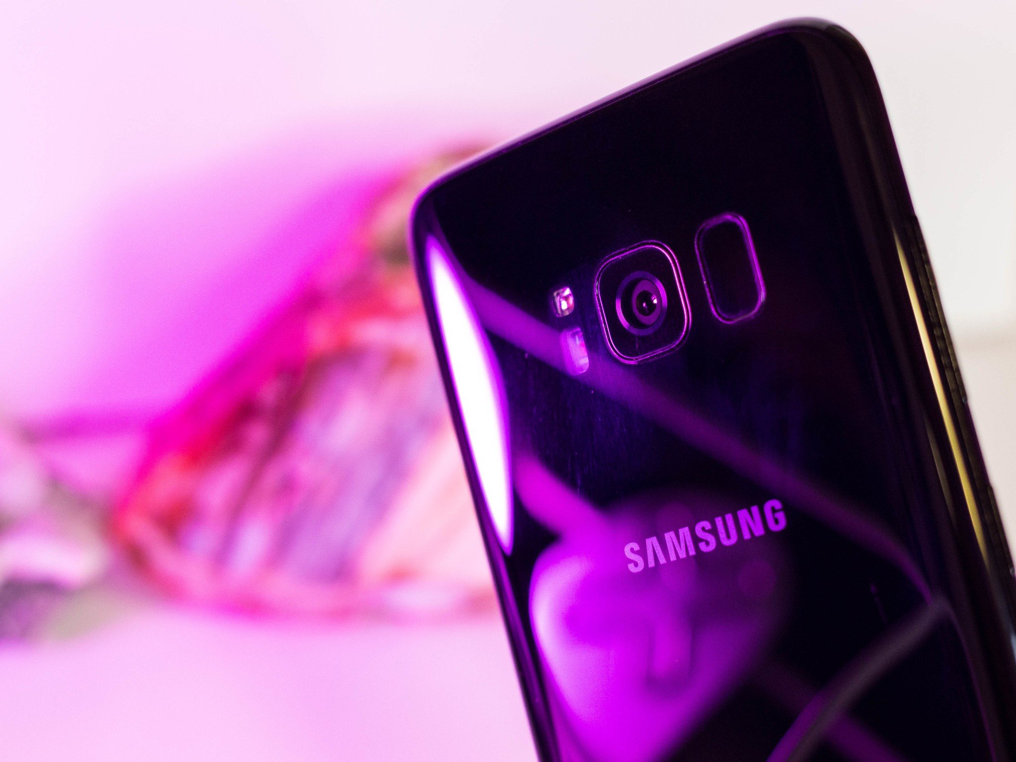
As a result, Samsung's fingerprint sensor has been moved to the back of the device. If you follow Android tech news at all, you may have heard a bit of kvetching about this particular design decision — I'm still scratching my head about it, too, to be honest. In my experience, the Google Pixel has the best rear-case implementation when scanning your fingerprint, not to mention the best placement.
Your experience with the Galaxy S8 will differ somewhat depending on the size you adopt.
Conversely, your experience with the Galaxy S8 will differ somewhat depending on the size you adopt. The Galaxy S8+ requires a bit more reaching for smaller hands and it can be hard to scan your fingerprint on the phone's narrow sensor when you add a case.
At the very least, the GS8's fingerprint sensing mechanism is faster than the Home button fingerprint scanning method featured on its predecessors.
Samsung Galaxy S8 Security
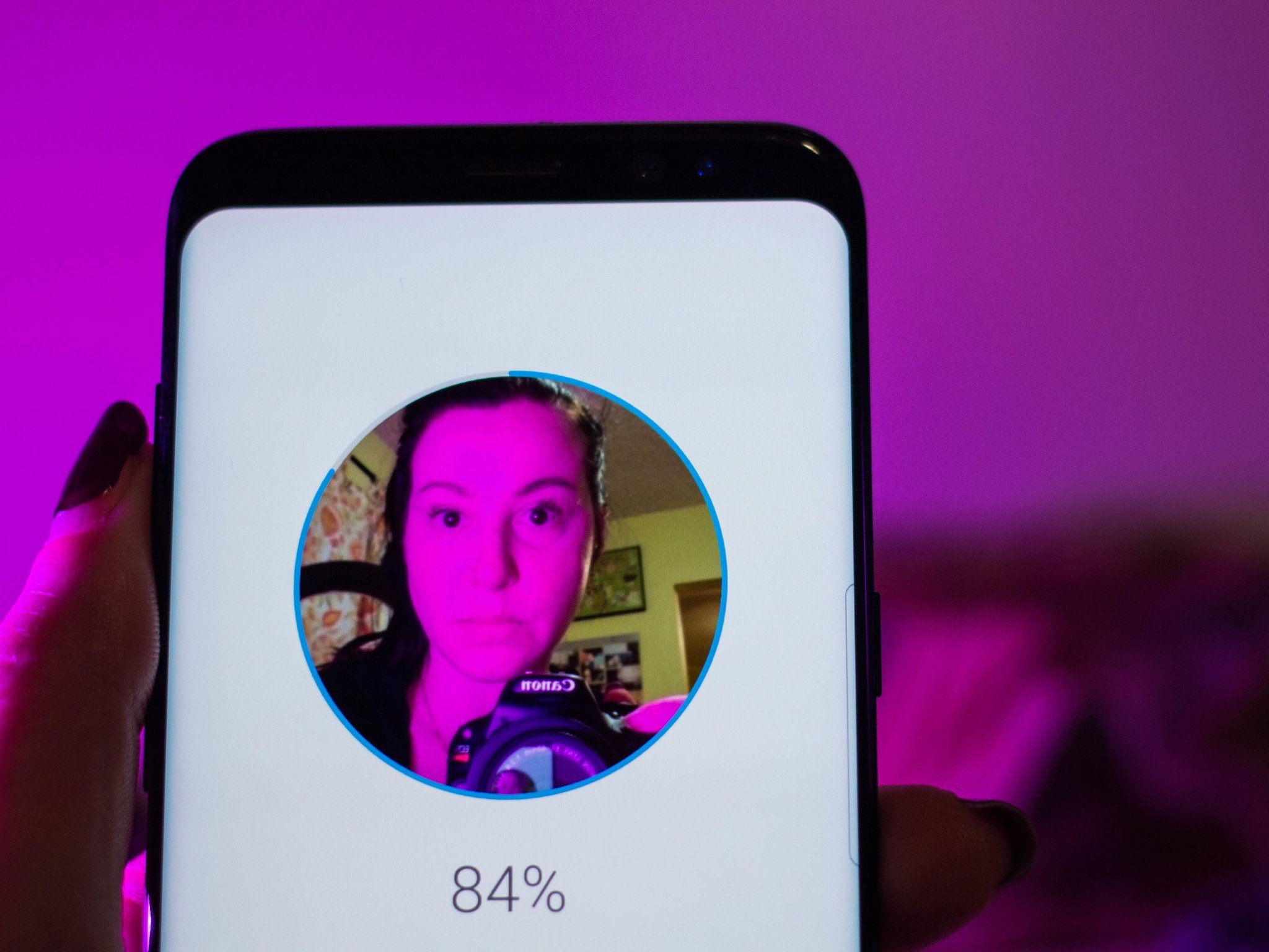
They say the eyes are the windows to the soul, and now, I suppose, your smartphone: You can unlock the Galaxy S8 with them — if you want to. The iris recognition ability introduced in the Galaxy Note 7 has been reprised here, along with full face unlocking capabilities. It's true: the Galaxy S8 can read your face, though... not always successfully.
Some people have been able to get the phone to unlock with just a picture of themselves, but I tried that and it didn't work. When I did use the face unlock in a traditional manner, I found that it often failed to identify me, and I'd have to use a backup method to unlock the screen.
Samsung Galaxy S8 Performance
Let's get one thing straight: the Galaxy S8 is a really powerful device, and if you're considering it as your daily driver, consider everything else it can do, too. The Galaxy S8 is powered by an octa-core Snapdragon Qualcomm 835 processor with 4GB of RAM. (Other markets will be getting the Exynos 8895, which is made by Samsung.) It's the first smartphone to ship with the chip, which uses a newer 10nm manufacturing process with more powerful cores running in the background. The smaller chip promises more battery efficiency in the long run, though we'll have to take the wait-and-see approach to actually measure long-term benefits. This processor also supports gigabit speeds, which the big four carriers have all committed to for the future.
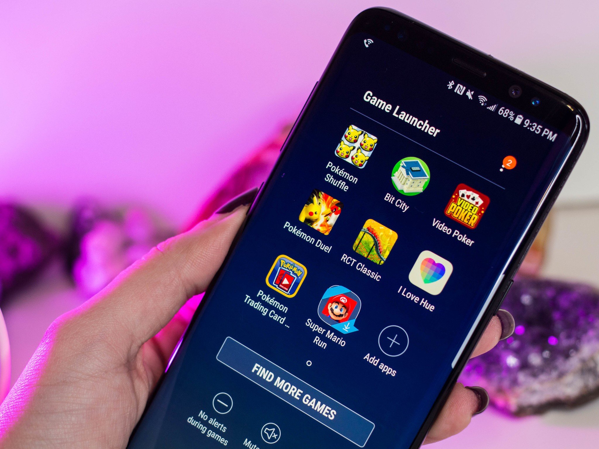
The Galaxy S8 is also prepped and primed for virtual reality, particularly the new Gear VR with remote control (sold separately from the smartphone). But even if VR isn't your thing, there are a bevy of other gaming-friendly features bundled into the GS8's premium package: There's a Game Launcher, for instance, initially introduced with last year's Galaxy S7. Its interface has since been refined, and you can use it to go fullscreen or turn off alerts so that no one bugs you while you're playing. You can also use the Game Launcher tools to grab a screenshot record your gameplay to post to YouTube and social media later on.
There are a couple of other performance enhancing modes you can unlock through the settings panel, too, including a video enhancer, which essentially ups the brightness and contrast in some of your video apps. However, enabling these particular features will affect battery life, which is already majorly affected by how bright the display is.
On standby, the Galaxy S8 and S8+ doze off into dreamland. The Galaxy S8's 3000 mAh battery lasted a few days with little usage, though the Galaxy S8+ seems to have a bit of an edge with its 3500 mAh battery. Either way, there's a definite energy suck when the Super AMOLED display's brightness is turned up. I noticed the battery drain as I was using the Galaxy S8 for turn-by-turn directions.
Samsung Galaxy S8 Camera
Like the iPhone 7, the Galaxy S8 is equipped with a 12-megapixel rear-facing camera, though the S7 opens the aperture to f/1.7, and both offer optical image stabilization (OIS). The phone is extremely capable in low light situations, particularly if you employ the aid of its built-in manual mode.
The GS8 also comes with an 8-megapixel front-facing camera with autofocus and a number of beautification features that people really do use — I've noticed that more people have softer faces on Instagram in this day and age. I mean, I've smoothed out my face in Photoshop as much as the next person, but the way smartphones do that these days can look a little extreme, and a little too obvious.

Anyway, if you're not into blurring out your pores or choosing the angle of a faux "spotlight," you could always virtually pop on one of the GS8's augmented face masks. They look and work like Snapchat's filters, and some of them even have music, and scenes that play out when you open your mouth or raise your eyebrows. They're super fun to use and I am prepared to see these pop up throughout social media in due time. I imagine Samsung will launch seasonal filters in the Galaxy Apps store down the line.
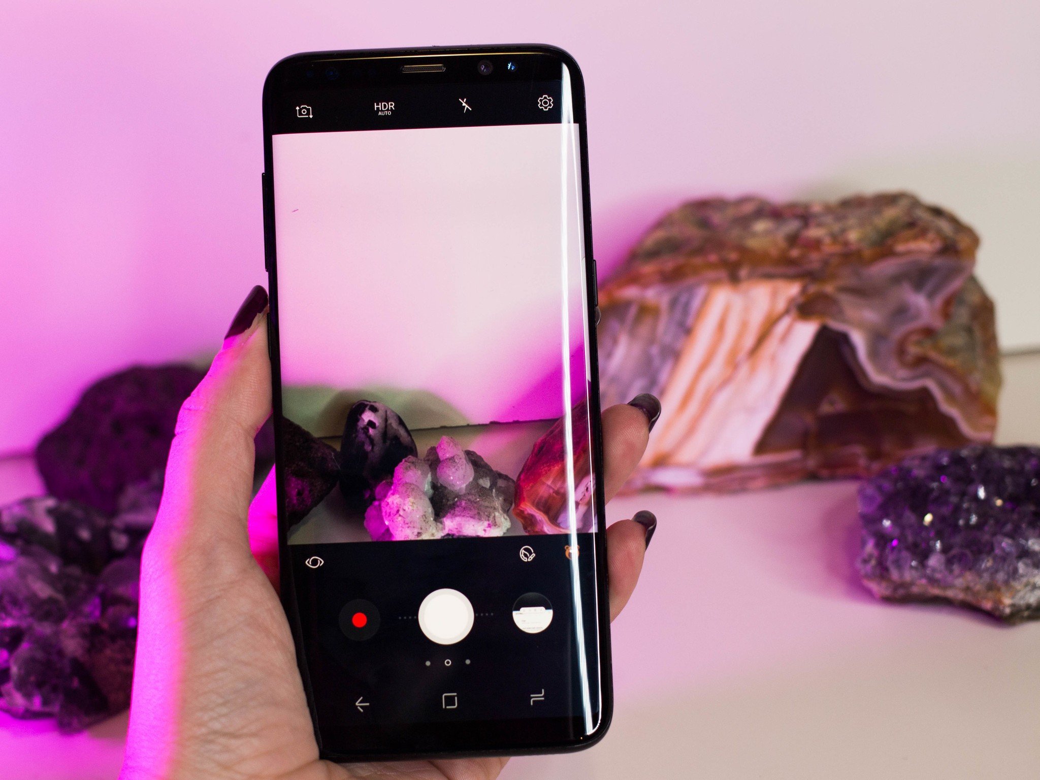
The GS8's camera app has been tweaked a bit since last year, in a direction that's ever-so-slightly more user-friendly. The shutter button seems to have remained the same size, though you can now tilt it to the left or right to zoom in and out. You'll still have to tap on the screen to adjust the exposure as you're setting up the scene. The aforementioned beautification mode has also been made available to the rear camera, so you can use it when you're taking pictures of other people.


Photos snapped indoors with the Galaxy S8.



Photos snapped outdoors with the Galaxy S8.
Compared to last year's Galaxy S7, the camera performance is the Galaxy S8 is merely a subtle improvement. Not that that's a bad thing, but keep in mind that if you were hoping for a major upgrade from last year, that's not happening.
Still, the Galaxy S8 is an amazing shoot, and I'm especially excited to see how it fares on the trail and in the overseas wilderness. From my short time with it in the suburbs, I can say Samsung is known for high contrast images and slightly increased saturation, and for the most part that comes across as a vibrant photo. The colors produced by Samsung's Sony IMX333 sensor are stunning, not to mention that there's less lens distortion overall compared to the Galaxy predecessors. It's not until you zoom in close that you start to see some of the limitations of smartphone photography, however, and if that's a concern for you, then I'd suggest you use the Galaxy S8's RAW capturing capabilities when you're feeling more serious and then take it from there.
Samsung Galaxy S8 Software
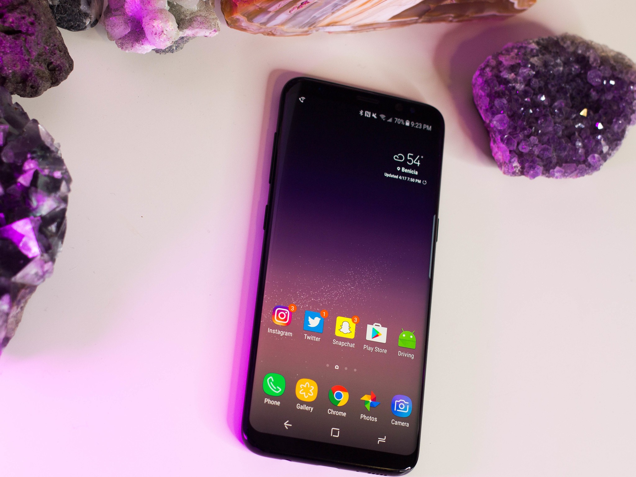
Samsung, in particular, has eased up on the extreme Android makeover these past few years. And while Samsung's "squircles" motif certainly exists here, you can choose to eliminate it on the icons of all non-Samsung apps or apply some other theme of your choosing. That's the beauty of Android: if you really don't like something, there are ways to change it. You just have to want to put in the effort.
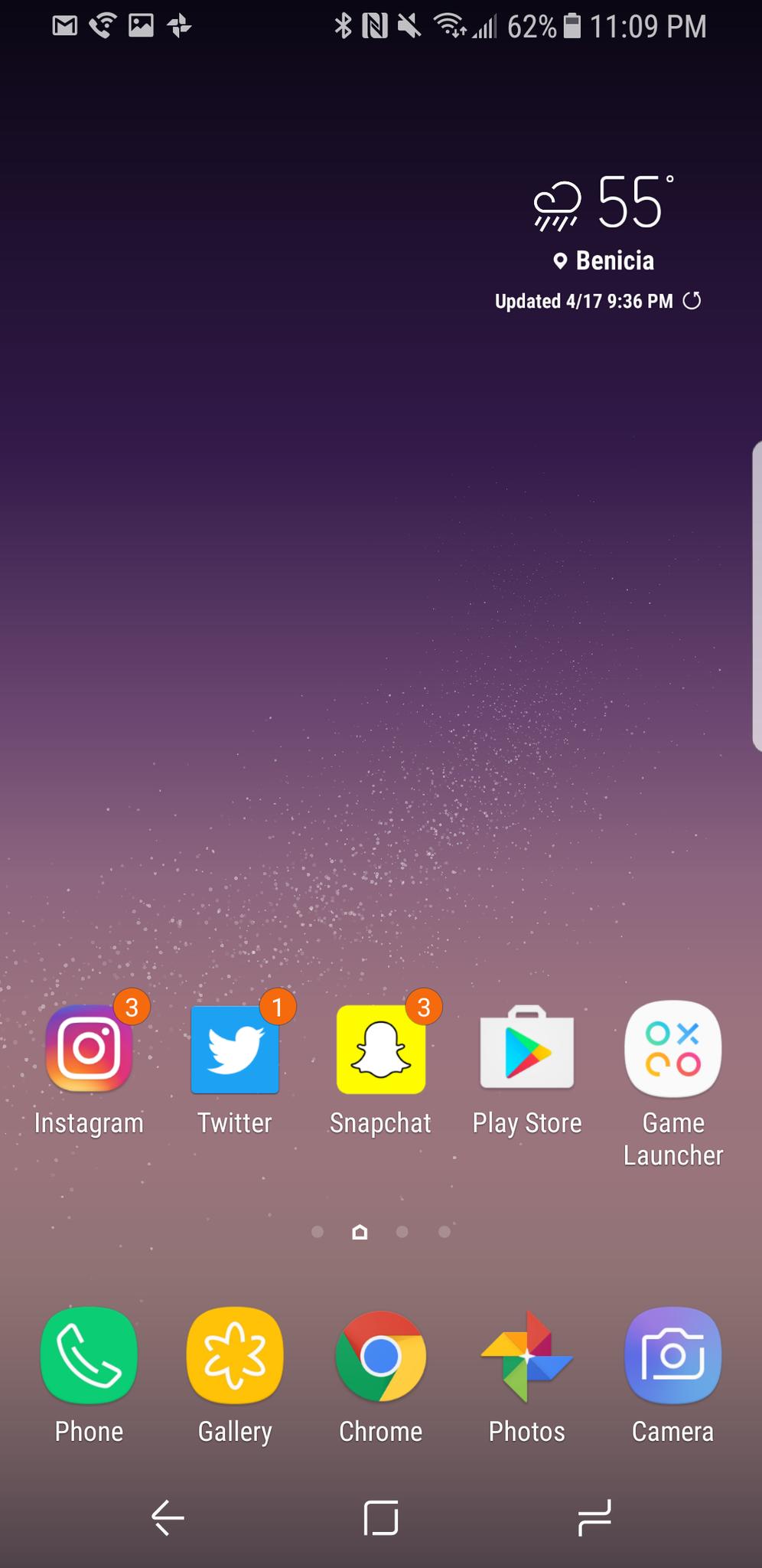
Fortunately, I didn't feel like changing too much on the Galaxy S8's interface. It's a reprise of what Samsung shipped with the Note 7 last year. It's clean, navigable, and there's little color to distract you from everything else. I like that the design paradigm has been significantly pared down compared to year's past, because now when I exit an app I feel like I'm retreating rather than jumping into something deeper. Busy interfaces can be very overwhelming, but the good news is that Samsung doesn't do that anymore.
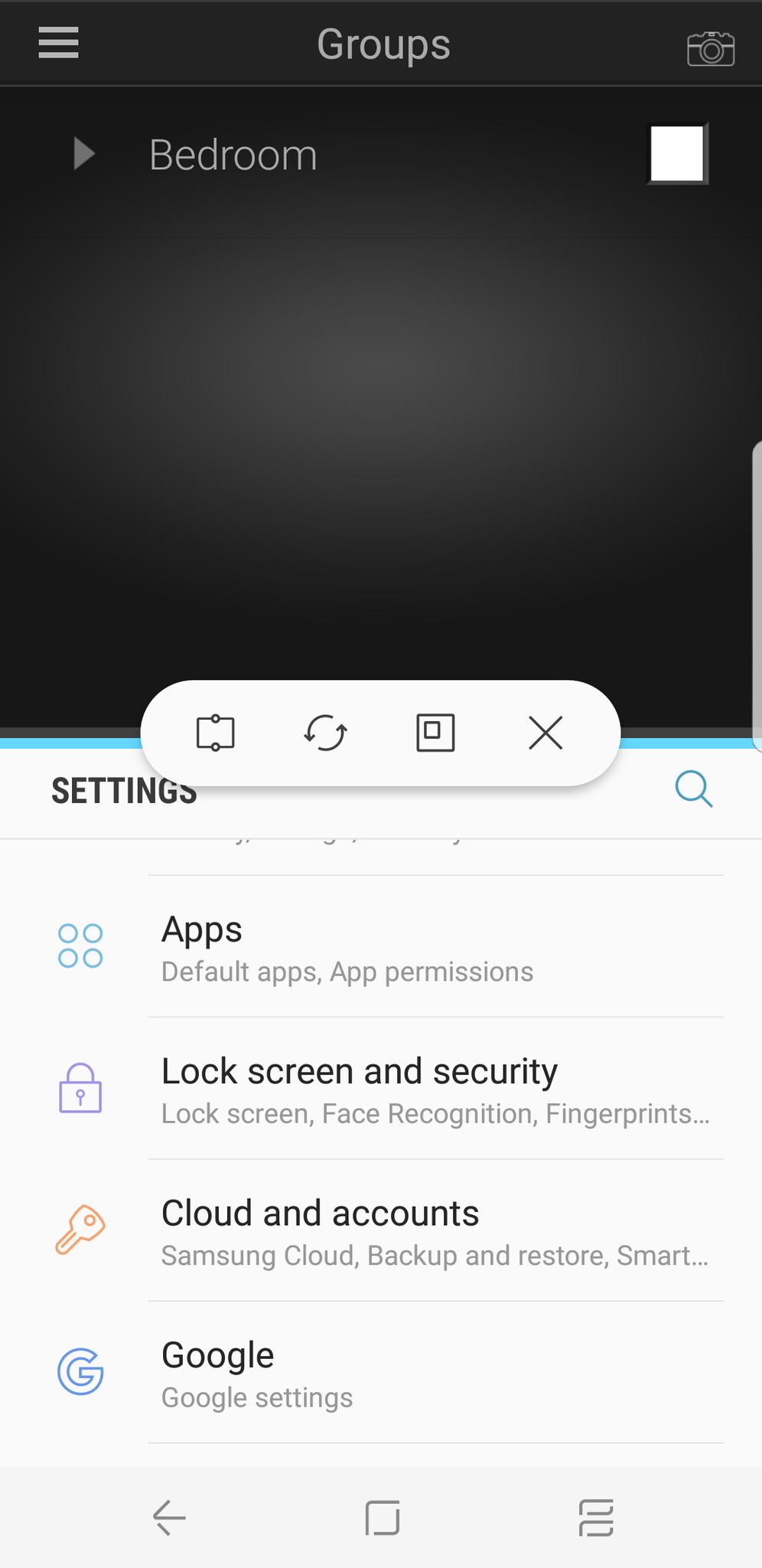
Samsung's Multi-window functionality has been given an oomph, likely in an attempt to keep an edge over what Nougat can now do natively. Android's multi-window ability is certainly easier to use, but Samsung's is more robust. Not only can you split the screen in half between two apps, but you can also use a pop-out screen mode, or select an area of an app to dock at the top of the screen. It may seem like more stuff padded into the interface, but it was added as an attempt to make the Galaxy S8's fuller display more useful.
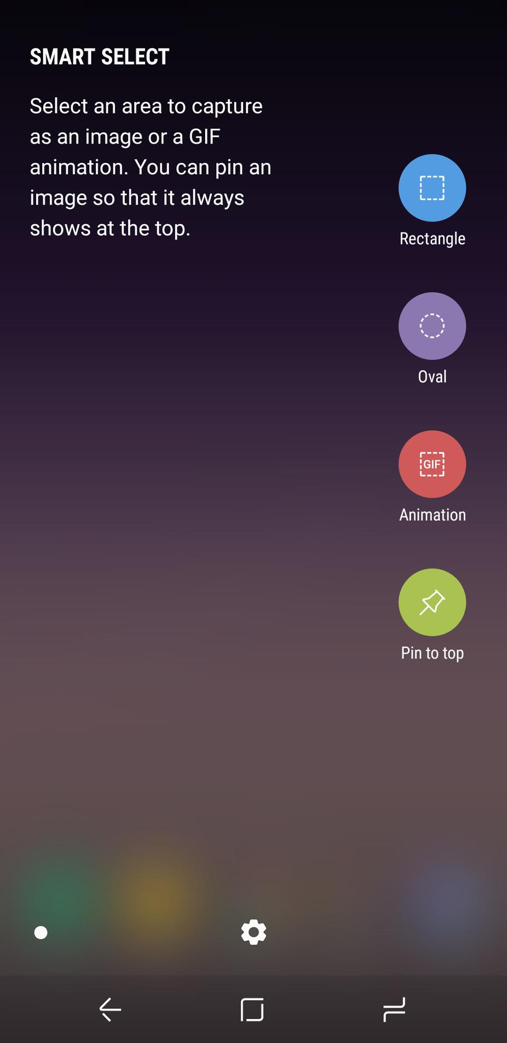
The Edge panels that came standard with the S6 edge and S7 edge are now permanent fixtures of the Samsung interface. If you like having a "shelf" of sorts on your mobile interface, you can use the Edge panels as an app dock of sorts, or to pin contacts of your choosing. The Edge panels also feature some of the Note 7's tricks, including the ability to make animated GIFs from DRM-free videos. I like that these features have made it over to Samsung's marquee devices, but the Edge panels can be a become a bit of a nuisance on the smaller Galaxy S8. I was constantly triggering it while panning through Instagram and Snapchat. There's no other way to activate the Smart select features, however, so I made the Edge handle a bit smaller in the settings panel.
Samsung Galaxy S8 Bixby
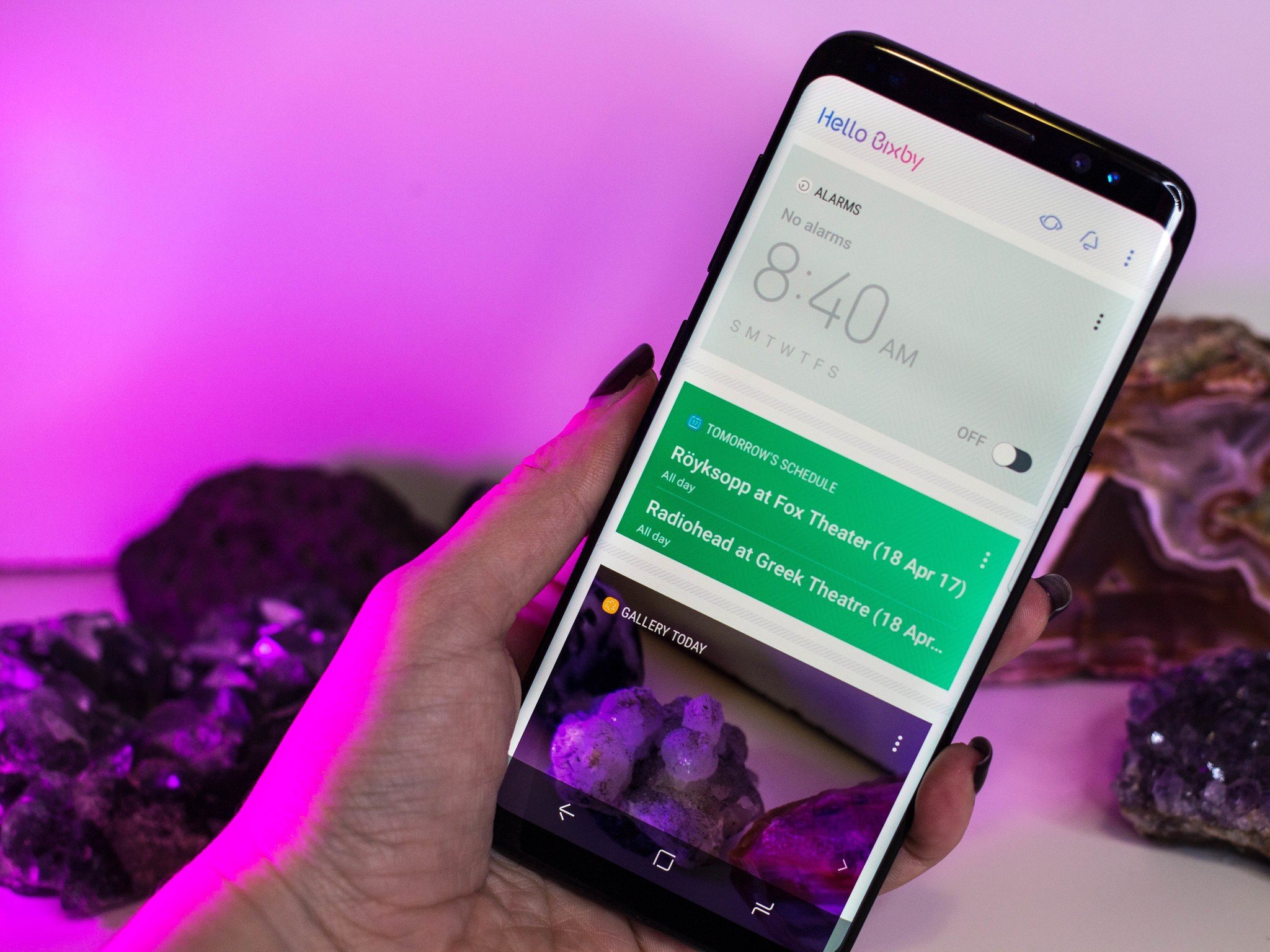
Bixby is the major software feature everyone's talking about when they talk about the Galaxy S8, since it seems to directly collide with Android's Google Assistant (and compete with Apple's Siri). Unfortunately, Bixby isn't operating at full speed until "later this spring," so we can't yet tell if it's a worthy competitor to other assistants, including Assistant, Siri, or Amazon's Alexa. There's a button made specifically to launch this feature, too, so it's obviously something Samsung really wants you to use. But at present, Bixby doesn't do much that justifies its dedicated hardware button.
As an app, Bixby works similar to Google Now: It's ostensibly a feed of information pulled from the apps installed on the phone. Some of the cards include trending Twitter hashtags, your latest compositions from the Gallery app, and your schedule for the day. There's even Spotify integration offering quick links to your favorite playlists, which Google doesn't actually do.
Think of the Bixby feed as more of a launcher than an informational marquee, one that you have to curate to get it to look and act the way you like — just as you have with any other contextual services. Bixby also utilizes Flipboard to pull in relevant news articles, but if that's not your cup of tea, you can easily disable it and any other apps you don't want to pop up.
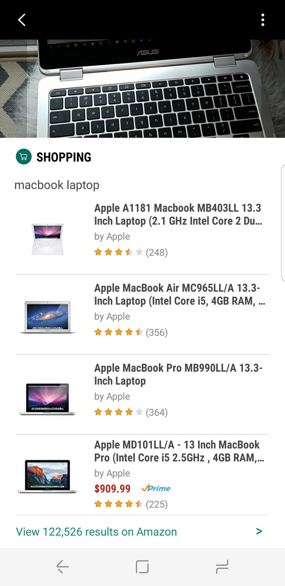
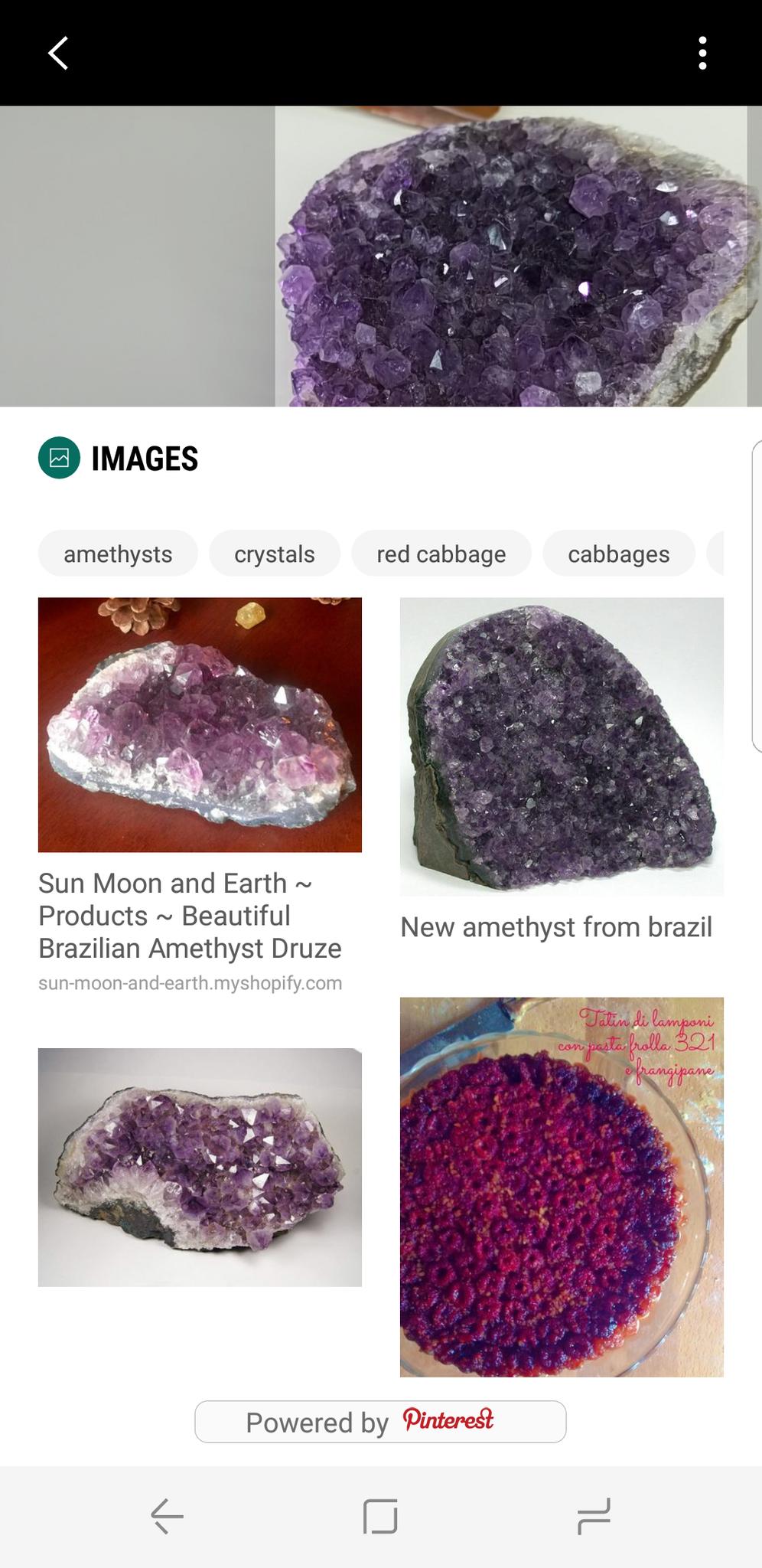
Silly, Bixby. That's not a MacBook!
The other part of Bixby is the Bixby Vision. It uses the camera to snap a photo of an object or location, and then it fetches external shopping links or images off Pinterest. It works on a variety of objects, including clearly labeled beauty products and branded electronics. Bixby even managed to look up information on one of the crystals from my collection, though it failed to provide any relevant shopping links. Hilariously, it also confused my Chromebook for a MacBook Pro.
At present, Bixby feels like a half-baked feature of the Galaxy S8, and it's sort of disappointing as a technology fan to see a weak rollout for a potentially killer feature. But that won't matter to consumers once it goes live and everyone starts using it — just as it didn't matter how limited Google Now was at its inception. From what Samsung showed off, there is hands-free, we'll-think-of-it-for-you functionality coming to the Galaxy S8. Bixby isn't supposed to be a replacement for Google Assistant; it's a companion.
Samsung Galaxy S8 Extra features
Samsung DeX is the company's new computing dock: It supposedly unlocks a hidden desktop operating of sorts for the Galaxy S8 series, but isn't available yet, so I can't tell you whether it's worth the extra $150 you'd have to spend for the dock that enables it.
That said, I can tell you about some additional features that might make the Galaxy S8 seem more worth the money.
There are some additional features that might make the Galaxy S8 seem more worth the money.
For one, it's resistant to up to five feet of water for half an hour, so it's the type of thing you can take with you into the bathroom — to play music while you take a humid shower. It also comes packaged with a pair of AKG-branded headphones that are more comfortable than what Samsung used to bundle in with its smartphones. The phone features some software-enabled aesthetic wonders, too, like a customizable always-on display, which now feature dynamic backgrounds as a part of the infinity wallpapers.
Lastly, there's Samsung Pay, which is arguably more ubiquitous than both the NFC-reliant Android Pay and Apple Pay. It works in more places because it employs MST, or Magnetic Secure Transmission. Basically, it identifies as a credit card, which is how it works with even some archaic payment terminals. I can't tell you how many times I've attempted to use Android Pay on my Pixel, only to hear the clerk to say to me, "Oh, sorry. It only works for Samsung phones."
Galaxy S8 Should you buy it?
Ladies and gentlemen, we are now nearing our final descent into the reality where Samsung and Apple rule the smartphone land. But it's pleasant here because it means that as consumers, we have the near pick of the litter when it comes to worthy mobile devices. As companies go head to head in the battle for the Smartphone That Rules Them All, we get to reap the benefits of all those evolutions and weird little experiments that end up turning into phenomenal things.
The Galaxy S8 is another spectacular smartphone to add to the pile, precisely because it's an outstanding representation of Samsung's continued attempts to find a new path. After all, you can't remain the king of the castle forever; eventually, your reign will end. It's almost as if the Galaxy Note 7 disaster helped put some things in perspective for the South Korean smartphone maker. With so many new and compelling Android smartphones coming into the ring, and Apple continuing to knock it out of the park for its fanbase, it's easy to see Samsung as a company attempting a little magic. But in the end, consumers aren't going to care much about that. What they're going to care about is wielding a beautiful phone with substantial battery life, ease of use, and a camera that takes pictures worth keeping. And for the most part, the Galaxy S8 and S8+ knock it out of the park in all of those categories.
Read Android Central's Galaxy S8 and S8+ review!
Looking for the definitive take on the Galaxy S8? Look no further than our friends at Android Central for lots of words and a shiny video.


