Slack updates its iPad app to be more like the Mac app

What you need to know
- Slack has released an update to its iPad app.
- The update brings a new two-column layout, updated sidebar, and new accessibility features.
- The iPad app is much more like the Mac app now.
Slack's latest update to its iPad app is another move in the Mac's direction.
In a blog post on the company's website, Slack announced a slew of changes for its iPad app. The update includes a new two-column layout, updated sidebar, and new accessibility features that align the iPad app closer to the Mac app.
The new two-column layout, as Slack explains, more closely resembles "the layout of the desktop version."
When you select a Slack channel or a direct message from the left-hand sidebar, you'll see the content appear in the right-hand pane. This new layout makes it simpler to multitask and stay productive, whether you're producing a video shoot or planning out a product roadmap.
The app now features many of the functionality of the desktop app in the sidebar as well, including the ability to collapse sections:
- Sections are now collapsible, so you can hide groups of channels and focus on just the most relevant conversations
- Section preferences will now be synced with the desktop version, keeping your sidebar consistent when you switch between devices
- Usernames in direct messages now feature avatars, making them easier to scan. Channel activity can now be sorted by recency, so you can more quickly review the latest updates from your team
- With just a long press on a channel name, you can now access a context menu from which you can easily mute or leave the channel, copy a link to it or mark it as read
The company has also released new accessibility features, including improvements to VoiceOver:
For starters, the app now has improved labels for Apple VoiceOver screen-reading functionality. This helps users with visual impairments get more information about each conversation to decide its relevance. And Recent Activity sorting will let them find new conversations faster and skip extraneous navigation.We've also turned the Workspace Switcher feature into a modal, making it more intuitive for VoiceOver users to toggle between different Slack workspaces. And we've increased our Dynamic Type support, giving users control over the size of elements like the Workspace Switcher and the sidebar for better readability.
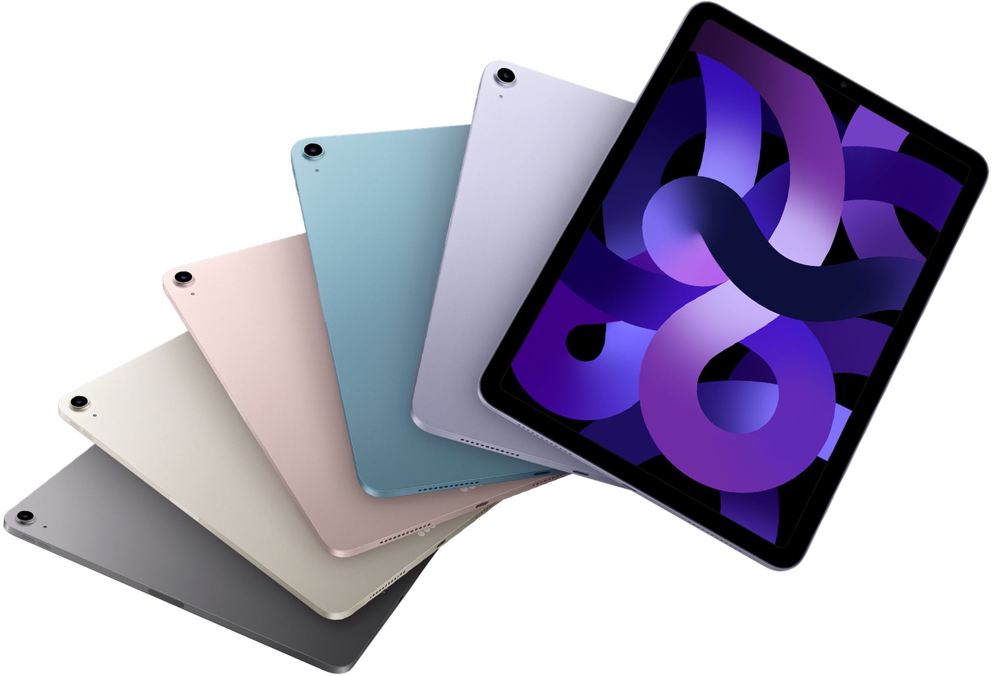
You can learn more about all of the new changes to the Slack app for iPadOS on the blog post. The changes come right ahead of the launch of the 5th generation iPad AIr which will release to customers on Friday, March 18.

Bottom line: This s the best iPad for most people, offering fantastic performance thanks to the M1 chip, but also a great starting price. Whether you use an iPad for work, play, or a combination of the two, the iPad Air 5 will be able to handle anything you throw at it.
Master your iPhone in minutes
iMore offers spot-on advice and guidance from our team of experts, with decades of Apple device experience to lean on. Learn more with iMore!

Joe Wituschek is a Contributor at iMore. With over ten years in the technology industry, one of them being at Apple, Joe now covers the company for the website. In addition to covering breaking news, Joe also writes editorials and reviews for a range of products. He fell in love with Apple products when he got an iPod nano for Christmas almost twenty years ago. Despite being considered a "heavy" user, he has always preferred the consumer-focused products like the MacBook Air, iPad mini, and iPhone 13 mini. He will fight to the death to keep a mini iPhone in the lineup. In his free time, Joe enjoys video games, movies, photography, running, and basically everything outdoors.
