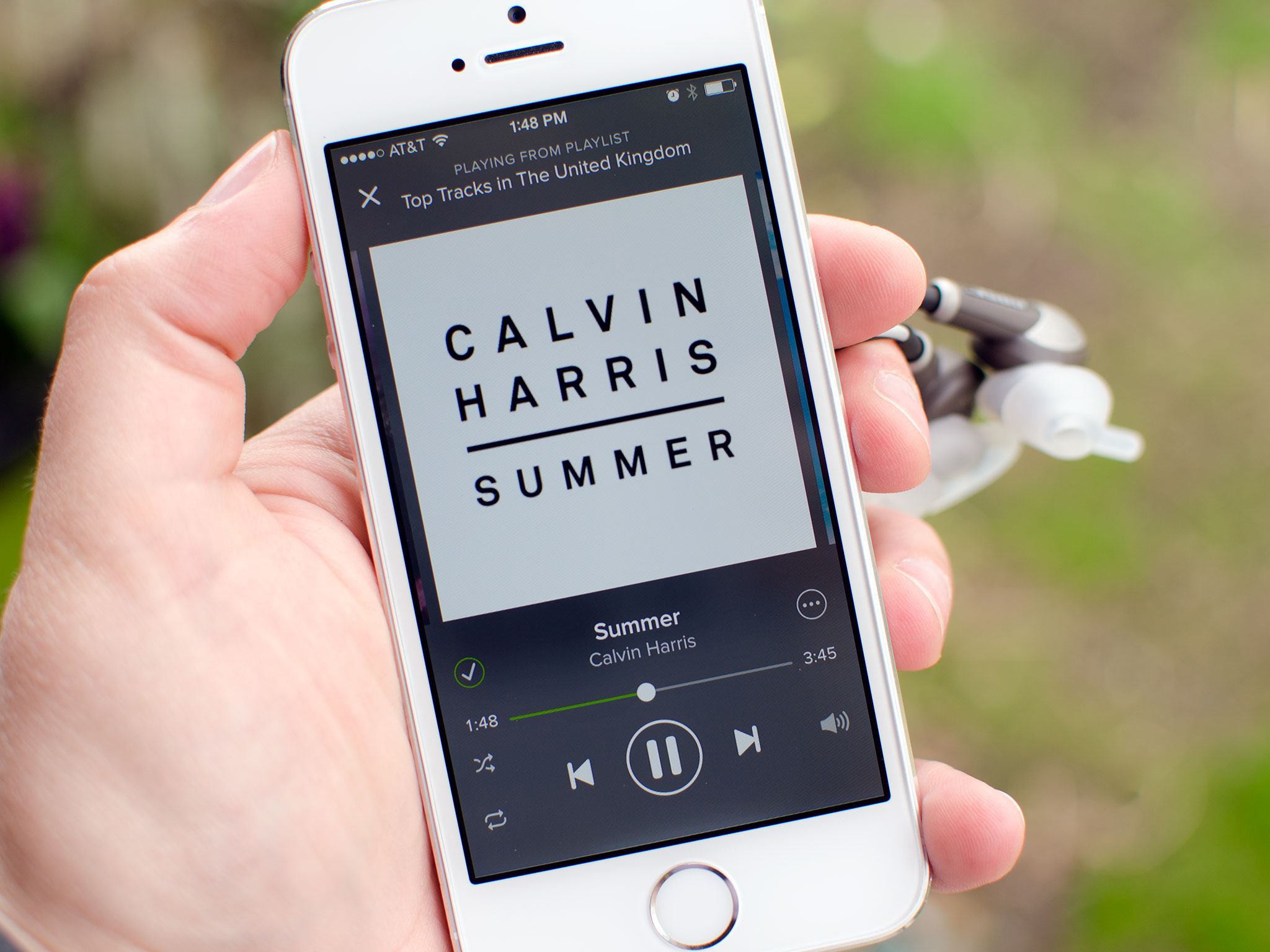
I have an ongoing love hate relationship with pretty much every music streaming service available. I just want them to be better as none of them as a whole are the best. That's why I was excited when Spotify majorly overhauled their iPhone app. It was a chance to try the service out again and see if the glaring issues that push me on the Rdio side of the fence are finally remedied. Is it good enough for me to give it a second chance? More importantly, is it good enough for you, our readers, to choose it over the many available options? Let's find out...
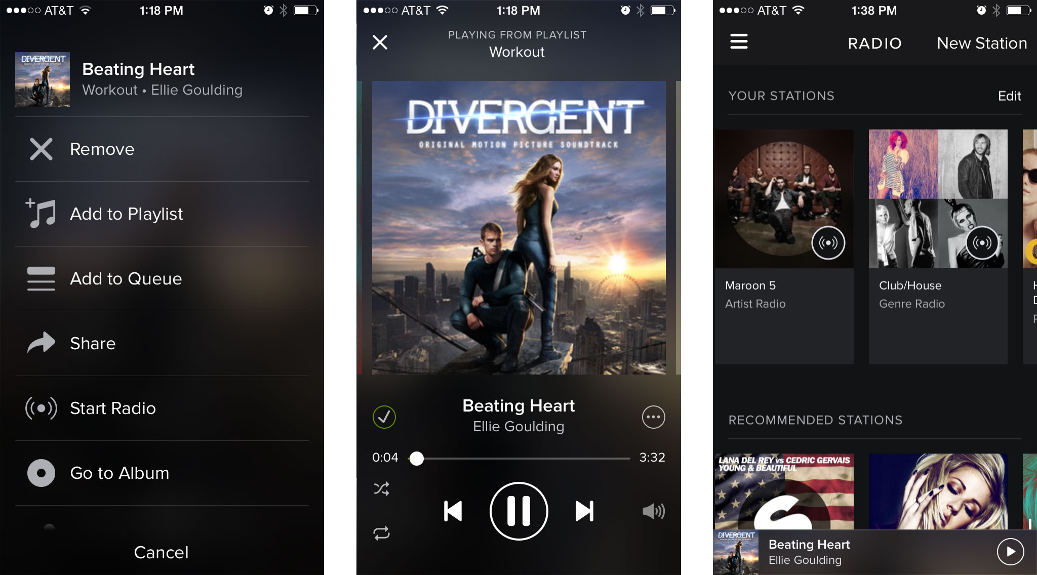
The first thing you'll notice upon launching the new Spotify app for iPhone is the completely new look and design. It's not a bad thing either. I never particularly cared for the overwhelming amount of green Spotify chose to use in past versions so the solid black design with subtle accents and overlays was a welcome surprise. When it comes to actually navigating the app, there are very few buttons since most of the interface relies on gesture navigations. Swipe from one list to the next and so on. The top menu button always stays fixed in the top left corner making it easy to get back to your collection and main sections of Spotify in just a tap.
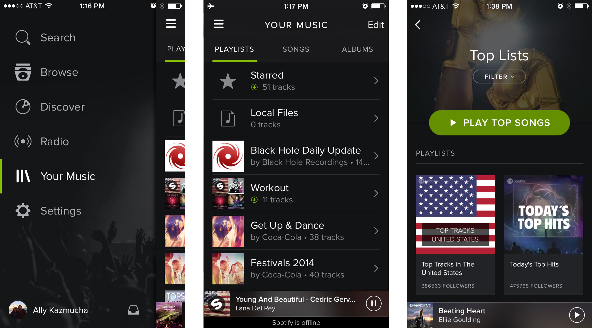
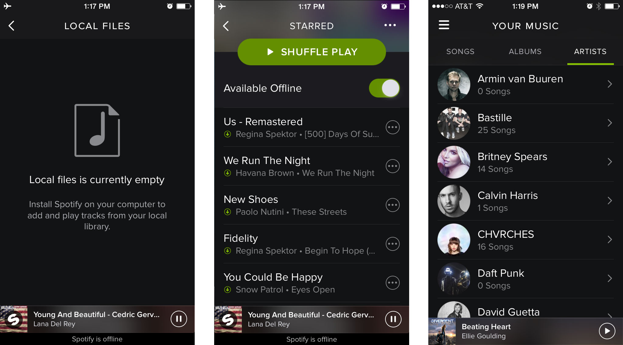
However, there are a few things that irk me about the new design — and I do mean only a few. First, when browsing through the artist section of the Your Music category, I don't like that it shows every artist I follow. If I don't have any songs saved by that artist, I probably don't want it cluttering up my collection. I want to drill down and find what I'm looking for quickly. Of course, the search feature is the fastest but if I'm just browsing, it's odd to me there are artists I'm following even if I don't currently have any music by them in my collection. I feel that should be a separate section.
My next and only other issue is really two issues. I'm having trouble figuring out what the point is for starred and local tracks anymore. I have offline tracks saved but they don't show up in local. I understand this is where you used to sync tracks from your computer to Spotify wirelessly but is this section really needed anymore? Perhaps I'm missing something and if I am, someone please point out what it's for, because I'm at a loss. The same goes for starred tracks. I don't see a way to star a track with the new design so why is the section still there? Is it simply to show songs I have starred in the past? Are they just stuck there for all eternity unless I had everything to my collection manually?
Aside from the above mentioned quirks, I've been finding my experience with the newly design Spotify app to be an enjoyable one. It doesn't drain my battery any faster or slower than Rdio but I do feel like there is a hugely noticeable different in sound quality. Obviously this is due to the fact that Spotify streams at 320 kbps while Rdio is supposedly only at 192 kbps, at least for now. They've already stated they're upgrading their catalog to the same but we aren't sure when that's officially happening. So for now, Spotify wins that fight and may make a switch more tempting for current Rdio users.
Unfortunately Spotify for iPad has not received the same treatment the iPhone app did. It's still the same clunky mess that's really a mirrored version of their web streaming service. Have music saved to your collection on your iPhone? Too bad, you can't access it on your iPad. It really is a terrible app and one that's in desperate need of an overhaul. I'm really hoping an iPad app revamp is on Spotify's urgent list of to do's. Right now I'd be hard pressed to recommend Spotify to anyone who streams music frequently on their iPad, no matter how good the iPhone app is.
The good
- The design is worlds better than past iterations
- It's obvious that great care was given to navigation, it's one of the easiest apps to navigate and explore
- Reliable streaming and less skips or hiccups in playback, at least in my experience
The bad
- No love for the iPad, and that app really is a mess
- Some design quirks such as the confusing starred and local sections under the Your Music section
The bottom line
I've always had reasons in the past to stay away from Spotify, due to one irritating issue or another. This version of Spotify for iPhone is a huge improvement and shakes off most of my past complaints. Minus a few small quirks, Spotify did a great job this time around. I only wish the same could be said about the iPad app.
If you only stream music on your iPhone, the Spotify service paired with its new iPhone app won't disappoint. For those that depend on their iPads for streaming music, other options such as Rdio are still more worthy of your money.
- Free - Download Now
iMore senior editor from 2011 to 2015.
