Inspired by the Microsoft Courier project, Taposé has great potential but the usability just isn't there yet.
The Microsoft Courier project was an original take on tablets but never got out of the concept video stage before Steve Ballmer decided to kill it in favor of Windows 8. Undaunted, a couple of developers from Seattle who were fans of the project hooked up with former Courier lead, J. Allard, and raised enough enough money on Kickstarter to create a Courier-like experience on the iPad. Namely, Taposé.
The promo video for Taposé was exciting. It showed a lot of what made the Courier so novel and interesting. It showed, on an iPad, a two-paned UI, and dragging and drooping content from one pane, say a webpage or maps, into the journal contained in the other pane that contained your journal. Unfortunately, the reality of the app doesn't match the aspiration of the video.
I'll preface all of this by saying the the idea behind Taposé is fabulous. The video, although a bit misleading, was fantastic. Everything about the concept of Taposé is brilliant, but the execution to date was disappointingly poor.
First of all, the tutorial that you're initially presented with, for lack of a better word, sucks. This app is jam packed with different UI elements and features, but the tutorial doesn't let you actually use any of the important ones while reading through it. Instead, you must ingest all this information without trying it out along the way. For hands-on learners like me, it was a nightmare and I finished the tutorial learning very little.
I was still positive at this point, though, thinking that, sure, the tutorial needs a little work, but I can still explore around and figure things out on my own. I quickly figured out that the tutorial was not Taposé's only flaw. The app is very sluggish and somewhat confusing to navigate around -- and this is on a brand new iPad, mind you. I don't want to think about how it performs on a first generation iPad.
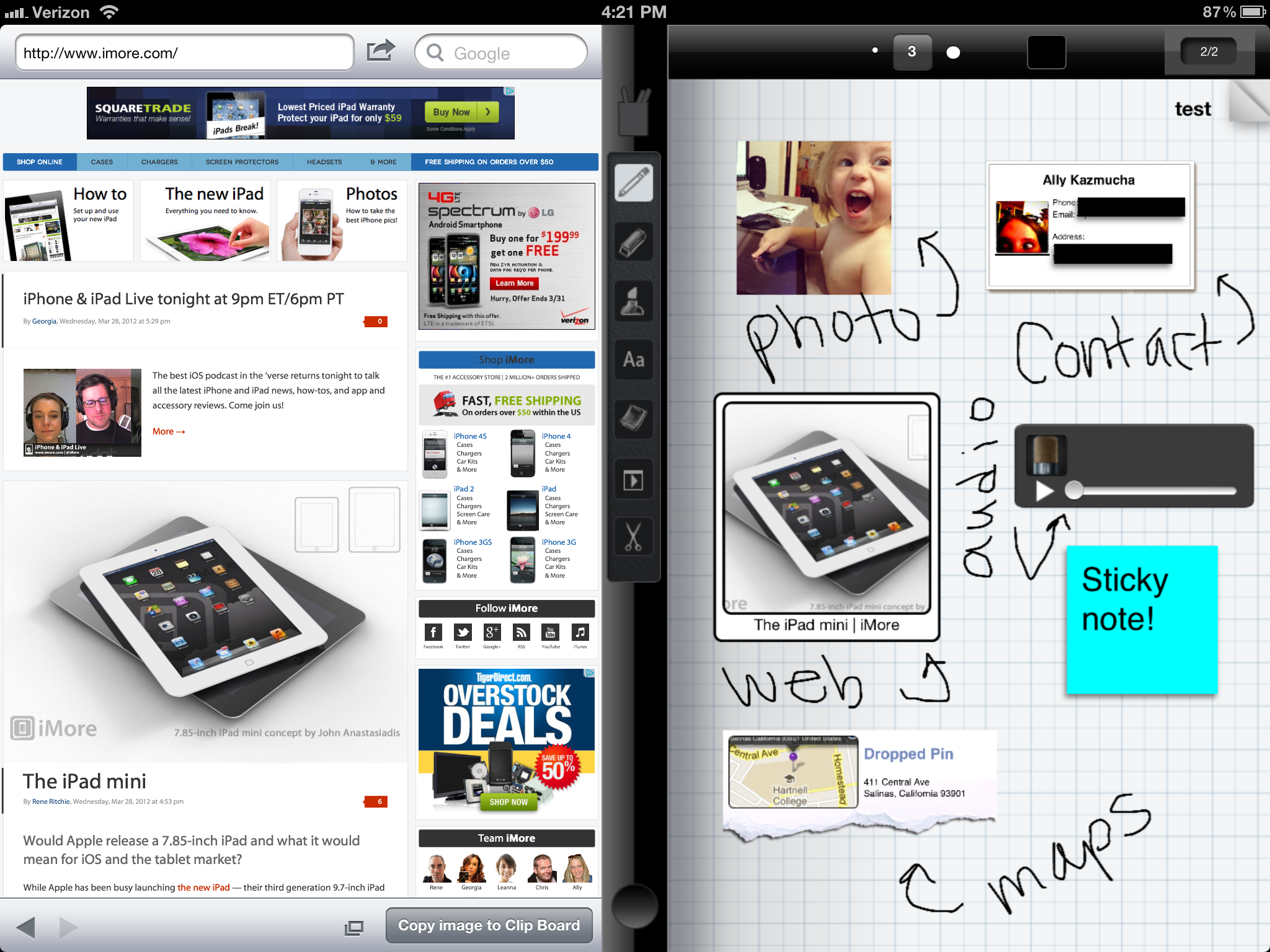
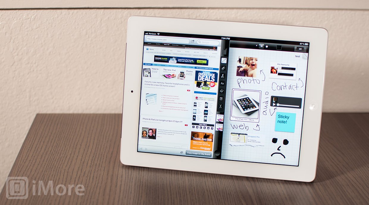
Sluggishness aside, Taposé does work, sort of, and its cool feature is that it lets you have two panels -- one with your working journal, and the other with a web browser, maps, contacts, or calculator.
To open and close the left panel, simply slide the circle at the bottom of the toolbar left and right. Swiping up and down above the circle will give you the options for opening a journal, web browser, maps, contacts, or calculator in your panels. But don't you dare try swiping up and down on the circle - it'll just leave you frustrated at Taposé's lack of response.
If you have a website open in one of your panels, you can copy the image or webclip to your clipboard to add to your journal. How to paste it into your journal from your clipboard? I have no idea. Perhaps it's in that tutorial I don't remember anything from. However, you can tap the photo icon button next to the "Copy image to Clip Board" button and drag the created webclip to the toolbar which can then be dragged to your journal. Don't expect to get precise with how your webclips appear, though. Think of it as a fun guessing game -- you zoom into the webpage and see if Taposé creates the image you expected!
Maps was a little confusing to learn how to use as well.. The trick is that you don't get to zoom into (or out of) a specific area that can be shared with your journal, but you share either your current location or pinned locations. The resulting clips actually look pretty cool on the journal. Contacts look great as well. The calculator is convenient so that you don't have to open a separate calculator app to perform a calculation. Calculations can't be shared, though. You must type or handwrite the results.

Speaking of handwriting, the quality of the handwriting is nothing to brag about and could use a lot of work. Taposé does include a zoom tool to make your handwriting smaller which is great. Don't you dare make a mistake, though, because while zoomed in, there's no way to undo or erase. This reminds me about the unintuitive placement of the undo button. Despite the ample space in the top toolbar (or even above the pen cup icon in the left toolbar) for an undo button, you must actually tap the page number icon to find it. This is where you'll also find the search tool, index, sharing options, paper type, and wrist guard.
Some of the other features of Taposé include adding text or sticky notes, but don't add them in the area that the keyboard pops up over if you want to see what you're typing. That's right, you can't scroll down your journal to see the bottom of the page when the keyboard is active.
The last thing I'm going to mention is that when trying to make an interesting looking screenshot to share with you, I was using the zoom tool to handwrite notes for you to see. At some point, the zoom tool stopped working and the area I was supposed to write in just turned gray. I tried force closing the app and relaunching it, but the problem persisted.
This is about the time I gave up and closed the app for good.
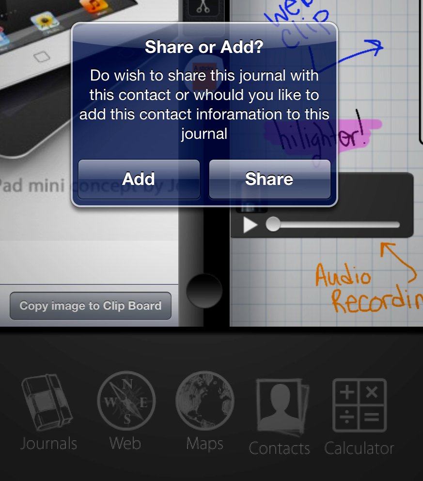
Oh, I almost forgot to mention this gem I discovered (I cropped the screenshot so that you can read the popup).

Now look at the screenshot again, but pay attention to the icons at the bottom.
The Good
- Great concept
The Bad
- Sluggish
- "Tutorial" doesn't let you try things as you read through it
- Can't undo while using zoom tool
- Just confusing and unintuitive, in general
The bottom line
Taposé has the potential of being a really awesome app, but it's nowhere near there, yet. This is not an app that's ready for a public release, so unless you like the beta-testing experience, I recommend waiting for an acceptable update before picking this one up.
Check out the video below to see the potential of Taposé and what I hope to see it become.
$2.99 - (Don't) Download Now
Former app and photography editor at iMore, Leanna has since moved on to other endeavors. Mother, wife, mathamagician, even though she no longer writes for iMore you can still follow her on Twitter @llofte.


