Tempo is a new calendar app for iPhone that not only attempts to handle your appointments and schedule more elegantly, but also doubles as somewhat of a personal assistant. It achieves this by tying into several different account types such as your emails, contacts, and more. The more you use Tempo, the smarter it gets, and the more relevant the information presented to you will be.
As many of you may have already noticed if you've attempted to install Tempo, there's a reservation system in place and you'll have to wait your turn in line. This is similar to the reservation system the recently Dropbox acquired company Mailbox implemented. While it may be frustrating, we can certainly understand why apps that may have high server usage may do this. Instead of causing a spotty experience for all users, they are choosing to let users in as they can handle the traffic.

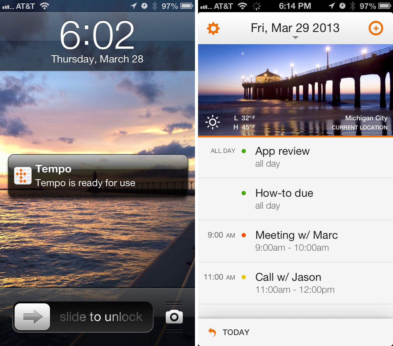
After you get through the reservation system and you've gained access to Tempo for iPhone, you'll be guided through a quick tour of the main features. After that you will have the opportunity to link up your mail accounts and grant Tempo access to your contacts and current calendars. Tempo can take a little while to set up depending upon how many contacts and email inboxes you have. Once Tempo is ready to go, you'll receive an email and a push notification on your iPhone letting you know. For me, this process took about 20 minutes and I've got a pretty healthy number of contacts and synced 4 inboxes with it.
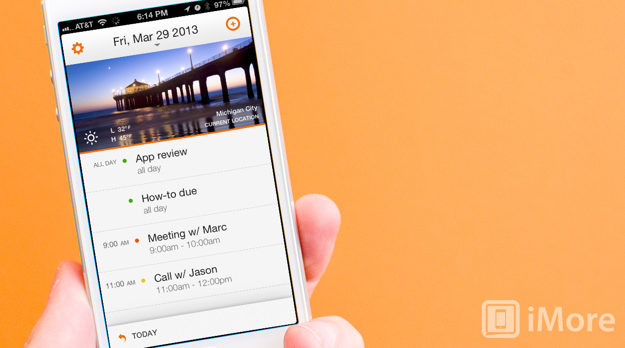
The first thing you'll notice is the layout and design. The main home screen will default to agenda view. You can either choose a static photo to sit at the top or you can leave Tempo's photo of the day feature which will rotate out a new image each day. You'll also see the weather for your current location. Below that is where you'll be spending most of your time, your actual calendar. You'll see a list of events for the day under agenda view. To toggle between views, simply tap the date at the top and choose between agenda, list, day, week, and month.

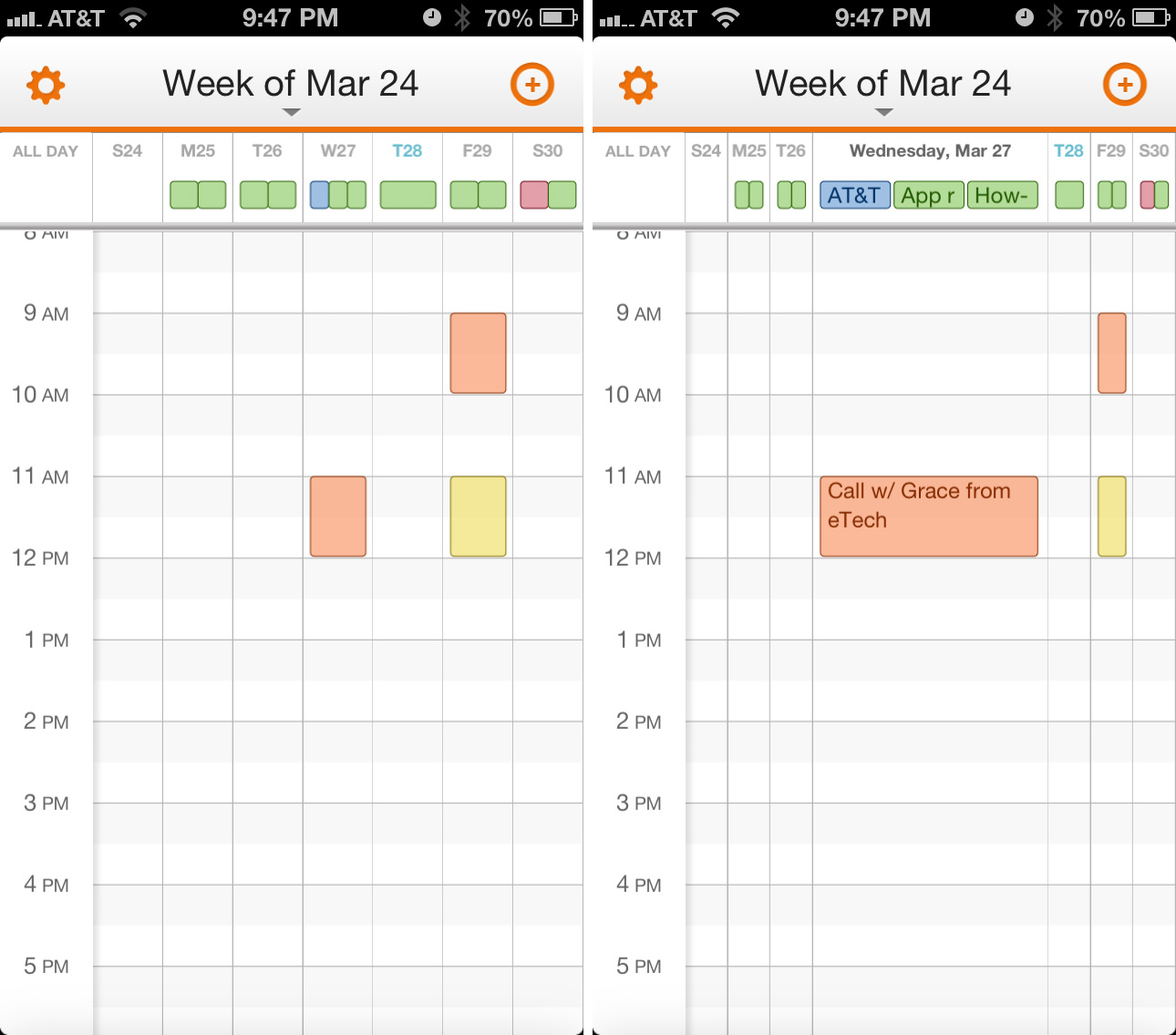
As far as the calendar views go - agenda, list, and month are probably the better views while the day and week options could still use a little work. For the most part they look very simliar to the default calendar but the week view will just show colored blocks. Tapping on them expands the event to see the title. You'll have to then tap on it again in order to view the detail. I'm not quite sure what the deal is with the colored blocks but a colored grid that shows no information isn't productive at all nor a good use of space. Tapping too many times to expand events can get annoying fast in week view.
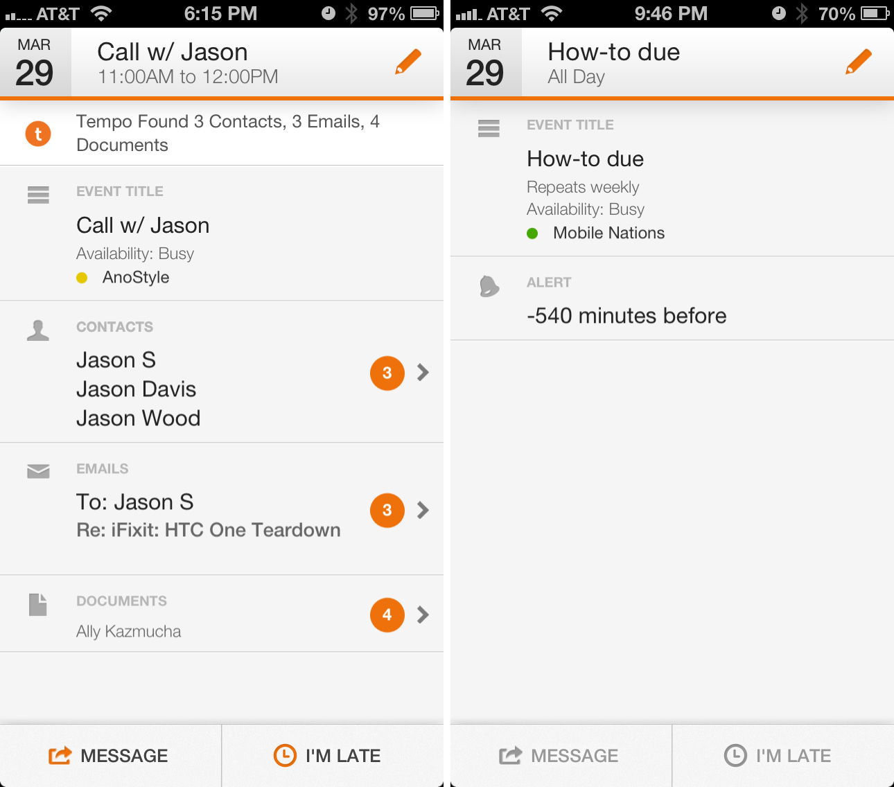
The main feature of Tempo is how it smartly adds contacts to events based on your description. For example, if I tell Tempo I have a call with Jason, it will import any relevant information it may find in my emails and contacts that it finds relevant. If you use last names, your results will obviously be better. The point of combining this information is so that you can view all your information without jumping between apps and for that purpose, it really does work. You have the ability to view emails (including attachments), contact cards, social networks, and more for a contact or colleague at a single glance. From there you can text a contact that you're running late, view directions to a location, and more.

The good
- Very fluid interface with easy gestures that just feel natural
- Support for almost every contact type for importing
- Gets smarter as you use it
The bad
- Once an event is entered, you can not edit the calendar it is on, you'll have to delete the entry completely and redo it
- If you don't use last names for people in calendar entries and meetings, Tempo may import wrong contacts into events
- No iPad support
- Imported alerts sometimes show up funny, sometimes as a negative amount of minutes
The bottom line
Overall, Tempo is off to a nice start and really does function as somewhat of a personal assistant. I've been adding entries and viewing my calendar in it for a few days now and it does seem to get smarter the more you use it.
For people who travel frequently and want one app to rule them all for sorting calendars, getting driving directions, and viewing information on a client or contact, Tempo can do it all. While certain calendar views could use some improving upon, I have a feeling the app will only get better over time. For the most part, it's off to a pretty great start.
- Free - Download Now
iMore senior editor from 2011 to 2015.


