Three accessibility improvements I'd love to see in iOS 12

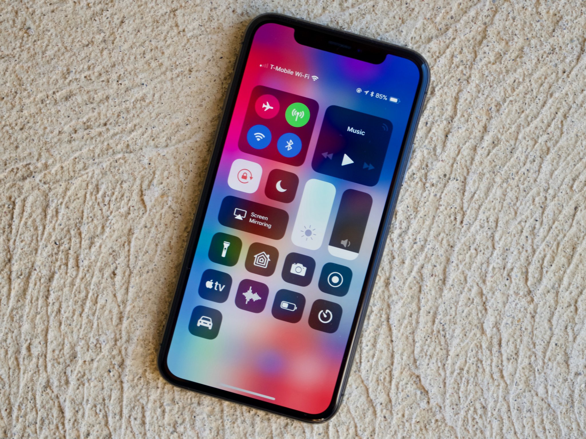
iOS 11 is the best-looking version of Apple's mobile operating system since iOS 7's radical redesign four years ago. Design may well be about how something works, but in an accessibility context, one can rightfully argue how it looks is equally — if not more — important.
This is because the aesthetic of buttons, icons, typography, and the like are crucial details for a visually impaired person. If you have trouble seeing what's on screen, you'll have trouble using your device(s). Different people have different needs and tolerances, but in general, high-contrast interfaces will win the day over lower-contrast designs.
While iOS 7 may have thrown the baby out with the bath water in many aspects, each successive version has moved closer to the mean. That has never been truer than for iOS 11, which has drawn closer than ever. From the giant headers to thicker icons to real buttons, iOS 11 is a triumph of contrast. The look, in my view, combines the best of the iOS 6-era design with the modern sensibilities iOS 7 brought with it in 2013.
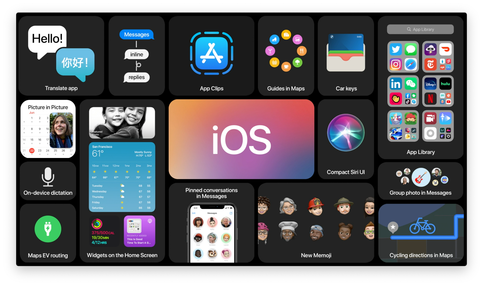
But there's still work to be done — still fruit that Apple can pick from the tree. In iOS 12, I hope Apple builds on the foundation of iOS 11's design strengths. With this sentiment in mind, here are three big things I'd like to see next summer that would make iOS even more visually accessible.
Increase the size of the magnification loupe and insertion point
As a writer, I obviously work with text a lot. One problem with iOS for me is the size of the magnification loupe and insertion point. For editing text, both are simply too small to see comfortably. The loupe's magnification isn't powerful enough, while the insertion point also is too small to find at times.
What I'd love to see Apple do to remedy this is look to macOS, at least for the insertion point. On the Mac, there's an option in System Preferences (Accessibility > Display) to enlarge the size of the mouse pointer. I have mine set at the largest size, and it's wonderful. Never do I have issues finding the mouse. Apple should create an analogous setting in iOS whereby you can adjust the size of the insertion point. It not only would make editing text easier, but it would make the writing process in general easier because the insertion point would be easier to find at, say, the beginning of a new paragraph.
Related to the insertion point is the magnification loupe. When editing text, I find it just isn't strong enough to make the cursor stand out. Like with adjusting the insertion point, a setting for different magnification sizes (like with the macOS Dock) would be extremely helpful in making text more accessible.
Master your iPhone in minutes
iMore offers spot-on advice and guidance from our team of experts, with decades of Apple device experience to lean on. Learn more with iMore!
Bring Safari Reader View to App Store Feature Stories
Yes, the App Store still needs more pervasive Dynamic Type support, but that's not all it could use.
Given Apple's greater focus on editorial content, there are things the company can do to improve the reading experience of stories in the Today tab. In reading several of these articles, one improvement that immediately jumped out to me is adapting Safari's Reader View feature. While the current presentation is good overall—text size is good and photos are laid out nicely—it sure would be nice to have an option to strip an article of ornamentation so one could focus on the words. You could have settings for font type, size, and background—just like in Safari. Reader View is one of my favorite and most-used features on the Mac and iOS, and I believe it can have relevance to the App Store. It would enhance the reading experience, especially for visually impaired users, by taking away any distractions.
Dark Mode, Dark Mode, Dark Mode
Apple has several iOS apps that have dark themes—Clock, Stocks, the App Watch app are a few examples—that a system-wide dark mode option is long overdue. I hoped iOS 11 would include dark mode, but it didn't.
Here's hoping iOS 12 will.
Compare and contrast
I said at the outset of this piece iOS 11 is a triumph of contrast, and it is in many ways. But adding a dark mode would really put things over the top. The contrast and visibility of something like the Apple Watch app is off the charts good. Text and icons pop off the black background, which makes everything much easier to see. Likewise, dark mode on the Mac makes the menu bar infinitely more visually accessible for the same reasons. It's not hard to imagine what a dark mode would do for iOS. I'd switch to it right away, and I anxiously await the day when I can. iOS would be exponentially better for it, for everyone.
Steven is a freelance tech writer who specializes in iOS Accessibility. He also writes at Steven's Blog and co-hosts the @accessibleshow podcast. Lover of sports.


