Three software features I want to see in the 2017 iPad Pro
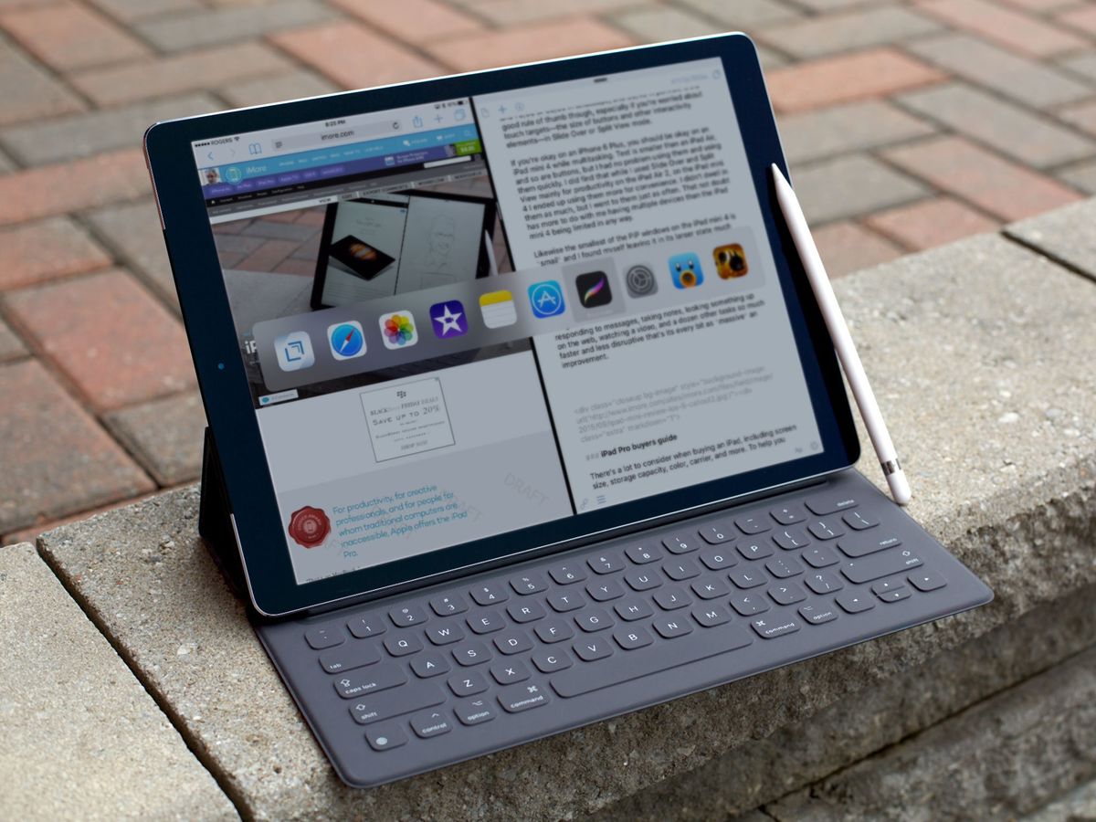
There are several things I want to see from the 2017 iPad Pro hardware. But that's only half the story. The other half is the three software-oriented features I'd like to see Apple add to its "deluxe" tablet lineup this year.
Bring 3D Touch to iPad
My friend and colleague Rene Ritchie tells me 3D Touch is technically a hardware feature because of the sensors needed to measure finger pressure, but I include it here anyway.

I use 3D Touch often on my iPhone. I like the concept that putting varying degrees of force on the screen enables me to do different things. I also like how it makes using iOS a more tactile, more efficient experience. From an accessibility standpoint, 3D Touch is great because the "shortcuts" lessen the need for multiple taps and less searching, which can be troublesome if you're visually impaired and/or have certain fine-motor delays. One example is force-pressing on Messages from the Home screen. It's quicker and easier to jump right into a thread, as opposed to launching the app and searching for the right conversation. I do it all the time, and love it.
Given how much use I get out of 3D Touch on my phone, I miss it on my 12.9" iPad Pro. I want it mostly for Quick Actions on the Home screen because, again, I find the shortcuts extremely handy. Beyond Quick Actions, I can envision a 3D Touch-equipped iPad Pro being useful for, say, dragging and dropping content between apps. One "buzz" when you press to select an item (e.g., a photo) and one "buzz" when you drop it into place. The haptic feedback would act as a secondary cue that you're manipulating an object, which is beneficial for accessibility.
I don't know the engineering challenges of adapting 3D Touch to a display as large as on the Big Pro's. If anything, it makes sense to me Apple would try to move 3D Touch beyond the iPhone.
Make the Text Selection Tools Larger
As a journalist, I work with words every day. Whether for my personal blog or for my job, I spend most of my days working with text in my text editor of choice. Consequently, I spend a lot of time moving the cursor and using Cut, Copy, and Paste.

While the interface for these controls is well-designed in terms of usability, I've long griped about the size of its presentation. Especially on the Big Pro, the cursor and text selection menu aren't very visually accessible. At least in my experience, it's difficult to see the cursor and the text selection labels because of their relatively small size. The cursor is particularly problematic because the magnification of the loupe is nowhere near as powerful as I need. These factors make manipulating text a chore, even on the Big Pro's screen.
Master your iPhone in minutes
iMore offers spot-on advice and guidance from our team of experts, with decades of Apple device experience to lean on. Learn more with iMore!
As such, I'd like to see Apple make the text selection controls larger. It'd be great if the company added a "Resize Cursor" option, similar to what has existed on macOS forever. I would crank that slider up as I do with Dynamic Type. (Making the loupe itself more powerful would also be helpful.) Likewise, I'd like the text selection popover (for Cut, Copy, and Paste, etc) to adopt Dynamic Type, if possible. The white-on-black contrast is terrific; I just need the labels in the menu to be bigger.
Together, these changes would make working with text much easier by alleviating the drudgery inherent to the current system.
More Apps By Apple
The iPad's beginnings, in 2010 and 2011, was a time Apple invested in making creative apps meant to show off what one could do with the device. Apple launched Pages, Numbers, and Keynote with the original iPad in 2010. A year later, GarageBand and iMovie launched with the iPad 2. While these five apps are not necessarily "professional-grade," they nonetheless deliver on the premise that one can actually be productive on iPad.
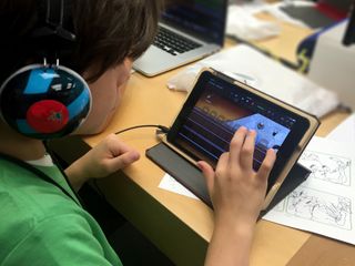
Since the iPad 2, however, Apple hasn't gone back to the well, so to speak. Swift Playgrounds debuted last year, but that's been it for the last several years. I wish Apple would do more here, because I think it's a great opportunity to lead by example. After all, iOS and the iPad belong to Apple; they have the greatest advantage in being able to show customers and developers what's possible on their platform, on their devices.
Put another way, Apple is in the best position to put the pro in the iPad Pro.
A great example of a true "pro" app, albeit not from Apple, is Proloquo2Go by development studio AssistiveWare. It's a communication app for people with limited or no speech, which uses a picture-based system called PECS. (I was trained on how to use PECS when I worked in Pre-K special education classrooms.) The app is used by many teachers, speech and language pathologists, and other education professionals in order to facilitate communication. It's an admittedly niche app, but professionally priced at $249.99. It is one of the best professional-grade apps on iOS today, however unheralded.
There are other high-quality apps on the App Store as well, but I hope Apple doesn't cede this space to third-party developers. The iWork suite, GarageBand, and Swift Playgrounds all are great—feature-rich and well-designed. There are many things iOS needs to improve upon, especially on iPad, but Apple shouldn't forget about apps. As I wrote earlier, the company can lead by example here by inspiring developers. The richer the platform, the richer the experience will be for me and others who have embraced the iPad as Apple's vision for the future of computing.
Steven is a freelance tech writer who specializes in iOS Accessibility. He also writes at Steven's Blog and co-hosts the @accessibleshow podcast. Lover of sports.
