Tweetbot vs. Twitterrific vs. Twitter: iPad twitter app shootout!
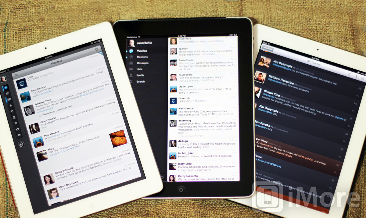
The darling of hardcore iPhone twitter users comes to the iPad, but how does Tweetbot measure up on the big screen compared to Twitterrific and Twitter's own app?
Twitter may not be as big a social network as Facebook, but you can't turn on a television, let alone visit a website, without seeing an endless stream of @usernames and #hashtags. While smartphones are great for Twitter on the go, the iPad is perfect for sitting back and really getting engaged. But which Twitter app for iPad is the best to engage with? Not only do you have Twitterrific, the original iOS Twitter app, but you have Twitter's official Twitter for iPad app, and now you have Tweetbot to consider as well, one of the most popular iPhone Twitter apps, just released for the iPad.
We've often said iOS and Twitter and like chocolate and peanut butter, two great tastes that taste even better together. And it's true. Time after time, platform after platform, the best developers and designers always seem to gravitate towards making Twitter clients, and nothing proves that more than Twitterrific, Twitter, and Tweetbot.
So which one is best, or more importantly, which one is best for you?
Caveats
We're going to be using a lot of Twitter-specific jargon here. If you're not already familiar with Twitter and are reading this as a way to decide which app you should start with, be sure to check out our Twitter and social networking slang dictionary so you can get up to speed on also the latest terms. (Or just skip to the conclusion to find out which one you should get.)
Also, Twitter for iPad is currently still the version that began life as Tweetie for iPad by Loren Brichter of Atebits but was bought and rebranded by Twitter before release. Twitter has since redesigned the iPhone version of Tweetie/Twitter, and we expect will be redesigning the iPad version soon as well. When that happens, the pros and cons listed here will change dramatically, and we'll do an update.
Similarities
Since Twitterrific, Twitter, and Tweetbot are all Twitter apps for iPad, there are a great many similarities. They all have timelines to see the tweets of the people you follow. They all show you mentions, lists, and direct messages. They all let you search and see favorites. They all let you compose new tweets and direct messages. But the way in which they go about doing this varies greatly.
Reading Experience
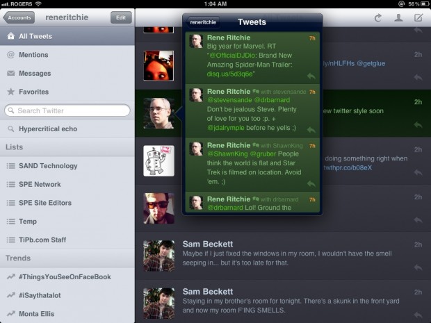
Twitterrific has a combined timeline, so you see all the tweets of the people you follow listed alongside your @mentions and direct messages. You can read @mentions and direct messages as separate lists, but there's no option to separate view just the tweets of the people you follow. The sidebar contains those tabs, as well as search, recent searches, lists, and current trends.
Master your iPhone in minutes
iMore offers spot-on advice and guidance from our team of experts, with decades of Apple device experience to lean on. Learn more with iMore!
Twitterrific makes extensive use of popovers (a combination of popup and dropdown menu that Apple introduced alongside iOS for the iPad), but it can also make you feel boxed in, unable to expand content like pictures and lists to fill the screen. All this makes Twitterrific a good reading experience, but not a highly scalable one.
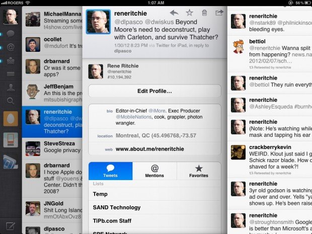
Twitter for iPad uses an almost futuristic feeling, highly table-optimized sliding panel user interface that's also deeply divisive. Some love it, some loathe it. Everything you tap causes a new panel to slide in from the right, layer after layer, and you need to swipe them all away to get back to where you started. You can also pinch to zoom out on a tweet to bring up a user's profile, and pinch to zoom in to fold it away again. Twitter's sidebar contains a list of all your accounts (if you have more than one), and timeline, mentions, messages, lists, your profile, and search are shown for the currently active account. Overall, Twitter manages to feel scalable and spatial, but still simple to some, while annoying and needlessly fancy to others.
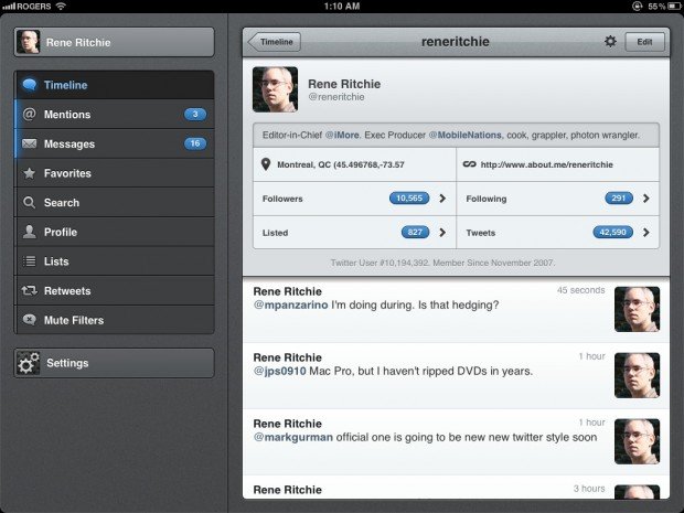
Tweetbot has a charmingly distinct user interface that some adore and others feel is overly loud and heavy. Instead of popovers or sliding panels, Tweetbot simply replaces the main window content with whatever you tapped on, be it timeline, user, or picture. That makes it harder to quickly refer back to something, but also removes a lot of the visual clutter that can otherwise build up. Tweetbot's sidebar presents tabs for timeline, mentions, messages, favorites, search, your profile, lists, retweets, and mute filters (so you can temporarily suppress people, hashtags, and even certain clients and services). The web view also has a toggle to switch between standard and Readability views.
Despite the distinctive design and gesture actions for more advanced users, Tweetbot behaves a lot like a standard iOS-app, making it easily accessible to new users as well.
Writing experience
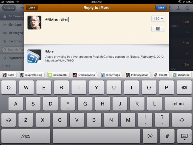
Twitterrific's compose window is unique in that the content persists, even after you close it. If you start typing a tweet, then close it to go do something else, when you tap compose or hit reply again, your text will still be there. (You have to tap the counter and then hit Reset Text to clear it.) There are no auto-complete buttons, but if you type an @ (at) symbol it will start offering username suggestions. If you type a # (hashtag), however, it won't start offering trend suggestions, and you can't change which account you're replying from once you've begun to reply. Also, if you add a picture or video, no thumbnails are shown so if you come back later, you'll need to go to the link if you want to remind yourself what it was.
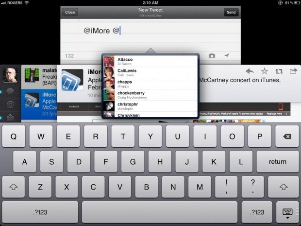
Twitter's compose window can quickly start looking like an unruly stack of papers, one piled atop the other. However, it means you have instant, same-screen access to the contents of your timeline and of any conversations you're joining, which makes checking references while you type a breeze. Twitter supports drafts, and offers auto-complete for both @mentions (which, ironically, brings up a popover in one of the few places Twitterrific does not) and #hashtags. If you add a photo or video with the camera button, you can preview it by tapping the camera button again, and there's a location button to toggle your coordinates on and off as well.
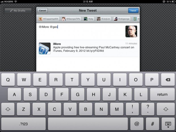
Tweetbot has a clean, clear composition screen but, aside from the tweet you're replying to, you lose out on the ability to reference any other content unless you cancel, save as draft, and come back later which is more cumbersome. There are buttons for auto-completing @mentions and #hashtags, and toggling location, and any photos you add are placed in the menu bar as thumbnails you can tap to view or remove.
Bells and whistles
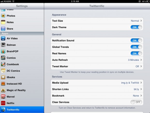
Twitterrific doesn't yet support native iOS Twitter integration, which means you have to authenticate through the web the first time you set it up. (I'm guessing this will be updated in the not-to-distant future). Twitterrific also doesn't support push notifications, which means unless you have email or SMS alerts set up, you won't know if you get any mentions or direct messages until you open the app.
Twitterrific's settings are found in the built-in iOS Settings app, and there you can enable the Dark Theme for night-time use, set up Tweet Marker to sync your timeline position between different clients, like iPhone, iPad, and Mac, and toggle and customize services, including read later (called bookmark) and advanced features like custom media uploads as well.
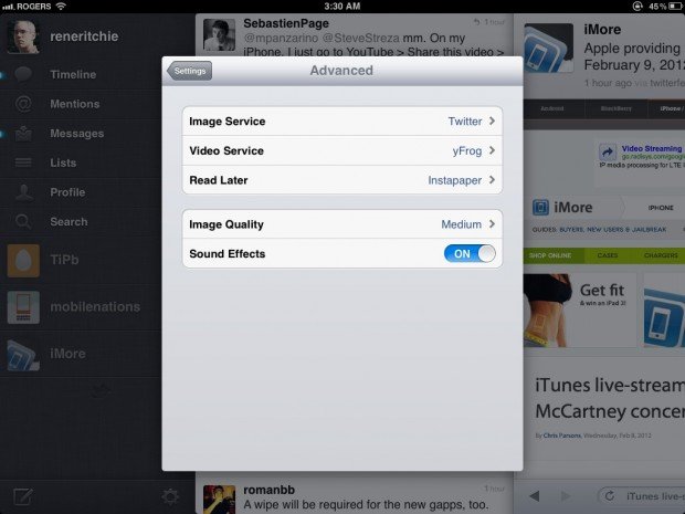
Twitter for iPhone supports native iOS Twitter integration and push notification, but not Tweet Marker. Despite having been on the market for a significant amount of time, it never got all the power features Twitter for iPhone enjoyed, and likely won't given the almost certain redesign in its near future. You do have control over which image, video, and read later services you use. However, there's still no pull-to-refrsh direct messages and while it marks messages as unread, frustratingly, there's still no way to quickly mark them all as unread.
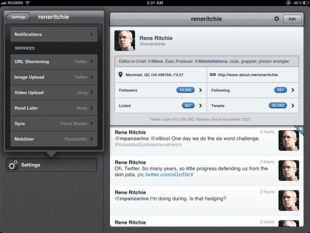
Tweetbot supports a ton of features, including native iOS Twitter integration, push notifications, and Tweet Marker. For notifications, it not only has options for mentions and direct messages, but retweets, favorites, follows, adds to lists, and subscribes to lists. It's almost too many, but they can be mitigated by sleep options that suppress them at night (just pick your start and end times).
You can also customize services, including read later and mobilizer (like Safari's built in Reader feature, but with your choice of provider). Literally, the options threaten to burst out of their popover.
Cost
Twitterrific is free but requires a $4.99 in-app purchase to turn off ads and turn on tweet translation and multiple account support. A universal binary, it supports both iPad and iPhone.
Twitter for iPad is free and also universal for iPad and iPhone.
Tweetbot is $2.99. It's not universal so the iPhone version will cost you another $2.99.
Conclusion
That part about there being an embarrassment of riches when it comes to iPad Twitter apps wasn't fluff or filler -- it was truth. Twitterrific, Twitter, and Tweetbot each come from brilliant designers and developers with sometimes very different visions for what the ideal Twitter app entails.
Twitterrific is great for new users who want a simple, stable experience, where everything is easy to find, and often all in one place. It doesn't have as many features, and lack of push notifications might be a show-stopper for some, but those who have been using it since the beginning and like the way it works and syncs consistently across iOS and OS X will also do well to stick with it.
Twitter for iPad, in its current form, is great for those who want fast access to literally layer upon layer of information. It's an audacious, inspired interface that's likely going to be replaced with something much more like the Twitter.com website, which also makes it very difficult to recommend to anyone who isn't already using it.
Tweetbot might feel over-designed to some, but it's well-designed. It has a ton of features for power users, including the best push-notification implementation in the business. As far as general purpose Twitter apps go, Tweetbot hits the best balance for the widest range of our readers.
Twitterrific could update any time now, and Twitter for iPad will be going through a substantial change soon, but as of right now, if the $2.99 price tag -- less than the cost of a fancy coffee, mind you -- doesn't give you pause, Tweetbot should be your go-to Twitter app for iPad.
- Twitterrific - Download now
- Twitter - Download now
- Tweetbot - Download now

Rene Ritchie is one of the most respected Apple analysts in the business, reaching a combined audience of over 40 million readers a month. His YouTube channel, Vector, has over 90 thousand subscribers and 14 million views and his podcasts, including Debug, have been downloaded over 20 million times. He also regularly co-hosts MacBreak Weekly for the TWiT network and co-hosted CES Live! and Talk Mobile. Based in Montreal, Rene is a former director of product marketing, web developer, and graphic designer. He's authored several books and appeared on numerous television and radio segments to discuss Apple and the technology industry. When not working, he likes to cook, grapple, and spend time with his friends and family.
