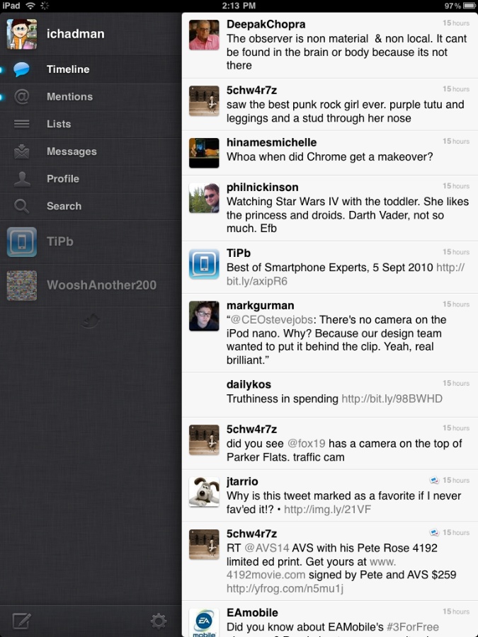
There is a lot of debate out there about Twitter's new official universal binary app for iPhone/iPad. The iPad update brings an all new interface to the iPad. What's new? What's great? What's not so great? Let's start at the beginning...
Interface
Twitter for iPad brings a new and unique redesign to the Twitter experience that we know and love on the iPhone. Immediately after signing into the application I noticed something that looked, well, odd. The screen was split about 40/60 in portrait mode. Most other Twitter applications I have used took the full screen in portrait. So, I began my usual scrolling through the timeline and all seemed well and good. The familiar release to refresh was there and everything.
Next I proceeded to tap a tweet. Boom. This is where my Twitter world turned upside down. Next thing I know there is a flurry of screen animations and I am presented with a tweet partially overlapping the timeline! What's going on here?
Article continues belowWhat Twitter and company have done is create a snazzy way to view your tweets. This is how it works:
- Tap a tweet with no replies- You see the tweet as well as the user profile of the user
- Tap a tweet with replies- You see the conversation
- Tap a tweet with a link- Take you directly to the webpage
When these actions above happen, everything, I mean everything become stacked. The profile stacks on top top of the tweet, which stacks on top of the timeline, etc. When you are done viewing, say the profile of a user or tweet, swipe it off to the right and you are taken back to your timeline view. I find this interface to be quite fun. Twitter has also found a couple of fun additional interface functions too. If you see an "@" reply in your timeline, place too fingers on the tweet and scroll down. This will display the conversation without selecting it. Want to see a profile? Pinch and zoom out to literally fold open the user profile; do it slowly to get the full effect. You have your standard fanfare for reply, reply all, favorites, retweet, retweet with quote, translate, email tweet, copy tweet and Instapaper. If you have multiple accounts, it couldn't be easier to switch accounts. All of your accounts appear on the left side of the screen with an icon. Tap the icon to switch accounts, it couldn't be easier.
Compose/Replies/Direct Messages
If you want to compose a tweet, tap the compose icon in the lower left. This makes the compose window appear above the timeline. The keyboard pops up from the bottom and you can start to type. You can add media, geotag and shrink URLs from here. But what is missing? A couple things. For starters you don't have username look up. That is just crazy. Second you don't have hashtag lookup either. Again, crazy. There is room on the screen for them, but I can only assume they have not made it into this build (but for all I know they are hiding somewhere with some sort of crazy finger flick I haven't found yet.)
When composing direct messages, again you don't have the username lookup function so composing can be troublesome. You can use the standard Twitter syntax of course, but to be honest I have become dependent on many of the conveniences Twitter applications provide, such as this.
iMore offers spot-on advice and guidance from our team of experts, with decades of Apple device experience to lean on. Learn more with iMore!
Lists
One of the biggest features to come out of Twitter in recent months is the List feature. I use Lists to separate out my tweets from news to people and so on. One of the typical workflows I have when on the go when I use competitive products to this official Twitter app is to add the person I follow immediately to a list. Sadly, any list management features are completely gone from this version of Twitter for iPad. You can view your lists, view others' list but no editing, subscribing or adding users from this app.
There are some other things to discuss like options, Instapaper support and more, but the key things I feel people care about is what is the experience like. I really enjoy the experience. it is fresh and fun. In this reviewers opinion it does for Twitter what Reeder did for RSS. However, there are plenty of folks who are not as much of a fan (including our own Rene Ritchie, he just wants to swipe those panels away!).
Should you download Twitter for iPad? Most definitely, afterall it's free. I think that it breaks new ground and I enjoy what Twitter is trying to do. Will you like it? That is the question.
[Free- iTunes Link]

Pros
- Easy account switching
- Selected tweets stay on screen
- Peek at a profile (pinching)
- Two finger scroll in timeline to view replies
Cons
- When composing, no saved hashtags
- Tweet "breaks" don't scroll to oldest tweet first
- Missing features
- No user list management
- No Username Search
- No export to address book
- No Saved hastags
[gallery link="file" columns="2"]
Software trainer, blogger and mobile technology enthusiast living in the suburban Midwest.

