Earlier today Twitter launched a new service and app named Vine. It was a purchase rather than something homegrown, and sits mostly on its own. I'd be tempted to explain the relationship of Twitter and Vine in similar terms to Facebook and Instagram, but frankly Vine is nowhere nearly as good yet.
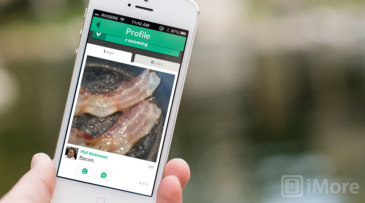
Phil Nickinson from Android Central has already shared his thoughts on Vine. Here are mine.
The idea behind Vine has a lot of potential. You get to easily make concise video clips and just as easily share them with your friends. It's the implementation where Vine falls all over itself. To go back to Instagram, Vine took the square format but didn't take any of the user experience lessons.
It's almost as though Vine has gone out of its way to make the app and the service less compelling to use. It starts with sign-in. The process isn't bad, and you can sign in with Twitter, but it's just a little more cumbersome than it ought to be. The existing Vine system was bought but the integration not improved.

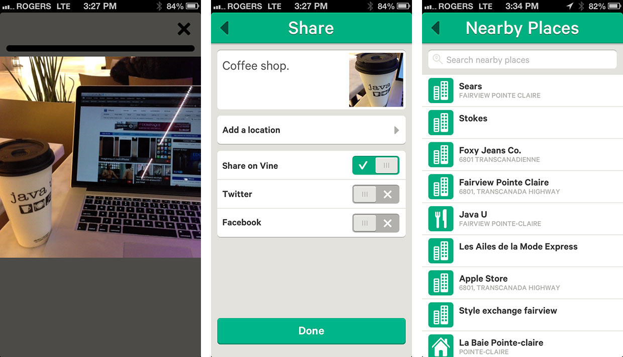
To take a video, tap the Camera button at the top right. Then touch the screen to start recording. To pause, you stop touching. There's no simple record/stop button like on the built-in Camera app, or on real video cameras. And... I'm not sure about it yet. If you're going to replace something so default, so well understood, so instantly discoverable, you have to do it with something far, far, better. This doesn't seem much, if any better. Sure, it's fast to touch/untouch, but it's also fiddly and more error prone than a simple switch.
You can't change to the front facing camera, making self-video, one of the hallmarks of quick internet sharing services, awkward and painful to shoot. Likewise, you can't upload existing video, so you can't even use the built-in Camara app to take self-video. And you can't share moments you've captured using apps outside of Vine, which is absolutely table-stakes for a social sharing app.
The square aspect ratio video gets stored in your Camera Roll, which Vine then needs permission to access. (Along with Location permission, Twitter permission, push notification permission, and various other permissions, so be sure to properly stretch out your "OK" tapping finger before you begin.)
Once the video is recorded, you can share it. But if you do, it's public. No protected accounts like on Twitter. Once it's out, it's out for the whole wide world. Vine is rated 12+, and given the 500px app getting rejected for "pornography", both Twitter and Apple are likely monitoring it carefully. Still, be aware and conduct yourself accordingly. No reason to lose that big job in 10 years just because you Vine'd your nethers in ought 13.

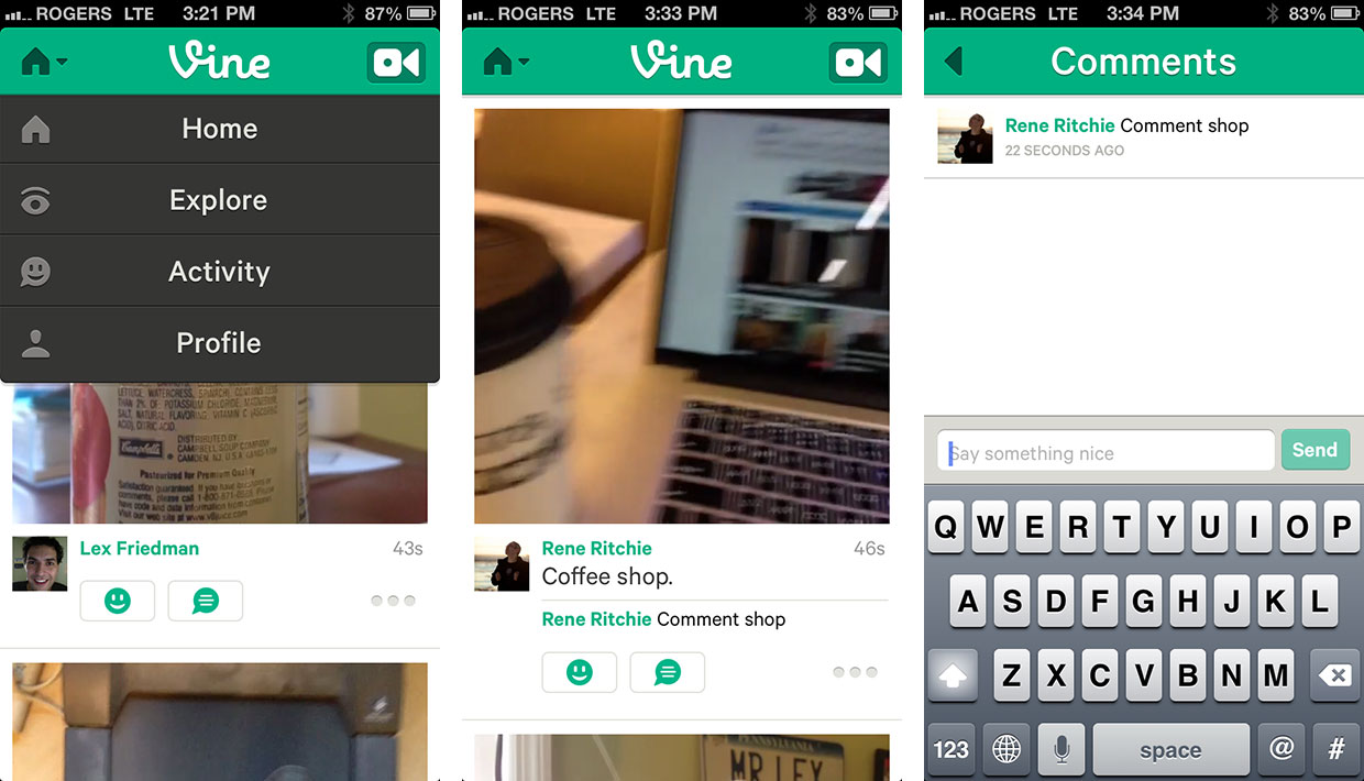
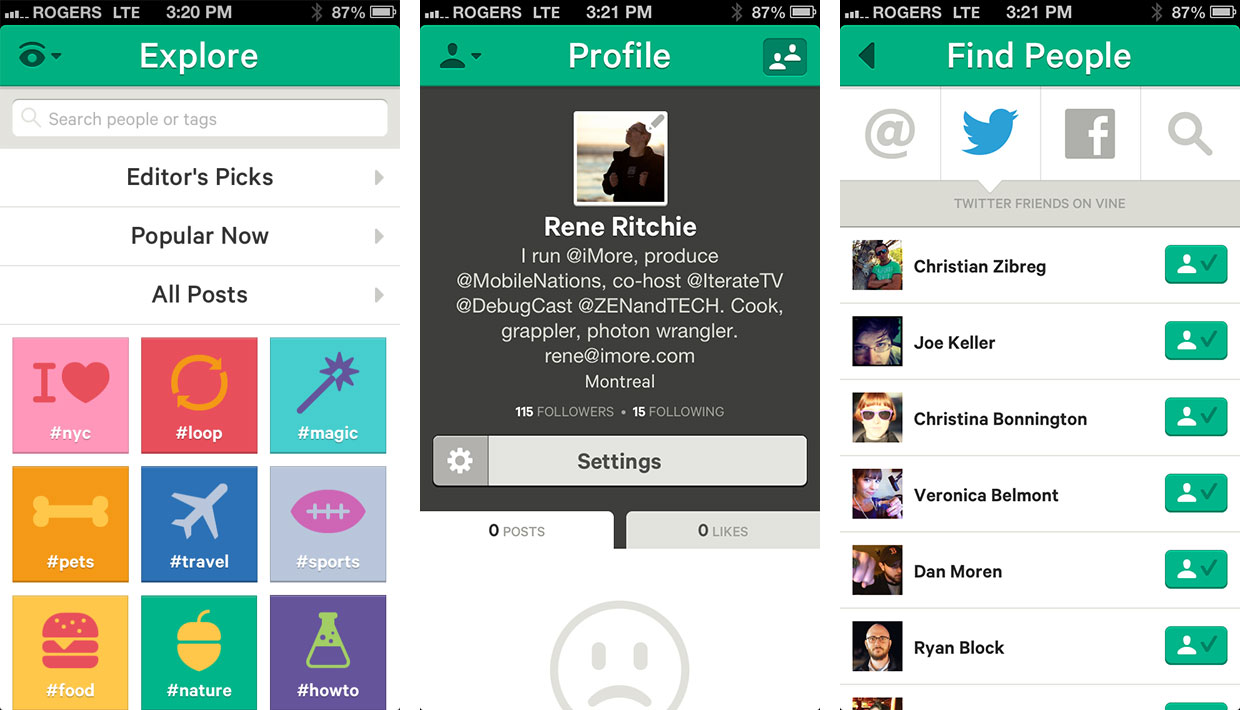
You can view videos in the timeline, called Home. They auto-play the moment you scroll down enough for them to fit on the screen. Tap to pause. Tap to keep playing. You can like videos with a smiley face or add a comment. There also an Explore section where you can find recommended videos, sorted by Editor's Picks, Popular Now, All Posts, or by #hastags, represented by big square icons.
Activity shows likes, comments, and follows. And Profile shows your info and videos. You can access Settings from here, and also Find People. You should be able to find and follow friends you have on Twitter, Facebook, and in your contacts on Vine, but it wasn't working for me, returning only a few results and forcing me to search and add people manually. Worse still, we've gotten some reports of user account mix up and cross-posts, which is a huge bug and needs to be fixed and now.

The server side stuff can be quickly and easily fixed, however. The user experience choices will likely require a major redesign, and that takes time. Twitter has some fantastic designers and coders on their team, so hopefully the acquisition not only gives them great underlying video technology, but gives the Vine team resources to make a better app.
Make the Twitter integration absolutely transparent. If I use Twitter, I can use Vine just by logging in. All my Twitter follows are just there. Let me switch cameras between rear- and front-facing. Let me upload videos I've already shot. Give me a real shutter button and make the gesture a shortcut, not the main control. Use Twitter conventions, like the same tabs with the same names along the bottom. Consistency is usability. Take a look at what really works in Instagram and Twitter and use that. Make it great.
For now, Vine is interesting but nowhere nearly fully cooked yet. I won't be spending any time with it until 1.x or 2.0 is released, but I will be coming back to take another look as soon as they are.
Don't forget to read Phil's piece on Android Central and watch his video, below. If you've tried Vine, let me know your thoughts as well.
- Free - Download Now

Rene Ritchie is one of the most respected Apple analysts in the business, reaching a combined audience of over 40 million readers a month. His YouTube channel, Vector, has over 90 thousand subscribers and 14 million views and his podcasts, including Debug, have been downloaded over 20 million times. He also regularly co-hosts MacBreak Weekly for the TWiT network and co-hosted CES Live! and Talk Mobile. Based in Montreal, Rene is a former director of product marketing, web developer, and graphic designer. He's authored several books and appeared on numerous television and radio segments to discuss Apple and the technology industry. When not working, he likes to cook, grapple, and spend time with his friends and family.

