Understanding Apple Music
Some people whose opinions I could not value more highly have wondered out loud why Apple Music, the new Music app for iOS, and latest version of iTunes on the Mac turned out the way that they did. I've not spoken to anyone at Apple about the development process but I've spent years trying to understand the company, have a background in design and product marketing, and been thinking about exactly this. A lot.
Apple's DNA
When Tim Cook said Apple loves music and that music was in the company's DNA, he meant it. Music isn't a significant business for Apple. It's practically nothing when compared to the iPhone and other devices and the movement from purchasing to streaming will only lessen its impact.
Having an integrated music service does make the overall ecosystem more valuable for owners of Apple devices, but nowhere nearly as much as it did back in the glory days of the iPod. And nowhere nearly as much as something like the App Store does today.
If Apple didn't love music, if the company didn't consider it a point of pride from those glory days, they could likely wind it down with little or no impact to their bottom line.
But one look at how much of the company's resources Apple has poured into the new music project—from the very top level executives to the usually very tightly held purse strings—should show everyone just how important it remains to them.
There are a lot of other services that could have used the attention and resources, but it went to music.
One complete thought
Likewise, when Jimmy Iovine said he approached Tim Cook and Eddy Cue with the idea of building "one complete thought around music", I also believe he meant it. During his presentation at WWDC, Iovine showed the status of music on iOS today—a myriad of different apps used for streaming music, watching videos, and following the artists who make the music and videos. Iovine didn't even include the music purchasing services, internet radio services, or music locker services.
Master your iPhone in minutes
iMore offers spot-on advice and guidance from our team of experts, with decades of Apple device experience to lean on. Learn more with iMore!
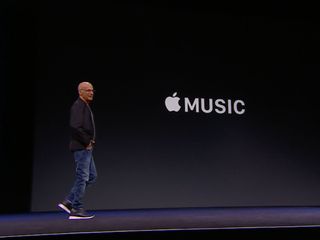
If you were in iTunes and wanted to stream music you hadn't bought, you were out of luck. If you were streaming music and wanted to see the video, you were out of luck. If you were listening to internet radio and wanted to add a song to your music locker, you were out of luck. If you were watching a video and wanted to check the artist's social feed, you were out of luck. At best some services would partner with others and provide links, so you could switch apps and do something else, and then try to find your way back. At worse, you had to figure it all out on your own.
The fragmentation Iovine mentioned was, from his point of view and likely the points of view of many other people, a clear and present problem in need of solving. And the solution he proposed was fusing it all together.
Paved with good intentions
So, if we take Apple at its word—and historically that's been something we can safely do—the company really wanted to make a modern, integrated music service. Even if we don't take Apple at its word, that's a very Apple thing to want to do, and a very Apple way to want to do it.
Could those goals have been realized if Apple had removed some of the functionality from the service, or if Apple had split it up across two or more apps? Let's take a look.
The tabs
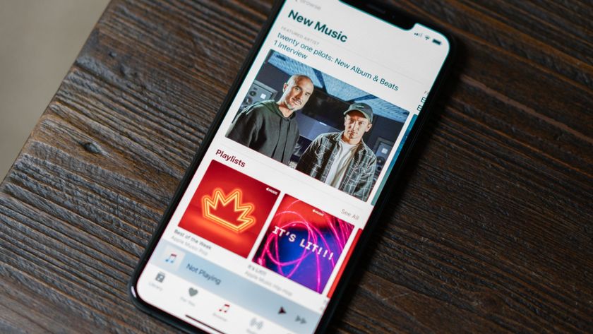
The new Music app, like the old, is laid out in a series of tabs. For You is the new recommendation engine. It's a place for you to discover music, new and old, that the Apple Music service thinks you'd enjoy listening to. It replaced Genius Recommendations, and is similar in concept to the suggested media or recommendation pages of many other streaming apps.
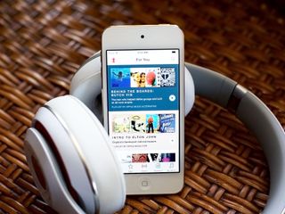
Putting it in a separate app would mean any time you wanted to hear one of the suggestions, you'd have to switch back to the Music app to play it and, any time you were listening to music and wanted a suggestion, you'd have to switch to the For You app to get it.
New is just what it says—all the latest music that's been added to the service. It's similar to the new releases or recently added sections of other streaming apps.
Personally, I would have preferred it if New was combined with For You as a single repository of everything "new for me" whether it was chronologically new or just content not already in my collection. If I can top-tab between Library and Playlists in My Music, I can certainly top-tab between New Releases and Recommended in For You.
Putting it in the iTunes Store app, where Featured already shows new music, might sound like a good idea but really isn't. Not only is the iTunes catalog different than the Apple Music catalog, and iTunes is for buying where Apple Music is for streaming, but you'd again have to switch apps back and forth every time you wanted to play or discover anything. It's how the iTunes App and Music used to work before iOS 8.4 and it wasn't seamless.
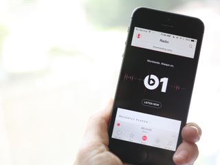
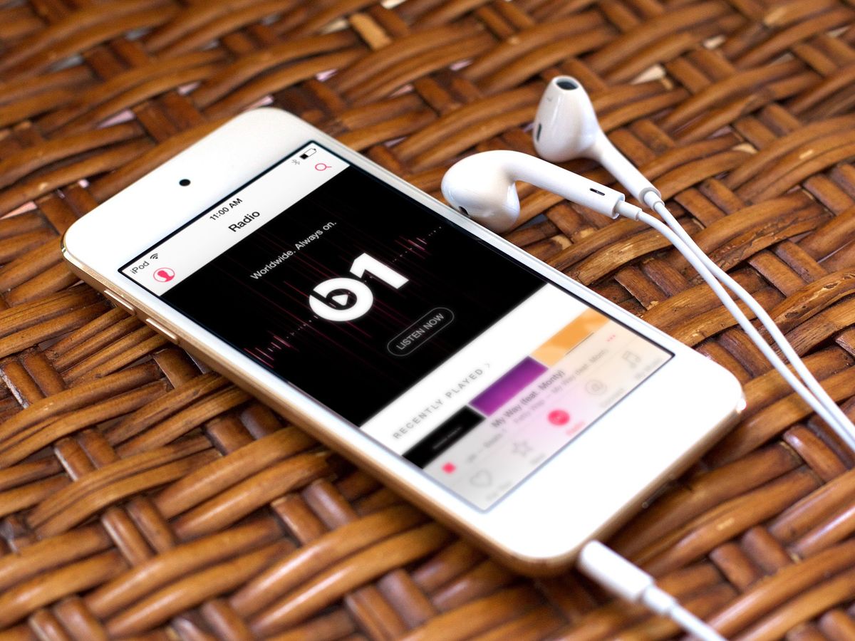
Radio, which houses both Beats 1 and the multitude of other Apple Music stations is perhaps the tab that could best survive as its own, distinct Apple Radio app. You'd still have the inconvenience of having to switch back and forth between the two apps, but not as much as the other tabs.
Fewer people might use or remember to check out a separate app, though, and if pop-up reminders tried to prompt people even about important shows or releases in one app about the other, it probably wouldn't go over well. Casual exploration and discovery, in other words, would take a hit.
Connect, the new social network for artists to share rough cuts, lyrics, backstage footage, play lists, and similar content with fans, might be another good candidate for a stand alone app. Twitter, Facebook, Instagram, Pinterest, and a bevy of other social networks are stand alone apps. Hell, the Facebook and Twitter apps have been spewing off separate binaries of their own for several years now.
Yet Connect, as currently implemented, isn't designed to be stand-alone. It's designed as yet another doorway into new and interesting content for you to discover within Apple Music. So, once again, it would be annoying to have to switch between apps every time you wanted to follow an artist, see what an artist you follow is doing, or start playing the content an artist has shared.
iOS 9 backlinks could mitigate some of that, but it would still degrade the intended experience—just like selling booklets and sleeve notes separate from an LP would have been back in the days of the album. It would also hurt casual exploration and discovery as well.
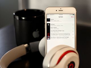
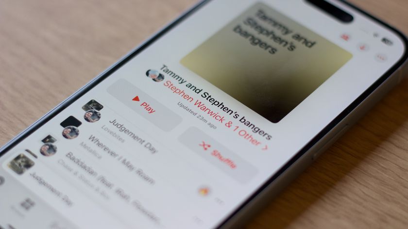
My Music is all the music you've bought from iTunes, synced over iTunes Match, or added (bookmarked) or downloaded (cached) from Apple Music. All in one big list. Could Apple Music be a separate app? Perhaps, but then you'd have to remember where a certain song was located—in your library in the Music app or in your library in the Apple Music app.
The idea of one thought around music is that you shouldn't have to care, manage, hunt down, organize, or otherwise deal with fragmented music. You should just be able to play any music you want, any time you want, regardless of whether you own it or not.
Separate your music from Apple Music, and any song you have that isn't on Apple Music can no longer be part of your playlists or queues. Separate Apple Music from your music and the same happens with any music you don't own.
The services
Instead of separating by tabs, could Apple have separated by service? It becomes much the same. If you have separate apps for purchased music (iTunes Music), streaming music (Apple Music), music locker (iTunes Match), radio (Beats 1), recommendations (Genius), and social (Connect), then instead of people simply being able to play any song, they have to remember first where that song lives. Instead of being able to tap around and discover what they want to play next, they'd be stuck in one app or constantly being switched between several.
You'd lose the ability to have a unified view of all the music you've added, to be shown more like it, to quickly find and add more, and to just listen to what's playing, all in one place.
The More button
The More button (looks like •••) is probably the poster child for Music complexity. Tap it and you get options for Playlists and Up Next, Adding and Downloading, Stations and Sharing. The More button has been around, in tab form, since the advent of the Music app. Now, however, it's accused of being the new Menu/Hamburger button (looks like ☰), and its pop-up lists the new sidebars overstuffed with options.
It's a tough problem to solve though. Typically you reduce interface clutter by reducing options. For example, do we really need Playlists and Up Next and Stations? If Apple tried to be opinionated here and decided on Playlists only, or decided to ditch Stations, significant amounts of people who prefer one over the others, or use all of them differently, would be just as unhappy as those who currently dislike the complexity.
Likewise, get rid of Add to Library or Download for Offline, and people would no longer be able to easily find the content they love most, or listen to it when there's no internet connection. And they'd be just as mad.
That leaves better design as the solution. Apple's already doing that in iOS 9, which has simpler, saner, better visually organized popups in many cases. There are still times when there are too many options, but it's an improvement and hopefully the first of many.
Only Apple
Apple is ambitious. The company tries to solve big problems in big ways. They swing for the stars. That's how you hit a lot of home runs, but it's also how you get some spectacular misses. Apple Music is no different, and it's truly to early to say which one it'll be yet.
I believe everyone at Apple, from Tim Cook to Eddy Cue to Jimmy Iovine, to all the vice-presidents and directors, and engineers and designers, went into Apple Music with the best of intentions. I believe they wanted to make a great service. Every choice they made is understandable if you consider it within the context of the stated goal: "One complete thought"—an app where all music services, from purchases to streams, radio to lockers, social to recommendations, all meet.
Whether it's the right idea and the right implementation of the idea is something Apple still needs to prove. Beyond bug fixes, beyond the critical need for better personal data protection and more timely documentation and explanations, Apple needs to prove Music something that's better than what came before, and better than the sum of its parts.
I believe Apple Music is a totally customer-centric, totally experience driven project at Apple. But the company still has to prove it's the right one.
Note: I didn't address iTunes on Mac here because it's problems, frankly, go far beyond Apple Music. iTunes carries over a decade of dependencies for Apple, for content makers, and for customers. Simply stating Apple "should or "must" scrap it and start over is fair from an "it's Apple's job to fix things!" perspective, but is less than helpful in providing scope or setting timeline expectation.*
Updating the aging iTunes Store backend, with its billions of transactions, hundreds of millions of accounts, and hundreds of thousands of vendors, is a massive undertaking all by itself. Figuring out Windows compatibility, tethered device management, and customer-facing complexity are also non-trivial. Hopefully Apple's already working on what comes next, back end and front, and will be rolling it out over time. New app(s), though, are literally just the tip of that iceberg.

Rene Ritchie is one of the most respected Apple analysts in the business, reaching a combined audience of over 40 million readers a month. His YouTube channel, Vector, has over 90 thousand subscribers and 14 million views and his podcasts, including Debug, have been downloaded over 20 million times. He also regularly co-hosts MacBreak Weekly for the TWiT network and co-hosted CES Live! and Talk Mobile. Based in Montreal, Rene is a former director of product marketing, web developer, and graphic designer. He's authored several books and appeared on numerous television and radio segments to discuss Apple and the technology industry. When not working, he likes to cook, grapple, and spend time with his friends and family.
