Wall Street vs. sanity: Painting a clearer picture of AAPL

In the few days that have passed since Apple’s latest quarterly results, people can’t seem to stop writing about the so-called stalled growth and “margin collapse” that hit the company. Ok, the term “collapse” is excessively stupid (you know who you are, stop it). Apple’s revenue is still growing, but profitability is down year over year. The profit decline is due to undeniably lower gross margin. But what does that mean?
If you look at a the last 5 quarters and put it in graph form, it looks ugly. It looks scary. It makes you wonder why anyone would own the stock. And looking at 5 quarters is a pretty typical thing to do on Wall Street. People think of this as a longer term view of things, as crazy as that sounds. Apple just reported Q2, so looking at 5 quarters means you see Q2 from last year on the left, and Q2 from this year on the right.
Newsflash: Looking at a year over year comparison in isolation doesn’t paint a very clear picture of what’s really happening. And because Wall Street suffers from attention deficit disorder, it needs to form rapid-fire decisions on things.
Most analysts do not publish long term performance charts in their reports. I don’t know why, but it’s true. Sure, they all have the data in their models. They probably all have long term charts built in Excel, but they don’t get published.
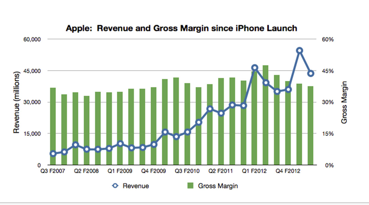
Well, I’m publishing the one I keep in my model.

This chart goes back to Q3 2007, which is the first quarter of iPhone shipments. I could have gone back further, but I don’t think it would be as relevant because the business truly has changed ever since iOS was built.
So in blue we have a line graph representing revenue. You can see that it took a while for the iPhone to make a massive impact on the overall revenue, but in 2010 things just started to rocket upwards.
Master your iPhone in minutes
iMore offers spot-on advice and guidance from our team of experts, with decades of Apple device experience to lean on. Learn more with iMore!
Then in the last two years, you can see that the holiday quarter has stood out as massively important. There have been two such holiday quarters so far, and they define the new peaks for revenue. In other words, Apple revenue has become much more seasonal. This means the quarters in between the seasonal peaks are less important. They are not unimportant. They are just less important.
Think of it this way. When you watch a storm build in the ocean, you can see each wave becoming bigger, crashing harder onto the beach. It doesn’t make a lot of sense to evaluate each wave on it’s way down. It makes a lot more sense to think about how high each wave crest goes. And right now, Wall Street is looking at a falling wave. Revenue could easily rocket higher again. China Mobile deal? Potentially a less expensive iPhone? Continued growth of the iPad, where sales nearly doubled year-over-year?
Now let’s look at gross margin, because this is what really has Wall Street bothered. I showed margin on the green bar chart, because somehow it just seemed easier to look at in bar format.
Apple had gross margin above 40% for 8 quarters since the iPhone launch. And a full 6 of these quarters were consecutive, from the March 2011 through to June 2012 quarter. For rear-view-mirror observers, it’s horrible to see that the gross margin peak happened in March 2012, which is the year ago quarter relative to this week’s earnings report.
But Apple does not have a history of margins above 40%. The mid to high 30% range is much more common, and it seems the company is moving back into that zone. Yes, the iPhone has higher margin than the Mac or even iPad. And that’s great. But I think we all realize that Apple can’t continue to gain global market share with a product that is out of reach for most global consumers.
So Apple has done the smart thing. They’ve taken more aggressive action on the iPhone 4 in places like China. It’s quite obvious that this makes the year-over-year margin comparison look like a case of Apple failure. But if you zoom out and look at the bigger picture, the margin moves really don’t look that shocking. If anything, it’s shocking to see how bloody high they climbed in the first place. This seems more sustainable.
And what if Apple had been more aggressive on pricing in the first place? The margin never would have climbed so high, and last year’s Q2 quarter never would have been as insanely profitable as it was. And we’d be looking at the most recent Q2 result saying, “Wow, Apple keeps growing. Amazing!”
The stock market is all about comparisons. And unfortunately, the comparisons are fairly short term in nature. But even the “fast moving” (I use that term loosely) technology sector requires a longer time frame for analysis. Apple did not build its iOS empire in a year, or even two years. Android did not grow to dominate the scene in a couple of years either. BlackBerry did not collapse in a year (and it’s potential comeback will not take one year). Things still move a lot more slowly than we all seem to think.
Apple is growing quite nicely. And if gross margin normalizes here, which seems reasonable, then next year we’ll be looking at a growth stock again. Everyone will forget about the supposed gross margin “collapse” that we apparently just witnessed.
Since I happen to have my DSLR camera beside me right now, this metaphor seems appropriate. You don’t need to constantly take pictures with your telephoto lens set to 300mm. Sometimes the wide angle shot is better, and provides more context.
Former sell side analyst, out-of-box thinker, consultant, entrepreneur. Interests: Wife & kids, tech, NLP, fitness, travel, investing, 4HWW.

