watchOS 3 review: A big roll in the right direction
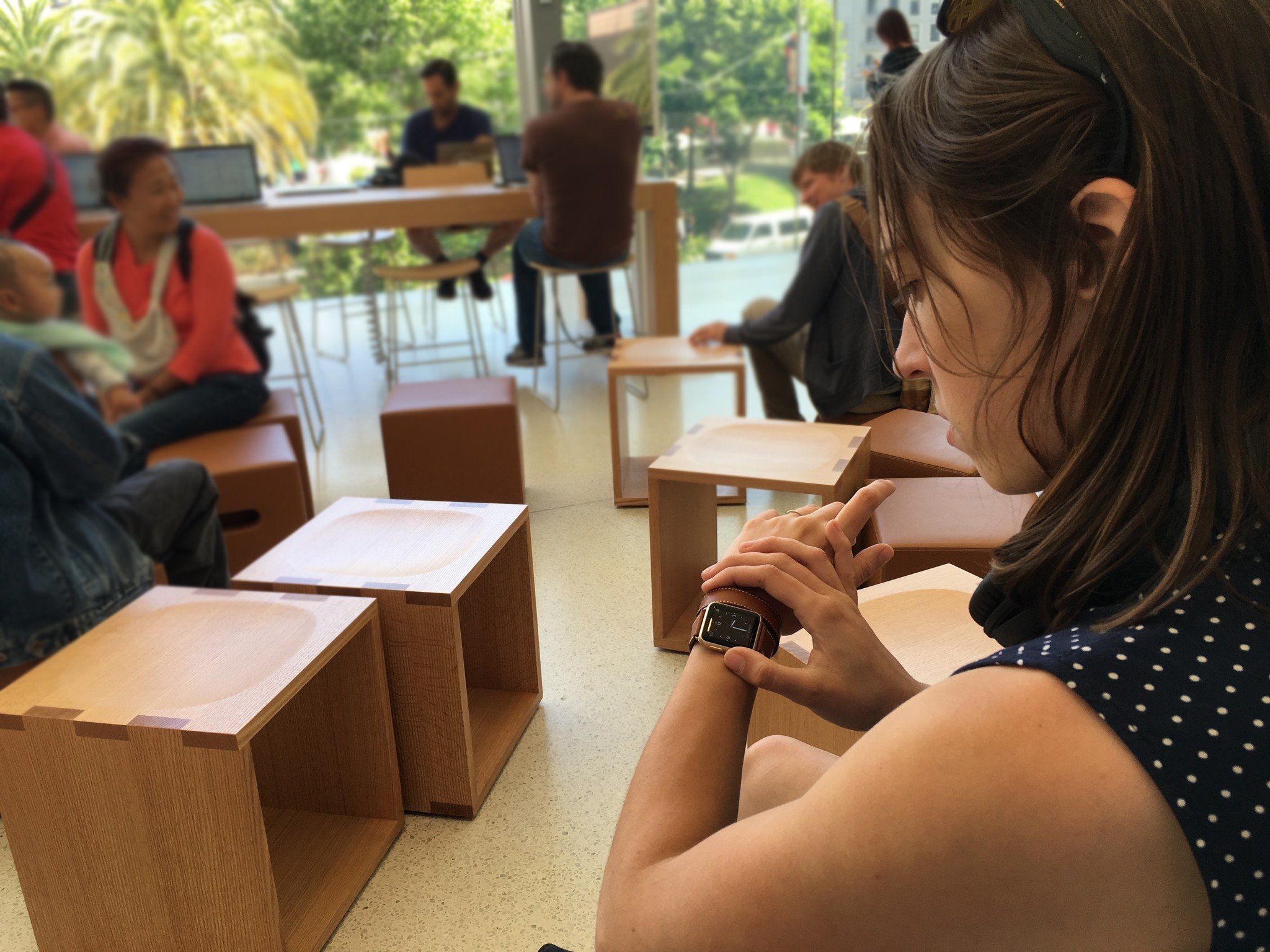
This fall, the Apple Watch celebrated a strange sort of milestone: Two years prior, it was previewed before an audience of thousands inside the Flint Center — the same stage where the Macintosh made its debut.
That preview focused on three goals for Apple Watch: making it a great digital timepiece, communicator, and health tracker. Though the device wouldn't ship for another 6 months, these goals helped create what we now know as watchOS.
This fall, we've seen the culmination of those goals in watchOS 3. It's a rethinking of the Apple Watch's software, all while staying true to those goals: Previously prominent features have been hidden — or, in the case of the Friends circle, vanished entirely. The Apple Watch's physical buttons and touch interactions have been refactored and focused. And Health has taken an even more prominent place on your wrist.
Now that watchOS 3 is available, what's all the fuss about? Read on.
In brief
The Apple Watch software team has been busy: watchOS 3 is the third major operating system release in the 15 months since the Apple Watch's debut. And while the previous two watchOS versions may not have ever had the designation "beta," they sure feel like it when compared to watchOS 3: The operating system makes my year-and-a-half-old Apple Watch feel brand new.
Though watchOS 3 doesn't have iOS 10's giant list of new features, it's still a pretty impressive improvement. Apple has listened to its customers and made substantial changes to the way users interact with the Watch. The company's new goal is an average of 2 seconds or less per interaction: No more holding your wrist up while you wait for an app to open, secretly wishing you'd done more arm work in the gym.
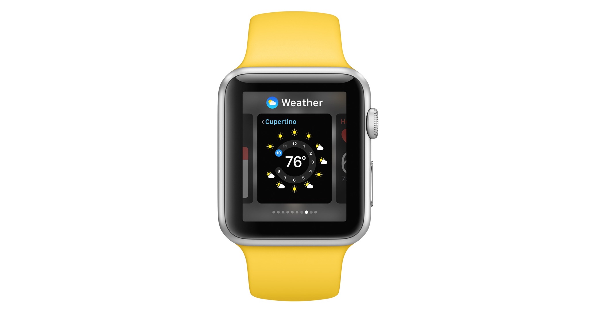
The app carousel, heavily promoted in the first release of watchOS, is all but gone. It still exists — there's been no Home screen reinvention on any of Apple's mobile platforms — but the likelihood of ever seeing it on your Apple Watch has diminished to near-zero with watchOS 3.
Master your iPhone in minutes
iMore offers spot-on advice and guidance from our team of experts, with decades of Apple device experience to lean on. Learn more with iMore!
Instead of the Carousel, you now launch apps from complications and the new Dock, which replaces the Friends screen and Glances in one fell swoop. You can save a number of apps inside your Dock for easy access, and the most recently launched app displays at the end of your Dock list for easy access — or Dock addition.
Apple, too, has embraced the idea that users should have more than one watch face: You can now swipe edge-to-edge between your saved watch faces, each with their own custom complications — including a new Extra-Large face and super-sized complication that may be the closest thing we get to fully-customizable watch faces until watchOS 4.
Between complication launching, Dock glances, and Siri, you may find — like me — that you never press the Digital Crown to see the Carousel again.
And that's good, because apps linked to your active watch face and Dock launch the way they should have from the start. If apps haven't been updated to watchOS 3, there's still a little awkward wrist-holding while your third-party app of choice spins up before launch, but it's far less aggravating. And apps with watchOS's new background refresh technology embedded launch up to seven times faster than their watchOS 2 compatriots. Dock apps, for me, have become an instant experience — launch and go. Authy, which was for a long time unusable on the watch, is now a daily experience.
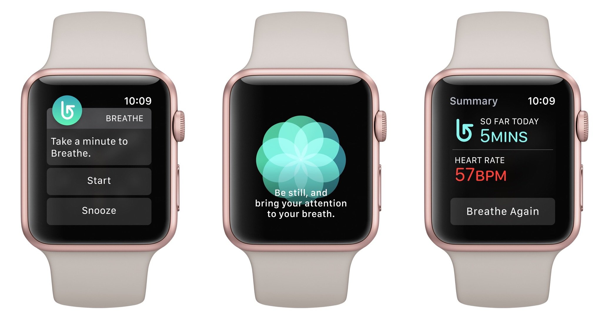
Several of the Apple Watch default apps have gotten facelifts, along with new apps for Reminders, Find Friends, Breathe, and Home. The latter two are entirely new to iOS and watchOS alike: Breathe helps you practice stress-relieving full breathing throughout the day, while Home gives users a button-based way of interacting with their HomeKit accessories.
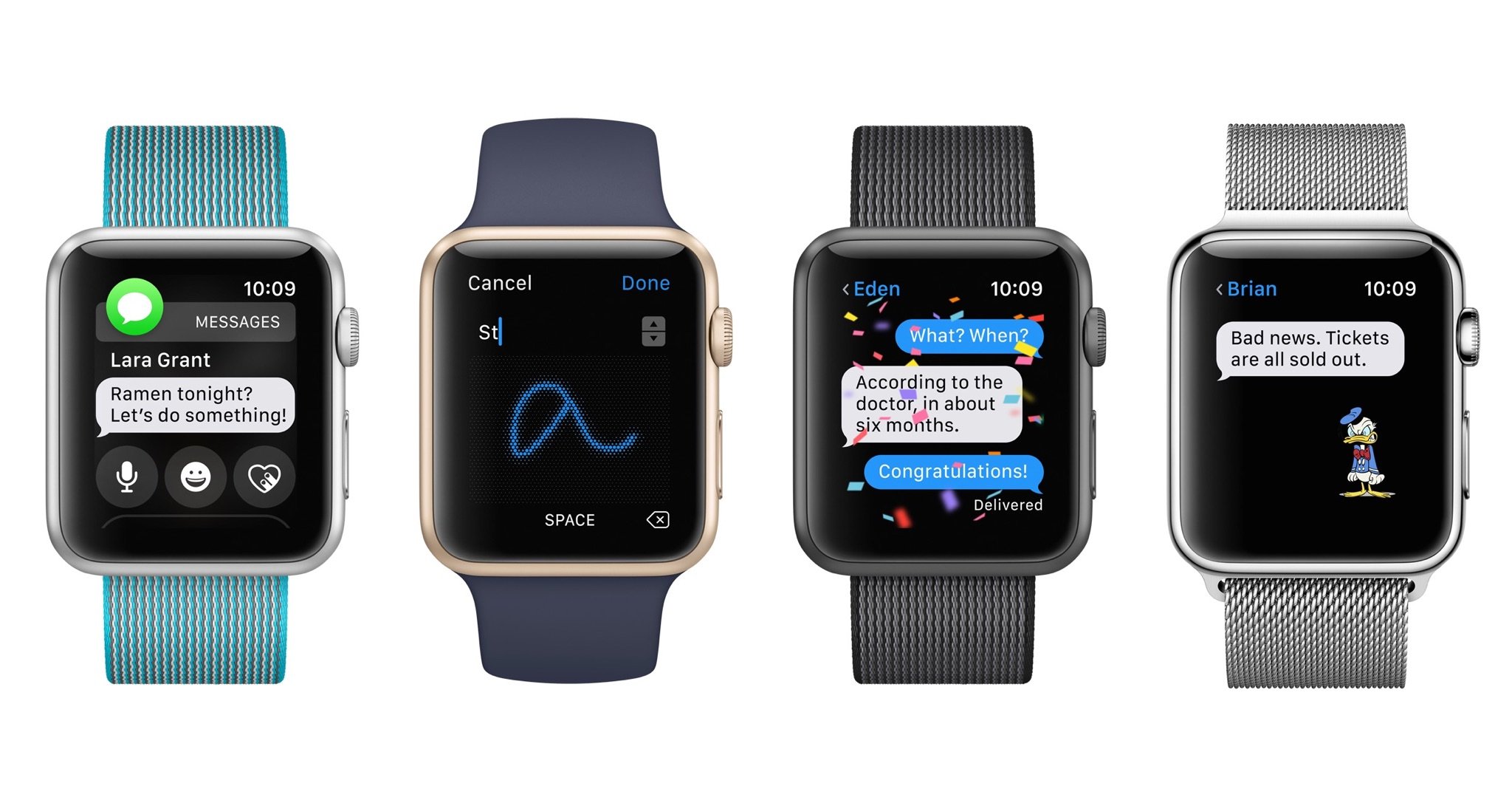
Messages has the same overall app interface, but replying to a message in a notification or conversation has been drastically simplified. There are options for replying with your voice, stickers or emoji, Digital Touch, pre-written responses, or the new Scribble pad — which lets you handwrite letter-by-letter to type out a message.
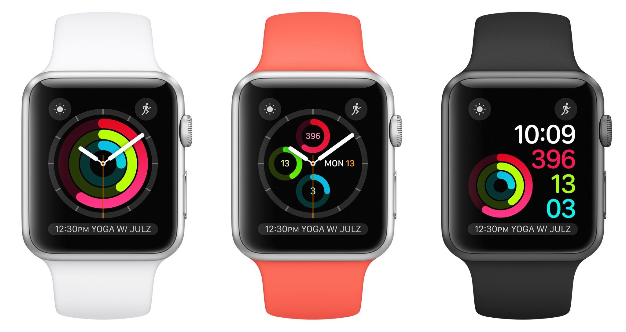
Health remains a huge part of the Apple Watch ecosystem, with new Activity watch faces, condensed Workout information screens, customized workout logging, automatic pausing when movement stops during a run, and a bunch more. Apps get access to Activity rings and sensor data as well as background logging, making my dream of a roller derby-centric watch app that much closer.
Not content with focusing engineer energy on traditional workouts and training, Apple has also made huge strides in accessibility with two new wheelchair workouts and "Time to roll!" notifications, all of which take into account the types of wheelchair rolls and the terrain traversed. The company has also copied the Health app's Medical ID data to the Apple Watch, available after a quick long press of the side button and a swipe to the right. You can also swipe on the SOS toggle in this screen to immediately call the emergency services department in your country in case you've fallen or been otherwise injured.
Apple is also expanding how the Apple Watch is used in tandem with other devices. If you own a Mac, when you install watchOS 3 and macOS Sierra on your respective devices, you can bypass your computer's password screen with the company's new Auto Unlock feature. This uses time proximity, Apple Watch skin contact, and an iCloud handshake to authenticate your watch to your Mac, and unlock the latter, shortening the time you spend waiting for your Mac to wake or entering in a cumbersome password.
The same is true for Apple Pay on your Mac — with your watch and macOS Sierra, you'll be able to use your Apple Watch to authenticate any app or website that uses the company's payment service, or even pay for items within a watch app.
That's an overview of what you can expect from watchOS 3. But the real excitement comes when you start to dive down.
Reinventing the Apple Watch experience
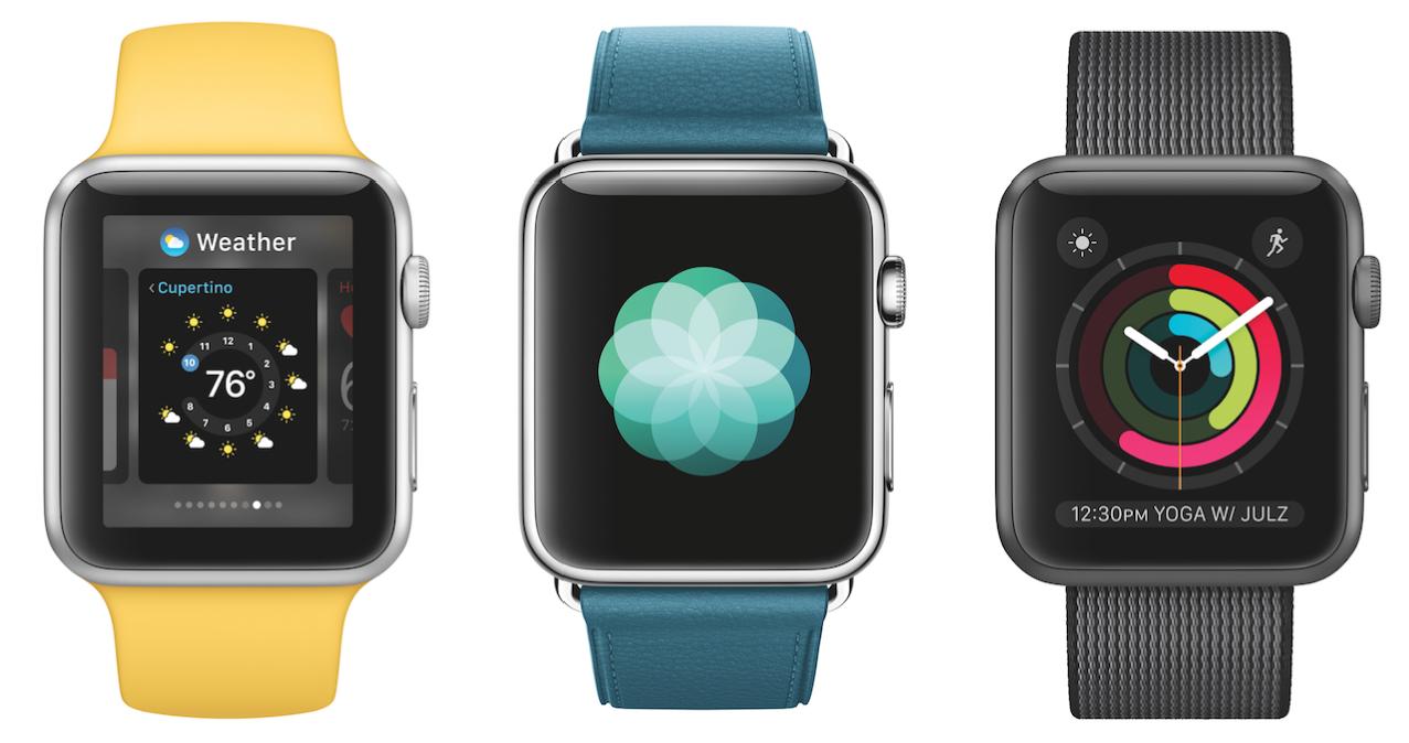
How do you use your Apple Watch? It's a question we asked iMore readers last summer, and it's a question Apple has clearly asked its developers and customers. watchOS 3 carries on the idea of making Apple's smartwatch about information, health, and communication, but with a renewed focus on smart, quick interactions.
The new Apple Watch experience is about interacting with information through watch faces, the Dock, and Siri — and interacting with that information quickly. Apple's two-second mantra is no joke: I find myself accomplishing tasks with watchOS 3 much more quickly than its predecessors, even when using third-party apps that haven't been updated to fully take advantage of the new backgrounding tasks.
The Home screen Carousel is still there, but you wouldn't know it by looking at Apple's display art and promotional material — it's all about the methods users enjoy using. I don't think anyone, myself included, can admit to enjoying tapping on a teensy app icon on the Carousel — especially if you happen to own the smaller 38mm Apple Watch variant.
On the surface, Watch faces look very similar to their watchOS 1 and 2 compatriots, with one key difference: To switch faces, you need only swipe from edge to edge. You can still press firmly on the display to switch from the edit display, but it's wholly unnecessary — and given that you'll be able to much more quickly pick and customize watch faces in the Watch app, new Apple Watch users may stop using Force Touch on the watch face altogether.
I've been using multiple watch faces since the early watchOS 1 days, but being able to quickly switch them makes the experience a thousand times better: I'm much more comfortable wearing a minimalist face like Photo or Numerals, all while knowing that a complications-heavy Modular face is waiting a swipe away.
Complications get more attention in watchOS 3, too: The minimalist faces each get two, and Extra Large gets a gigantic complication option that third-party developers will undoubtedly use to create pseudo-watch faces for their apps.
This is in part due to Apple's background refresh APIs, which not only guarantee complications 50 information pushes throughout the day (roughly two per hour), but let developers customize when those pushes get sent to the user. (If you have a complication for a Red Sox app, for instance, the developer could push minute-by-minute updates during a game, but leave it static on non-game days.) Complications on active watch faces also get to keep their companion app in memory, which means tapping on an app complication should launch an app near-instantly — no more spinning wheel.
This is also true of apps inside the new Dock, which subsumes the Glances feature launched alongside the Watch to provide something far more functional. It lives behind a press of the Side button (RIP, Friends interface), and displays your favorite apps and most recently opened app in scrollable cards, identified by their names and icons along the top of the screen.
Cards are similar to Glances in that they can include live-updating information; that information is smaller, however, and the Dock's interface is far superior. You can quickly scroll through items using the Digital Crown or a fast swipe; and because the interface and gestures are familiar to those who have used an iPhone or Apple TV before, they're easier to learn. (You can long press on a card to move it, for example, or swipe up to remove it from the Dock.)
By relegating glanceable information to the Side button, watchOS also frees up the bottom watch face gesture to Control Center-type functions. It helps unify the iOS/watchOS experience, sure, but it also frees Control Center from the "single card, no scrolling" Glances layout, allowing it to add new buttons for battery life and screen lock (and, on Apple Watch Series 2, the new "Water" mode).
I admit, I do miss having a few things in glances: Even after several months, I swipe from the bottom to try and access my heart rate rather than tap on a complication or the Side Button. But my path errors are minor when it comes to overall navigational improvement. In letting a friend of mine test out the watch over lunch earlier this week, she even remarked how intuitive she found when exploring the watch. I've long felt navigating the interfaces clunky in previous watchOS versions, but she's right — watchOS 3 does unify a lot of the interface's disparate parts into a usable, functional system.
Siri, too, is smarter about interactions. After you push in the Digital Crown (or hail it with "Hey, Siri") and speak a command, Siri makes an immediate calculation: If the digital assistant can't instantly connect to your iPhone and transcribe your request, you can drop your wrist and get a haptic tap when your command has finished executing. (It's a small watchOS tweak in the grand scheme of things but a much appreciated one.)
There are a few other nice tweaks to the Apple Watch experience, including more customization in the iPhone app; you can turn off the Apple Watch's Screenshots function, for instance, if you find that your watch tends to snap pictures of its screen when you're not paying attention. There's also a long-awaited "Find My Apple Watch" button which links your watch to the Find My iPhone app — hallelujah.
A better timepiece
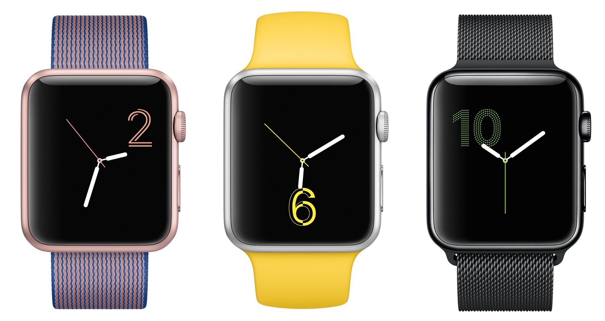
With new complication options, new watch faces, and new ways of creating those faces, the Apple Watch screen feels more customizable than ever. We may not be able to download custom watch faces just yet, but there are enough options that it doesn't really matter.
The two-complication addition to the Photo face alone does a lot of good: If you want your Superman watch (looking at Rene, here), it's yours — with a Modular face of launchable complications just a swipe away.
Apple has also added two new Activity-based faces, a minimalist Numerals face, and new Minnie Mouse designs to the former Mickey-only face. (For some fun, tap on either with the sound enabled.) All of these can be browsed and configured through the Apple Watch app, or rearranged once they've been added.
We're also getting a full-screen X-Large complication. Unlike the traditional X-Large watch face, this isn't just for users with accessibility needs; the X-Large complication lets third-party apps take advantage of the watch's full display for information. Developers are still limited in what that display can do — they can't offer controls beyond sending you into the watch app — but it's a nice way to have more screen real estate.
Interactions, not applications
From the beginning, "apps" on the Apple Watch have felt like a misnomer: I spend hours in apps on my iPhone. I don't want to spend hours holding up my wrist. The molasses-slow launching of both native apps and third-party properties in earlier versions of watchOS certainly felt like hours, and made me very unlikely to use apps beyond those with smart complications.
With watchOS 3, however, Apple is improving how both the company and third-party developers create applications by focusing on specific interactions.
The new apps exemplify this. Reminders was a Siri-only task until watchOS 3, and in a way, still is: The app is solely for looking at your lists and checking off reminders. There's no way to add reminders, or new lists; the only interactions you have are tapping lists, completing reminders, or a Force Touch to see completed tasks.
But it's kind of beautiful that way. I'm never going to go into the Reminders watch app to add a new task via dictation when I can just as easily add it via Siri. But I've checked off reminders several times through the app, and it's done what no iOS version of the app has done before: I actually use Reminders on a regular basis.
Watch apps don't need to do everything — in fact, they shouldn't. But if they can focus in on doing one or two tasks well, that's going to be far more valuable than a bloated, buggy app that tries to do too much, especially now that Dock apps and active complications launch almost instantly.
Despite this missive, third-party developers do have quite a bit more to play with in watchOS 3: They can incorporate the Digital Crown, touch events, speaker audio, inline video, iCloud storage, Game Center, and even SpriteKit and SceneKit.
Some apps, like Sky Guide, are already taking advantage of these extra abilities, but I remain skeptical as to their practicality. I've played precisely one game (the phenomenal Lifeline) on the Apple Watch, and while I certainly plan to mess around with the Pokémon Go Apple Watch app when it's released, I'm worried about what that will do to an already-battery-constrained Series 0 watch. Series 1 and 2 may be better on the battery front thanks to the S1P and S2 processor, but I won't know for sure until I test them.
Perhaps Apple hopes game developers will embrace the idea of two-second turns, and incorporate games that only require a quick glance to go back and forth with friends. We'll see.
Since we're speaking about battery constraints, a note: Those speedy-launching apps use the Apple Watch's memory stores to achieve such quick load times, which means you're going to be putting a bigger strain on your Apple Watch's battery. I'm largely reserving judgement on battery tests until I can test Series 0 against Series 1 and 2, but I haven't seen drastically different numbers on watchOS 3 vs watchOS 2. The 38mm watch is always going to struggle when compared to its bigger cousin; it simply doesn't have the raw space for the 42mm's capacity.
I do find, however, that I'm using the watch a lot more often on watchOS 3 than before, and that tends to bring the battery lower by the end of the day. Where I would previously run a workout and maybe glance at the complications screen a few times over the course of a day, I'm now frequently using the watch to mark off Reminders, talk to Siri, swipe between watch faces, and launch apps like Authy from the Dock. Heavy users may find they're going to need to have a watch charger on their desk for a midday quick-charge.
A great communications device
Friends groups, sketches, and heartbeats were nice ideas. Who doesn't want to send cute wrist-based messages to their buddies and family? But they failed.
They failed because sketching is difficult on a tiny device. They failed because the Friends interface was cumbersome and required other friends with Apple Watches. And they failed because users didn't want a separate app to message friends.
The Messages app of watchOS 3 acknowledges all these problems and attempts to rise above them. Sketching, taps, and heartbeats now all live in a single button under a Messages conversation or notification, and once sent, they'll show up inline within your Messages conversation — no more separate (often-broken) notification service, and non-Apple Watch users can see your messages.
The terrifying Messages emoji aren't gone, but now they're hidden behind an emoji picker button; Apple has chosen to giantify its current emoji set rather than continue to develop its 3D monstrosities, unifying the watch app with Messages on iOS 10. It's a welcome change, though I do hope the tap targets on the emoji categories get bigger for 38mm watch-wearers.
Apple Watch wearers will also get to take advantage of some of iOS 10's new messaging features, but mostly on a read-only basis: You can view stickers sent to you, as well as many of the iMessage app requests, but you're limited to sending only recently-used stickers, and you can't interact with most third-party Messages extensions from your watch.
Similarly, while the message bubble animations show up on your Apple Watch, there's no way currently to instigate those animations. (You can Tapback your reactions to things by tapping and holding on a message bubble, however.)
That's likely for the best: You shouldn't be spending lots of time replying to a message on your watch. That thought carries through into text-based interactions, too.
As with prior versions of watchOS, Messages offers its Quick Reply buttons and dictation option, but it adds a new feature to the mix: Scribble. Rather than implement an impossibly-tiny keyboard for weird non-dictatable phrases, as other manufacturers have done, Apple has chosen to take a Palm- and Newton-like approach, letting you handwrite each letter. It's impressively accurate and surprisingly fun to do.
Even better, the watch uses Siri's proactive suggestions to help you out after you've scribbled a letter or two: Once you write a few letters, you'll see up and down arrows to the right of the resulting typed message; spin the Digital Crown, and you can choose from an array of suggested words and phrases based on what you've started to write. It's not perfect — and I'd still love the ability to mix in dictation — but it's become one of my favorite little features in watchOS 3.
Taking care of your health
It may have started small — a logging app here, a step-tracker there — but Health has become an integral part of Apple's longterm goals. The Apple Watch is perhaps the clearest physical representation of those goals: It launched with a huge focus on helping others with healthy living, and has drastically expanded that mission statement throughout the last year and a half without ever having to improve the original hardware.
watchOS 3 continues this expansion. It brings two new Activity-based watch faces, which put your Move, Exercise, and Stand goals front and center. There's a new Workout complication that begins workouts faster, and workouts themselves are easier to keep an eye on, thanks to a single screen of training metrics. (No more swiping!) You'll even be able to customize what you see on that screen on a per-workout basis within the Apple Watch app.
Perhaps my favorite exercise-related feature is this: If you're one of the many Apple Watch users who regularly logs "Other" workouts, those can be tagged with any of the Health app's specific activities, and and that adds them to your list of workouts. It's a smart first step from the company to expand that list: Their engineers may not have the time or resources to figure out how the Apple Watch should track roller derby, weight training, or yoga, but you do. As you do your favorite activities, your watch can track that data and learn how your body reacts to each, rather than lumping all your non-running or cycling activities into one category.
The watch is also getting smarter when it comes to running- and route-based tasks: The Workout app will automatically pause and restart if it accelerometer movement stops, and it now keeps track of outside weather conditions, too. And whether you're traveling outdoors with your iPhone or going at it with a Series 2 Apple Watch, you'll be able to record route maps of your journey.
Third-party apps can also tap into background workout processes in watchOS 3, including heart rate data, gyroscope information, and the accelerometer; theoretically, that means third-party exercise apps will have more control over displaying and rendering your health data. I've yet to find a third-party app that I genuinely enjoy using more than the Workout app, but I'm still holding out for the developer that writes an app to track skating and roller derby (pretty please!).
If you're not content to keep your workout prowess to yourself, watchOS 3 has a nice new feature for you: Activity Sharing. It uses iCloud to connect you with fellow watch-wearers; you can see their Activity Ring data along with step and distance tracking, and even send along a little friendly smack talk to keep competition going. As someone who thrives off competition, it's already been somewhat encouraging to watch my friends log 308% goal workouts; it's certainly good motivation to get a little extra movement so my logs aren't quite so depressing.
Apple isn't just interested in physical workouts, however: The company is exploring what else the Apple Watch can do for you. Enter Breathe, which helps you, well, breathe. The app uses a pulsing icon and eerie haptics (which feel much like an expanding rib cage) to help you monitor and pace your breathing. As with Stand notifications, it bugs you every four hours to take a moment or two and just focus on your breathing.
Nowhere in Breathe's marketing will you find the words "meditation," but the app is clearly designed with that mindset: A meditation app for the folks who have written off meditation. And despite being someone who thoroughly enjoys yoga, that includes me.
I would have never sought out an app like Breathe from third-party developers, but I'm thoroughly grateful it's being packaged with watchOS 3. In my brief tests, it's already made a noticeable difference in my overall stress level and my ability to draw deep breaths. (It's even helped with roller derby, a sport that requires smart breath control.)
HomeKit, Auto Unlock and Apple Pay
The improvements coming in watchOS 3 go beyond the Apple Watch: There are new ways to interact with HomeKit, unlock your Mac, and pay for items in your own home — no NFC terminal necessary.
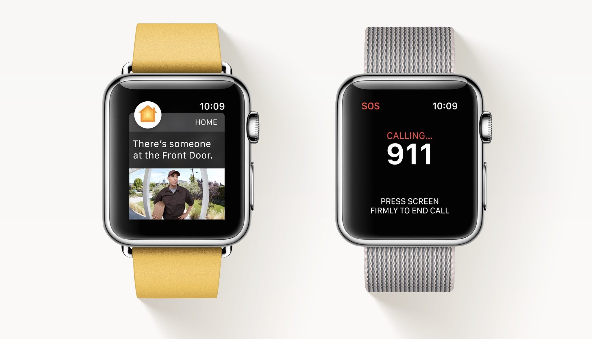
The Apple Watch gets a Home app with watchOS 3 — a companion to iOS 10's app of the same name. Where once you were limited to Siri interactions when controlling your smart lights or door lock, the Home app offers virtual buttons and sliders for all your gadgets. (It also offers one-tap Scene settings, though there's no way to create new ones from your watch.) I've been using the Home app a lot to control my various smart devices, and it's been a really nice option for those moments when my iPhone is across the room.
Auto Unlock and web-based Apple Pay both require macOS Sierra to function; they use skin contact, proximity, and iCloud authentication to let your Apple Watch interact with your Mac. Auto Unlock will let you unlock your Mac just by sitting down next to it, while the new Apple Pay feature has you complete a web-based Apple Pay transaction by authenticating with your watch.
There's another Apple Pay feature coming to the watch itself: In-app Apple Pay. This has the potential to be great for a number of third-party app interactions, but I'm thinking specifically about the one I use the most: Starbucks. The coffee company hasn't incorporated NFC-based Apple Pay in its stores; instead, it has a rewards-based QR card that you can reload via Apple Pay — a task previously restricted to the iPhone. But once Starbucks updates its app, I should theoretically be able to pay for my sweet sweet iced tea addiction right from my wrist.
Accessibility
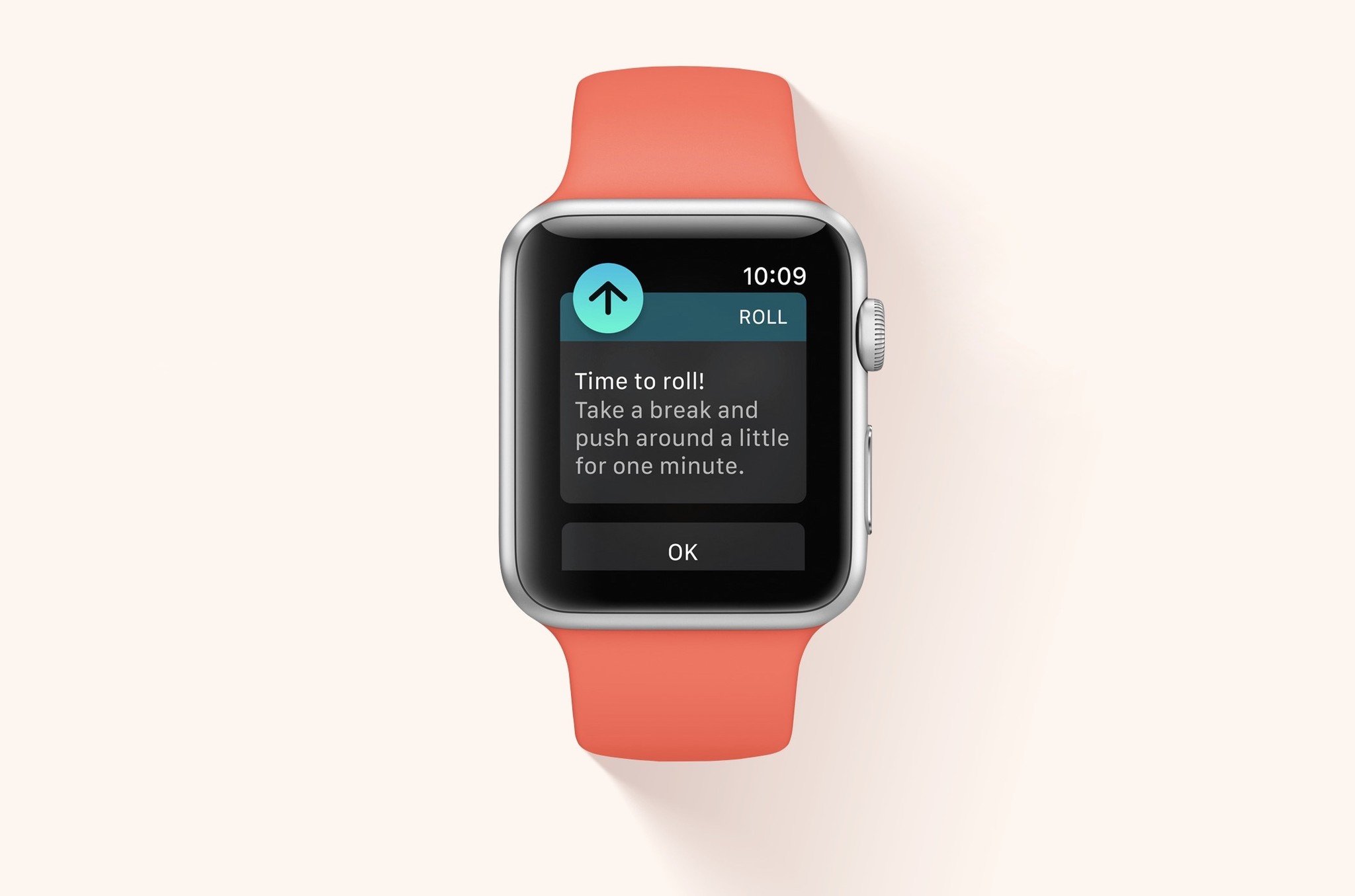
It's another topic near and dear to Apple's core, and watchOS 3 is making new strides forward — or, more accurately, "rolls" forward.
Alongside the other new Health improvements, Apple is introducing wheelchair-based workouts and activity reminders for those restricted to wheel-based mobility. The company reportedly did some serious research to make this happen, including looking at different wheelchair push techniques and incorporating terrain and weather. The result: two new workouts for wheelchair users — one at a "walk" pace, and one at a "run" — and a "Time to Roll!" notification in lieu of a stand alert. It's an impressive gesture from the company, and one I hope will genuinely aid wheelchair users going forward. I'd love to hear from our readers in wheelchairs who have the Apple Watch: Will this feature help you? Are you excited to use it?
Also new to accessibility in watchOS 3 are systemwide options for an SOS call and Medical ID display. Pressing and holding the Side button will get you the Power Off screen, per usual, but it also presents a swipeable option for Medical ID and SOS. Medical ID will replace the screen contents of your Apple Watch with a card that details your name, age, weight, height, allergies, emergency contact, and whether you're an organ donor, along with when the information was last updated. SOS, once engaged, will automatically connect you to the emergency service in your area for quick medical attention.
You can even set up SOS to work like an old-school panic button: Activate the feature in the iPhone's Watch app, and holding the side button for an extended period of time will automatically engage SOS. I'm exceedingly glad that this is an optional feature for those of us who engage in activities that accidentally trigger buttons on the watch, but it will undoubtedly be helpful for users who need such a panic button.
Bottom line
There can be no watchOS 3 without iOS 10, but this year, it's the wearable operating system that takes my prize for best update of the year. It's reinvigorated the original-generation "Series 0" Apple Watch and given users of those devices at least another full year of usage without feeling like they have to upgrade their hardware or be left in the dust.
But simultaneously, it teases the greatness that can be found by upgrading to Apple Watch Series 1 and 2: Route maps are fun to make with an iPhone present, but they'll be even better when you can just take a Series 2 Apple Watch and go. Those added SpriteKit and SceneKit graphics will look a lot nicer on the 1000-nits-bright Series 2 screen, and render a lot speedier on the Series 1 and 2 processors. And the more you find yourself using watchOS 3, the more you might yearn for a slightly bigger, better battery.
In short: There's a lot to like about the new watch operating system. Apple has made some smart calls on what works for the watch and what doesn't; watchOS 3 feels like the start of a much more refined era for the company's wearables. Gestures make sense. Hidden interactions have been removed. And your most important information is closer to front and center.
I'm using my Series 0 Watch more than ever before, which is great for pretty much everything (except for, perhaps, my battery life). I plan to follow-up on this review once I have access to the Series 1 and Series 2 Apple Watch and address how watchOS specifically benefits those newer casings, but in the meantime: If you currently have an Apple Watch, watchOS 3 is available now. It's more than worth your time.
Serenity was formerly the Managing Editor at iMore, and now works for Apple. She's been talking, writing about, and tinkering with Apple products since she was old enough to double-click. In her spare time, she sketches, sings, and in her secret superhero life, plays roller derby. Follow her on Twitter @settern.


