weekflow calendar for iPhone review: Use colors, grids, and gestures to better organize your schedule

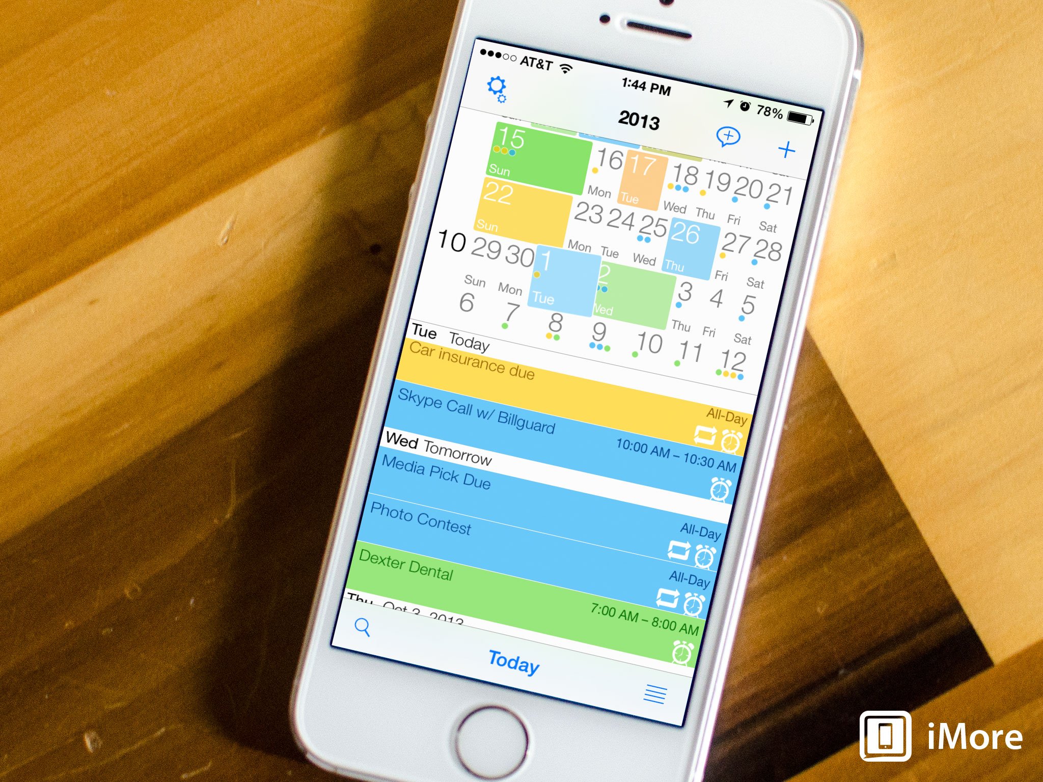
weekflow for iPhone is a rather unique alternative calendar app that treats your schedule as somewhat of a live feed where you can endlessly scroll up and down through weeks. Different colors and the width of different days indicate at just a glance what days are the busiest. These elements combined with natural language support and a great use of gestures can potentially make for a unique alternative.
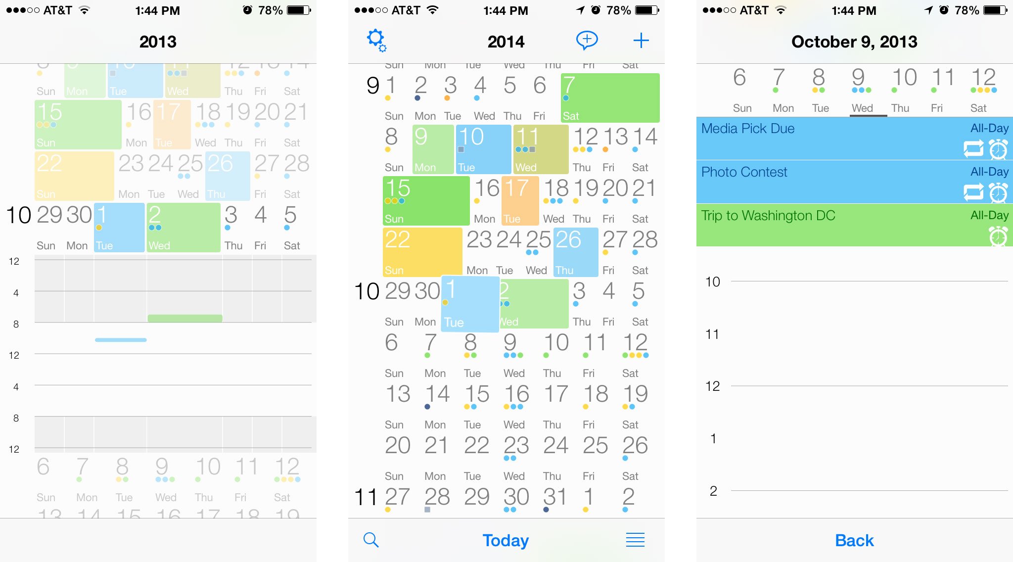
The thing that caught my eye when I first came across weekflow was its unique use of the main view. For calendar fanatics, this is a make or break moment. Instead of having to toggle between week, day, and month views, literally everything you need is already there or only a single tap or pinch away. The numbers in the very left column indicate what month you're currently viewing as you scroll.

Each row in weekflow is one calendar week. The width of each day indicates how busy each day is compared to the rest of the days in the week. Beyond that, color coding gives you an idea of which days have the most events compared to others.
Many people also like to see what events and appointments they have for a particular day and weekflow gives you multiple ways of obtaining that information. The most obvious is to toggle the list button in the lower right hand corner of the main view. A list view for whatever day you have selected will pop up and present you with events and appointments you have scheduled for that day. You can tap on different days in the top to view a different day or tap the list view button again to return to the main view.
You can also expand a week view by using a pinch to expand gesture. A view that shows all the events you have in a timetable for the whole week will appear. Tapping on any of the colored events will launch into that particular event's details.
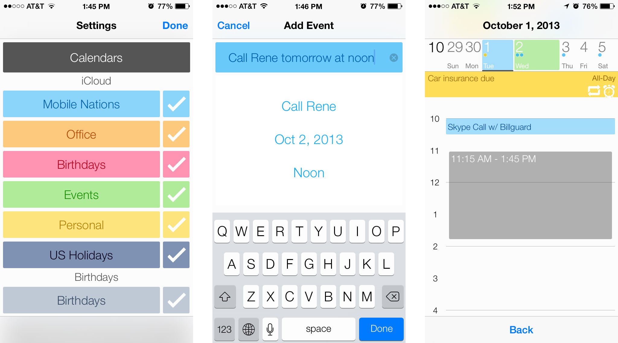
When it comes to event entry, weekflow supports natural language support in both English and German. Just type or speak something like "Call Rene tomorrow at noon" and weekflow will know what you mean and fill everything in for you. If you choose, you can use the regular entry screen as well. Another way of creating an event in weekflow is to be tap on a day and then drag your fingers outwards to specify a time that you'd like to create an event and it will appear gray to specify times. Adjust accordingly and release and the event creation screen will automatically launch with the time pre-filled.

The full entry input screen in weekflow lets you attach locations, set alarms, and more. Unfortunately, you can't share events with another person inside weekflow but that isn't really a limitation of the app itself but of Apple's calendar API. Unless a developer wants to use their calendar event creation interface, they don't give them access to share events. This would be true with other calendar apps as well.
Master your iPhone in minutes
iMore offers spot-on advice and guidance from our team of experts, with decades of Apple device experience to lean on. Learn more with iMore!
The good
- Unique interface unlike any other
- The week stream really does show a lot of data efficiently in a small amount of space
- Many ways to view and interact with your calendar without it feeling overwhelming
- Matches the look and feel of iOS even better than the default Calendar app
The bad
- No shared events, unfortunately it's an Apple issue, not an issue with weekflow
- It's a unique interface that won't suit everyone
- No iPad version
The bottom line
weekflow has one of the most unique interfaces when it comes to alternative calendar apps that I think I've ever seen. Luckily, it is an interface that works. It may not be for everyone but if you like gestures and being able to see the largest amount of information you can in just a glance, weekflow may be a good option for you.
- $1.99 - Download Now
iMore senior editor from 2011 to 2015.

