What Apple Watch Series 4 Means for Accessibility

Sitting in the audience at Apple's September 12 event, it became abundantly clear to me Apple Watch Series 4 was the true star of the show. Of course, the new iPhones are stellar too—particularly the colorful XR—but the announcement that most resonated with me was the new Watch.
The fact that I was most excited about a significantly upgraded Apple Watch coming into the event isn't surprising. I have been a diehard fan of the device since its inception in 2015, and have worn one nearly every day since it launched. From getting notifications to paying for coffee and groceries with Apple Pay to tracking my health and fitness, the computer I wear on my wrist every day has made my life better. Obtaining information is more convenient and accessible than ever.
In terms of accessibility, the Series 4 model has incredible potential to enrich the lives of disabled people even further.
The larger screen

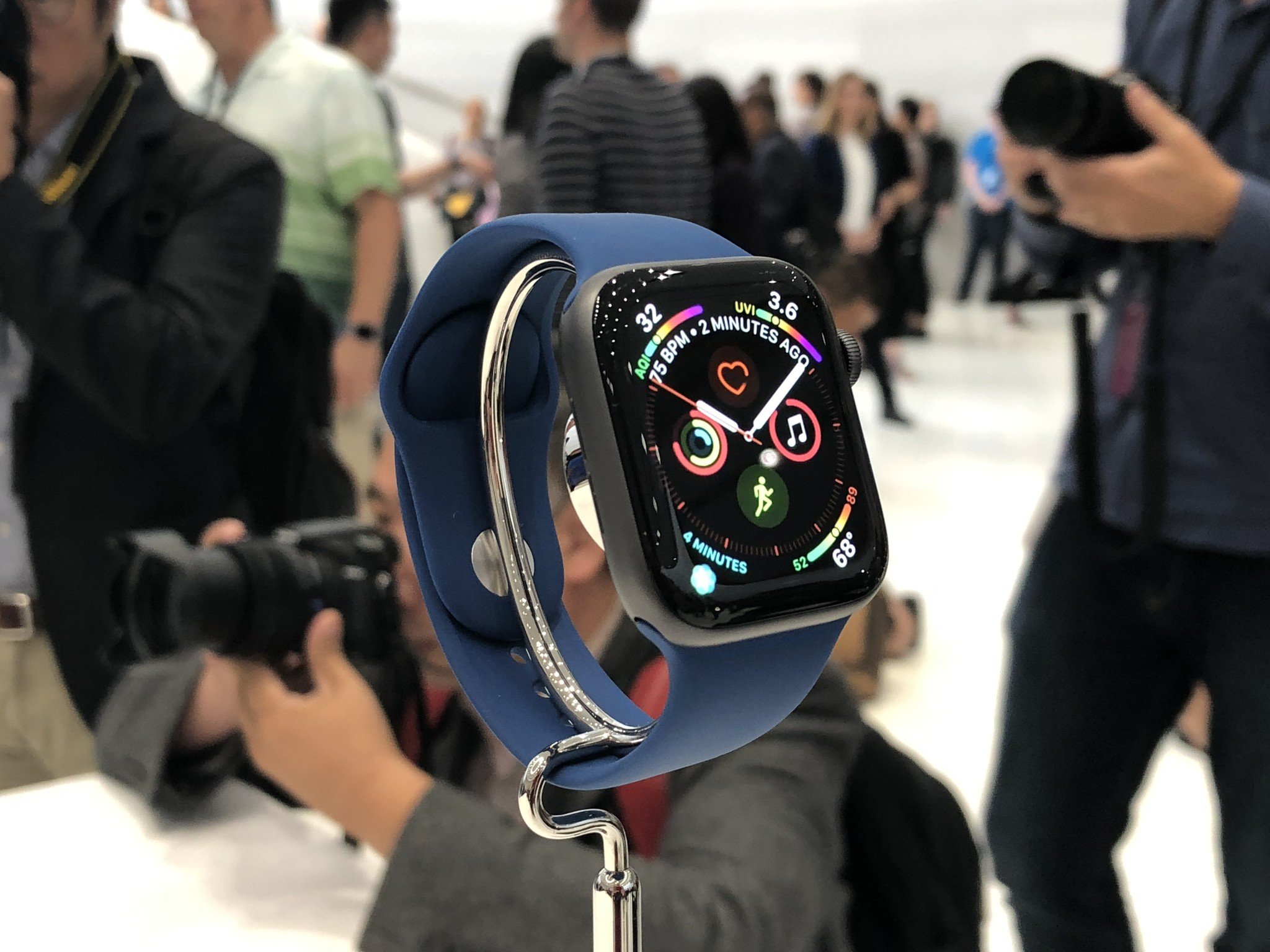
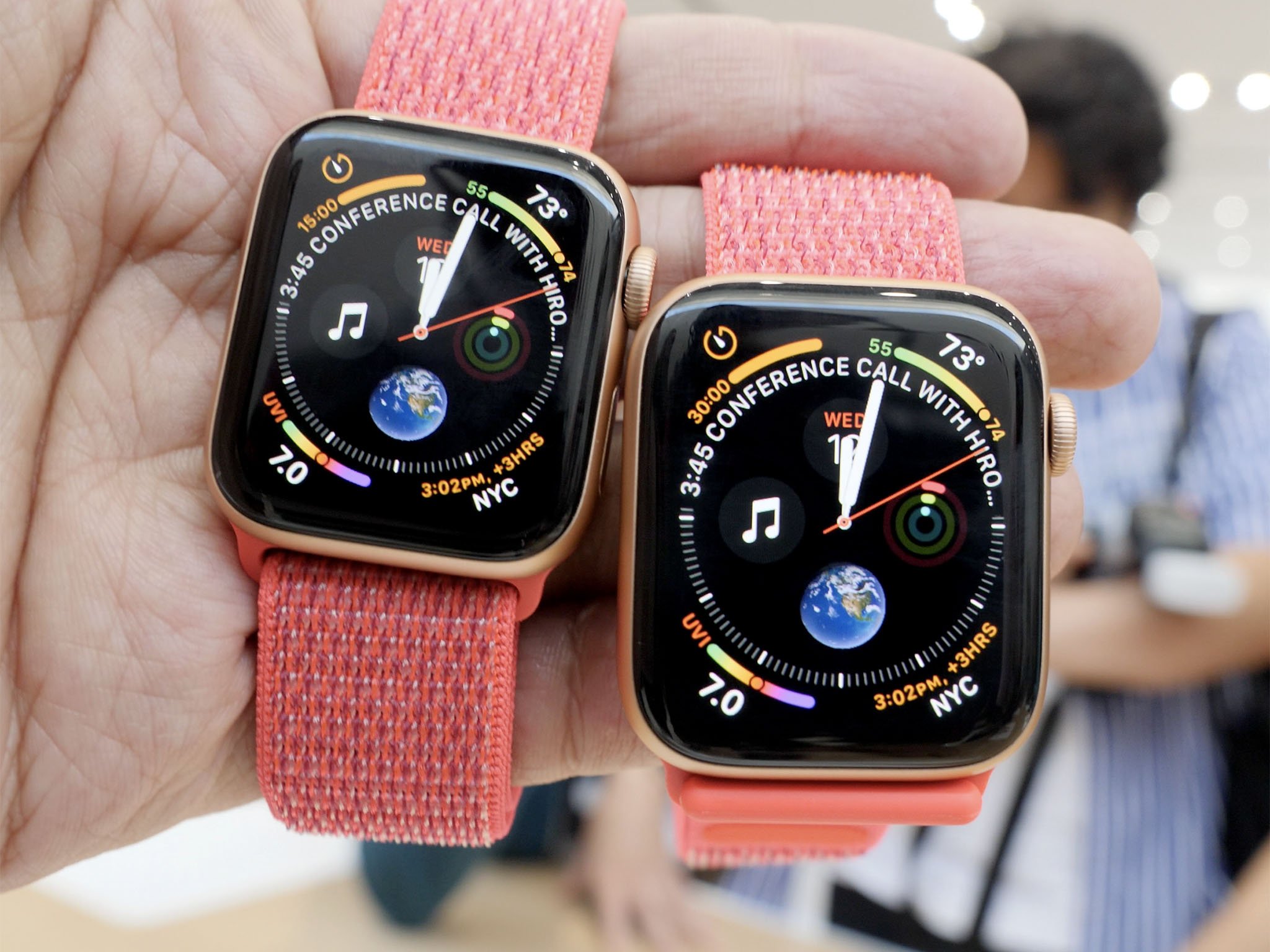
The most obvious change to this next generation Apple Watch is its dramatically larger display. I've used the 42mm model since the beginning solely for the bigger screen. Apple says both new sizes, 40mm and 44mm, are 30 percent bigger than their predecessors. After the presentation, I made a beeline in the hands-on area to the Apple Watch table and can confirm the bigger screens are the real deal. The 40mm is close in size to my 42mm Series 3, but the 44mm is what my heart wants. The difference between the two is relatively substantial, and I believe many visually impaired users will love the 44mm.
I plan to upgrade and can't wait to use the bigger screen.
For accessibility, the benefit of a larger display is obvious: it's easier to see content on a larger canvas. For people with low vision, this is especially true. But bigger screens benefit everyone, regardless of their visual acuity—more screen is precisely why the iPhone Plus (now Max) models have proven so immensely popular the last few years. As the adage goes, bigger is better.
For accessibility, the benefit of a larger display is obvious: it's easier to see content on a larger canvas. For people with low vision, this is especially true.
One potential downside to the larger display is the increased information density. Apple showed off several new watch faces that are heavy on complications, which isn't bad in and of itself, but there is some cause for concern. For many visually impaired users, too much information on screen can be jarring on the eyes because the interface can feel "cluttered"—that is to say, pinpointing a piece of information like, say, the current temperature can be difficult if there is a multitude of other elements on screen at once. The same principle applies to too much color. For some, too much color can make the screen feel like one washed out rainbow. I have yet to confirm this with Apple, but my assumption is users will be able to customize just how dense they want their face. Maybe there will be a setting to use a monochrome color scheme as well.
Master your iPhone in minutes
iMore offers spot-on advice and guidance from our team of experts, with decades of Apple device experience to lean on. Learn more with iMore!
Granted, no one is forced to use these info-dense watch faces if they don't care for them, but the point is nonetheless valid. Here's hoping for some level of customization there.
The haptic Digital Crown

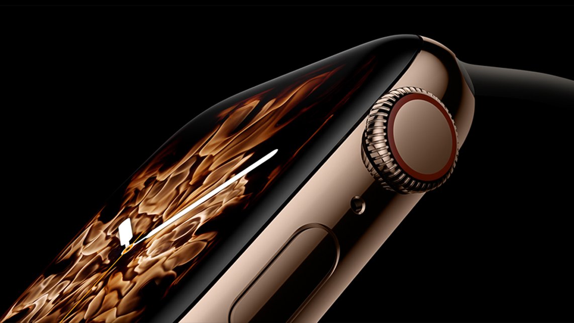
The addition of haptic feedback to the Apple Watch's Digital Crown makes a ton of sense. The accessibility gains of haptic are not trivial, and I'm glad to see Apple add it to the crown on the Watch. (Let's hope the Touch Bar on the MacBook Pro is next.) The benefit of haptic feedback in the Digital Crown is simple: Each time you turn it, you feel a subtle "tick" as you move. This is important for a reason.
Haptic feedback on Apple Watch (or any other product, for that matter) is important because it enhances the user experience, quite literally. Having bimodal sensory input, whereby you use multiple senses in manipulating an object, is key for accessibility because of the way it augments a task. In this context, you're no longer just spinning the crown and watching the interface move accordingly. Many people lack the hand-eye coordination necessary to spin the crown until you reach the desired point and stop. With haptic feedback, you can see and feel your way through a menu; that click you feel can act as an additional marker that you're moving and you've reached your endpoint—for example, a particular app in the app switcher.
The point I'm making here is nuanced, but ultimately what I'm saying is haptic feedback enhances user interfaces in such a way that aids many disabled people in navigating their devices. Apple Watch already has an underlying "Taptic Engine," but extending the technology to the primary input mechanism is no small detail. In my brief time with a Series 4 in the hands-on area, I was delighted by the lubriciousness of the crown and especially of the haptic feedback I got with every turn.
The Fall Detection feature

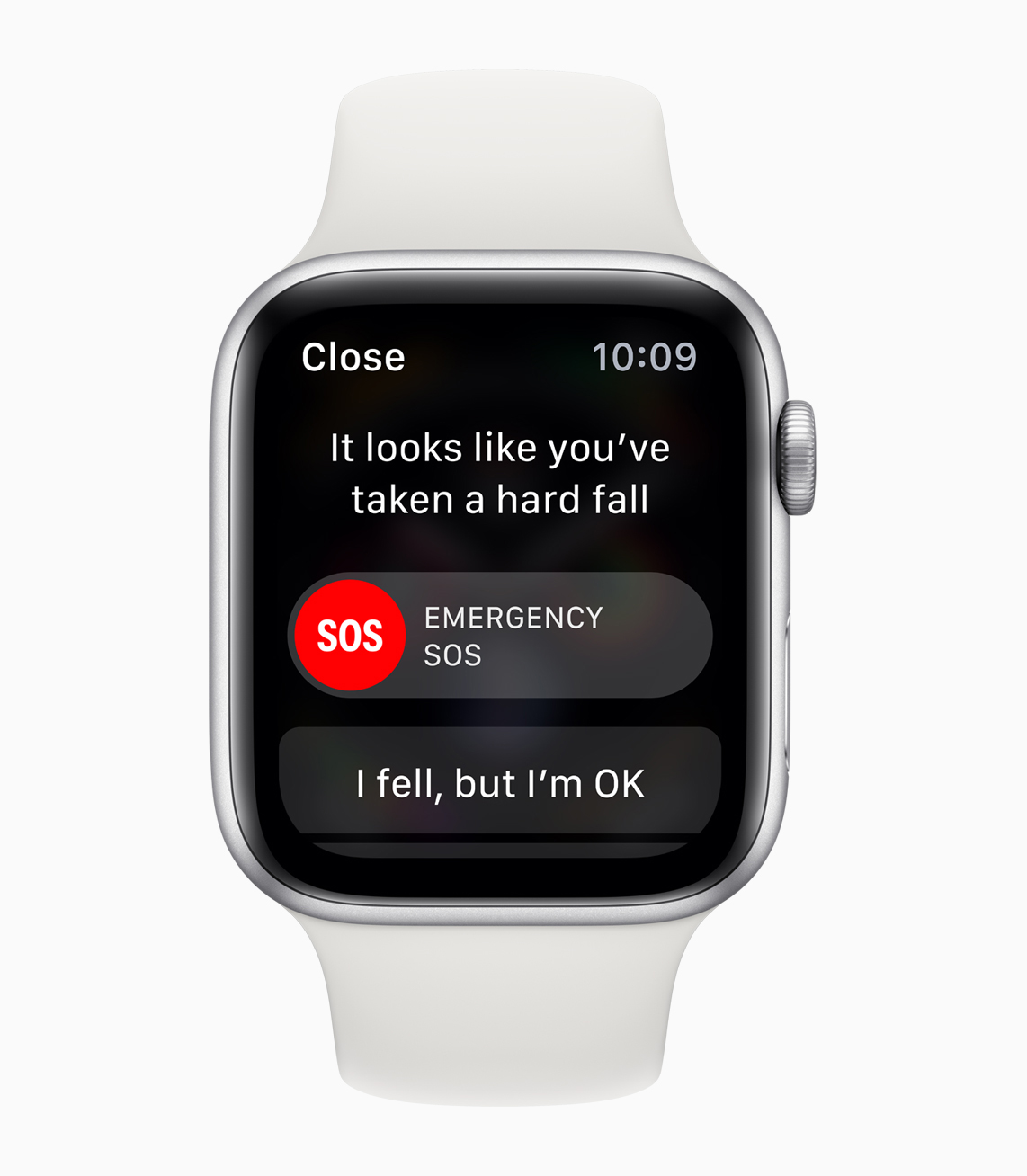
Apple COO Jeff Williams said during the event "we hope you never need to use" Apple Watch's new Fall Detection feature, but the truth is, falls are a reality for many people. I tweeted during the event this feature could be game-changing for many people for whom falling is cause for serious harm—the elderly and even someone who can be unsteady on their feet (like me) immediately came to mind when it was revealed.
Another group of people for whom Fall Detection can be lifesaving are epileptics. My girlfriend's mother has epilepsy, as did my own mother. When my girlfriend's mom found out about Fall Detection, she was over the moon with excitement. She wants a Series 4 as soon as possible, as she thinks having this functionality—along with everything else Apple Watch does—makes more sense for her than a dedicated lifeline device. The fact that watchOS will use the SOS feature to call 911 after a minute of inactivity and notify one's emergency contacts means the Watch is accessible in an entirely different way. No longer do you need a standalone button to get help; it's built into the same watch that you wear every day to tell time and whatnot.
Accessibly for everyone
I always say accessibility touches everything, even the slides at Apple events and to the marketing copy on the company's product pages. Fall Detection for, say, the elderly or someone like my girlfriend's mom takes that idea even further. It really is a de-facto accessibility feature in a very similar vein to how Apple has pitched mainstream iOS 12 features such as Group FaceTime and Siri Shortcuts as having relevance to accessibility. Accessibility truly is for anyone and everyone.
Steven is a freelance tech writer who specializes in iOS Accessibility. He also writes at Steven's Blog and co-hosts the @accessibleshow podcast. Lover of sports.

