What Marzipan Might Mean for Accessibility

Many podcast episodes and blog posts in the Apple-verse have been spent pontificating on what Apple's cross-platform software project, Marzipan, will mean for the company and particularly the Mac. With WWDC two weeks away, the anticipation for the official unveiling of what exactly Marzipan entails is reaching a fever pitch.
Whatever Marzipan actually is—and whatever it's actually called—will have significant ramifications for accessibility. Marzipan's headliner is about iOS apps on macOS, but this "back to the Mac 2.0" undertaking has the potential to make the already accessible desktop operating system even more appealing to disabled users.
Finally, Dynamic Type on the Desktop
Since it came out with iOS 7 six years ago, I have spent countless words over countless stories extolling the virtues of Dynamic Type. It is my favorite feature of iOS; I reap the benefits of it literally every day on my iPhone and iPad.
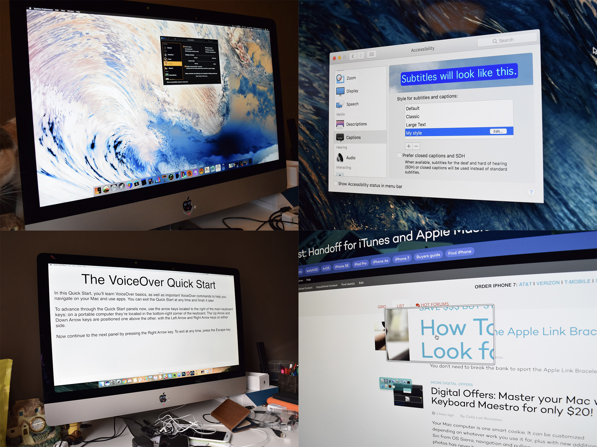
Since 2013, however, new versions of macOS have come and gone without any sign of Dynamic Type. That's been a disappointment for me, especially as a laptop user, because I believe Dynamic Type would considerably improve the user experience. From a visual accessibility standpoint, the keyboard-and-mouse input method can be challenging because tracking the cursor and navigating the menu bar are conceptually "further away" than they are on an iOS device. In my experience, I find I need to get physically closer to my MacBook Pro's screen than I do my iPad because I can't touch it. (This is also why I'm such a believer in the Touch Bar as assistive technology. For all the nerd snide over how much of a failure it is, the Touch Bar has clear advantages when it comes to making the Mac more accessible.)
While Zoom is a worthwhile aid, Dynamic Type could instantly solve those issues, not to mention augment text in dialog boxes and System Preferences panes. Many third-party developers use the Dynamic Type API in their iOS apps, so it makes sense that the feature could finally arrive this year alongside Marzipan. Aside from being the usual system-wide text sizing tool, "Marzipan'd" Mac apps could utilize a similar API for macOS, which would enrich the experience of this new functionality.
At WWDC last year, I was forthcoming to Apple about my displeasure that Dynamic Type was missing in Mojave. The company responded by tacitly admitting the need for it by telling me it was "on their radar for the future."
Here's hoping that future comes the morning of June 3.
Master your iPhone in minutes
iMore offers spot-on advice and guidance from our team of experts, with decades of Apple device experience to lean on. Learn more with iMore!
Touching on the Touch Bar
Reports from Bloomberg and other outlets have suggested Apple views Marzipan as not just a one-off endeavor, but rather a multi-year project that involves things the outside world can't yet see. 2019 seems to be the first step on that journey.
Given the focus on putting more of iOS into the Mac, I wonder if 2019 will also be the year Apple revisits the Touch Bar. Another letdown of the last few WWDCs has been the lack of iteration (or, perhaps more accurately, lack of interest) on Apple's part regarding the Touch Bar. Having covered the October 2016 press event where it was launched, I was intrigued and excited for the Touch Bar, and Apple told me how excited they were for it in terms of accessibility. To this day, I staunchly believe Touch Bar Zoom is one of the finest pieces of software Apple has ever shipped.
In the almost three years since, it feels like the Touch Bar has languished. It remains a workhorse for me but could stand improvement. A Taptic Engine is at the top of my wishlist. Perhaps part of Apple's Marzipan efforts include making more use of the Touch Bar—giving developers the ability to include customizable controls there. It strikes me as logical that the Touch Bar get more than a cursory mention during the keynote because it can do so much, especially in an accessibility context. I could use the Mac without a problem if I didn't have the Touch Bar, but I'd rather not. I would hate to see the product be seemingly further abandoned because a lot of people have long been vocal about it being gimmicky and gratuitous.
Mac, Meet Magnifier
One of the things that makes Apple's work in accessibility so remarkable is how consistent the feature set is. There's a lot of feature parity across the board, especially with more "mission critical" ones such as VoiceOver and Switch Control.
Marzipan's arrival is an opportune time for Apple to further share features across the Mac and iOS. The obvious example here is dark mode. The Mac got it last year, and I use it exclusively. Bloomberg's Mark Gurman recently reported iOS 13 includes a long-pined-for dark mode, which he describes as "a black and grey-heavy interface optimized for viewing at night, that can be enabled in Control Center." This means I can use dark mode on all my Apple devices, thereby unifying the experience. (watchOS is inherently "dark" due to the Watch's OLED display.)
Likewise, it'd be interesting to see Apple rebrand the aforementioned Zoom feature on macOS to be the desktop analog to iOS's Magnifier. Introduced in iOS 10, Magnifier is another of my favorite and most-used features. While it's primarily integrated with iPhone's camera, Apple surely could adapt some of the color contrast functions to make sense on the Mac. Imagine being able to toggle a yellow-on-black mode while editing a PDF in Preview, for instance.
Furthermore, consider AssistiveTouch. On the Mac, you could integrate it into the Touch Bar to invoke Notification Center, or even simulate taps or mouse clicks. The possibilities are endless.
Steven is a freelance tech writer who specializes in iOS Accessibility. He also writes at Steven's Blog and co-hosts the @accessibleshow podcast. Lover of sports.

