OS X Yosemite design language: Explained
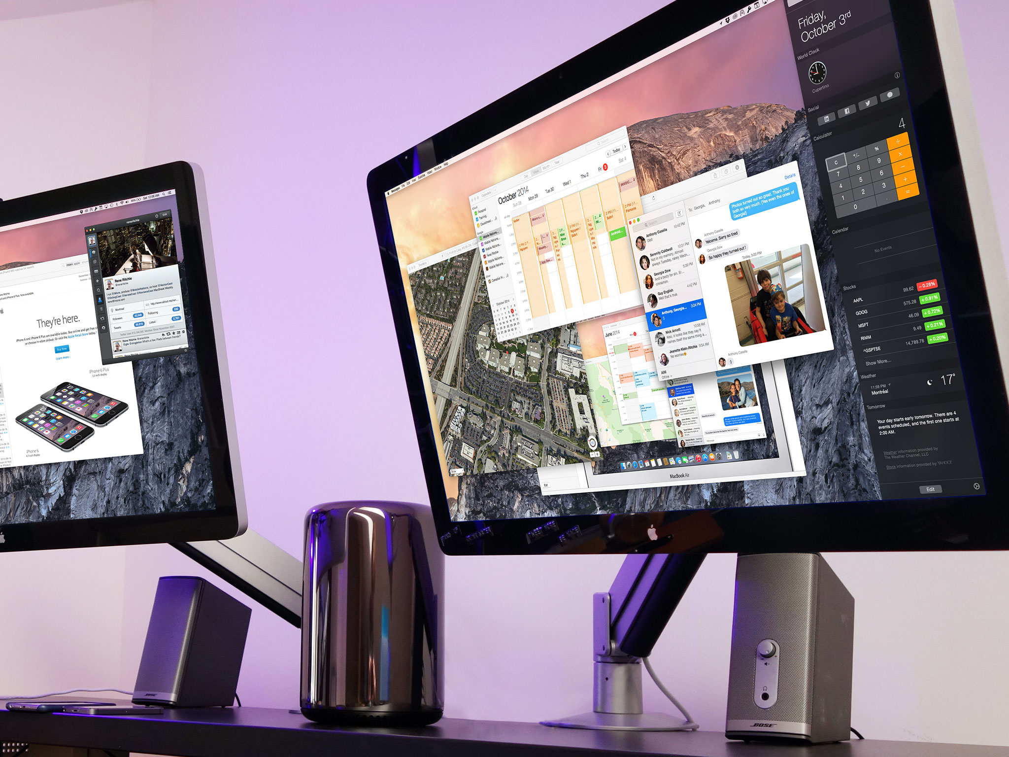
Back in October of 2012, senior vice president of industrial design, Jony Ive, became the person in charge of all design at Apple, both hardware and software. As a result, iOS 7 got a down-to-the-pixel interface update that set the iPhone and iPad up for the future, but left years of "back to the Mac" consistency behind. Apple simply didn't have the resources last year to redesign OS X at the same time. This year they do. This year OS X Yosemite not only gets onto Apple's new design language, but gets to take it even further into the future...
Like water from candy
The original OS X interface was called "aqua" and featured buttons that looked like beautifully rendered gum drops, windows that like emerged like genii from the bottle, and elements that were, at the time, referred to as "lick-able". Also, early on, pin-stripes.
Some awkward years followed as well, including forays into brushed metal, stitched leather, and linen. Yet it had good years as well. Sane years. Snow Leopard and Mavericks years that matured the interface, and made it more consistent, even if at the expense of some color.
Yosemite isn't the evolution of either Snow Leopard or Mavericks, nor is it the revolution of iOS 7. There's plenty new here, but there's also a a remarkable restraint. Yosemite isn't built on a physics or particle engine. There's nothing bouncing or colliding. But it is flatter, cleaner, and more coherent than what's come before. It's also darker...
Flat, with shadows
Flatness, or the eschewing of rich textures for solid colors, is the prevailing trend in modern interface design. Some believe it to be more authentic to the nature of the machines. Others as a sign that we, as a collective, have matured beyond the need for skeuomorphic cues and affordances. Still others as massive misstep when it comes to both design and usability.
Where ever you fall on the spectrum, Apple is falling just short of totally flat. Gone are the gum-drop style buttons, and the last of the green felt has been left by curb.
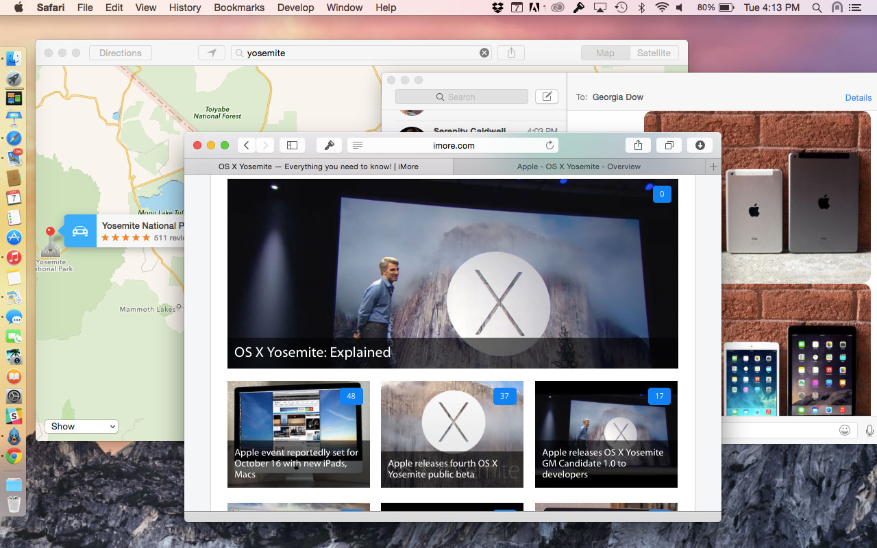
Instead we have solid colors, but subtle gradients. We have clean windows that still drop shadows. We have clear sidebars that blur the background behind them, and streamlined tool bars that blurs the content beneath them. Combined, they minimize distraction but still provide a sense of placement and personalization.
Master your iPhone in minutes
iMore offers spot-on advice and guidance from our team of experts, with decades of Apple device experience to lean on. Learn more with iMore!
The colors from your wallpaper show through. The photos and icons and documents from your files show through. As much as it breaks up the window and seems odd at first, it can also tie everything from the desktop to the folder grid together.
Because OS X is a multi-window environment, that shadows remain helps visually separate and stack different apps. It's one of the ways Yosemite is less extreme and better balanced than iOS 7 or iOS 8. It embraces the new without jettisoning what worked so well in the old.
Perhaps nowhere is that better exemplified that the dock. Where it once went from blessed 2D to faux 3D, it's now not only returned to past glory, it's done so in a newly translucent form. It really is the best of the past and the present, and hopefully a sign of what's to come from both of Apple's platforms in the future.
Icons newly iconic
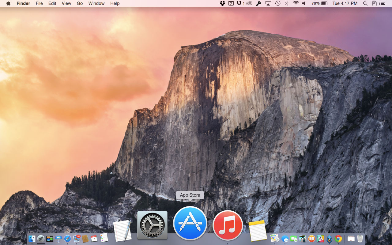
Yosemite doesn't just give windows and interface elements a makeover, it goes all the way down to the icons. Apple has standardized on three shapes — the rounded square, the circle, and the tilted rounded rectangle. Oh, and a new, shiny, translucent trash can.
The rounded square is used for system-related apps. That includes not only the new, happier, even slightly more embossed Finder, but the new System Preferences as well.
The circle is used for content-focused apps, like iBooks, the App Store, Safari and the new, red, iOS-Music-app-matching iTunes.
The tilted round rectangle is used for traditional apps, especially productivity apps, like Mail, Calendar, TextEdit, and Preview, often with a smaller icon at the bottom left to better hint and functionality, like a stamp for Mail, a pen for TextEdit, and a magnifier for Preview. It's no longer in perspective, but it does have depth.
There are a ton of exceptions, of course. Time Machine is round and Maps is tilted, to name but two. In general, however, the new look makes for a new feeling — a more ordered and organized one.
Still, Apple designers are Apple designers, and that means the icons are still filled with great colors, amazing details, and even small touches like a subtle reflection effect on the metallic icons, blues and oranges as though they were situated in the environment of Yosemite itself.
Going dark
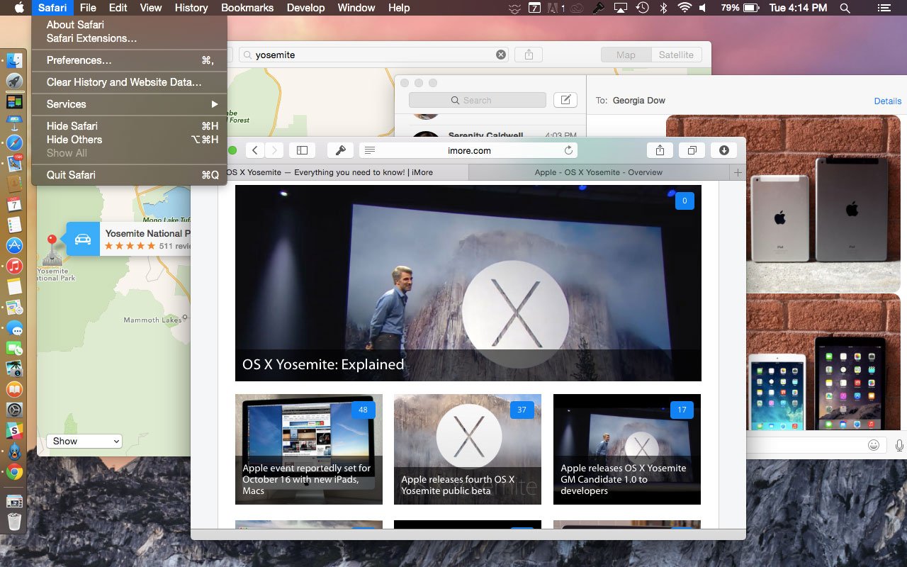
For those who want to keep focus on active windows and tasks at hand, Apple is also minimizing the potential distractions of menu bars and menus by introducing a "dark mode".
As you'd expect, dark mode changes the menu bar and drop down menus themselves to a deep, translucent, charcoal gray reminiscent of some of Apple's pro-apps past.
Dark mode looks good enough that even people who don't care about distractions might want to try it out.
Straight to Helvetica
Lucida Grande has been the OS X system font for as long as there's been a system a font. It was perfect for an era of lower resolution displays and subpixel antialiasing. Yet now we live in the era of Retina.
With iOS 7, Apple switched not to their own, custom font for iPhone and iPad, but to Helvetica Neue. With OS X they're doing the same for the Mac.
It doesn't have the personality of Lucida Grande, or of a custom Apple font, but it looks great on high density displays, and it even looks fine on older Macs with standard displays.
More importantly, it looks consistent with iPhones and iPads, which means anyone considering a Mac as their next computer will feel even more at home with OS X. And that's a feature.
The bottom line
With Yosemite Apple has achieved an even better balance than iOS. They've brought the Mac interface fully into the modern age without leaving behind everything that worked well in the past.
Apple has flattened out the textures and gone solid, but instead of losing the visual differentiation between apps, they've deferred to apps' own content, made it more prominent, and hence made the app itself more recognizable.
They've added transparency to let the desktop shine threw and integrate the overall look, but kept the drop shadows so the layers are better separated visually and the depth is even greater.
And the dock, the icons, the new system font, and everything else ties Yosemite together in a way no other version of OS X has been tied together before, at least not since it first launched.
OS X Yosemite's new design language isn't perfect, but it's lightyears ahead of where it was, and arguably iOS could learn a lesson or two from where it is now.
Overall it accomplishes two critical tasks — it once again makes the Mac consistent and comfortable for iPhone and iPad owners, and it breathes bold, clean new life into OS X.

Rene Ritchie is one of the most respected Apple analysts in the business, reaching a combined audience of over 40 million readers a month. His YouTube channel, Vector, has over 90 thousand subscribers and 14 million views and his podcasts, including Debug, have been downloaded over 20 million times. He also regularly co-hosts MacBreak Weekly for the TWiT network and co-hosted CES Live! and Talk Mobile. Based in Montreal, Rene is a former director of product marketing, web developer, and graphic designer. He's authored several books and appeared on numerous television and radio segments to discuss Apple and the technology industry. When not working, he likes to cook, grapple, and spend time with his friends and family.
