Home app: What's changed in iOS 13
What's new in the Home app?
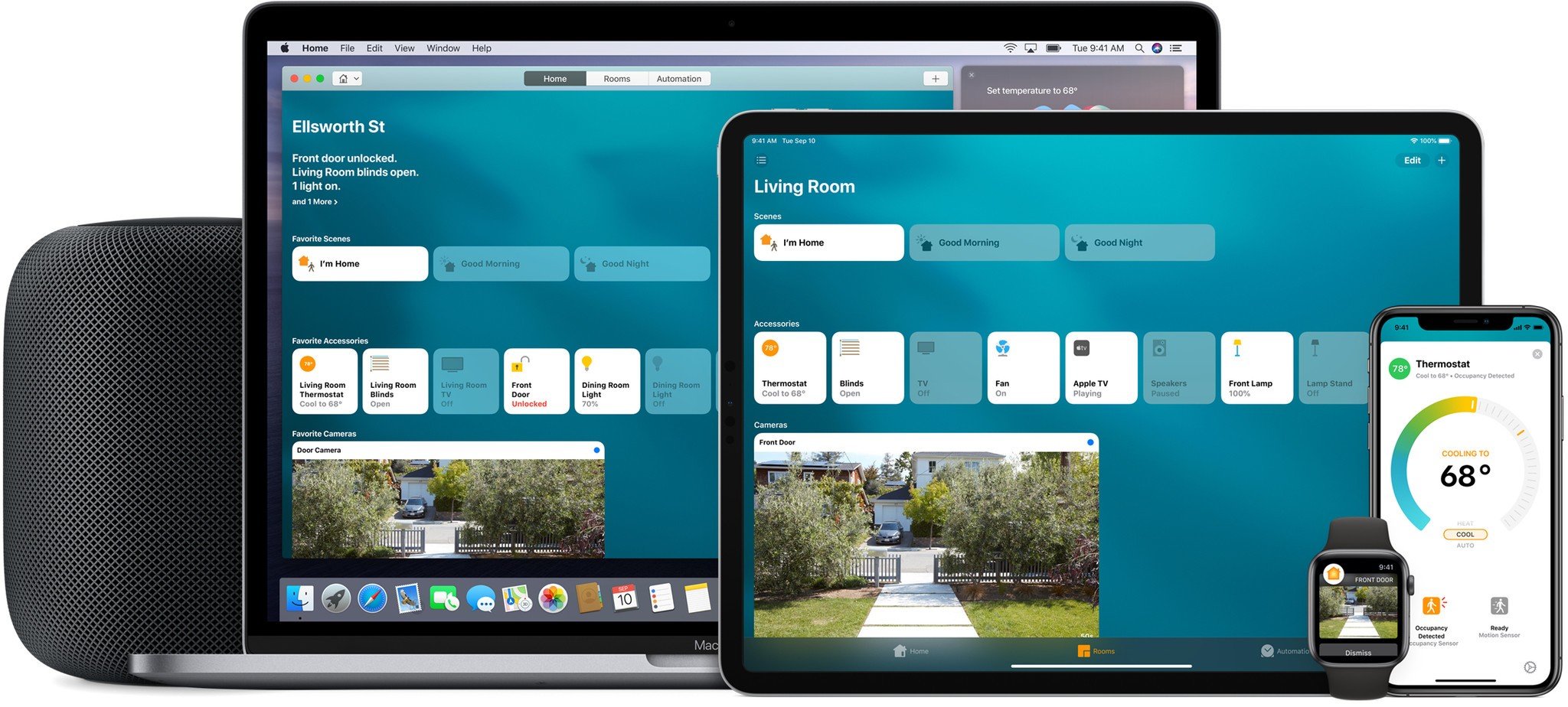
Apple's Home app may not be the flashiest app around, but it is vital for those that interact with their HomeKit accessories on a daily basis. While the basics of the app are still the same in iOS 13, the app has gotten some much needed variety on some of the icons that are used to depict our accessories. Controls for certain accessories have also been updated to provide a more consistent experience for users.
Updated icons (finally!)
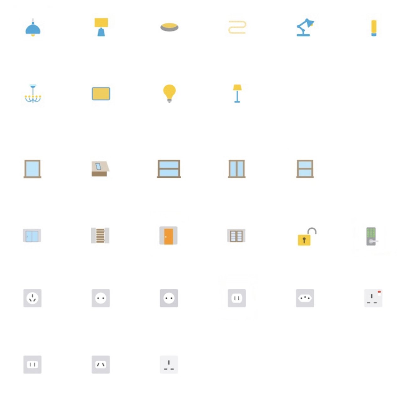
Finally, yes finally, Apple has provided some new accessory icons within the Home app. Gone are the days of having to use a pendant light icon to depict a chandelier, or a desk lamp for a more decorative table lamp. Here's the entire list of new icons that can be found:
- Table lamp
- Recessed light
- Light strip
- Cylindrical floor lamp
- Chandelier
- Panel light
- Light bulb
- Ceiling fan
- Tower fan
- Curtains
- Roller shade
- Awning
- Port window (hatch)
- Sliding window
- Single pane window
- Sliding glass door
- Gate
- French doors
- Door lock with keypad
- Smoke detector
- CO detector
- Motion sensor
- Outlets (various shapes worldwide)
- Cameras
- Humidity sensor
- Sprinkler
Icons for scenes however, remain untouched, with the same set that has been available for years still taking on the responsibility for covering our complicated scenes.
Fancy animations
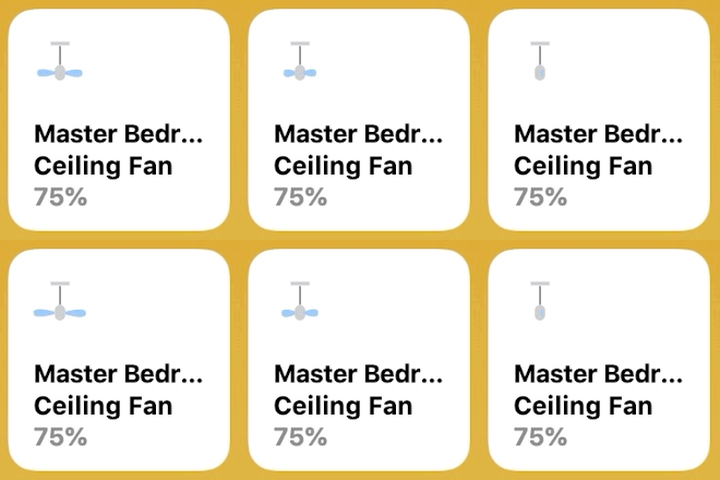
Along with the updated icon set, the Home app has received some fancy new animations. Most of these animations spring to life when you toggle on and off your accessories, such as a light bulb shining or a door handle swaying up and down to depict unlocking your HomeKit lock. Some animations, such as for HomeKit cameras, will play when scrolling past them in the Home app, which are subtle, but still neat to see. Accessory animations for devices such as fans are also on display in the automations tab, which helps to quickly show the states that are involved within the automation.
New wallpaper

iOS 13 also includes 6 new wallpaper options for the Home app. The new wallpaper include a new variety of colors, with each having a "hazy" or "smokey" effect to them, making them a little more busy than the gradient wallpaper introduced in iOS 12.
New controls
The control screens for some accessories have also seen a facelift in iOS 13. These screens (which can be found by haptic touching a device) include a completely different way for interacting with thermostat adjustments. Instead of a slider, thermostats are now depicted as a semi-circle manner, following the familiar curved form factor that thermostats are synonymous with.
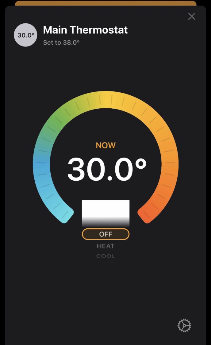
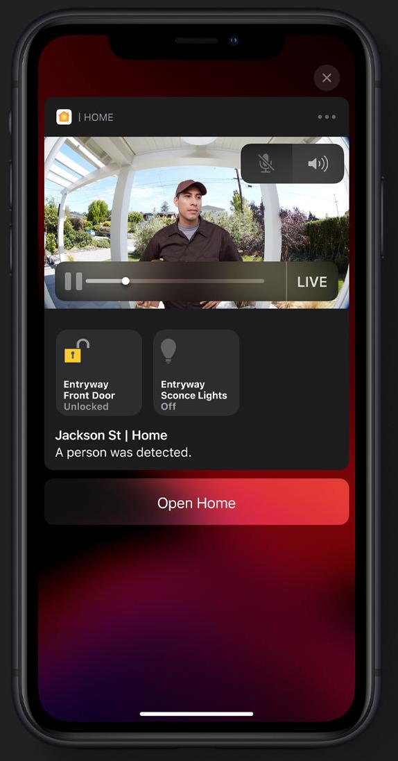
Devices with multiple controls are now displayed in a more compact manner, with each being displayed on one screen. Accessories such as smart color light bulbs have both a toggle for power and quick color presets on the same screen as well. Finally, for HomeKit cameras, a new option to display controls for devices located in the same "room" is available with just a tap while viewing the camera feed.
Master your iPhone in minutes
iMore offers spot-on advice and guidance from our team of experts, with decades of Apple device experience to lean on. Learn more with iMore!
Sensor grouping
While we are certainly happy to see some of the updated visuals within the Home app, there is one update in iOS 13 that seems like a step backwards. In every version of the Home app since its debut, accessories with multiple sensors have had a separate device "tile" for each metric that they report. So a device that reports motion, temperature, and humidity, will have 3 individual tiles within the app, making information available at a glance.
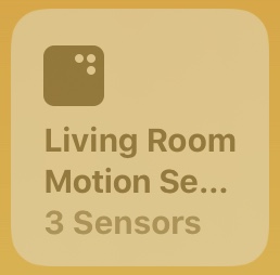
In iOS 13, accessories with multiple sensors are now grouped into one device tile. This means that our previous example of a device with motion, temperature and humidity sensors will be condensed down to just 1 tile for all 3 metrics, removing the glanceability that we had before. Let's say that if this device is a motion sensor, it will show the motion status on the device tile, and to see the other sensor data, you will now have to tap on the tile first. We can see this being a huge pain for those that like to review their temperatures for these multi-sensors from the favorites tab as they will now require interaction beforehand.
Splash screens galore
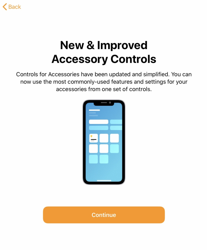
Also new in iOS 13 are a new set of onboarding or splash screens which are designed to inform the user of some of the changes that have been made. These screens include a general overview of whats new, controls explanation, HomePod personal requests, HomePod multiple voice support, and Apple TV profiles. During the betas for iOS 13, users also saw a splash screen for HomeKit Secure Video, which unfortunately, is not fully baked as of yet.
Under the hood
While there wasn't a ton of stuff new under the hood, one API change will be nice for HomeKit app developers. These developers will now have the ability to determine whether or not Home access has been grated to the app by the user. This allows developers to provide a troubleshooting step if your accessories are not showing up in a third-party app.
Missing HomeKit features from iOS 13
As with some of the other features promised with iOS 13, Apple has had to push back rolling out some of its marquee changes for HomeKit. One missing feature is HomeKit Secure Video, which is Apple's attempt to lock down your HomeKit camera's feeds and recordings to keep your data safe and in iCloud. This feature has made progress during the beta period, with developers able to find some of the UI and splash screens for this functionality, however it is not available as of yet.
HomeKit enabled routers are also missing in action at the moment. Introduced at WWDC this June, the feature will allow HomeKit routers to better manage the data that passes through and between your HomeKit accessories. Since the reveal, there has not been any announcements from Apple or router manufacturers regarding potential makes and models that would support it, so it looks like this may still be a little while out.
AirPlay 2 and Shortcuts support in HomeKit automations will also not be present in the initial release of iOS 13. However, these features are currently available in the latest beta of iOS 13.1, which is scheduled to be released at the end of the month (more on that below).
Coming soonish
Unfortunately, Apple has not yet provided a timeline on when to expect features such as HomeKit Secure Video and HomeKit enabled routers. However, the upcoming iOS 13.1 release, scheduled for the end of September will introduce AirPlay 2 devices into the automation fold, enabling some truly fantastic capabilities. One example is playing your favorite tune on your HomePod when you set a HomeKit scene for relaxing.
Shortcuts will also be expanded to integrate deeper with HomeKit in iOS 13.1. This will allow users to mix in their favorite shortcuts in with HomeKit scenes and automations. This enables shortcuts such as turning off your Wi-Fi on your iPhone when your leaving home scene is activated.
What are your thoughts on the changes that have been made to the Home app in iOS 13?
While the overall functionality of the Home app remains the same, Apple has sprinkled in many visual enhancements that breathe some new life into the utilitarian app. What are your thoughts on the updated icon sets? What do you think of the changes made to the way multiple sensors are displayed? Let us know your thoughts in the comments below.
Updated September 2019 to include wallpaper addition
Christopher spends most of his time writing and dreaming about all things HomeKit and the Home app. Whether it is installing smart light switches, testing the latest door locks, or automating his households daily routines, Christopher has done it all.
