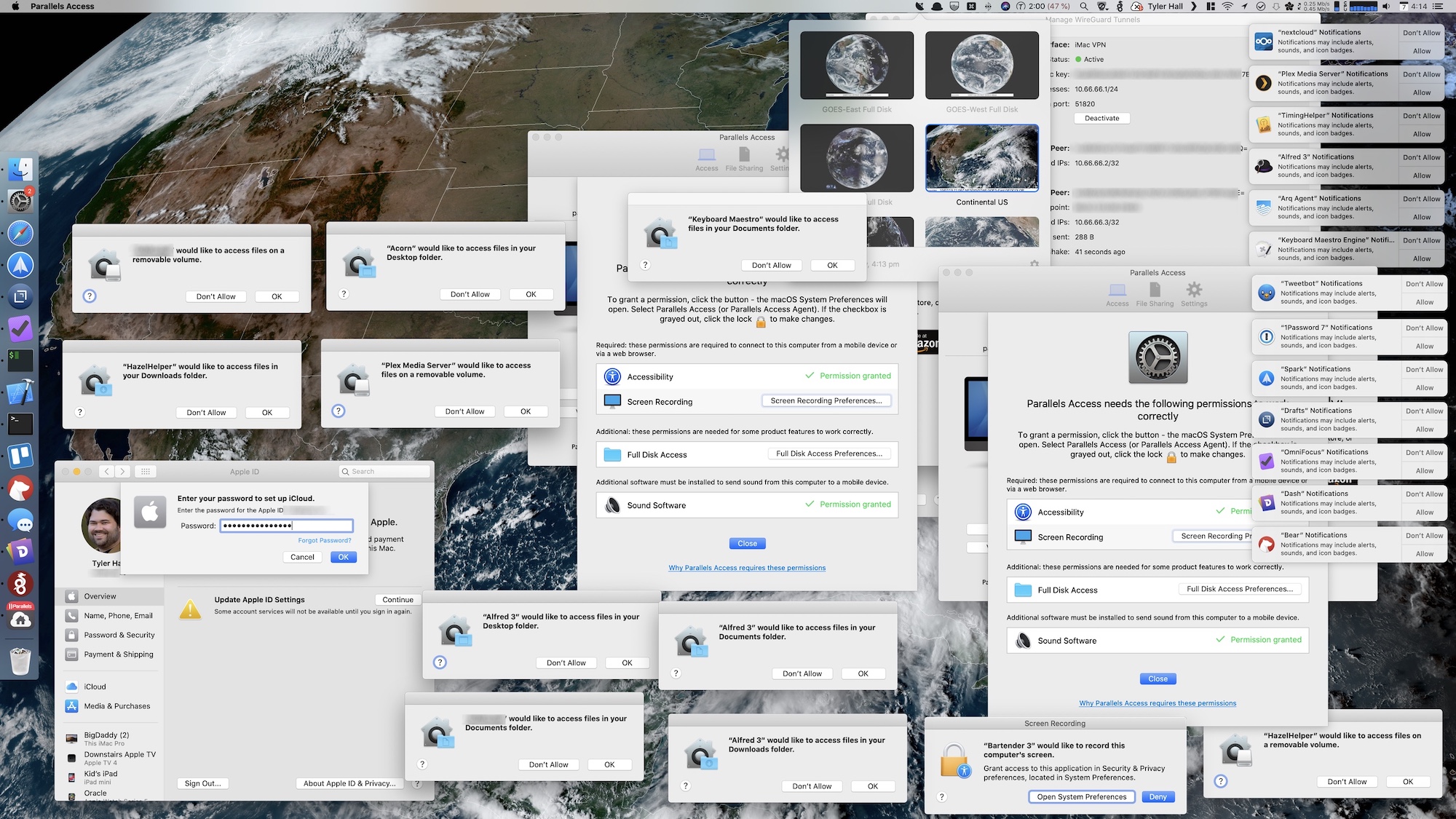
When your Mac looks like Windows Vista, something isn't right

What you need to know
- macOS 10.15 Catalina is here.
- But some first-run experiences aren't as great as they should be.
- One user's Mac looked more like a Windows Vista PC.
Apple released macOS 10.15 Catalina to the public yesterday. Despite the smart move being to hold off updating for a day or two, many of us jumped on the new update. Developer Tyler Hall was no different. But when they returned to their Mac they faced something chilling. Something nobody should ever have to see.
Their desktop looked like something out of a Windows Vista-shaped nightmare.
Overly dramatic intro aside, you can check the screenshot out and make up your own mind. But we'd suggest that this isn't something anyone should be faced with after performing a macOS update.
As Tyler mentions in a blog post, this all came about after Catalina continued to throw dialog boxes at them after updating from macOS 10.14 Mojave.
I took it after upgrading an existing Mojave system to Catalina this afternoon. Once the installer finished and I worked my way through the usual post-installation prompts/windows/whatever, I left and took my son to go get a flu shot. (Glamorous life of a father and all that.)When I came back about forty minutes later, that's basically how the screen looked. I thought it was mildly funny and began arranging all of the permission dialogs so they didn't overlap.And that's when all the "XXXX would like to show notifications" prompts appeared. So I took another screenshot.Soon after that, I realized that – like with nearly every macOS update – I had been logged out of iCloud, which meant time for a screenshot yet again.I only spent about ten minutes on that system today. But it was enough time to capture all of these papercuts and combine them into one truly-awful über screenshot.
As Tyler says, it's possible that the sheer number of messages here is down to the specific apps they have installed, but the messages are system-generated. Could they not be handled better?
You’re likely correct. Mine is probably a more extreme example given the dev and tech heavy apps I run.You’re likely correct. Mine is probably a more extreme example given the dev and tech heavy apps I run.— Tyler Hall 💉x3 (@tylerhall) October 7, 2019October 7, 2019
Presumably once all of these messages and dialogs were dismissed things went back to the usual, clean, functional macOS we and Tyler have come to expect. But Apple absolutely needs to do better in a number of regards here, not least making sure that the first-run experience of a new version of macOS doesn't look like this. No matter which apps are installed on the system at the time.
Master your iPhone in minutes
iMore offers spot-on advice and guidance from our team of experts, with decades of Apple device experience to lean on. Learn more with iMore!

Oliver Haslam has written about Apple and the wider technology business for more than a decade with bylines on How-To Geek, PC Mag, iDownloadBlog, and many more. He has also been published in print for Macworld, including cover stories. At iMore, Oliver is involved in daily news coverage and, not being short of opinions, has been known to 'explain' those thoughts in more detail, too. Having grown up using PCs and spending far too much money on graphics card and flashy RAM, Oliver switched to the Mac with a G5 iMac and hasn't looked back. Since then he's seen the growth of the smartphone world, backed by iPhone, and new product categories come and go. Current expertise includes iOS, macOS, streaming services, and pretty much anything that has a battery or plugs into a wall. Oliver also covers mobile gaming for iMore, with Apple Arcade a particular focus. He's been gaming since the Atari 2600 days and still struggles to comprehend the fact he can play console quality titles on his pocket computer.
