Why Apple Maps lead me to a meltdown in Central London
There are rumors that iOS 8 will be addressing a lot of lingering concerns over the reliability and usefulness of Apple's Maps. I very much hope so. Because I bring to you this Monday a tale of woe. A tale of using Apple Maps navigation, Central London and lots and lots of swearing. This is the tale of how using Apple Maps to navigate through the British capital – right through the middle – lead me to a meltdown.
The background; I haven't been driving much in the past 12 months, and this was the very first time I'd used Apple Maps navigation since the iOS 7 update.
First let me just say, this isn't yet another rant about sketchy directions and actually ending up somewhere in Birmingham. Far from it. The actual directions were faultless, but the way those directions were delivered caused me to have a mild breakdown outside Buckingham Palace.
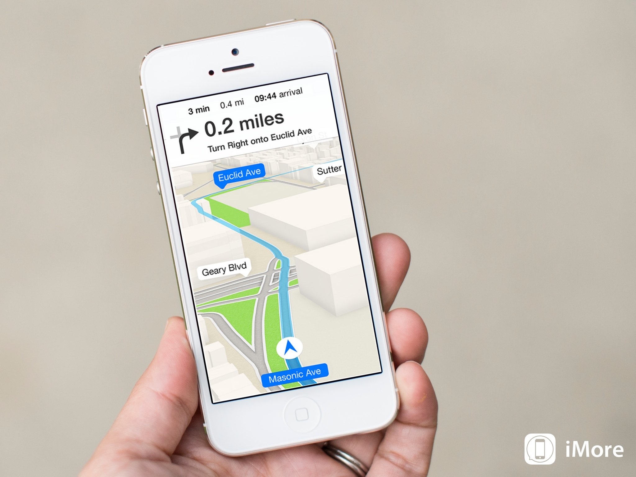
I just don't think black text on a white background is that hot for navigating with
I have two major criticisms.
The first is the appearance. Yes, the new look Maps fits beautifully within the overall look and feel of iOS 7. But I just don't think black text on a white background is that hot for navigating with. In a car, where the sun – sometimes, in the UK – shines in through the window at odd angles leaving the display filled with nothing but glare. And because of point number 2, you really do need to look at the display.
That's because the voice directions for Central London give nothing but local street names. Local street names are not what's displayed on road signs. Neither are they – usually – what is displayed on the actual road markings in front of you on occasion at roundabouts and junctions. I use my navigation my listening out for instructions, like "turn right onto A406 in 500 yards." Then I look at the road signs and the lane markings. In a city like London that's about the only way I can actually get around without pain, misery, swearing and getting lost.
These may sound like petty criticisms to some, but in a previous life I drove the length and breadth of the UK on a weekly basis. I wouldn't be able to do that comfortably using Apple Maps.
Master your iPhone in minutes
iMore offers spot-on advice and guidance from our team of experts, with decades of Apple device experience to lean on. Learn more with iMore!
So, what would I like to see done about it for iOS 8? Well, there wasn't really anything wrong with the iOS 6 navigation interface, so I'd love for the white to disappear and a bit of color and contrast to come back. And make the distance to and time of arrival more obvious. Not tiny at the top of the display.
Please, please, please make it so the verbal instructions match real life road signs.
And please, please, please make it so the verbal instructions match real life road signs. Because you should always be watching the road in front, not looking at your sat nav screen to try and work out which street you're turning on to. This might be more of an issue here in the UK, but it's still an issue in my car.
So that's my take, and any future trips into the unknown will be using another mapping or sat-nav service. And that's a shame, because Apple has done some really good work with Apple Maps. I just can't use it as it is.
But how about you guys? Any regular Apple Maps navigation users think I'm crazy, or have you experienced similar frustrating trips. Sound off in the comments below!

