Why I skipped the Touch Bar on my new MacBook Pro

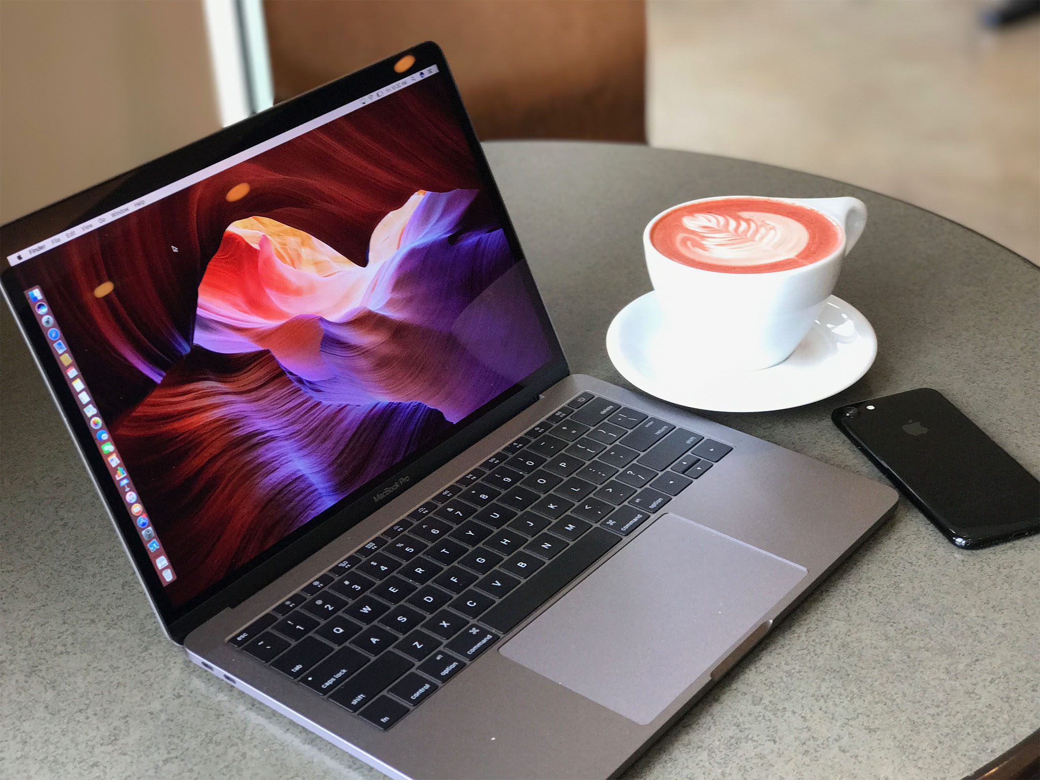
I'm typing this to you on a new MacBook Pro, the first Mac I've purchased since a refurbished 11-inch MacBook Air in mid 2011. While it's true I haven't bought my own new Mac since then, it's also a little misleading: I had a 2013 MacBook Air issued to me by my previous employer, plus I got loaner Macs from Apple to review, and I used a 2016 13-inch MacBook Pro with Touch Bar for months.
Now I'm my own boss, and Apple's loaners have all been returned. When I went shopping for a new Mac, I felt like I had an edge, since I'd used them all extensively before. Still, I found myself hemming and hawing over so many specs, like RAM and storage. But one thing fell into place pretty quickly in my decision-making process: No Touch Bar for me, thanks.
The Touch Bar is expensive
Unless someone else is paying, price is a big deal. Apple's website lets you configure your Mac with a faster processor and extra RAM and storage, but you'll see that price increase with every click. But before you even get to that build-to-order screen, you have to pick the base model, and if you're looking at a 13-inch MacBook Pro, the difference is striking: The model without a Touch Bar starts at $1299, the same price as an entry-level 12-inch MacBook. To get a Touch Bar, I'd be out at least $1799.
Since I choose the MacBook Pro without the Touch Bar (let's call it the MacBook Pro Escape for simplicity, and because it has an Escape key), I could spend the extra $500 upgrading the specs that I think really matter: It's $200 to go from the stock 8 GB of RAM to the max of 16 GB. Another $400 got me from the stock 128 GB of storage to 512 GB. That's $1899, which is plenty, but if I'd gotten a Touch Bar model with that much RAM and storage, it would be $2199. Breaking the $2000 mark on a 13-inch machine is tough for me.
Forgoing the Touch Bar also saves money for USB-C cables and docks, by the way, like a Lightning cable to plug in an iPhone or iPad or a USB-C hub to connect to a monitor or other USB Type A devices.
I don't need the ports
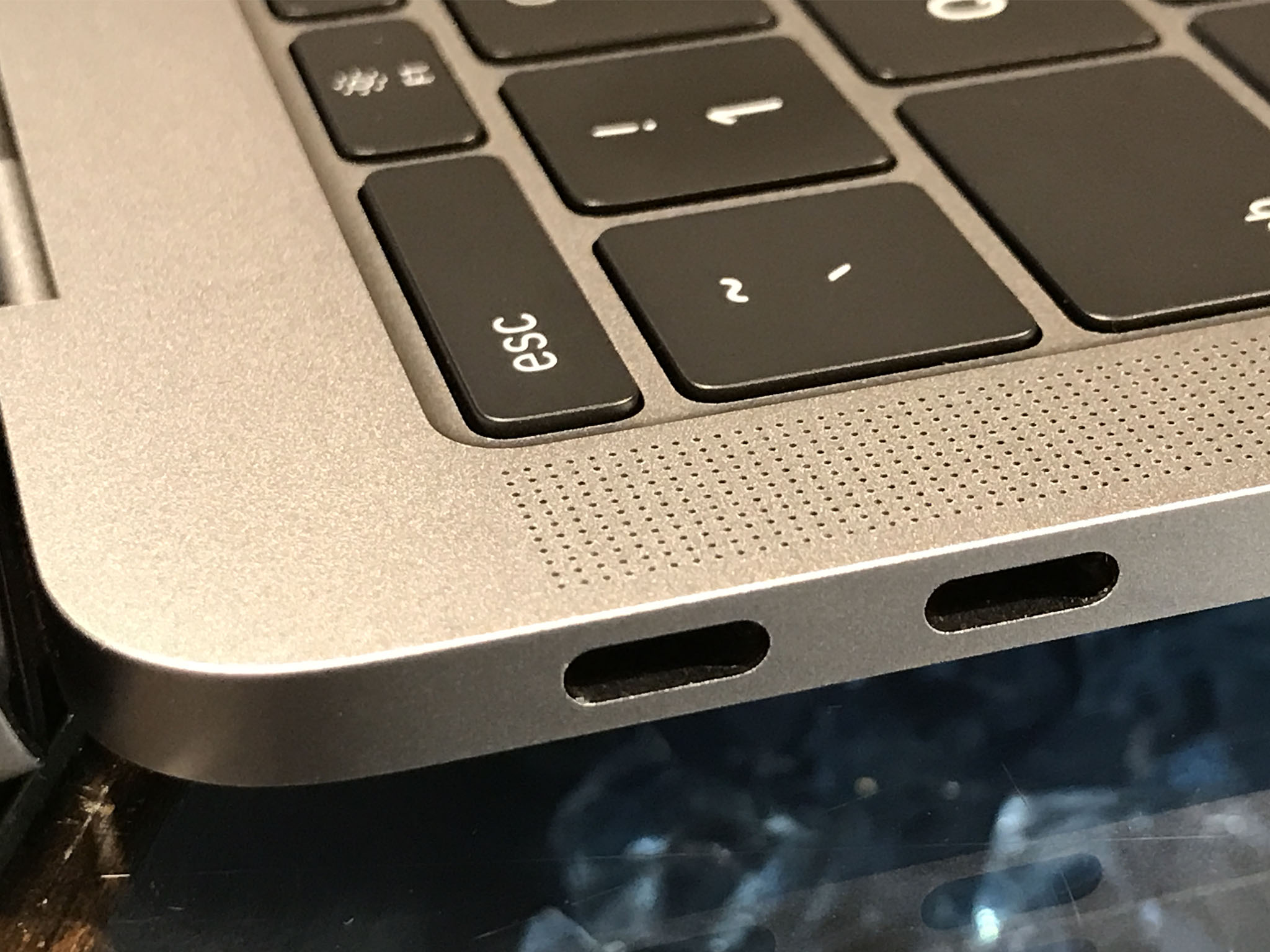
The Touch Bar isn't the only thing missing from the MacBook Pro Escape. It's also limited to two Thunderbolt 3 ports, while the Touch Bar models all have four. But I don't really notice. Two ports is enough for me because all I really plug in to this Mac is the charger.

I have a small USB-C dock for when I need to connect something, but that doesn't happen very often. I need it to plug in my iPhone on the rare occasion I need to transfer a photo and AirDrop isn't working, and I connect my USB Type A podcasting mic once or twice a week at most.
Master your iPhone in minutes
iMore offers spot-on advice and guidance from our team of experts, with decades of Apple device experience to lean on. Learn more with iMore!
One caveat: I don't use an external monitor, largely because this Retina screen blows away any monitor I own right now, and I'm not in the market to buy a 4K or 5K display right now, especially since I just dropped so much on this computer. Plenty of docks support an external monitor (mine has HDMI — I've just never used it) and if you get one with passthrough charging, you can charge your MacBook Pro and connect the display through the same Thunderbolt 3 port.
Look, I get it. Removing all the ports from the MacBook Pro in one fell swoop was a dramatic move on Apple's part, and users like you and me could be forgiven for assuming we need as many of these new Thunderbolt 3 ports as possible to replace everything we've lost. I've been pleasantly surprised to see that I really don't need that many ports. The two on this MacBook Pro Escape are just right.
I miss Touch ID, but not Touch Bar
Rene says he can tell when a new feature, like the Touch Bar, is compelling if he misses it when using an earlier device that didn't have it. After going from a tricked-out MacBook Pro with Touch Bar to this MacBook Pro Escape, I've found I really only miss Touch ID.

The Touch Bar is admittedly cool. It's a much better way to pick out emoji than pressing Command-Control-Space and clicking through menus. Still, for a $500 surcharge, it better do more than speed up my emoji workflow. I use plenty of Apple and third-party apps that put commands on the Touch Bar, like Pixelmator, Pages, Byword, and Excel. I just never found myself using the Touch Bar buttons, in favor of more familiar interfaces like the keyboard and trackpad.
Since developers can't count on everyone having a Touch Bar, any button that's in the Touch Bar is simply moved from the main interface — those apps don't have extra abilities, just a different layout. I'd rather set up a keyboard shortcut for a menu option I use constantly than have to redirect my eyes and my hands to hit that button on the Touch Bar.
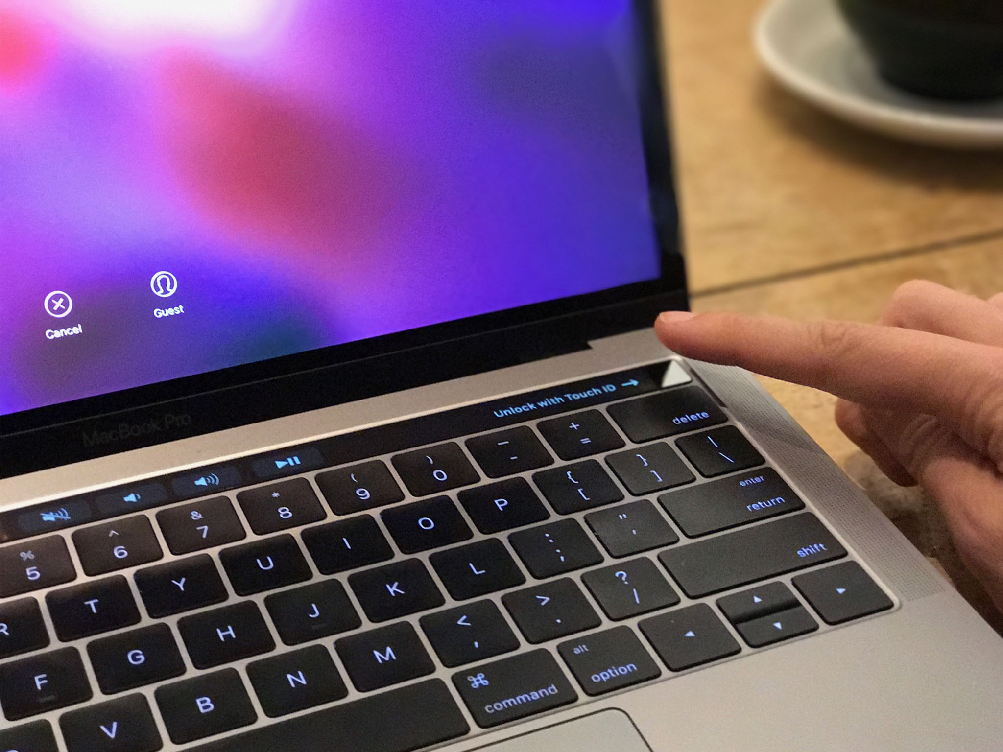
Touch ID, however, has no analogue on this MacBook Pro Escape. To unlock my Mac, I have to type in my passcode or use my Apple Watch. If I want to use Apple Pay in Safari, again I need my iPhone or Apple Watch to authenticate the payment. But the thing I miss most about Touch ID on a Mac is using it to unlock my 1Password vault. I'm sure someday Touch ID will be on every Mac, and I'll probably continue to be jealous until I have it again. (I just didn't want to pay for it.)
Touch Bar or no?
What do you think? Did I make a smart decision, or do the MacBook Pro with Touch Bar's extra ports and better graphics chip make it worth the extra money? Toss in your two cents in the comments, or visit the forums to talk through your own buying decision.
Susie is a tech-obsessed writer and mom, and former Executive Editor of Macworld and Mac|Life. Follow her on Twitter @sfsooz.

