Why stop with the headphone jack? Apple could delete everything!

When iPhone 7 ships next month, the venerable 3.5mm headphone jack won't be on it. That's the popular expectation, at least. Some are happy with the idea and eager to sacrifice the 100-year-old connector in an effort to bring a better and more wireless future to us faster. Others are filled with venomous rage at the thought of a standard being sacrificed and existing accessories made obsolete all in the name of some nebulous promise about tomorrow. Personally, I'm wondering why Apple's stopping with the headphone jack? If Apple is willing to delete even more hardware from the iPhone, why not simply delete it all?
Deleting Home
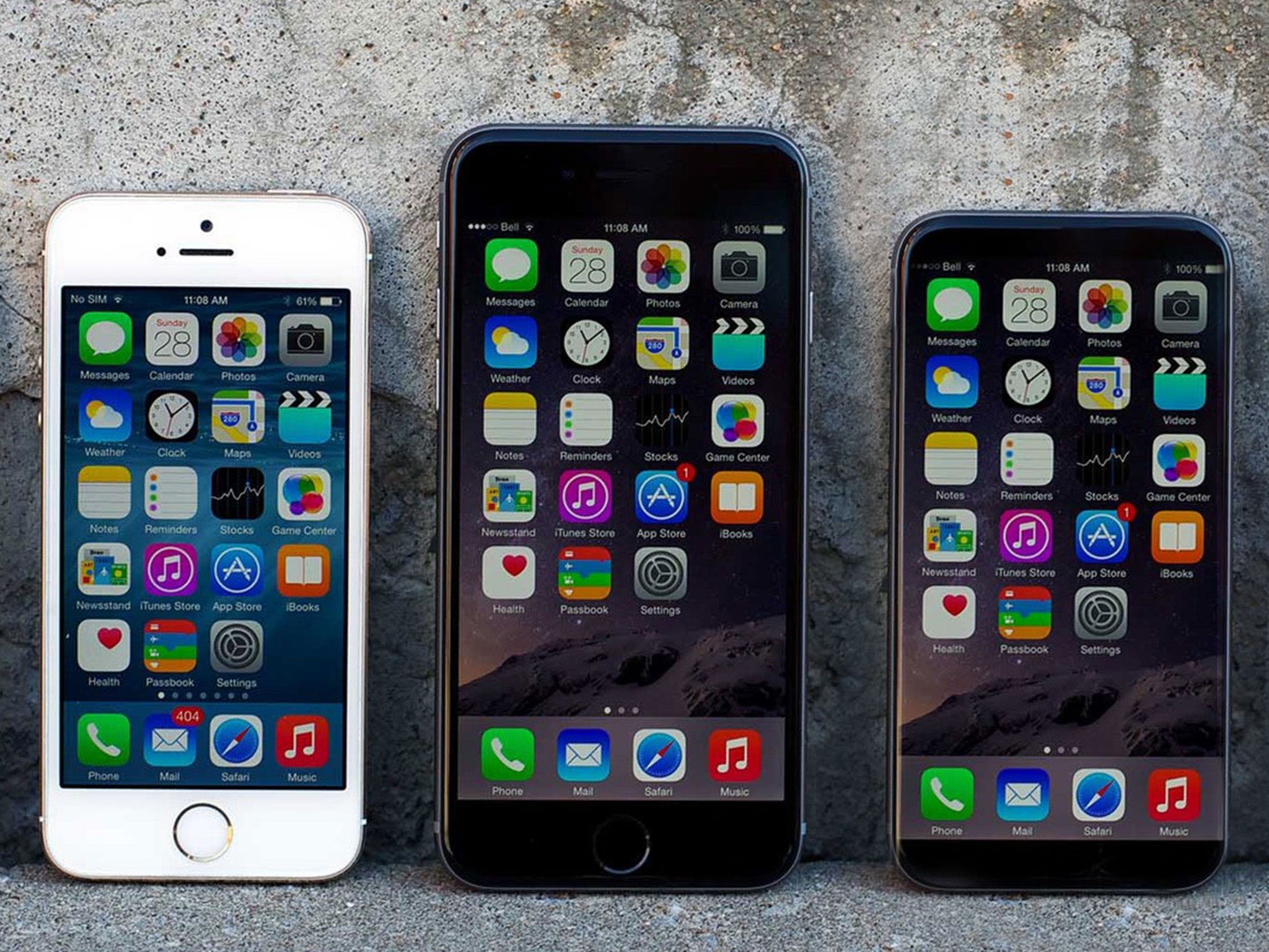
I'm not talking about replacing the mechanical Home button with a Force Touch Home button, the way Apple replaced the mechanical trackpad on the MacBooks with the Force Touch trackpad. I'm taking about deleting the Home button completely. The former saves vertical space by removing the mechanical stack needed to make it work. The latter saves all the space by removing the button. That would, theoretically, allow Apple to reduce the ratio of screen-to-bezel. In other words, make the casing smaller while maintaining the same display size. (Theoretically, because those bezels are tightly packed with components that still need to go somewhere.)
A few factors complicate this:
- Because Passcode and the first-generation Touch ID were so slow, people began using the Home button as a second power button to wake the iPhone's screen.
- The Home button functions as a manual escape valve for people who sometimes find iPhone confusing or stressful. With a click or two of the Home button, no matter where someone is in the operating system, no matter how lost or frustrated they feel, they'll get back to the known, comforting state of the Home screen and be able to start over.
- The Home button is also loaded with additional physical triggers. Holding it down triggers Siri. Touching it twice triggers reachability. Pressing it twice triggers Apple Pay. Pressing it three times, optionally, triggers accessibility. Pressing it once in conjunction with the power button triggers a screen shot. Holding it down in conjunction with the power button triggers a reboot.
- The Home button isn't dumb anymore. Thanks to Touch ID, it's now smart enough to scan our fingerprints and know who we are.
A few years ago it would have been easier, if still inconvenient to many, to delete the Home button. Since coupling it with Touch ID, though, it's become much tougher.
The obvious solution — obvious since tech writers are never the ones who actually have to implement anything! — is to decouple Touch ID from the Home button.
In the far-flung future, I imagine every part of iPhone will be able to "read" fingerprints, so the moment you touch it, it knows who you are. (Not just for unlock, but optionally to prevent anyone else from doing anything interactive with it — ever.)
Ubiquitous authentication — where the surface, camera, mics, motion, and other sensors conspire to collect a constant stream of partial prints, facial and iris scans, voice snippets, gait, and other data, and make a reasonable determination on authentication — is my beautiful dream.
Master your iPhone in minutes
iMore offers spot-on advice and guidance from our team of experts, with decades of Apple device experience to lean on. Learn more with iMore!
The shorter term reality, though, could be having a discreet section of the screen, near the bottom, with Touch ID built-in.
Once the Home button goes Force Touch, it could go 3D Touch, but Apple would still have to figure out how to handle collision with other on-screen 3D Touch elements and where to put all the aforementioned triggers.
Wake is already being handled in iOS 10, though. Raise to wake, like on Apple Watch, means the screen lights up whenever you lift the phone. Add tap to wake, also like on Apple Watch, and tapping anywhere on the glass can — and I'd argue should — wake it as well.
"Hey Siri!" can handle activation absent Home. So could a discreet 3D Touch area on the screen or Force Touch area on the casing. The latter would also work for the other shortcuts. Squeeze the bottom of iPhone and hold for Siri, squeeze twice for Apple Pay, squeeze thrice for accessibility.
Deleting Everything
iPhone currently has three buttons along the top left side: ringer, volume up, and volume down. There's also one button on the top or side, depending on whether it's an iPad or smaller iPhone, or a bigger iPhone.
Apple could delete all of these as well.
There are already software controls for volume, though Apple has shunted them to a secondary panel in Control Center for iOS 10. They're certainly not as convenient as physical controls for runners, people ducking into meetings or events, or quickly making adjustments to an iPhone in your pocket or iPad in your hands.
Force Touch controls might work here too. Or a hybrid, where squeezing the top of the device brings up an on-screen rotor that can make several options available.
Bottom line
Some will read this and think I'm trying to make a point about the headphone jack, either sarcastic or optimistic. My real point is this — the future is always coming and everything will change. It's always too soon and it's always too late.
Taking things away reduces points of failure; whether they reduce or increase functionality depends on implementation. We'll see how Apple's next efforts work this fall.

Rene Ritchie is one of the most respected Apple analysts in the business, reaching a combined audience of over 40 million readers a month. His YouTube channel, Vector, has over 90 thousand subscribers and 14 million views and his podcasts, including Debug, have been downloaded over 20 million times. He also regularly co-hosts MacBreak Weekly for the TWiT network and co-hosted CES Live! and Talk Mobile. Based in Montreal, Rene is a former director of product marketing, web developer, and graphic designer. He's authored several books and appeared on numerous television and radio segments to discuss Apple and the technology industry. When not working, he likes to cook, grapple, and spend time with his friends and family.

