WWDC 2019 Preview: Here's everything we expect to see!
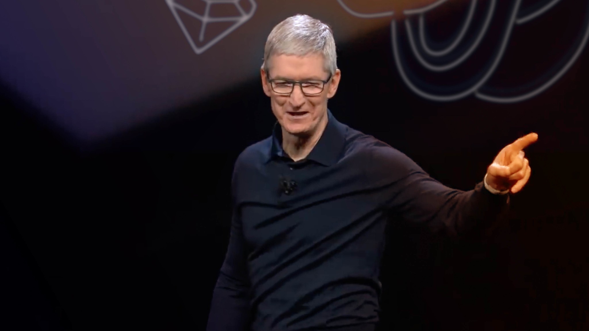
The music fades. The lights go down. A video plays. Developers. Apps. Apple. The community. We're all together again. And when the lights come back up, Tim Cook is walking onto the stage.
"Thank you. Thank you. Good morning. And welcome to Apple's 30th annual WWDC!"
Rather watch than read? Gui Rambo for Stack Trace and 9to5Mac joined me for a complete video preview, so hit pay and enjoy!
And then we're going to get it — Festivus in June. When Apple unwraps all the software presents, from iOS 13 to macOS 10.15, tvOS 13 to watchOS 6. And maybe, just maybe, our first look at the all-new, all modular Mac Pro and 6K Pro Display.
WWDC 2019: iOS 13
Tim Cook hands off the clicker to Senior Vice President of Software Engineering, Craig Federighi, and the iOS 13 logo fills the big screen above the stage.
Here's what Gui Rambo from 9to5Mac says we're getting now.
iOS 13 Dark Mode
Back in 2013, Apple released iOS 7, their first major software redesign for iPhone and iPad. And it was bright. And white. So very bright and white that many of us hoped immediately for a dark mode. Something to make it the opposite of bright and white, especially at night.
Master your iPhone in minutes
iMore offers spot-on advice and guidance from our team of experts, with decades of Apple device experience to lean on. Learn more with iMore!
And, in 2014, Apple gave us just that. But not for iPhone or iPad. For the then brand new Apple Watch. But that was ok. That was cool, because after inverse colors and smart inverse colors, which were kinda sorta but no not really, in 2017 Apple gave us dark mode… for Apple TV. Fine. Everything was fine. Because in 2018, we finally got dark mode… for the Mac.
Yeah. Ouch. I've already joked that this means, this year, we'll absolutely, finally get dark mode… for HomePod.
But it sounds like the half a decade plus of trolling is, at last, behind us, and performance improvements done, the design evolution is continuing, and this year we'll actually be getting dark mode for iPhone and iPad.
It probably won't be the more ambitious ThemeKit I've had on my wishlist for a while, the frameworks that would make it easier for the system and apps to offer not just dark and bright modes but low and high contrast, cool and warm colors, neon or pastel, and much more customization than is currently possible.
But, dark mode beggars can't be dark more choosers.
So, my question is: how easy will it be to switch back and forth? Because, as much as everybody always wants to dark mode all the things, dark modes can be as oppressive as they are impressive, and it's important to be able to easily go from bright as day to black as night.
iOS 13 Fonts
My other big visual wishlist item for iOS 13 was FontKit. One look at Adobe Photoshop for iOS and it was impossible to see, more than a decade later, the absence of anything even resembling font handling — from the company that made their Mac name on typography, no less — as a glaring, gaping omission.
Management is going to be implemented in a Settings panel. There'll be a new Font Picker controller so you can get your styles on inside text fields, and an alert if you download a document but don't have the fonts installed to go with it.
I'm not sure how much space fonts will take up given the size of modern iOS device storage, but for people who either have the smallest amount or have filled up even the largest already, some kind of on-demand resource management, where newer, more frequently used fonts are kept local and available and older, infrequently used fonts are kept online until needed, would be interesting to see.
iOS 13 New Home screen
A new home screen design seems to get rumored every year, even though the iPhone's springboard layout has been essentially unchanged since launch in 2007. It's gotten multiple screens, the minus one screen, spotlight search, and other additions, but no major alterations.
There were yet more rumors of a redesign last year but it reportedly got pushed back to free up time for the performance updates. It was also unclear if it was an iPad-specific redesign or one that touches both iPhone and iPad.
Nerds want something that'll take better advantage of the bigger screens or allow for almost complete customization. Mainstream want you to leave their icons alone and not confuse them or they'll come for you. And cut you.
Widgets are better off remaining on the minus one screen, because the home screen, name aside, is a portal not a dwelling. But, there's a lot Apple could do with allowing different content types, like contacts with 3D Touch contextual shortcuts, and having a space for Siri suggested apps, something that would allow for object permanence for the apps we always want to be able to launch like muscle memory and dynamism for the apps we only want when we want them.
iOS 13 Multi-Window Apps
The Mac is all about multi-window workflows. Until a few years ago, though, you couldn't even stack two iPad apps side-by-side. Hell, you still can't even do that on even the biggest iPhones. Now, in addition to side-by-side, swipe over apps, and picture-in-picture, we have drag-and-drop.
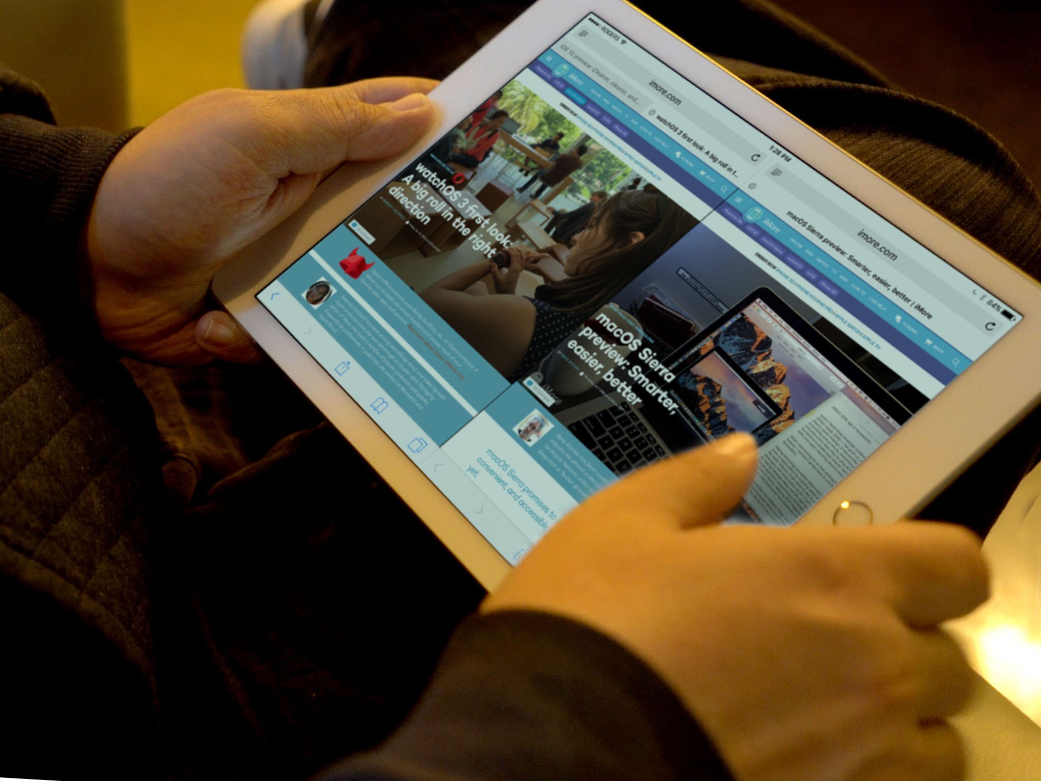
What we don't have is multi-window, side-by-side in Safari aside, within apps. Two Notes windows open at once, for example, or two conversations in Messages or Mail.
According to Gui, iOS 13 is going to fix a lot of that. At least for iPad. Apps will get multi-window support. Sounds like side-by-side, maybe even tabbed, because there'll be lighter and darker options, so hopefully we'll actually know which windows is, you know, active at any given time. Something that's been inexplicably lacking from iPad multi-window so far.
Gui does add that something like PanelKit will also be in the offering. Windows will be able to contain sheets and those sheets will be able to be dragged free, into cards, and those cards will be able to be stacked.
That's a lot of visual and spatial data to parse at a glance, depth effects or no, but I'm really interested to see how the human interface team envisions it all looking and working.
iOS 13 Gestures
Back in iOS 4, at least in beta, we got the four finger gestures on iPad for closing and switching apps. iPhone X brought us an almost full on gesture-navigation system. iPad… has gone through a couple of different versions over the last couple of awkward teenage years.
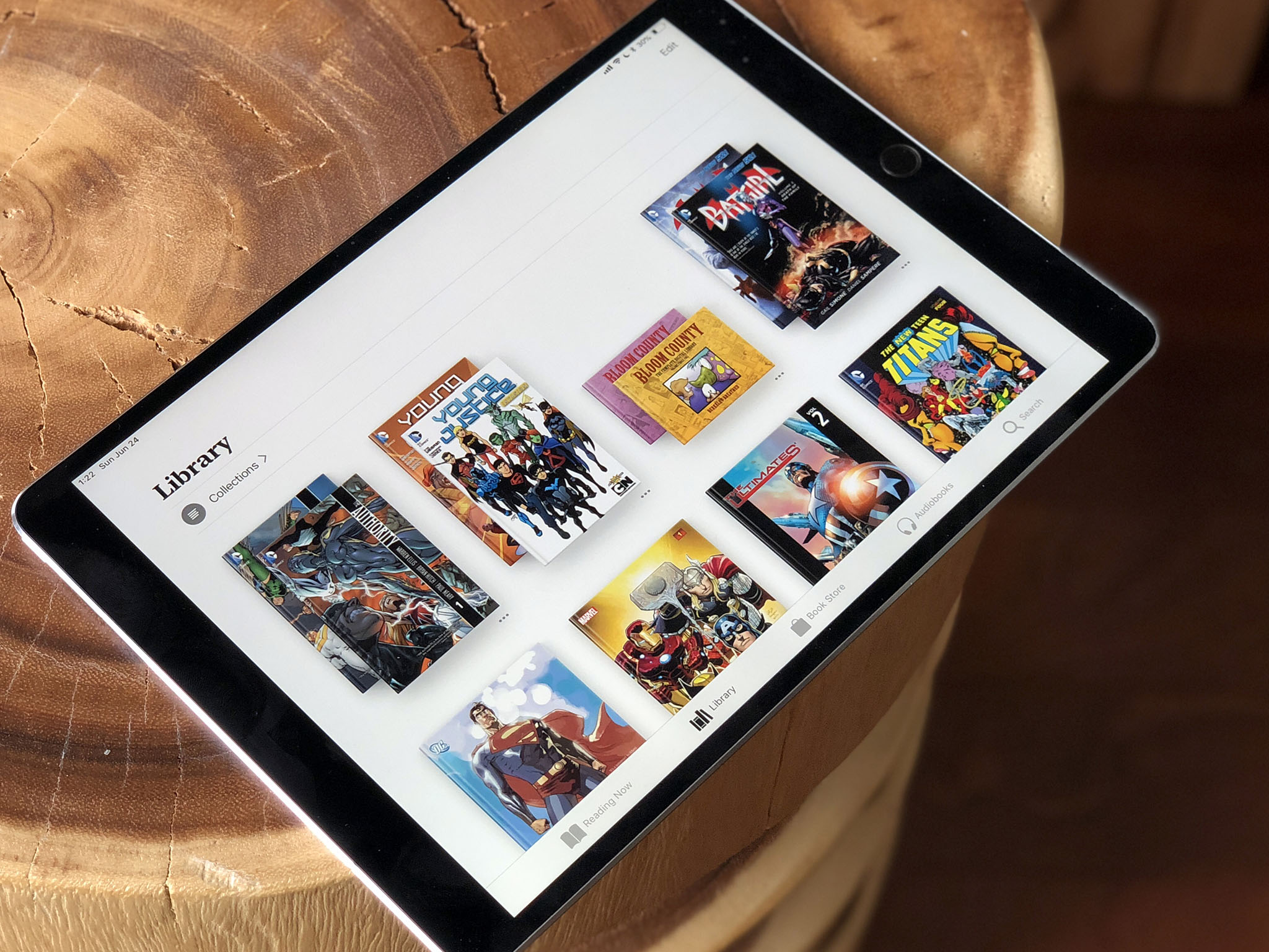
The trouble with gestures is that there are only a few really basic ones you can do, like swipe up or swipe down, and overloading those with multiple options based on where exactly you started and stopped the swipe, or how many fingers you used, can lead to collision and confusion. Likewise, making complex gestures becomes like spell casting, where you have to remember which shape you draw leads to which fireball, sorry, which editing task, being invoked.
That said, gestures are the keyboard shortcuts of multitouch, and there's room for just a few more, still simple, but specific ones to help speed up the interface.
Trackpad mode, where you currently touch and hold the virtual space bar for a long moment, is one example. A universal undo, one that doesn't require you to just shake-shake-shake it off — the entire device off — is another.
Sounds like we'll finally be getting it with iOS 13. Three finger tap and swipe left to undo. Three finger tap and swipe right to redo. It's not quite the Procreate double finger tap, but it's close and direction adding dimension sounds smart.
It also sounds like we'll be getting multi-select support not just for icons and draggable items, the kind that currently exists in iOS, but for items in list and collection views as well. I've wanted lasso select for Apple Pencil for a while but getting it for fingers as well is even more ideal. Idealer?
I'll have to see the mechanics in action, because multitouch multi-select can be a little tricky depending on digit dexterity and eye-hand coordination, but my hope level is high.
iOS 13: Find my Stuff
According to Gui, in a separate article on 9to5Mac, Find my iPhone and Find my Friends are merging and, what's more, adding the option to find other things connected to small, Tile-like beacons from Apple.
I don't know how one UI will be able to handle so much… stuff but I'm eager to find out.
iOS 13 Mail & Safari
It feels like Apple has been working on an improved Mail app for half a decade or more. Whether this is that remains to be seen but some of the ideas sound similar. Given the advances in machine learning, I'm all for all apps doing more of the drudge work and heavy lifting for me, all the time. Sorting is one of the main ones. Just build a model based on Merlin Mann, the entire team at Omni, and the other high-order organizers, and let the world reap the benefits.
Gui says our messages will be smart-sorted into marketing, purchases, travel, "not important" and more, with the categories being searchable. And that we can add them to a read-later queue.
I'm still wishing for that universal queue where anything I save in News and now News+, and anything I add to Safari Reading list, and sure, now in Mail, all ends up in the same place so I can just read through it at any time, for anywhere.
Also, automatic desktop mode for Safari, because sites like Reddit and YouTube giving you the tiny, iPhone optimized version on the giant iPad screen should be subject to summary de-resolution. And if their developers don't care enough about the simple usability of their sites to code the detection better, at least the Safari team can help us impose our wills upon them.
iOS 13 New Siri Intents
Siri Shortcuts let you assign voice triggers to any simple action surfaced by an app, or any workflow you create by linking those actions. They can add a lot of functionality but it's also very limited functionality. Siri intents, on the other hand, well, those are the holy grail of voice control.
Intents are deep, robust ways for apps to surface functionality for Siri, ways that don't require specific triggers but can respond to a wide range of different sentence structures. For example, Skype Lory, make a Skype call to Lory, call Lory on Skype.
If Shortcuts are like a Siri day pass, Intents are much closer to first class Siri citizenship.
Apple announced the first, limited batch a few years ago, and a couple more have tricked out since, but nowhere nearly enough and nowhere nearly fast enough.
According to Gui Rambo of 9to5Mac, though, that's about to change with new intents coming to iOS 13 for event ticketing, message attachment, trains, planes, and some big ones search and media playback.
I'm not sure how either will manifest yet, but if Apple does media playback right, it'll be what pretty much all of us have been waiting years for: Full on Siri control for everything from Spotify to Netflix to Overcast and Audible. Basically, every third-party video and audio app would suddenly be as integrated with Siri as Apple's own TV, Music, and Podcast apps.
Seriously, this alone just quadrupled, quintupled, dectupled? My WWDC excitement.
iOS 13 Augmented Reality
Apple doesn't really see augmented reality — AR — as an app or even a feature. If you listen to Tim Cook enough over the years, it's clear Apple sees AR as a core technology key to Apple's future. And that, one day, having an AR view will be like having a display. See my previous video, link in the description.
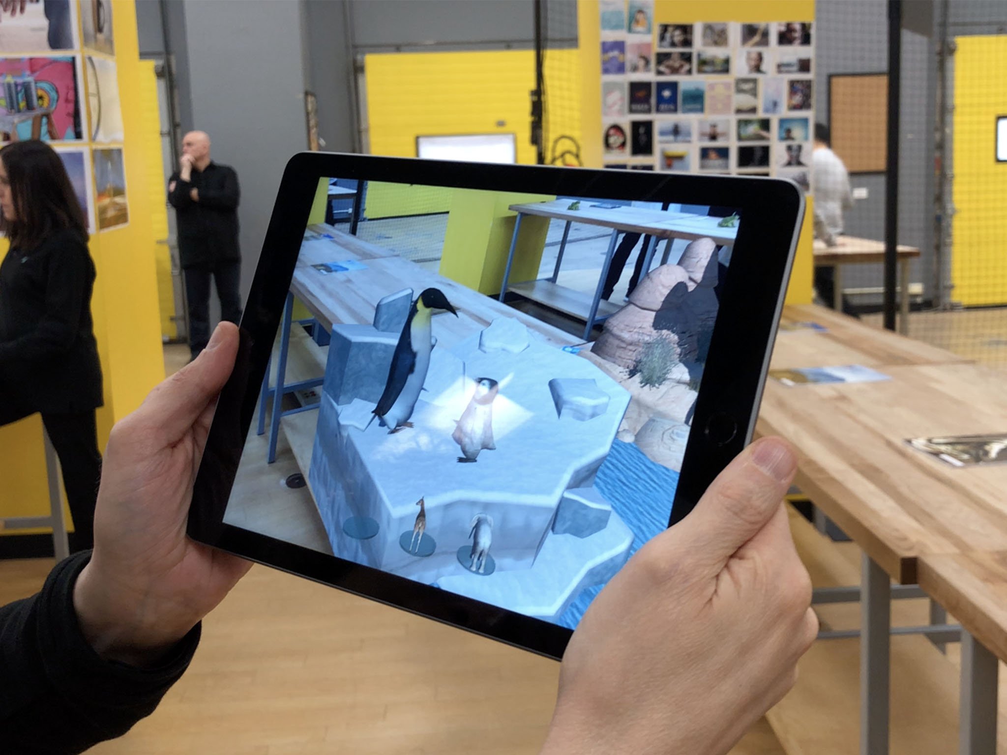
That's why Apple's been so aggressive with iterating ARKit, their framework for AR. They've gone from relatively simple surfaces and ephemeral models to full-on, multi-person, persistent environments and Memoji-style face and expression tracking in a couple of years flat. Even working with Pixar on a new, portable, standardized file format where directors can have different opinions on where virtual props go than the set designers who initially placed them. It's all shades of goofy cool.
According to Gui, Apple won't be slowing down with iOS 13 either, adding the ability to detect human poses — I'm guessing that means bipedal, sorry dog and cat friends… for now! Also, a new Swift-based framework and app that'll let you create AR experiences visually, and support for controllers with touchpads and… wait for it… stereo AR headsets.
No, that doesn't mean Apple has to announce its own AR glasses at WWDC. Just like with ARKit in general, Apple is using its existing devices, in the hands of hundreds of millions of people, and features and apps like Animoji and Measure to slowly get developers and customers alike familiar with AR, so they can understand and iterate as much as possible at the bit level before spitting out any atoms.
Clever Apple. But it does feel like we must be getting close, right?
iOS 13 Taptics
Confession: I'm overly smitten with the idea of tactile interfaces. Graphical User Interfaces have been a thing since Xerox Park, the original Lisa and Mac, and Windows. Voice interfaces have grown with Siri, Alexa, and Google Assistant. We've had things like the Taptic Engine in iPhones and Nintendo's Joy-Cons for a while, and everything from the really abstract head shake feedback when you try to 3D Touch an icon without any options, to the feeling of ice shaking in your hand when playing a game is just… beyond cool. But, the technology also still feels like it's in its infancy.
According to Gui, though, Apple is working on maturing them with a new iOS 13 frameworks that'll give developers even more control over the Taptic Engine in modern iPhones.
I don't know what we'll see as a result of this. I don't know what I even want to see — I mean feel. But developers, especially and including game developers, have been pretty savvy about incorporating force feedback so far, so at this point, I just want to see it — feel it — dammit.
iOS 13 Direct Image Capture
Right now, if you want to get a photo off your camera or SD card and into an app, you have to go through Apple's Photo-based import feature. Even if you want to use it in Lightroom or whatever. You have to go through Photos. Likewise, if you want to scan a document, you have to go through Notes or an app that has its own, built-in, capture system.
With iOS 13, though, Gui says Apple will be providing API — Application Programming Interfaces — so that any app that implements them will be able to pull photos and scan documents directly, no Apple app intermediation needed.
If it works well, that should seriously speed up a lot of workflows and remove a lot of duplicate content across libraries. Hurrah.
iOS 13 Machine Learning
Apple is all-in on AI these days the way it was on silicon a decade ago, and we've all seen the results of that push. Now, with John Giannandrea as head of his own, ethically-focused org, the sky — instead of the Skynet — may be the limit.
How much of iOS 13 his team has had time to work on, I don't know, but Gui does mention a few new machine learning features coming our way.
CoreML will be updatable on-device, so apps will be able to learn and improve in real time. That'll help make sure the privacy benefits of not hoovering all our data to the cloud are matched by greater dynamism and, hopefully, even better results.
Vision is getting a built-in image classifier, and a new API will provide for a new sound analyzer. That'll save developers having to roll — sorry, train — their own and maybe even more and better integration into a wider range of apps and features.
iOS 13 Mouse support
This one comes from Federico Viticci of MacStories fame, from his Connected podcast, and was echoed by Steve Troughton Smith on Twitter.
https://twitter.com/stroughtonsmith/status/1120447708215554049?ref_src=twsrc%5Etfw
If you missed last week's @_connectedfm, @viticci had a pretty interesting scoop that he'd been sitting on re mouse support coming to iPad as an accessibility feature. As far as I'm aware, that *is* indeed in the works. I feel like every pro user will turn that on, day one
Why as an accessibility feature and if that will impact anyone wanting to use it more generically, is impossible to say. But, you know, even Steve Jobs relented and let arrow keys and command lines onto the Mac, so letting people fall back onto the mouse, trackpads, and pointers almost a decade post-iPad doesn't seem like a bad thing. Especially since the keyboard made its official comeback a few years ago already.
Basically, anything that lets us keep our eyes and hands in context is a huge win for productivity.
WWDC 2019: tvOS 13
Tim Cook goes over the recent developers with the all-new TV app and TV+ then Eddy Cue, Senior Vice President of services, or maybe someone on the Apple TV team hits the stage, to talk tvOS 13 and... what exactly?
tvOS never seems to get as much stage time or as many new features as Apple's other operating systems. And, previously, a lot of what it has gotten was focused on the TV app. Since Apple already showed off and launched the new TV app back in March and May respectively, what could we see on stage in June?
Apple game controllers, or some licensed controllers and game bundles? Maybe keyboard gaming support? TV app for Android and other Smart TVs? Continuity for media?
We'll have to wait and see.
WWDC 2019: watchOS 6
Tim introduces Kevin Lynch, Vice President of watch software, but he doesn't walk out. Tim looks confused but, then, Kevin transporters right onto center stage with that special app he showed off last fall. Well, no, probably not that. Instead, Kevin hits the stage and watchOS 6 hits with him.
watchOS 6: On-device App Store
Mark Gurman writing for Bloomberg:
Apple is adding the App Store directly onto the Apple Watch so users can download apps on the go, making the device more independent. Users currently install new apps via the Watch companion application on their iPhone.
There are still fundamental questions about the nature of Watch apps that need to be sussed out, but plenty of them are great already and having them on-demand, especially if you're out and about without your iPhone is even greater.
It took until iOS 5 and iCloud for the iPhone to begin to break its tether to iTunes on Mac and PC. It's taking longer for Apple Watch, but given the technical and usability constraints of a device that small, it's hardly surprising. Still, steady, step by step progress like this is terrific to see.
watchOS 6: New and belated apps
Apple is bringing the Voice Memos app from the iPhone, iPad, and Mac so users can record voice memos from their wrist. Apple is also planning to add Animoji and Memojis stickers to the device that synchronize from an iPhone.The Watch will also get an Apple Books app for listening to audio books from the wrist and a Calculator app. There will be two new health-related apps for the Watch: one dubbed "Dose" inside Apple for pill reminders and another called "Cycles" to track menstrual cycles.
About damn time on Voice Memos and Calculator. The later because it's just what every geek with a calculator watch expected to see on Apple Watch day one. The former because for a device where voice is often the primary input system, not having Voice Memos was just a glaring omission.
Pcalc, Just Press Record, and Drafts all filled the gap, and can still offer functionality well above and beyond the base, but covering the basics was Apple's job to begin with. Same with a Notes app, which is still MIA.
watchOS 6: Health & Fitness
As for the health features, yes please, and the more the better.
Apple is adding more watch face "Complications," which show additional snippets of information beyond just the time. There will be one that shows the status of audio books, another showing the battery life of hearing aids, and others that measure external noise and rain data.
The more complications also the better. I'm still hoping we see some form of dynamic, context-aware complications as well. There's a lot to be said for spatial permanence, where we always know exactly where to look to get exactly what we want. Weather, for example, always being top left on the display means we never have to waste time or stress over finding it exactly there when we need it.
But other complications you may just want or need in specific situations, like the workout app every morning or whenever you arrive at the gym. Maybe the outer ring of infographic could be static and the inner complications dynamic? I don't know, but I'd love for Apple to figure it out.
The company is also planning several new watch faces: a "Gradient" face that makes a gradient look out of a color the user chooses, at least two new "X-Large" faces that show jumbo numbers in different fonts and colors, a "California" dial that looks like a classic watch face and mixes Roman numerals with Arabic numerals, a redesigned "Solar Analog" watch face that looks like a sundial, and a new "Infograph Subdial" one that includes larger complication views like a stock market chart or the weather.
The gradient Hermes face that came out earlier this spring is cool, so a general gradient face should be cool as well. So should the other ones.
I know some people still want custom, third-party watch faces for the App Store, but that still seems as likely as custom, third-party launches for the iPhone. Never say never, don't build up any large scale expectational debt either.
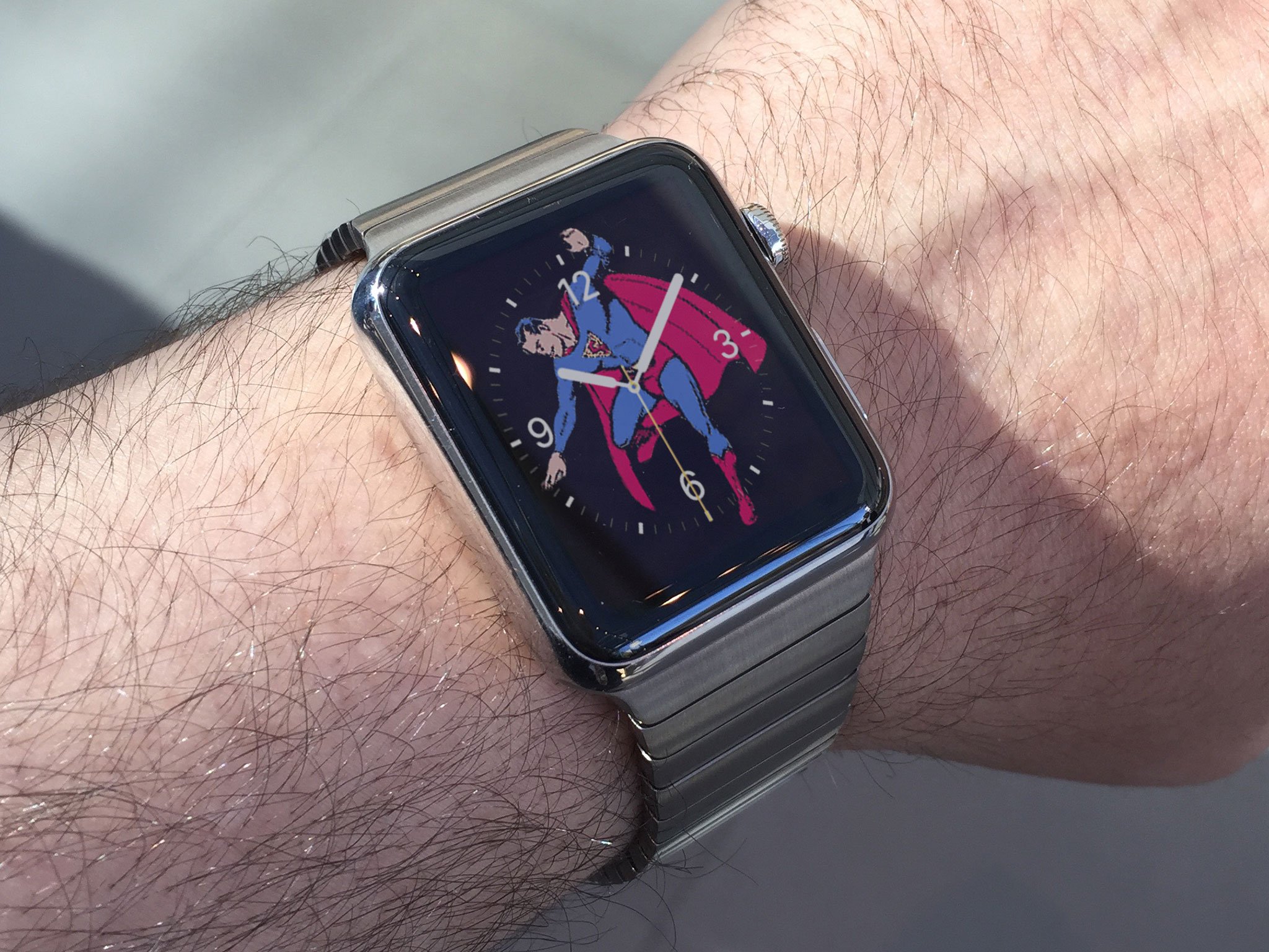
What would work for me, though, is simply the photo face with a ton more complication options. Like Infographic level complication options. Let me turn off any I don't want obscuring my photo and turn all the others into anything I want. That way, I could have a picture of someone I love, a Superman Watch, heck, pretty much any background I want, and not have to sacrifice all the useful, glanceable data I need just to get it.
As with complications, I'd also love to see some smarts with watch faces. Day and night faces that switch when I get to or leave work, or on a schedule. Workout faces that take over when I arrive at the gym or a travel face when I hit the airport. It could be brilliant or it could all go horribly wrong, but it feels like there's a lot of room for Apple to play around with intelligence beyond just the Siri face.
WWDC 2019: macOS 10.15
Craig Federighi comes back on stage but this time, it's for the Mac. Rather, it's for the next-generation of Mac software, macOS 10.15 and whatever name Apple's crack marketing team has come up with to represent it.
macOS 10.15: Marzipan Phase 2
A lot of what's coming to the Mac this year is building on what was introduced, let's charitably call it in alpha form, last year: UIKit apps for the Mac. We got News, Home, Voice Recorder, and Stocks, and they're all a bit of a inconsistently hot to lukewarm mess. So much so, it's hard to believe Apple of all companies was willing to release them, even as proofs of concept. But they were and they did, along with the promise that UIKit apps on the Mac would be coming to developers this year.
My understanding is that this version of Marzipan will be much better. So much better it'll help flashy thing last year's version out of our brain boxes. Not finished. Not fully polished. Not until it comes out of beta and developers can start shipping off of it. But much closer to Marzipan as it was originally and always intended to be.
I know it scares a lot of Mac traditionalists, probably as much as Cocoa scared the classists, but it also feels very much like the near-future, at least until the real next NeXT comes along, and that means it really has to be insanely great.
In a separate story on 9to5, Gui said there'll be Mac-specific API – application programming interfaces — to support the Mac menubar and the MacBook Pro Touch Bar, among other things.
Support will be there for multiple Marzipan windows, which has always been a key part of the Mac user experience. So, hurrah.
Split View Marzipan apps will be able to be resized or reset through the divider, like on iOS, which already be an improvement to the announced-and-promptly-abandoned split view mechanic currently on macOS. And if they include a way to swap out split view apps without having to destroy and re-create the entire split view, after hunting down that one app that always, perplexingly, goes full screen off screen, I will personally send a proper Montreal poutine recipe to Caffe Macs. You're welcome.
macOS 10.15: iMessage effects
Finally. (Sent with Fireworks.)
Does that mean the several years old AppKit app will get updated to support them, or a new Marzipan app will just bring the UIKit functionality on over?
Marzipan everything, I say. Get us to the future faster and dog food everything as much as possible so Apple hits all the pain points before, or at least alongside, developers.
macOS 10.15: Siri & Shortcuts
Last year, Apple rebooted Workflow as Siri Shortcuts and brought not only automation to iOS, but suggested actions and even voice triggers. I hopped the suggested part would serve as an easy entry point for casual users even as the workflow part seriously amped up the power for power users. A year later, and I still haven't seen many suggestions, which means I don't think Shortcuts have seen a lot of on boarding. But, the workflows, they're everywhere among the nerdy.
And, according to Gui, this year we're getting Shortcuts for the Mac. That could… should… would include a Marzipan Shortcuts app for the Mac to match the one on iPad, and improved Siri support, so the Mac's assistant capabilities better match those of iPad, and Shortcuts can provide a non-crippled experience.
Siri, and hopefully this mean both iOS and macOS, should also, finally, be getting increased intents support, including for media playback, which will be huge for anyone using services and apps outside of Apple's own.
Now, shortcuts are great and are probably going to end up being an important step towards the future of easy-to-assemble voice apps. I'd have loved to have seen Shortcuts support on the Mac last year when the feature was first introduced for basically everything else.
But, Workflow was an iOS app when Apple bought it and it took everything the team had just to turn it into shortcuts and ship it, version 1 feature complete, for all the iOS-based operating systems and devices last year. Now, Marzipan has had time to mature and they've had time to spin up the Mac version, and provided they stay in lockstep from this point on, a lot of nerds are going to be a lot of happy come beta in June and release in the fall.
macOS 10.15: Screen Time
The overall digital wellbeing movement and the way some companies and activists talk about it has always been a little pandery and sensational for me. I just like data. And that's just exactly what Screen Time gives me — how much of what am I doing for how long.
Based on that data, I can be more honest with myself about what I'm doing, and if I had kids, what they're doing, and make better informed decisions and changes when and as needed.
And this year, according to Gui, that's also coming to the Mac.
The feature set sounds identical to what we currently have on iOS, and if there are any improvements there, hopefully we'll get them here as well. It's hard to balance simplicity with robustness, security with usability, but that's Apple's job here, even and especially in a more open computing system like the Mac.
macOS 10.15: Family Sharing
A lot of the new services Apple pre-announced in March, like Apple Arcade, are going to work not only on the Mac but with Family Sharing. And that means Family Sharing needs to be as easy and accessible to manage on the Mac as it has been on iOS.
Gui says Apple will be implementing a new Apple ID management panel in System Preferences to help with that, similar to how Settings works on iOS.
That way, you can sign up for services new and old, and assign them, on the Mac just like you would from your iPhone or iPad.
macOS 10.15: File Providing Extensions
Gui also mentions that the Mac will be getting file provider extensions, which should help services like Dropbox better integrate with the Finder system. Bonus points if they never harass me about enabling special accessibility powers ever again. No means no.
Also, an API devs can use to write device drivers. And wow but would I love to see that for iPad Pro as well.
macOS 10.15: Authentication
Currently, if you have a modern Apple Watch you can use it to unlock your Mac and approve Apple Pay transactions if your Mac doesn't have Touch ID. If your Mac does have Touch ID, you can race it with your Apple Watch, which is kinda but not really super fun.
But, Touch ID on Mac can also do things Apple Watch can't, like enable autofill for passwords and authorize privilege escalation in some cases as well.
According to Gui, Apple Watch could be gaining the ability to do everything Touch ID can do now as well. Which would be really cool because as much as Touch ID is far more convenient than typing a long, strong, unique password, Apple Watch auth is damn near invisible at best, and at worst bring Touch ID-like functionality to Macs that still don't have Touch ID. Which is, confoundingly, still many.
And, with the fancy time of flight and other precautions Apple takes, it's likely secure enough for most people as well, which is a huge win for convenience.
macOS 10.15: External Displays
Macs have worked with external displays for a long time but, new, Gui says there'll be a simple menu, accessible by hovering right over the green traffic light button on any window, that'll provide options not only for full screen and tiling, and hopefully other, long overdue window management options, but for moving that window to any external display… including full-screen on an iPad.
Better still, if the iPad supports Apple Pencil, which all of the most recent iPads do, you'll be able to draw on it with the Pencil and have the results input into the Mac app, which should make Wacom cry. Again.
WWDC 2019: New Mac Pro
WWDC is often but not always a software-only show. Bback in 2013 we got a preview of the trash can MacBook Pro. In 2017 we got a preview of the iMac Pro. Apple's already said they're working on a new, modular Mac Pro with Pro Display. So, does that mean we'll see Phil Schiller, Senior Vice President of worldwide marketing, or John Ternus, Vice President of Hardware Engineering hit the stage with and a preview of the next-generation, all-new, all-modular Mac Pro?
Part of me just wants that updated cheese grater already. Keep it super damn simple stupid, and just give me the big CPU box with all the slots, get out of my way, and let me Mac Pro me.
The other part of me recognizes the past as the past and is really curious what the future of workstation computing looks like… in the future.
Most people will take modular to mean… whatever they want it to me. From slots to stacks, a single tower to one built from many blocks.
What Apple has in mind, we'll just have to wait and see.
WWDC 2019: To be continued
WWDC 2019 kicks of on June 3 at 10am Pacific, 1pm Eastern in San Jose California. But that's just the beginning. Right after the main keynote is the developer keynote, State of the Union. Then, traditionally, the Apple Design Awards. And that's still only Monday. Developer sessions and special events run from Tuesday through Friday, and you can track them all in the just updated WWDC app, which is outstanding work by the evangelist team, each year, every year, and certainly this year.
Keep it locked to iMore and VECTOR for all the news, views, and fun!

Rene Ritchie is one of the most respected Apple analysts in the business, reaching a combined audience of over 40 million readers a month. His YouTube channel, Vector, has over 90 thousand subscribers and 14 million views and his podcasts, including Debug, have been downloaded over 20 million times. He also regularly co-hosts MacBreak Weekly for the TWiT network and co-hosted CES Live! and Talk Mobile. Based in Montreal, Rene is a former director of product marketing, web developer, and graphic designer. He's authored several books and appeared on numerous television and radio segments to discuss Apple and the technology industry. When not working, he likes to cook, grapple, and spend time with his friends and family.
